source("../_globals.r")Week 9: Dimensionality Reduction
DSAN 5000: Data Science and Analytics
\(K\)-Means Clustering
cb_palette = ["#E69F00", "#56B4E9", "#009E73", "#F0E442", "#0072B2", "#D55E00", "#CC79A7"]

from IPython.display import Markdown
def disp(df, floatfmt='g', include_index=True):
  return Markdown(
    df.to_markdown(
      floatfmt=floatfmt,
      index=include_index
    )
  )

def summary_to_df(summary_obj, corner_col = ''):
    reg_df = pd.DataFrame(summary_obj.tables[1].data)
    reg_df.columns = reg_df.iloc[0]
    reg_df = reg_df.iloc[1:].copy()
    # Save index col
    index_col = reg_df['']
    # Drop for now, so it's all numeric
    reg_df.drop(columns=[''], inplace=True)
    reg_df = reg_df.apply(pd.to_numeric)
    my_round = lambda x: round(x, 2)
    reg_df = reg_df.apply(my_round)
    numeric_cols = reg_df.columns
    # Add index col back in
    reg_df.insert(loc=0, column=corner_col, value=index_col)
    # Sigh. Have to escape | characters?
    reg_df.columns = [c.replace("|","\|") for c in reg_df.columns]
    return reg_df
\[ \DeclareMathOperator*{\argmax}{argmax} \DeclareMathOperator*{\argmin}{argmin} \newcommand{\bigexpect}[1]{\mathbb{E}\mkern-4mu \left[ #1 \right]} \newcommand{\definedas}{\overset{\text{defn}}{=}} \newcommand{\definedalign}{\overset{\phantom{\text{defn}}}{=}} \newcommand{\eqeventual}{\overset{\text{eventually}}{=}} \newcommand{\expect}[1]{\mathbb{E}[#1]} \newcommand{\expectsq}[1]{\mathbb{E}^2[#1]} \newcommand{\fw}[1]{\texttt{#1}} \newcommand{\given}{\mid} \newcommand{\green}[1]{\color{green}{#1}} \newcommand{\heads}{\outcome{heads}} \newcommand{\iqr}{\text{IQR}} \newcommand{\kl}{\text{KL}} \newcommand{\lik}{\mathcal{L}} \newcommand{\mle}{\textsf{ML}} \newcommand{\orange}[1]{\color{orange}{#1}} \newcommand{\outcome}[1]{\textsf{#1}} \newcommand{\param}[1]{{\color{purple} #1}} \newcommand{\paramDist}{\param{\boldsymbol\theta_\mathcal{D}}} \newcommand{\pgsamplespace}{\{\green{1},\green{2},\green{3},\purp{4},\purp{5},\purp{6}\}} \newcommand{\prob}[1]{P\left( #1 \right)} \newcommand{\purp}[1]{\color{purple}{#1}} \newcommand{\red}[1]{\color{red}#1} \newcommand{\spacecap}{\; \cap \;} \newcommand{\spacewedge}{\; \wedge \;} \newcommand{\tails}{\outcome{tails}} \newcommand{\Var}[1]{\text{Var}[#1]} \newcommand{\bigVar}[1]{\text{Var}\mkern-4mu \left[ #1 \right]} \]
K-Means Clustering Algorithm
- Data \(\mathbf{X} = (X_1 = \mathbf{x}_1, \ldots, X_N = \mathbf{x}_N)\)
- Distance metric \(d(\mathbf{v}_1, \mathbf{v}_2)\)
- Hyperparameter value for \(K\) (⁉️)
- Assign each point \(\mathbf{x}_i\) to a cluster \(C_i \in \{1, \ldots, K\}\) (so \(S_j = \{\mathbf{x}_i \mid C_i = j\}\) is the set of points assigned to cluster \(j\))
K-Means Clustering: Centroids
- In general, the centroid \(\mu(S)\) of a set of \(N\) points \(S = \{\mathbf{x}_1, \mathbf{x}_2, \ldots, \mathbf{x}_n\}\) is just the arithmetic mean of all points in \(S\):
\[ \mu(S) = \frac{1}{|S|}\sum_{\mathbf{x}_i \in S}\mathbf{x}_i \]
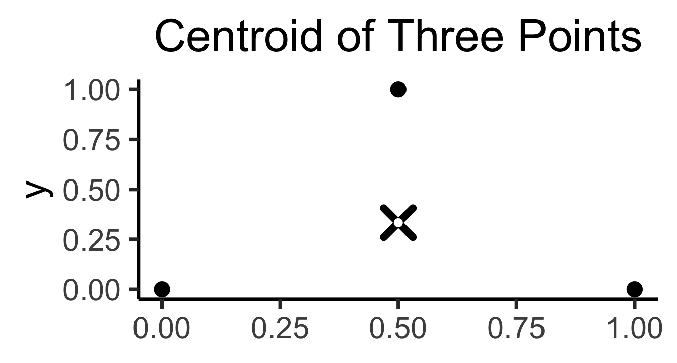
\[ \begin{align*} \mathbf{x}_1 &= (\phantom{0}0\phantom{0}, 0) \\ \mathbf{x}_2 &= (\phantom{0}1\phantom{0}, 0) \\ \mathbf{x}_3 &= (0.5~, 1) \end{align*} \]
\[ \implies \]
\[ \mu(\mathbf{X}) = \left( \frac{1}{2}, \frac{1}{3} \right) \\ \]
library(tidyverse) |> suppressPackageStartupMessages()
simple_df <- tribble(
    ~x, ~y,
    0, 0,
    1, 0,
    0.5, 1
)
cent_x_simple <- mean(simple_df$x)
cent_y_simple <- mean(simple_df$y)
cent_df_simple <- tibble(x=cent_x_simple, y=cent_y_simple)
ggplot(simple_df, aes(x=x, y=y)) +
  geom_point(size = g_pointsize) +
  geom_point(
    data=cent_df_simple,
    aes(x=x, y=y),
    shape=4, stroke=4, color='black',
    size = g_pointsize * 1.5
  ) +
  geom_point(
    data=cent_df_simple,
    aes(x=x, y=y),
    shape=19, color='white',
    size = g_pointsize / 2) +
  dsan_theme('quarter') +
  labs(
    title = "Centroid of Three Points"
  ) +
  theme(
    axis.title.x = element_blank()
  )
N <- 250
r1_vals <- runif(N, 0, 1)
r2_vals <- runif(N, 0, 1)
triangle_df <- tibble(r1=r1_vals, r2=r2_vals)
v1 <- c(0,0)
v2 <- c(1,0)
v3 <- c(0,1)
triangle_df <- triangle_df |> mutate(
    bary_w1 = 1 - sqrt(r1),
    bary_w2 = sqrt(r1) * (1 - r2),
    bary_w3 = sqrt(r1) * r2
)
triangle_df <- triangle_df |> mutate(
    x = bary_w1 * v1[1] + bary_w2 * v2[1] + bary_w3 * v3[1],
    y = bary_w1 * v1[2] + bary_w2 * v2[2] + bary_w3 * v3[2]
)
triangle_cent_x <- mean(triangle_df$x)
triangle_cent_y <- mean(triangle_df$y)
triangle_cent_df <- tibble(x=triangle_cent_x, y=triangle_cent_y)
triangle_plot <- ggplot(
    triangle_df,
    aes(x=x, y=y)
  ) +
  geom_point(
    size = g_pointsize / 2,
    color=cbPalette[1]
  ) +
  geom_point(
    data=triangle_cent_df,
    aes(x=x, y=y),
    shape=4, stroke=4, color='black',
    size = g_pointsize * 1.5) +
  geom_point(
    data=triangle_cent_df,
    aes(x=x, y=y),
    shape=19, color='white',
    size = g_pointsize / 2) +
  dsan_theme('quarter')
# Now a rectangle
x_coords_rect <- runif(N, 0.5, 1)
y_coords_rect <- runif(N, 0.5, 1)
rect_df <- tibble(x=x_coords_rect, y=y_coords_rect)
cent_x_rect <- mean(x_coords_rect)
cent_y_rect <- mean(y_coords_rect)
cent_df_rect <- tibble(x=cent_x_rect, y=cent_y_rect)
rect_plot <- triangle_plot +
  geom_point(
    data=rect_df,
    aes(x=x, y=y),
    size = g_pointsize / 2,
    color=cbPalette[2]
  ) +
  geom_point(
    data=cent_df_rect,
    aes(x=x, y=y),
    shape=4, stroke=4, color='black',
    size = g_pointsize * 1.5) +
  geom_point(
    data=cent_df_rect,
    aes(x=x, y=y),
    shape=19, color='white',
    size = g_pointsize / 2) +
  dsan_theme('half') +
  theme(
    axis.title.x = element_blank()
  )
rect_plot 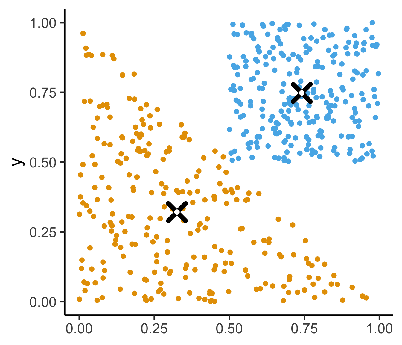
(For those interested, see the appendix slide for how we can efficiently sample points uniformly from the triangle)
K-Means Clustering: Choosing K
- Elbow Method
- Gap Statistic
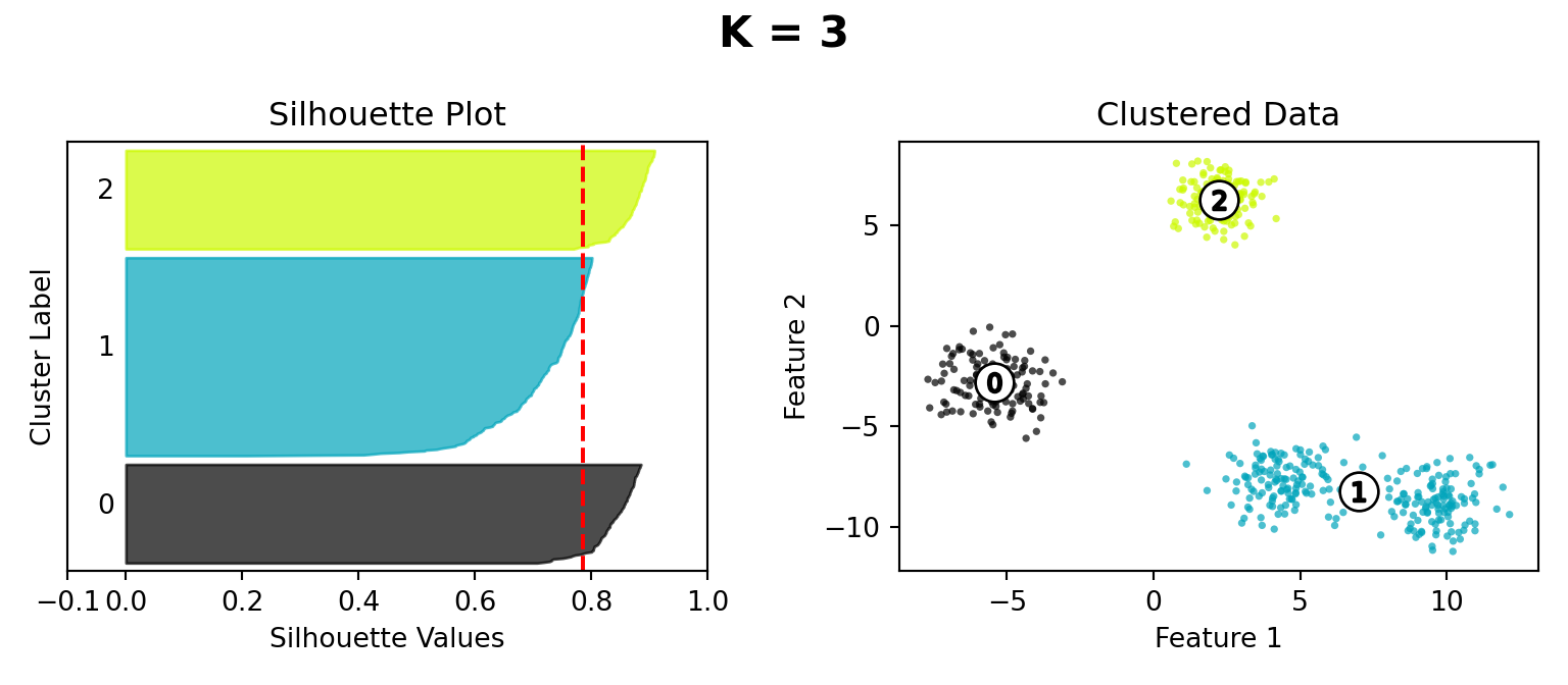
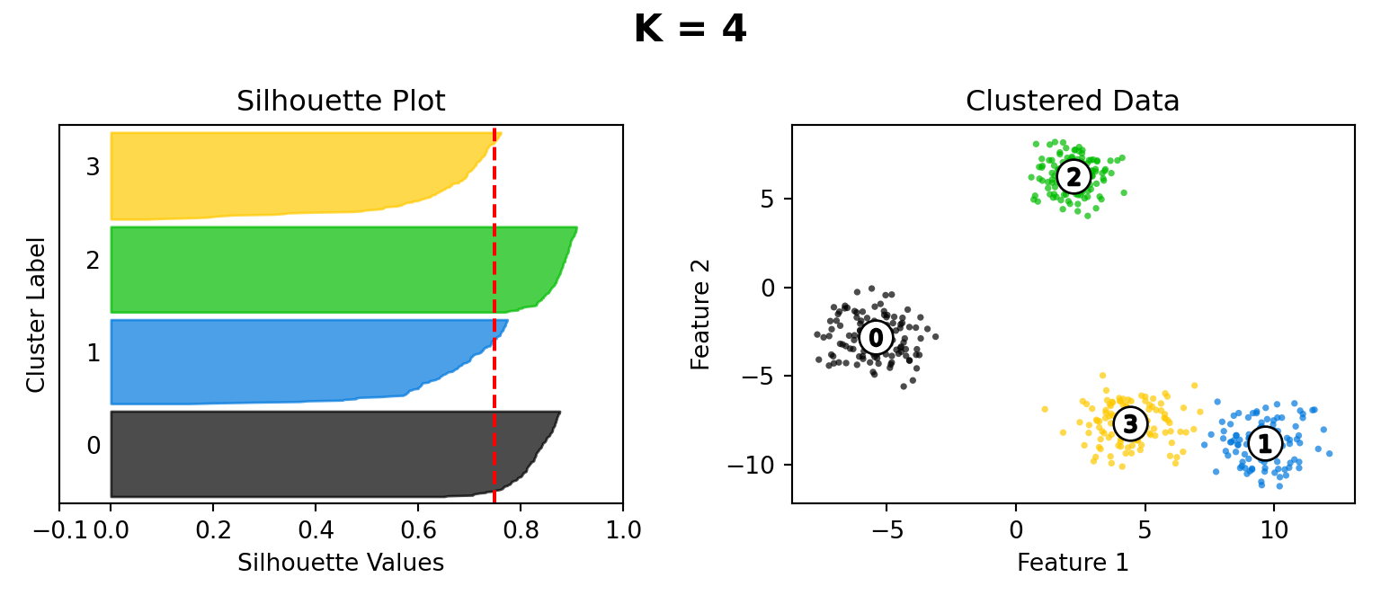
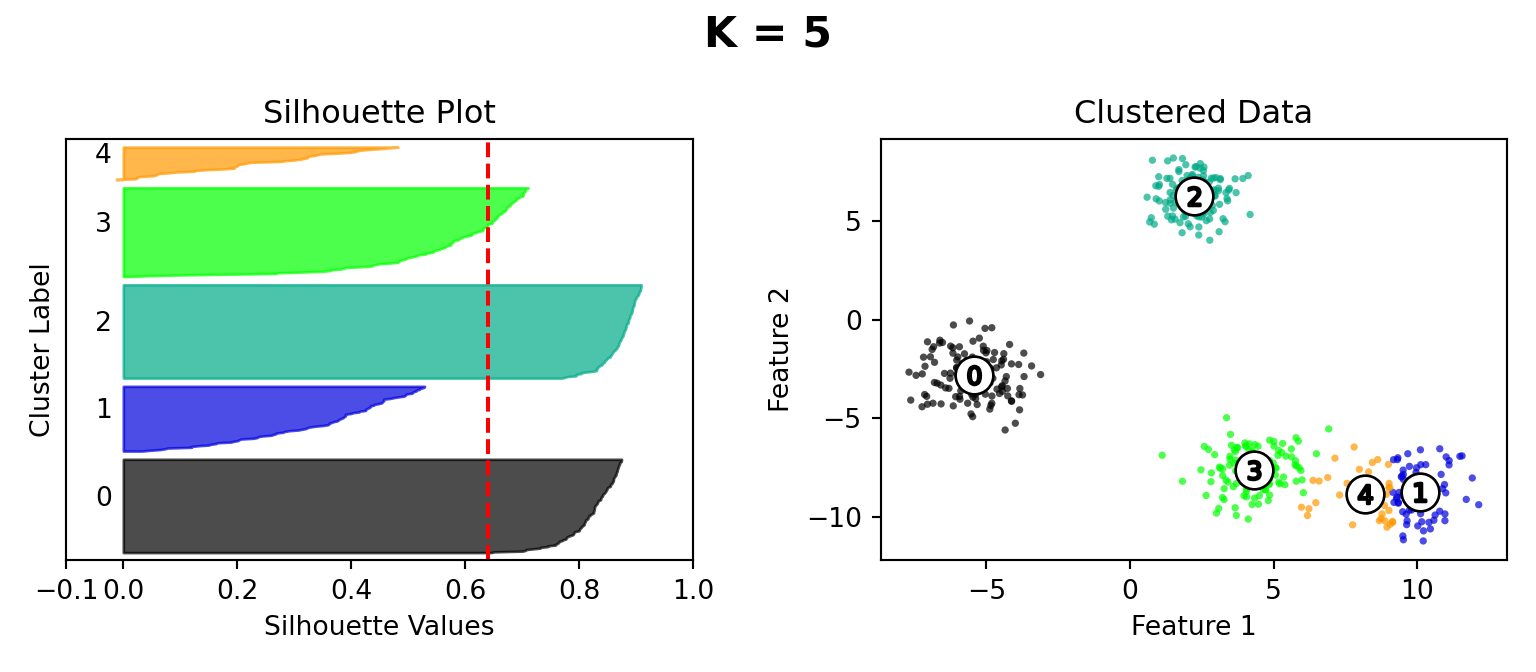
- Silhouette
(Check out this incredibly helpful writeup covering each of these methods: it’s what I look at for reference whenever I’m trying to figure out a good value for \(K\) in my research!)
Elbow Method
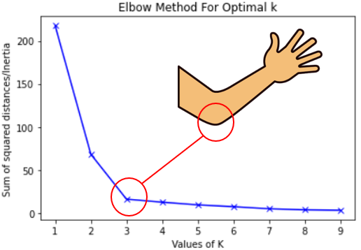
- Your lab involves generating an elbow plot!
Gap Statistic
- From Tibshirani, Walther, and Hastie (2001)
- Intuition: choice \(k\) is “good” for data \(\mathbf{X}\) if it produces clusters that are more cohesive than null distribution \(\mathbf{X}_0\) with points uniformly distributed in the same range as \(\mathbf{X}\):
\[ \text{Gap}_N(k) = \mathbb{E}_{\mathbf{X}_0}[\log(W_k)] - \log(W_k) \]
library(tidyverse)
library(patchwork)
library(MASS)
library(latex2exp)
N <- 300
x_coords_unif <- runif(N, 0, 1)
y_coords_unif <- runif(N, 0, 1)
unif_df <- tibble(x = x_coords_unif, y = y_coords_unif)
unif_df <- unif_df |> mutate(
    cluster = ifelse(y <= 0.5, 3, ifelse(x <= 0.5, 1, 2))
)
plot_title <- TeX(r"(Null Distribution $X_0$, k = 3)")
unif_gap_plot <- ggplot(unif_df, aes(x=x, y=y, color=factor(cluster))) +
  geom_point(size = g_pointsize / 2) +
  dsan_theme('half') +
  labs(
    title = plot_title,
    color = "Cluster"
  ) +
  coord_equal()
unif_gap_plot
N_cluster <- 100
sigma <- 0.01
Sigma <- matrix(c(sigma, 0, 0, sigma), nrow=2)
Mu1 <- c(0.2, 0.8)
Mu2 <- c(0.8, 0.8)
Mu3 <- c(0.5, 0.2)
cluster1 <- as_tibble(mvrnorm(N_cluster, Mu1, Sigma))
cluster1 <- cluster1 |> mutate(cluster = 1)
#print(cluster1)
cluster2 <- as_tibble(mvrnorm(N_cluster, Mu2, Sigma))
cluster2 <- cluster2 |> mutate(cluster = 2)
cluster3 <- as_tibble(mvrnorm(N_cluster, Mu3, Sigma))
cluster3 <- cluster3 |> mutate(cluster = 3)
cluster_df <- bind_rows(cluster1, cluster2, cluster3)
colnames(cluster_df) <- c("x","y","cluster")
cluster_gap_plot <- ggplot(cluster_df, aes(x=x, y=y, color=factor(cluster))) +
  geom_point(size = g_pointsize / 2) +
  dsan_theme('half') +
  labs(
    title = "Actual Data X, k = 3",
    color = "Cluster"
  ) +
  coord_equal()
cluster_gap_plot
Attaching package: 'MASS'The following object is masked from 'package:patchwork':
areaThe following object is masked from 'package:dplyr':
select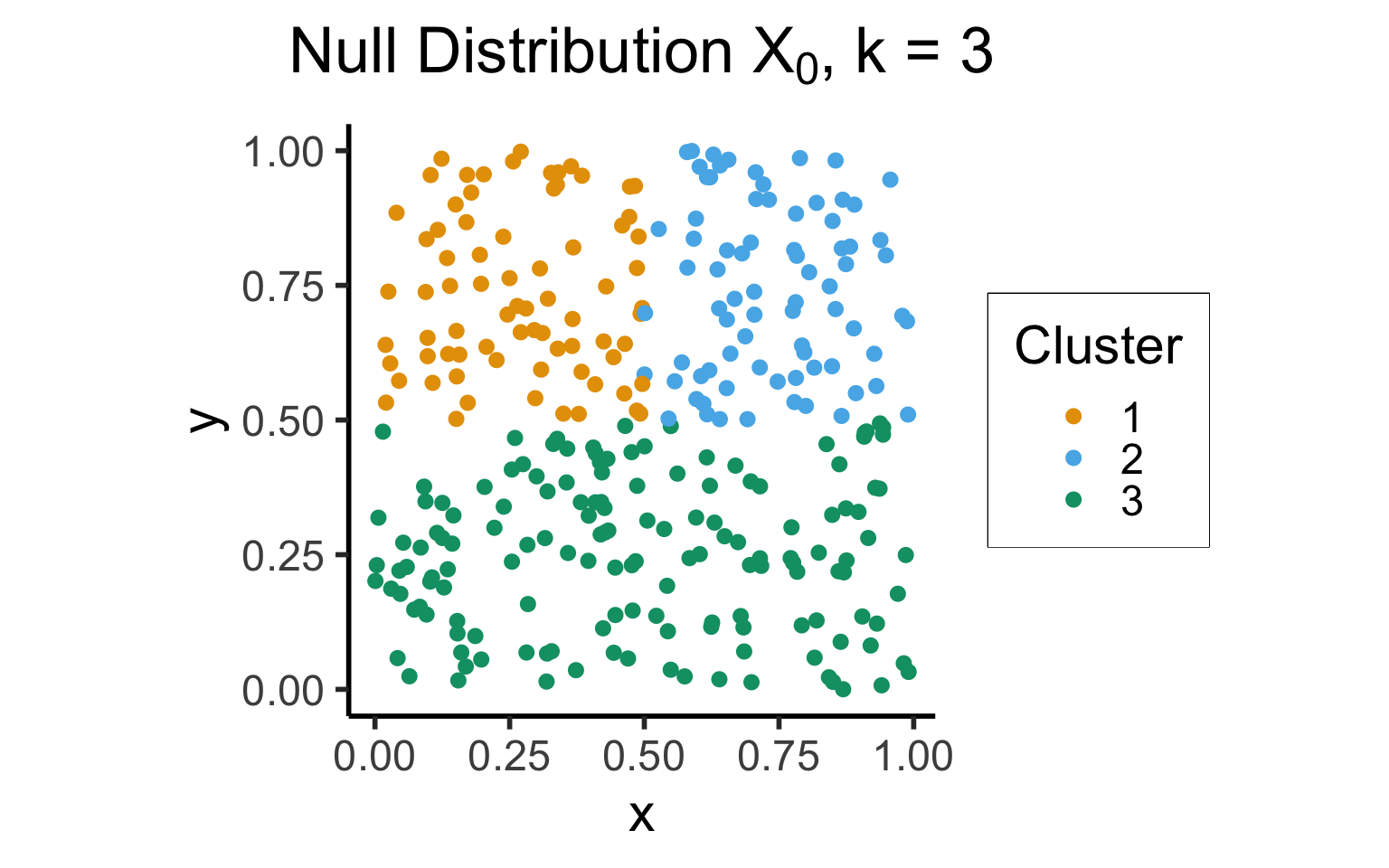
Warning: The `x` argument of `as_tibble.matrix()` must have unique column names if
`.name_repair` is omitted as of tibble 2.0.0.
ℹ Using compatibility `.name_repair`.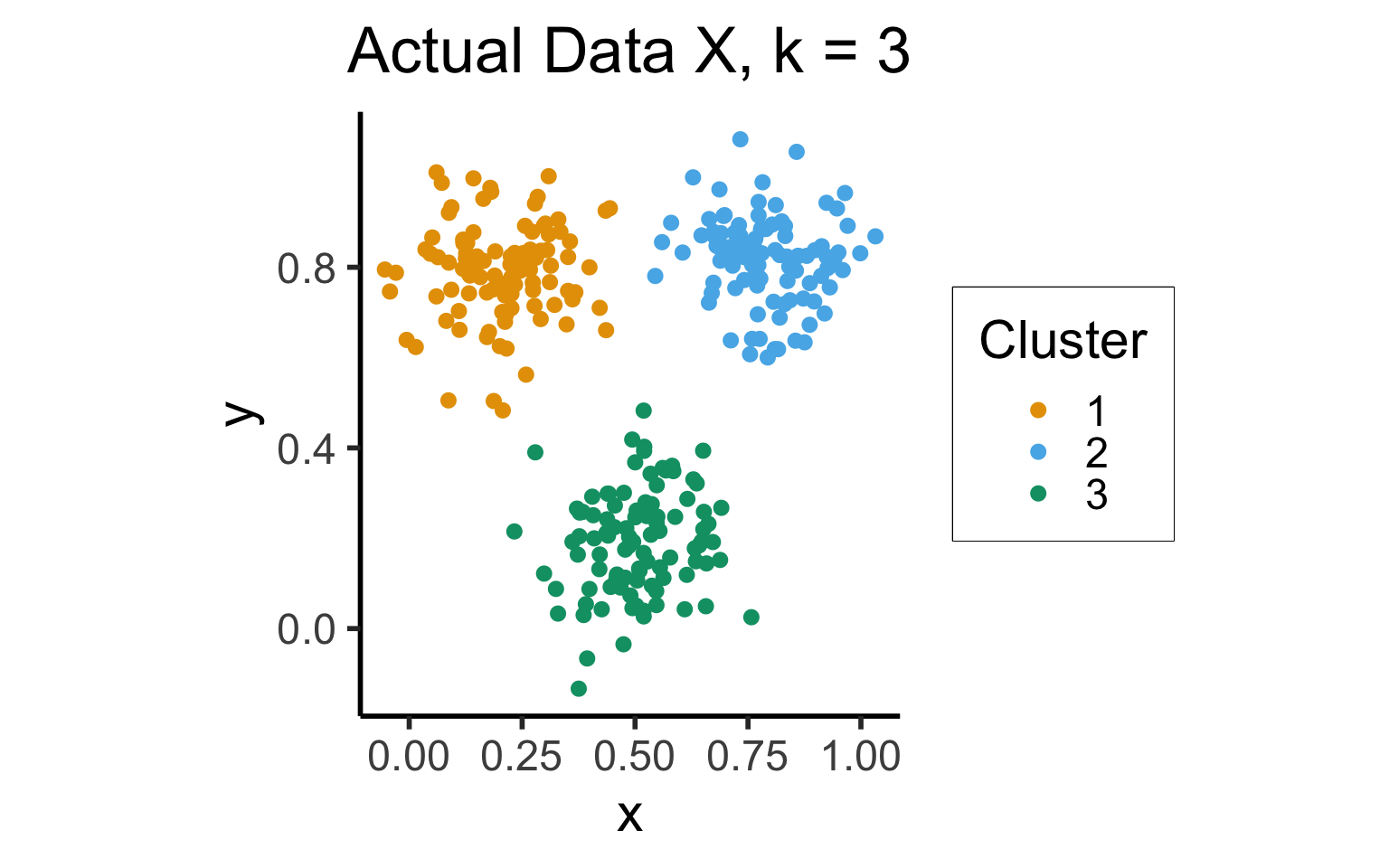
Silhouette Method
import matplotlib.cm as cm
import matplotlib.pyplot as plt
import numpy as np

from sklearn.cluster import KMeans
from sklearn.datasets import make_blobs
from sklearn.metrics import silhouette_samples, silhouette_score

# Generating the sample data from make_blobs
# This particular setting has one distinct cluster and 3 clusters placed close
# together.
X, y = make_blobs(
    n_samples=500,
    n_features=2,
    centers=4,
    cluster_std=1,
    center_box=(-10.0, 10.0),
    shuffle=True,
    random_state=5000
)

def silhouette_plot(n_clusters):
    # Create a subplot with 1 row and 2 columns
    fig, (ax1, ax2) = plt.subplots(1, 2)
    fig.set_size_inches(8, 3.5)

    # The 1st subplot is the silhouette plot
    # The silhouette coefficient can range from -1, 1 but in this example all
    # lie within [-0.1, 1]
    ax1.set_xlim([-0.1, 1])
    # The (n_clusters+1)*10 is for inserting blank space between silhouette
    # plots of individual clusters, to demarcate them clearly.
    ax1.set_ylim([0, len(X) + (n_clusters + 1) * 10])

    # Initialize the clusterer with n_clusters value and a random generator
    # seed of 10 for reproducibility.
    clusterer = KMeans(n_clusters=n_clusters, n_init="auto", random_state=10)
    cluster_labels = clusterer.fit_predict(X)

    # The silhouette_score gives the average value for all the samples.
    # This gives a perspective into the density and separation of the formed
    # clusters
    silhouette_avg = silhouette_score(X, cluster_labels)
    #print(
    #    "For n_clusters =",
    #    n_clusters,
    #    "The average silhouette_score is :",
    #    silhouette_avg,
    #)

    # Compute the silhouette scores for each sample
    sample_silhouette_values = silhouette_samples(X, cluster_labels)

    y_lower = 10
    for i in range(n_clusters):
        # Aggregate the silhouette scores for samples belonging to
        # cluster i, and sort them
        ith_cluster_silhouette_values = sample_silhouette_values[cluster_labels == i]

        ith_cluster_silhouette_values.sort()

        size_cluster_i = ith_cluster_silhouette_values.shape[0]
        y_upper = y_lower + size_cluster_i

        color = cm.nipy_spectral(float(i) / n_clusters)
        ax1.fill_betweenx(
            np.arange(y_lower, y_upper),
            0,
            ith_cluster_silhouette_values,
            facecolor=color,
            edgecolor=color,
            alpha=0.7,
        )

        # Label the silhouette plots with their cluster numbers at the middle
        ax1.text(-0.05, y_lower + 0.5 * size_cluster_i, str(i))

        # Compute the new y_lower for next plot
        y_lower = y_upper + 10  # 10 for the 0 samples

    ax1.set_title("Silhouette Plot")
    ax1.set_xlabel("Silhouette Values")
    ax1.set_ylabel("Cluster Label")

    # The vertical line for average silhouette score of all the values
    ax1.axvline(x=silhouette_avg, color="red", linestyle="--")

    ax1.set_yticks([])  # Clear the yaxis labels / ticks
    ax1.set_xticks([-0.1, 0, 0.2, 0.4, 0.6, 0.8, 1])

    # 2nd Plot showing the actual clusters formed
    colors = cm.nipy_spectral(cluster_labels.astype(float) / n_clusters)
    ax2.scatter(
        X[:, 0], X[:, 1], marker=".", s=30, lw=0, alpha=0.7, c=colors, edgecolor="k"
    )

    # Labeling the clusters
    centers = clusterer.cluster_centers_
    # Draw white circles at cluster centers
    ax2.scatter(
        centers[:, 0],
        centers[:, 1],
        marker="o",
        c="white",
        alpha=1,
        s=200,
        edgecolor="k",
    )

    for i, c in enumerate(centers):
        ax2.scatter(c[0], c[1], marker="$%d$" % i, alpha=1, s=50, edgecolor="k")

    ax2.set_title("Clustered Data")
    ax2.set_xlabel("Feature 1")
    ax2.set_ylabel("Feature 2")

    # plt.suptitle(
    #     "Silhouette analysis for KMeans clustering on sample data with n_clusters = %d"
    #     % n_clusters,
    #     fontsize=14,
    #     fontweight="bold",
    # )
    plt.suptitle("K = " + str(n_clusters), fontsize=16, fontweight="bold")
    plt.tight_layout()
    plt.show()
/Users/jpj/.virtualenvs/r-reticulate/lib/python3.11/site-packages/threadpoolctl.py:1019: RuntimeWarning: libc not found. The ctypes module in Python 3.11 is maybe too old for this OS.
warnings.warn(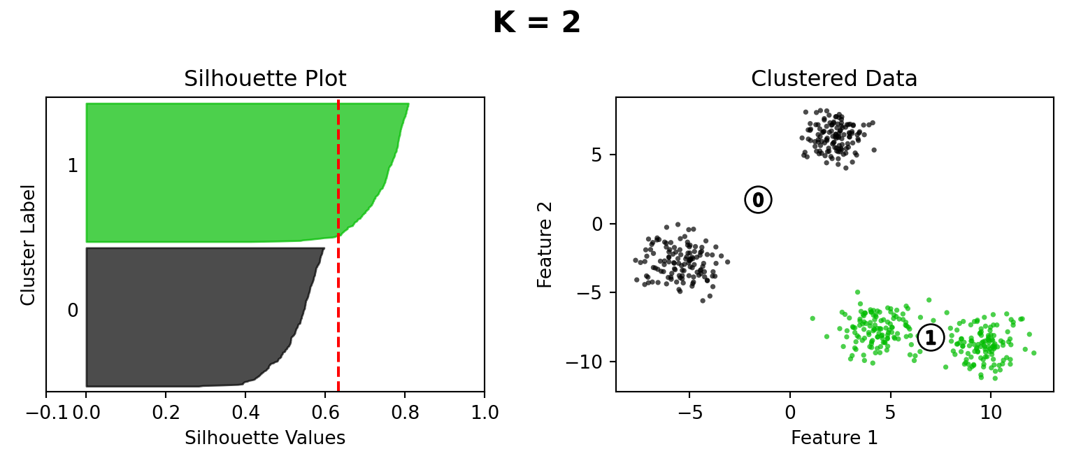
Dimensionality Reduction
Dimensionality Reduction: Why?
- Dimensions are just numbers we use to describe where something is in some space
- Do we really need 2 numbers to describe where we are on this line segment?
my_vec <- tribble(
    ~x, ~y, ~xend, ~yend,
    0, 0, 1, 1
)
my_dotted_vec <- tribble(
  ~x, ~y, ~xend, ~yend,
  1/3, 1, 1, 1/3
)
my_point <- tribble(
    ~x, ~y,
    2/3, 2/3,
)
my_line <- function(x) x
ggplot() +
  geom_segment(
    data=my_vec,
    aes(x=x, y=y, xend=xend, yend=yend),
    linewidth = g_linewidth,
    arrow = arrow(length = unit(0.1, "npc"))
  ) +
  geom_segment(
    data=my_dotted_vec,
    aes(x=x, y=y, xend=xend, yend=yend),
    linewidth = g_linewidth,
    linetype = "dashed"
  ) +
  geom_point(
    data=my_point,
    aes(x=x, y=y, color='jeff'),
    size = g_pointsize
  ) +
  #annotate("point", x = 2/3, y = 2/3, color = cbPalette[1], size = g_pointsize) +
#   geom_function(
#     data=data.frame(x=c(0,1)),
#     aes(x=x),
#     fun=my_line,
#     linewidth = g_linewidth
#   ) +
  annotate("text", x=1/3, y=1/3 + 0.05, label="2/3", angle=45, size=8, vjust='bottom') +
  annotate("text", x=4.8/6, y=4.8/6 + 0.05, label="1/3", angle=45, size=8, vjust='bottom') +
  dsan_theme('quarter') +
  labs(
    title = "Position of Your Boy Jeff w.r.t. v=(1,1)"
  ) +
  theme(
    title = element_text(size=18),
    legend.title = element_blank(),
    legend.spacing.y = unit(0, "mm")
  ) +
  #xlim(c(0,1)) + ylim(c(0,1)) +
  scale_color_manual(values=c('jeff'=cbPalette[1]), labels=c('jeff'="Your Boy Jeff")) +
  coord_equal()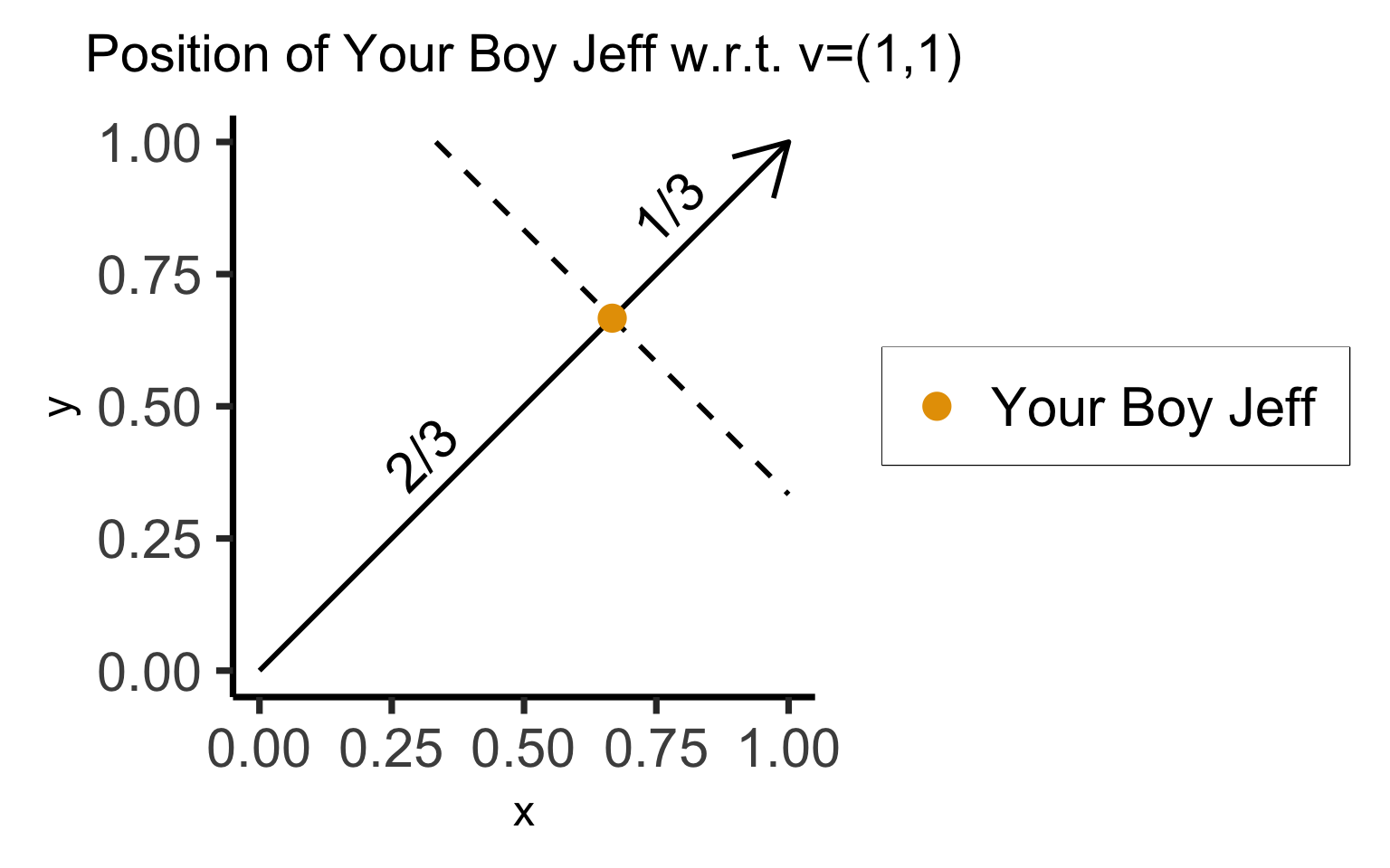
- Representation 1: \(\text{Jeff} = \left(\frac{2}{3},\frac{2}{3}\right)\)
- Representation 2: \(\text{Jeff} = \frac{2}{3} \cdot \mathbf{v}\)
- If we have a 2D dataset (\(X_i \in \mathbb{R}^2\)), but we know that all points are in \(\text{Span}(\mathbf{v})\), we can obtain a 1-dimensional representation!
Dimensionality Reduction: Noisy Data
- If points are perfectly linear, 1D representation perfectly compresses 2D data
- Now, same intuition but with lossy representation: how many dimensions do we really need to describe where a person is on this line, to high approximation?
import pandas as pd
import numpy as np
import matplotlib.pyplot as plt
import seaborn as sns
rng = np.random.default_rng(seed = 5000)
def set_seaborn_style():
    sns.set(rc={'figure.figsize':(4.5,4.5)})
    sns.set_theme(style="whitegrid")
set_seaborn_style()
N = 100
slope = 1
intercept = 0
# Now with noise
sigma = 0.1
x_coords = rng.uniform(0,1,N)
# Generate normally distributed random error ~ N(0, sigma**2)
errors = rng.normal(loc=0, scale=sigma, size=N)
y_coords = slope * x_coords + intercept + errors
random_line_df = pd.DataFrame({'x':x_coords, 'y':y_coords})
sns.scatterplot(data=random_line_df, x="x", y="y", color='black')
sns.rugplot(data=random_line_df, x="x", y="y", color='black')
plt.tight_layout()
plt.show()
from sklearn.decomposition import PCA
set_seaborn_style()
pca = PCA(n_components=2).fit(random_line_df.values)
Xp = pca.transform(random_line_df.values)
Xp_df = pd.DataFrame(Xp, columns=['x','y'])
pca_scatter = sns.scatterplot(data=Xp_df, x="x", y="y", color='black')
pca_scatter.set_xlim((-1,1));
pca_scatter.set_ylim((-1,1));
custom_ticks = [-1,-0.8,-0.6,-0.4,-0.2,0,0.2,0.4,0.6,0.8,1]
pca_scatter.set_xticks(custom_ticks)
pca_scatter.set_yticks(custom_ticks)
pca_scatter.set_xlabel("First Principal Component")
pca_scatter.set_ylabel("Second Principal Component")
plt.axhline(0, color='black', alpha=0.5)
plt.axvline(0, color='black', alpha=0.5)
sns.rugplot(data=Xp_df, x="x", y="y", color='black')
plt.tight_layout()
plt.show()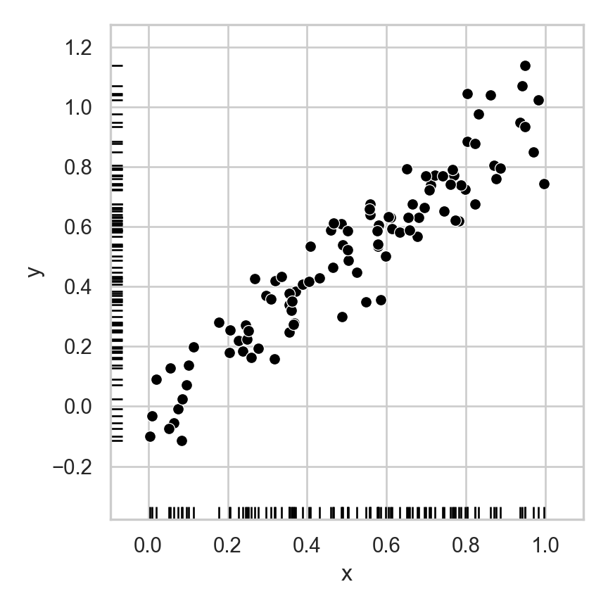
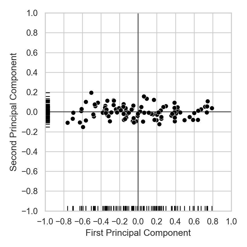
Sounds Good In Theory 🤔… How Does It Help Us Understand The Real World?
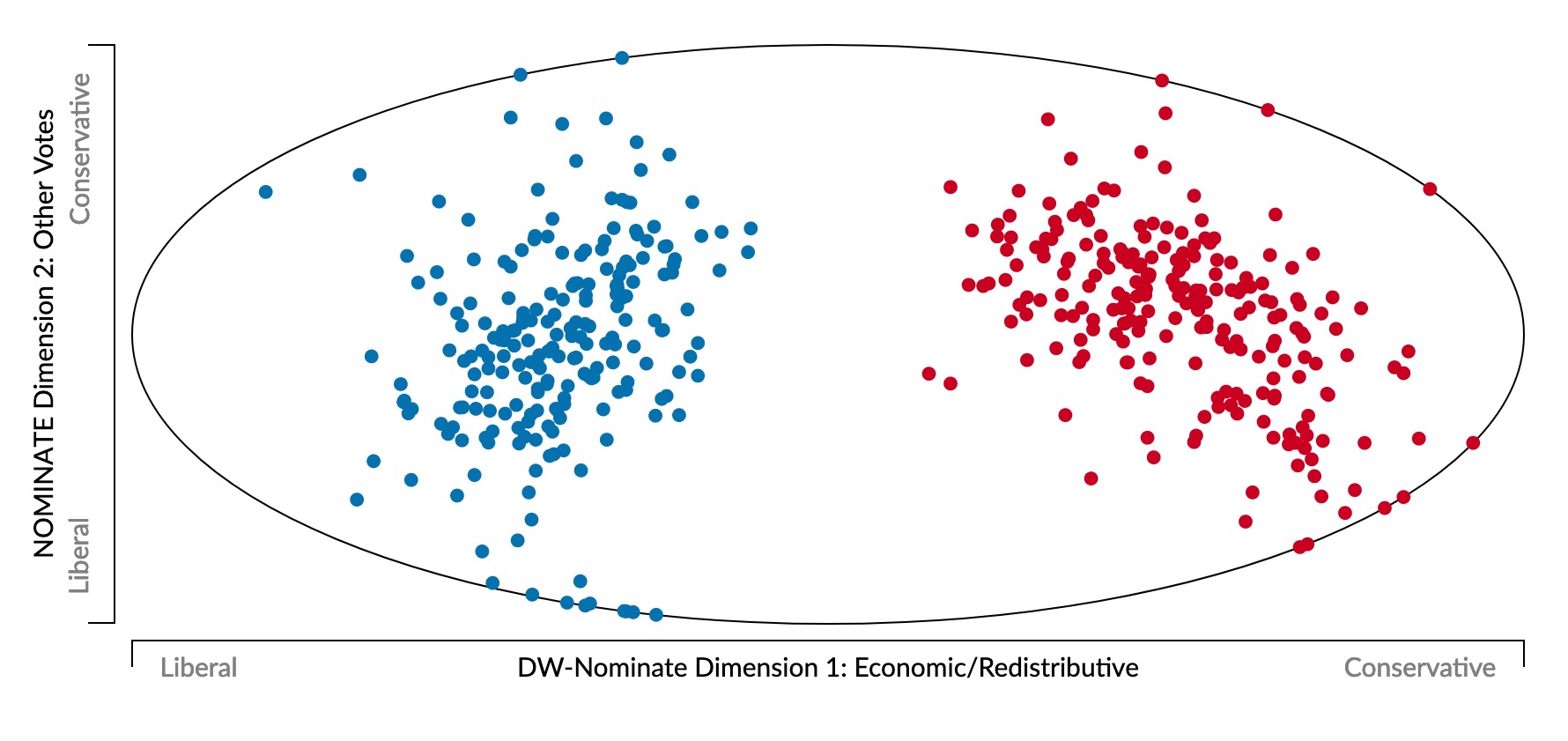
- Represent politician \(i\) as a point \(\mathbf{v}_i = (v_{i,1}, v_{i,2}, \ldots, v_{i,N})\)
- \(v_{i,j} \in \{Y, N\}\): politician \(i\)’s vote on bill \(j\)
- Last US Congress (117th) voted on 1945 bills \(\implies\) 1945-dimensional space 😵💫
- What happens if we view this 1945-dimensional space along two axes of maximum variance? (Same principle used to obtain principal component line on last slide)
A Principled Quantification of Political Ideology 🤯
library(ggjoy)Loading required package: ggridgesThe ggjoy package has been deprecated. Please switch over to the
ggridges package, which provides the same functionality. Porting
guidelines can be found here:
https://github.com/clauswilke/ggjoy/blob/master/README.mdmetadata <- read_csv(
"col_name , col_width
congress , 4
icpsr , 6
st_code , 3
cd , 2
st_name , 8
party_code , 5
mc_name , 15
dim_1 , 10
dim_2 , 10
dim_1_se , 10
dim_2_se , 10
dim_1_2_corr , 8
log_lik , 11
num_votes , 5
num_class_err , 5
geo_mean_prob , 10"
)Rows: 16 Columns: 2── Column specification ────────────────────────────────────────────────────────
Delimiter: ","
chr (1): col_name
dbl (1): col_width
ℹ Use `spec()` to retrieve the full column specification for this data.
ℹ Specify the column types or set `show_col_types = FALSE` to quiet this message.members <- read_fwf(
"assets/dwnom.DAT",
fwf_widths(widths = metadata$col_width, col_names = metadata$col_name)
)Rows: 37521 Columns: 16
── Column specification ────────────────────────────────────────────────────────
chr (2): st_name, mc_name
dbl (14): congress, icpsr, st_code, cd, party_code, dim_1, dim_2, dim_1_se, ...
ℹ Use `spec()` to retrieve the full column specification for this data.
ℹ Specify the column types or set `show_col_types = FALSE` to quiet this message.representatives <- members %>%
filter(
congress >= 88,
!(cd %in% c(0, 98, 99)),
party_code == 100 | party_code == 200
) %>%
mutate(year1 = congress * 2 + 1787) %>%
arrange(desc(year1))
democrats <- representatives %>% filter(party_code == 100)
republicans <- representatives %>% filter(party_code == 200)
ggplot(representatives, aes(x = dim_1, y = year1, group = year1)) +
geom_joy(data = democrats, fill = "blue", scale = 7, size = 0.25, rel_min_height = 0.01, alpha = 0.2) +
geom_joy(data = republicans, fill = "red", scale = 7, size = 0.25, rel_min_height = 0.01, alpha = 0.2) +
theme_classic() +
scale_x_continuous(limits = c(-1, 1.3), expand = c(0.01, 0), breaks = seq(-1, 1, 0.5)) +
scale_y_reverse(breaks = seq(2013, 1963, -10)) +
ggtitle("Distribution of DW-NOMINATE of U.S. House by Party: 1963-2013") +
ylab("First Year of Each Congress") +
xlab("First Dimension DW-NOMINATE") +
dsan_theme('full')Warning in geom_joy(data = democrats, fill = "blue", scale = 7, size = 0.25, :
Ignoring unknown parameters: `size`Warning in geom_joy(data = republicans, fill = "red", scale = 7, size = 0.25, :
Ignoring unknown parameters: `size`Picking joint bandwidth of 0.0483
Picking joint bandwidth of 0.0446Warning: Removed 1 row containing non-finite outside the scale range
(`stat_density_ridges()`).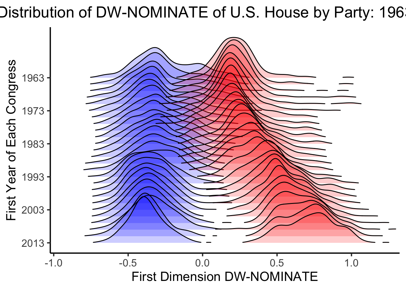
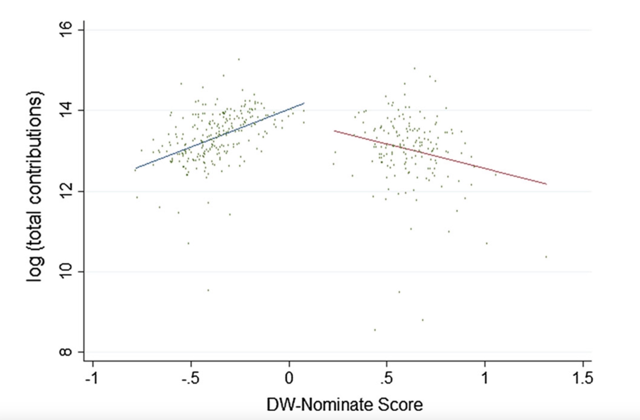
Political Contributions vs. Ideology

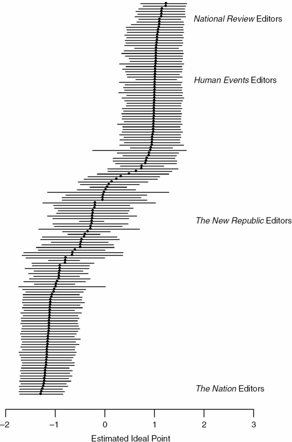
For Media Literacy


For NLP
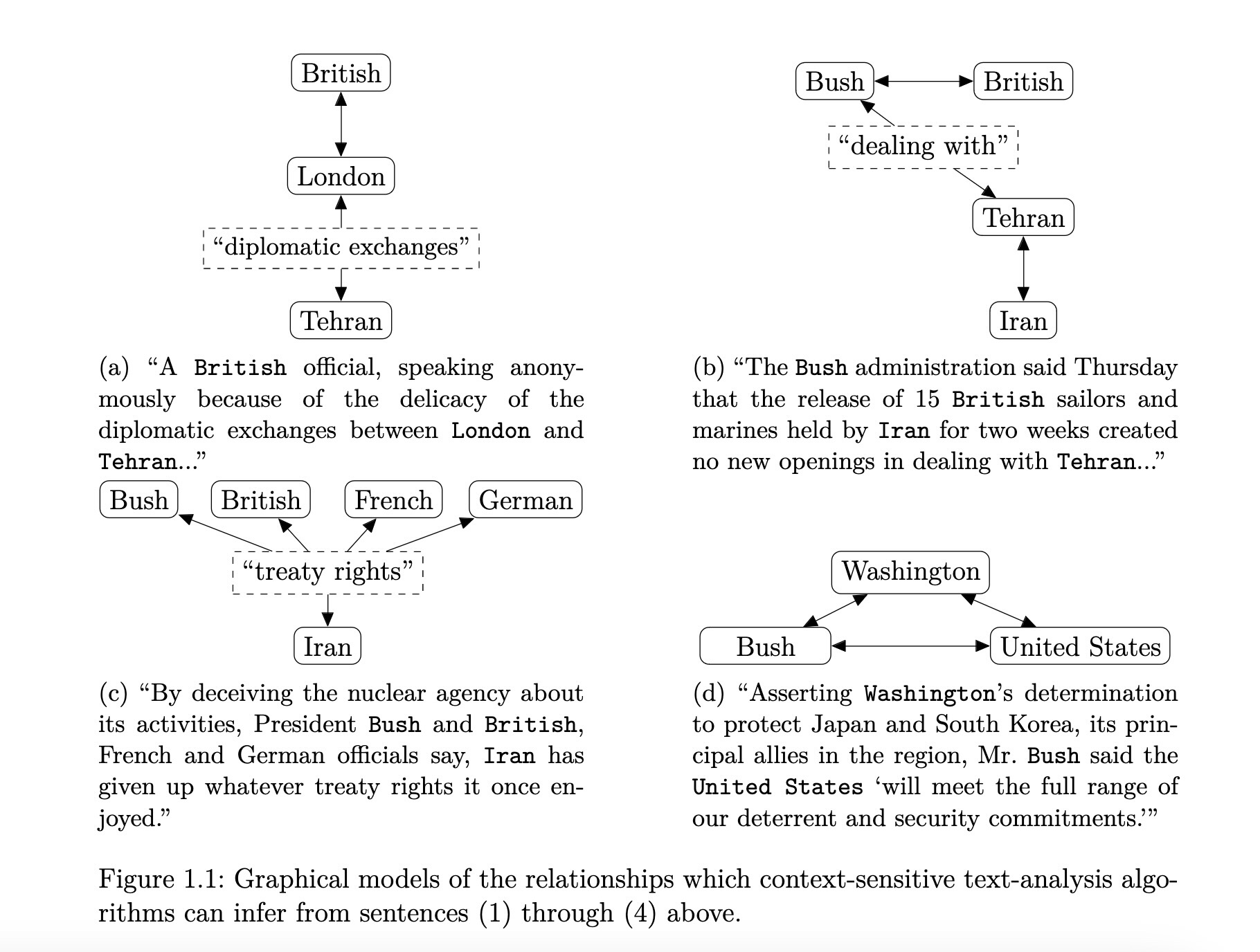
- High-level goal: Retain information about word-context relationships while reducing the \(M\)-dimensional representations of each word down to 3 dimensions.
- Low-level goal: Generate rank-\(K\) matrix \(\mathbf{W}\) which best approximates distances between words in \(M\)-dimensional space (rows in \(\mathbf{X}\))
But What Do The Vectors Mean?
- The coordinates of a word vector \(\textbf{w}\) mean… the coordinates that best preserve its distance to other words in the high-dimensional space
- However, you can transform the word vectors, or the space they’re plotted in, to impose meaning upon the otherwise-meaningless coordinates!
“Gaps” Between Vectors Also Meaningful!
Coding Demo Interlude!
Clustering and Dimensionality Reduction for Text Data
Feature Extraction
Reducing Dimensionality
- Method 1: Feature Selection. Selecting a subset of existing features:
| \(F_1\) | \(F_2\) | \(F_3\) |
|---|---|---|
| 0.8 | 0.9 | 0.1 |
| 0.6 | 0.4 | 0.1 |
→
| \(F_1\) | \(F_2\) | \(F_3\) |
|---|---|---|
| 0.8 | 0.9 | 0.1 |
| 0.6 | 0.4 | 0.1 |
→
| \(F_1\) | \(F_3\) |
|---|---|
| 0.8 | 0.1 |
| 0.6 | 0.1 |
- Method 2: Feature Extraction. Constructing new features as combinations/functions of the original features
| \(F_1\) | \(F_2\) | \(F_3\) |
|---|---|---|
| 0.8 | 0.9 | 0.1 |
| 0.6 | 0.4 | 0.1 |
→
\[ \begin{align*} {\color{#56b4e9}F'_{12}} &= \frac{{\color{#e69f00}F_1} + {\color{#e69f00}F_2}}{2} \\ {\color{#56b4e9}F'_{23}} &= \frac{{\color{#e69f00}F_2} + {\color{#e69f00}F_3}}{2} \end{align*} \]
→
| \(F'_{12}\) | \(F'_{23}\) |
|---|---|
| 0.85 | 0.50 |
| 0.50 | 0.25 |
Principal Component Analysis (PCA)
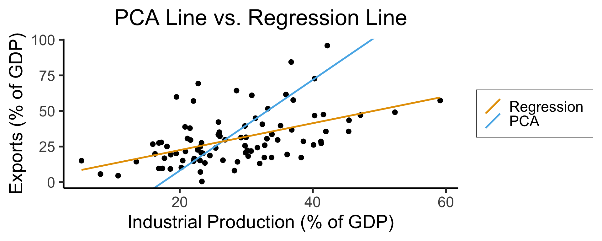
- We know this is feature extraction since we obtain new dimensions:
library(tidyverse) |> suppressPackageStartupMessages()
gdp_df <- read_csv("assets/gdp_pca.csv")

dist_to_line <- function(x0, y0, a, c) {
    numer <- abs(a * x0 - y0 + c)
    denom <- sqrt(a * a + 1)
    return(numer / denom)
}
# Finding PCA line for industrial vs. exports
x <- gdp_df$industrial
y <- gdp_df$exports
lossFn <- function(lineParams, x0, y0) {
    a <- lineParams[1]
    c <- lineParams[2]
    return(sum(dist_to_line(x0, y0, a, c)))
}
o <- optim(c(0, 0), lossFn, x0 = x, y0 = y)
ggplot(gdp_df, aes(x = industrial, y = exports)) +
    geom_point(size=g_pointsize/2) +
    geom_abline(aes(slope = o$par[1], intercept = o$par[2], color="pca"), linewidth=g_linewidth, show.legend = TRUE) +
    geom_smooth(aes(color="lm"), method = "lm", se = FALSE, linewidth=g_linewidth, key_glyph = "blank") +
    scale_color_manual(element_blank(), values=c("pca"=cbPalette[2],"lm"=cbPalette[1]), labels=c("Regression","PCA")) +
    dsan_theme("half") +
    remove_legend_title() +
    labs(
      title = "PCA Line vs. Regression Line",
        x = "Industrial Production (% of GDP)",
        y = "Exports (% of GDP)"
    )
ggplot(gdp_df, aes(pc1, .fittedPC2)) +
    geom_point(size = g_pointsize/2) +
    geom_hline(aes(yintercept=0, color='PCA Line'), linetype='solid', size=g_linesize) +
    geom_rug(sides = "b", linewidth=g_linewidth/1.2, length = unit(0.1, "npc"), color=cbPalette[3]) +
    expand_limits(y=-1.6) +
    scale_color_manual(element_blank(), values=c("PCA Line"=cbPalette[2])) +
    dsan_theme("half") +
    remove_legend_title() +
    labs(
      title = "Exports vs. Industry in Principal Component Space",
      x = "First Principal Component (Axis of Greatest Variance)",
      y = "Second PC"
    )
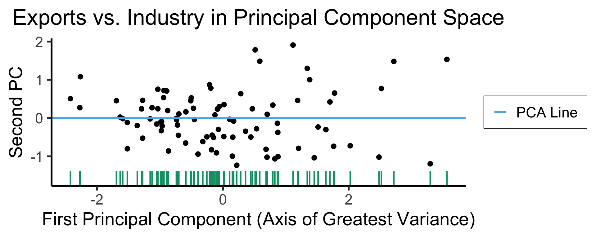
library(tidyverse) |> suppressPackageStartupMessages()
plot_df <- gdp_df |> dplyr::select(country_code, pc1, agriculture, military)
long_df <- plot_df |> pivot_longer(!c(country_code, pc1), names_to = "var", values_to = "val")
long_df <- long_df |> mutate(
  var = case_match(
    var,
    "agriculture" ~ "Agricultural Production",
    "military" ~ "Military Spending"
  )
)
ggplot(long_df, aes(x = pc1, y = val, facet = var)) +
    geom_point() +
    facet_wrap(vars(var), scales = "free") +
    dsan_theme("full") +
    labs(
        x = "Industrial-Export Dimension (First Principal Component)",
        y = "% of GDP"
    )
PCA Math Magic
- Remember that our goal is to find the axes along which the data has greatest variance (out of all possible axes)
- Let’s create a dataset using a known data-generating process: one dimension with 75% of the total variance, and the second with 25%:
library(tidyverse)
library(MASS)
library(ggforce)
N <- 300
Mu <- c(0, 0)
var_x <- 3
var_y <- 1
Sigma <- matrix(c(var_x, 0, 0, var_y), nrow=2)
data_df <- as_tibble(mvrnorm(N, Mu, Sigma, empirical=TRUE))
colnames(data_df) <- c("x","y")
# data_df <- data_df |> mutate(
#   within_5 = x < 5,
#   within_sq5 = x < sqrt(5)
# )
#nrow(data_df |> filter(within_5)) / nrow(data_df)
#nrow(data_df |> filter(within_sq5)) / nrow(data_df)
# And plot
ggplot(data_df, aes(x=x, y=y)) +
  # 68% ellipse
  # stat_ellipse(geom="polygon", type="norm", linewidth=g_linewidth, level=0.68, fill=cbPalette[1], alpha=0.5) +
  # stat_ellipse(type="norm", linewidth=g_linewidth, level=0.68) +
  geom_ellipse(
    aes(x0=0, y0=0, a=var_x, b=var_y, angle=0),
    linewidth = g_linewidth
  ) +
  # geom_ellipse(
  #   aes(x0=0, y0=0, a=sqrt(5), b=1, angle=0),
  #   linewidth = g_linewidth,
  #   geom="polygon",
  #   fill=cbPalette[1], alpha=0.2
  # ) +
  # # 95% ellipse
  # stat_ellipse(geom="polygon", type="norm", linewidth=g_linewidth, level=0.95, fill=cbPalette[1], alpha=0.25) +
  # stat_ellipse(type="norm", linewidth=g_linewidth, level=0.95) +
  # # 99.7% ellipse
  # stat_ellipse(geom='polygon', type="norm", linewidth=g_linewidth, level=0.997, fill=cbPalette[1], alpha=0.125) +
  # stat_ellipse(type="norm", linewidth=g_linewidth, level=0.997) +
  # Lines at x=0 and y=0
  geom_vline(xintercept=0, linetype="dashed", linewidth=g_linewidth / 2) +
  geom_hline(yintercept=0, linetype="dashed", linewidth = g_linewidth / 2) +
  geom_point(
    size = g_pointsize / 3,
    #alpha=0.5
  ) +
  geom_rug(length=unit(0.5, "cm"), alpha=0.75) +
  geom_segment(
    aes(x=-var_x, y=0, xend=var_x, yend=0, color='PC1'),
    linewidth = 1.5 * g_linewidth,
    arrow = arrow(length = unit(0.1, "npc"))
  ) +
  geom_segment(
    aes(x=0, y=-var_y, xend=0, yend=var_y, color='PC2'),
    linewidth = 1.5 * g_linewidth,
    arrow = arrow(length = unit(0.1, "npc"))
  ) +
  dsan_theme("half") +
  coord_fixed() +
  remove_legend_title() +
  scale_color_manual(
    "PC Vectors",
    values=c('PC1'=cbPalette[1], 'PC2'=cbPalette[2])
  ) +
  scale_x_continuous(breaks=seq(-5,5,1), limits=c(-5,5))
Warning in geom_segment(aes(x = -var_x, y = 0, xend = var_x, yend = 0, color = "PC1"), : All aesthetics have length 1, but the data has 300 rows.
ℹ Please consider using `annotate()` or provide this layer with data containing
a single row.Warning in geom_segment(aes(x = 0, y = -var_y, xend = 0, yend = var_y, color = "PC2"), : All aesthetics have length 1, but the data has 300 rows.
ℹ Please consider using `annotate()` or provide this layer with data containing
a single row.Warning: Removed 1 row containing missing values or values outside the scale range
(`geom_point()`).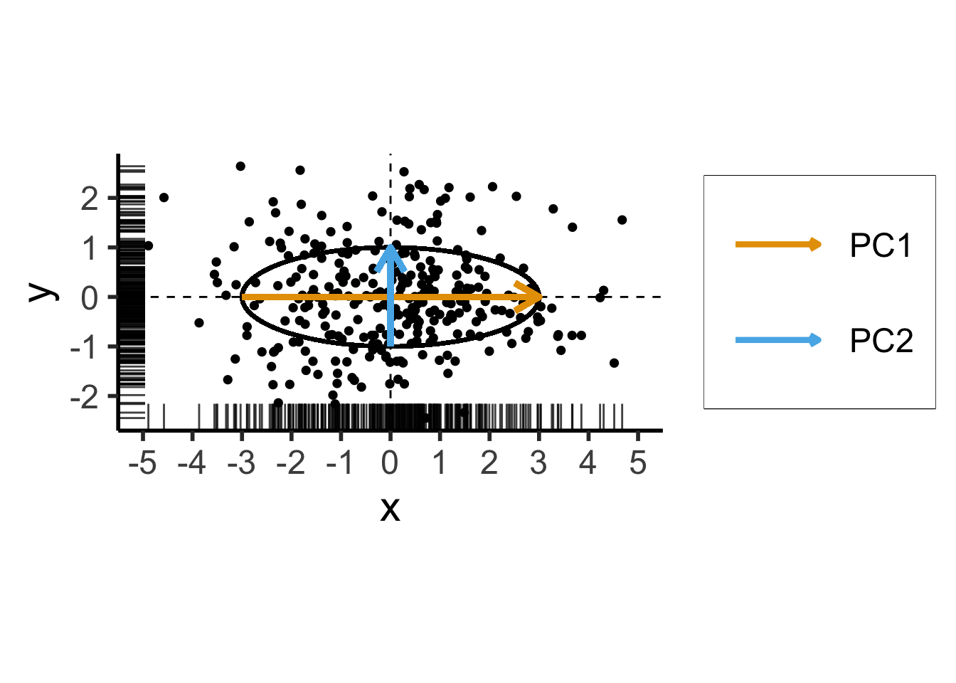
\[ \mathbf{\Sigma} = \begin{bmatrix} {\color{#e69f00}3} & 0 \\ 0 & {\color{#56b4e9}1} \end{bmatrix} \]
Two solutions to \(\mathbf{\Sigma}\mathbf{x} = \lambda \mathbf{x}\):
- \({\color{#e69f00}\lambda_1} = 3, {\color{#e69f00}\mathbf{x}_1} = (1, 0)^\top\)
- \({\color{#56b4e9}\lambda_2} = 1, {\color{#56b4e9}\mathbf{x}_2} = (0, 1)^\top\)
Now With PCA Lines \(\neq\) Axes
- We now introduce covariance between \(x\) and \(y\) coordinates of our data:
library(tidyverse)
library(MASS)
N <- 250
Mu <- c(0,0)
Sigma <- matrix(c(2,1,1,2), nrow=2)
data_df <- as_tibble(mvrnorm(N, Mu, Sigma))
colnames(data_df) <- c("x","y")
# Start+end coordinates for the transformed vectors
pc1_rc <- (3/2)*sqrt(2)
pc2_rc <- (1/2)*sqrt(2)
ggplot(data_df, aes(x=x, y=y)) +
  geom_ellipse(
    aes(x0=0, y0=0, a=var_x, b=var_y, angle=pi/4),
    linewidth = g_linewidth,
    #fill='grey', alpha=0.0075
  ) +
  geom_vline(xintercept=0, linetype="dashed", linewidth=g_linewidth / 2) +
  geom_hline(yintercept=0, linetype="dashed", linewidth = g_linewidth / 2) +
  geom_point(
    size = g_pointsize / 3,
    #alpha=0.7
  ) +
  geom_rug(
    length=unit(0.35, "cm"), alpha=0.75
  ) +
  geom_segment(
    aes(x=-pc1_rc, y=-pc1_rc, xend=pc1_rc, yend=pc1_rc, color='PC1'),
    linewidth = 1.5 * g_linewidth,
    arrow = arrow(length = unit(0.1, "npc"))
  ) +
  geom_segment(
    aes(x=pc2_rc, y=-pc2_rc, xend=-pc2_rc, yend=pc2_rc, color='PC2'),
    linewidth = 1.5 * g_linewidth,
    arrow = arrow(length = unit(0.1, "npc"))
  ) +
  dsan_theme("half") +
  remove_legend_title() +
  coord_fixed() +
  scale_x_continuous(breaks=seq(-4,4,2))
Warning in geom_segment(aes(x = -pc1_rc, y = -pc1_rc, xend = pc1_rc, yend = pc1_rc, : All aesthetics have length 1, but the data has 250 rows.
ℹ Please consider using `annotate()` or provide this layer with data containing
a single row.Warning in geom_segment(aes(x = pc2_rc, y = -pc2_rc, xend = -pc2_rc, yend = pc2_rc, : All aesthetics have length 1, but the data has 250 rows.
ℹ Please consider using `annotate()` or provide this layer with data containing
a single row.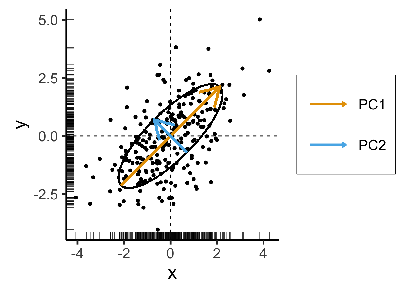
\[ \mathbf{\Sigma}' = \begin{bmatrix} 2 & 1 \\ 1 & 2 \end{bmatrix} \]
Still two solutions to \(\mathbf{\Sigma}'\mathbf{x} = \lambda \mathbf{x}\):
- \({\color{#e69f00}\lambda_1} = 3, {\color{#e69f00}\mathbf{x}_1} = (1,1)^\top\)
- \({\color{#56b4e9}\lambda_2} = 1, {\color{#56b4e9}\mathbf{x}_2} = (-1,1)^\top\)
For those interested in how we obtained \(\mathbf{\Sigma}'\) with same eigenvalues but different eigenvectors from \(\mathbf{\Sigma}\), see the appendix slide.
PCA and Eigenvalues
Takeaway 1: Regardless of the coordinate system,
- Eigenvectors give us axes of greatest variance: \(\mathbf{x}_1\) is axis of greatest variance, \(\mathbf{x}_2\) is axis of 2nd-greatest variance, etc.
- The corresponding Eigenvalues tell us how much of the total variance is explained by this axis
PCA as Swiss Army Knife
- PCA can be used for both reinterpretation and reduction of dimensions!
- Consider dataset \(\mathbf{X} = (X_1, \ldots, X_n)\), with \(X_i \in \mathbb{R}^N\)
If we project each \(X_i\) onto \(N\) principal component axes:
Datapoints in PC space are linear combinations of the original datapoints! (← Takeaway 2a)
\[ X'_i = \alpha_1X_1 + \cdots + \alpha_nX_n, \]
where \(\forall i \left[\alpha_i \neq 0\right]\)
We are just “re-plotting” our original data in PC space via change of coordinates
Thus we can recover the original data from the PC data
If we project \(X_i\) onto \(M < N\) principal component axes:
- Datapoints in PC space are still linear combinations of the original datapoints (← Takeaway 2b), but now some of the scalars (weights) are 0
- We have performed statistically-principled dimensionality reduction (← Takeaway 3)
- However, original data cannot be recovered
t-SNE for Dimensionality Reduction
- t-Distributed Stochastic Neighbor Embedding (Van der Maaten and Hinton 2008)
- If \(x, y\) are neighbors in \(\mathbb{R}^{1000}\), t-SNE “succeeds” if they remain neighbors in \(\mathbb{R}^2\)
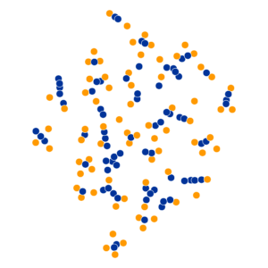
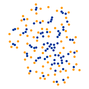
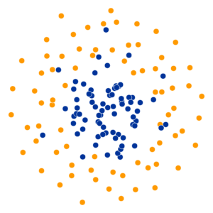
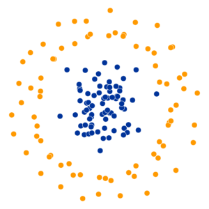
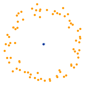
- Key hyperparameter: perplexity! Roughly, this affects the “tradeoff” between preserving local structure vs. global structure in the lower-dimensional space
- Choose \(x_i \in \mathbb{R}^{1000}\), and treat it as the center of a Gaussian ball with variance \(\sigma_i\)
- The choice of \(\sigma_i\) induces a probability distribution \(P_i\) over all other points (what is the probability of drawing \(x_j\) from \(\mathcal{N}(x_i, \sigma_i)\)?)
\[ \text{Perp}(P_i) = 2^{H(P_i)} \]
High perplexity \(\iff\) high entropy (eventually Gaussian ball will grow so big that all other points will be equally likely!). So, vary perplexity, see how plot changes
See here for an absolutely incredible interactive walkthrough of t-SNE!
What Happens As We Vary Perplexity?
References
Appendix: Uniform Sampling From A Triangle
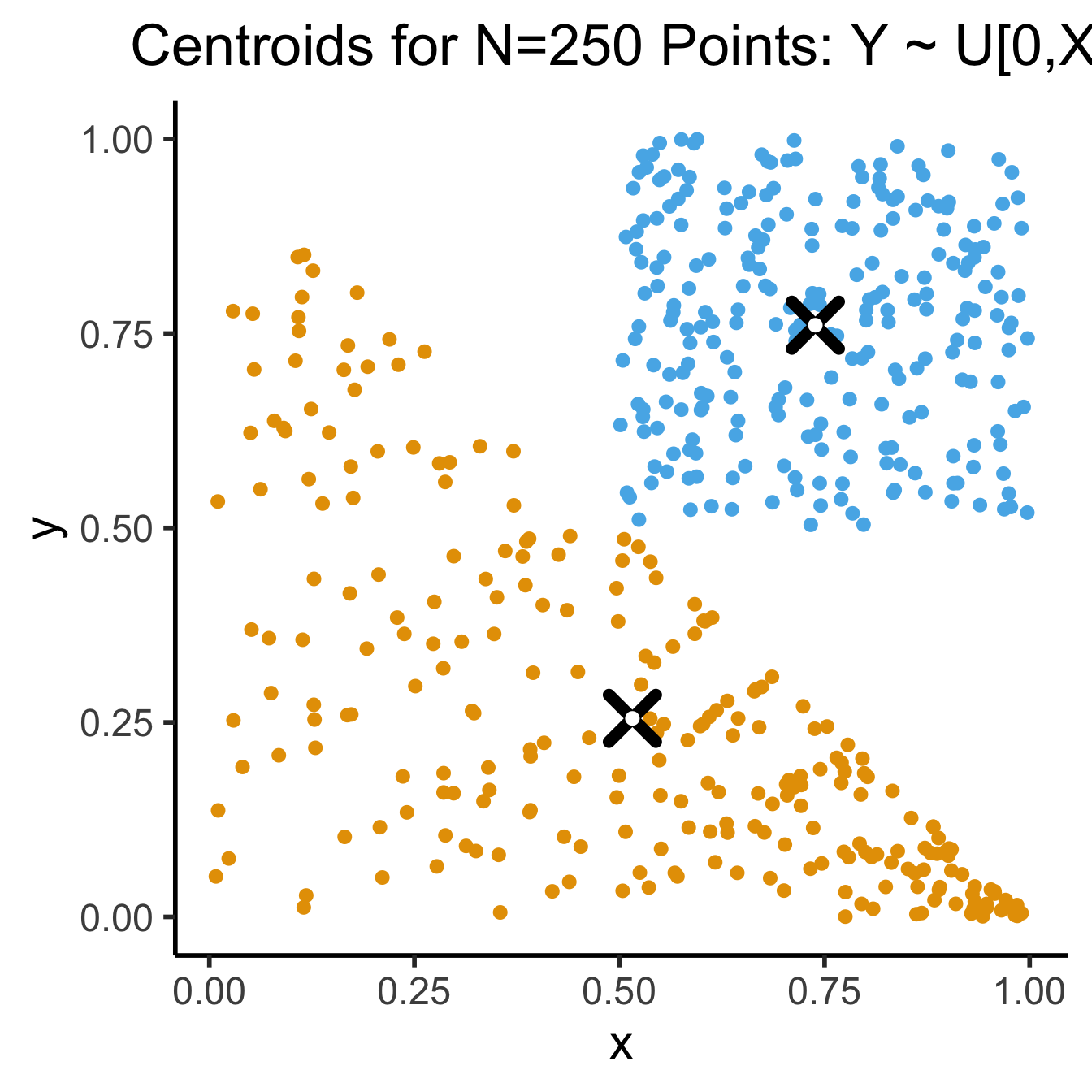
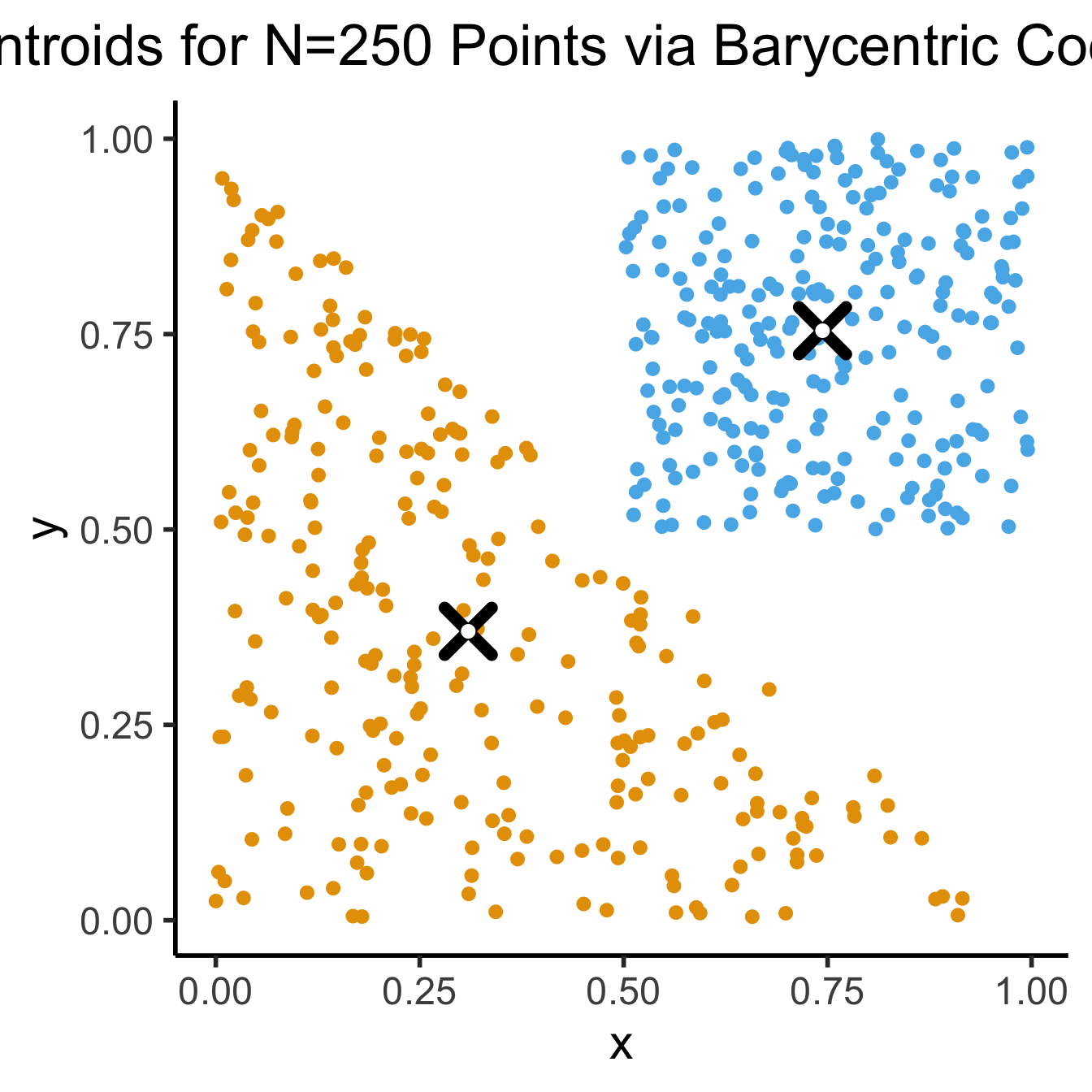
- See here for how the K-Means Clustering: Centroids slide sampled uniformly from \(\triangle\)!
- If you don’t use the Barycentric coordinate transformation (right), your points will be clustered more heavily towards the bottom-right of the triangle (left), and the centroid of the sampled points will not be the actual centroid of the triangle!
N <- 250
x_coords <- runif(N, 0, 1)
y_coords <- runif(N, 0, 1 - x_coords)
data_df <- tibble(x=x_coords, y=y_coords)
cent_x <- mean(x_coords)
cent_y <- mean(y_coords)
cent_df <- tibble(x=cent_x, y=cent_y)
triangle_plot <- ggplot(
    data_df,
    aes(x=x, y=y)
  ) +
  geom_point(
    size = g_pointsize / 2,
    color=cbPalette[1]
  ) +
  geom_point(
    data=cent_df,
    aes(x=x, y=y),
    shape=4, stroke=4, color='black',
    size = g_pointsize * 1.5) +
  geom_point(
    data=cent_df,
    aes(x=x, y=y),
    shape=19, color='white',
    size = g_pointsize / 2) +
  dsan_theme('quarter')
# Now a rectangle
x_coords_rect <- runif(N, 0.5, 1)
y_coords_rect <- runif(N, 0.5, 1)
rect_df <- tibble(x=x_coords_rect, y=y_coords_rect)
cent_x_rect <- mean(x_coords_rect)
cent_y_rect <- mean(y_coords_rect)
cent_df_rect <- tibble(x=cent_x_rect, y=cent_y_rect)
rect_plot <- triangle_plot +
  geom_point(
    data=rect_df,
    aes(x=x, y=y),
    size = g_pointsize / 2,
    color=cbPalette[2]
  ) +
  geom_point(
    data=cent_df_rect,
    aes(x=x, y=y),
    shape=4, stroke=4, color='black',
    size = g_pointsize * 1.5) +
  geom_point(
    data=cent_df_rect,
    aes(x=x, y=y),
    shape=19, color='white',
    size = g_pointsize / 2) +
  dsan_theme('half') +
  labs(
    title = "Centroids for N=250 Points: Y ~ U[0,X]"
  )
rect_plot
N <- 250
r1_vals <- runif(N, 0, 1)
r2_vals <- runif(N, 0, 1)
triangle_df <- tibble(r1=r1_vals, r2=r2_vals)
v1 <- c(0,0)
v2 <- c(1,0)
v3 <- c(0,1)
triangle_df <- triangle_df |> mutate(
    bary_w1 = 1 - sqrt(r1),
    bary_w2 = sqrt(r1) * (1 - r2),
    bary_w3 = sqrt(r1) * r2
)
triangle_df <- triangle_df |> mutate(
    x = bary_w1 * v1[1] + bary_w2 * v2[1] + bary_w3 * v3[1],
    y = bary_w1 * v1[2] + bary_w2 * v2[2] + bary_w3 * v3[2]
)
triangle_cent_x <- mean(triangle_df$x)
triangle_cent_y <- mean(triangle_df$y)
triangle_cent_df <- tibble(x=triangle_cent_x, y=triangle_cent_y)
triangle_plot <- ggplot(
    triangle_df,
    aes(x=x, y=y)
  ) +
  geom_point(
    size = g_pointsize / 2,
    color=cbPalette[1]
  ) +
  geom_point(
    data=triangle_cent_df,
    aes(x=x, y=y),
    shape=4, stroke=4, color='black',
    size = g_pointsize * 1.5) +
  geom_point(
    data=triangle_cent_df,
    aes(x=x, y=y),
    shape=19, color='white',
    size = g_pointsize / 2) +
  dsan_theme('quarter')
# Now a rectangle
x_coords_rect <- runif(N, 0.5, 1)
y_coords_rect <- runif(N, 0.5, 1)
rect_df <- tibble(x=x_coords_rect, y=y_coords_rect)
cent_x_rect <- mean(x_coords_rect)
cent_y_rect <- mean(y_coords_rect)
cent_df_rect <- tibble(x=cent_x_rect, y=cent_y_rect)
rect_plot <- triangle_plot +
  geom_point(
    data=rect_df,
    aes(x=x, y=y),
    size = g_pointsize / 2,
    color=cbPalette[2]
  ) +
  geom_point(
    data=cent_df_rect,
    aes(x=x, y=y),
    shape=4, stroke=4, color='black',
    size = g_pointsize * 1.5) +
  geom_point(
    data=cent_df_rect,
    aes(x=x, y=y),
    shape=19, color='white',
    size = g_pointsize / 2) +
  dsan_theme('half') +
  labs(
    title = "Centroids for N=250 Points via Barycentric Coordinates"
  )
rect_plot 