source("../dsan-globals/_globals.r")Week 8: Supervised and Unsupervised Learning
DSAN 5000: Data Science and Analytics
Machine Learning
cb_palette = ["#E69F00", "#56B4E9", "#009E73", "#F0E442", "#0072B2", "#D55E00", "#CC79A7"]\[ \DeclareMathOperator*{\argmax}{argmax} \DeclareMathOperator*{\argmin}{argmin} \newcommand{\bigexp}[1]{\exp\mkern-4mu\left[ #1 \right]} \newcommand{\bigexpect}[1]{\mathbb{E}\mkern-4mu \left[ #1 \right]} \newcommand{\definedas}{\overset{\text{defn}}{=}} \newcommand{\definedalign}{\overset{\phantom{\text{defn}}}{=}} \newcommand{\eqeventual}{\overset{\text{eventually}}{=}} \newcommand{\expect}[1]{\mathbb{E}[#1]} \newcommand{\expectsq}[1]{\mathbb{E}^2[#1]} \newcommand{\fw}[1]{\texttt{#1}} \newcommand{\given}{\mid} \newcommand{\green}[1]{\color{green}{#1}} \newcommand{\heads}{\outcome{heads}} \newcommand{\lik}{\mathcal{L}} \newcommand{\mle}{\textsf{ML}} \newcommand{\orange}[1]{\color{orange}{#1}} \newcommand{\outcome}[1]{\textsf{#1}} \newcommand{\param}[1]{{\color{purple} #1}} \newcommand{\paramDist}{\param{\boldsymbol\theta_\mathcal{D}}} \newcommand{\pgsamplespace}{\{\green{1},\green{2},\green{3},\purp{4},\purp{5},\purp{6}\}} \newcommand{\prob}[1]{P\left( #1 \right)} \newcommand{\purp}[1]{\color{purple}{#1}} \newcommand{\spacecap}{\; \cap \;} \newcommand{\spacewedge}{\; \wedge \;} \newcommand{\tails}{\outcome{tails}} \newcommand{\Var}[1]{\text{Var}[#1]} \newcommand{\bigVar}[1]{\text{Var}\mkern-4mu \left[ #1 \right]} \]
Supervised vs. Unsupervised Learning
Supervised Learning: You want the computer to learn the existing pattern of how you are classifying1 observations
- Discovering the relationship between properties of data and outcomes
- Example (Binary Classification): I look at homes on Zillow, saving those I like to folder A and don’t like to folder B
- Example (Regression): I assign a rating of 0-100 to each home
- In both cases: I ask the computer to learn my schema (how I classify)
Unsupervised Learning: You want the computer to find patterns in a dataset, without any prior classification info
- Typically: grouping or clustering observations based on shared properties
- Example (Clustering): I save all the used car listings I can find, and ask the computer to “find a pattern” in this data, by clustering similar cars together
Dataset Structures
Supervised Learning: Dataset has both explanatory variables (“features”) and response variables (“labels”)
sup_data <- tibble::tribble(
  ~home_id, ~sqft, ~bedrooms, ~rating,
  0, 1000, 1, "Disliked",
  1, 2000, 2, "Liked",
  2, 2500, 1, "Liked",
  3, 1500, 2, "Disliked",
  4, 2200, 1, "Liked"
)
sup_data| home_id | sqft | bedrooms | rating |
|---|---|---|---|
| 0 | 1000 | 1 | Disliked |
| 1 | 2000 | 2 | Liked |
| 2 | 2500 | 1 | Liked |
| 3 | 1500 | 2 | Disliked |
| 4 | 2200 | 1 | Liked |
Unsupervised Learning: Dataset has only explanatory variables (“features”)
unsup_data <- tibble::tribble(
  ~home_id, ~sqft, ~bedrooms,
  0, 1000, 1,
  1, 2000, 2,
  2, 2500, 1,
  3, 1500, 2,
  4, 2200, 1
)
unsup_data| home_id | sqft | bedrooms |
|---|---|---|
| 0 | 1000 | 1 |
| 1 | 2000 | 2 |
| 2 | 2500 | 1 |
| 3 | 1500 | 2 |
| 4 | 2200 | 1 |
Dataset Structures: Visualized
ggplot(sup_data, aes(x=sqft, y=bedrooms, color=rating)) +
  geom_point(size = g_pointsize * 2) +
  labs(
    title = "Supervised Data: House Listings",
    x = "Square Footage",
    y = "Number of Bedrooms",
    color = "Outcome"
  ) +
  expand_limits(x=c(800,2700), y=c(0.8,2.2)) +
  dsan_theme("half")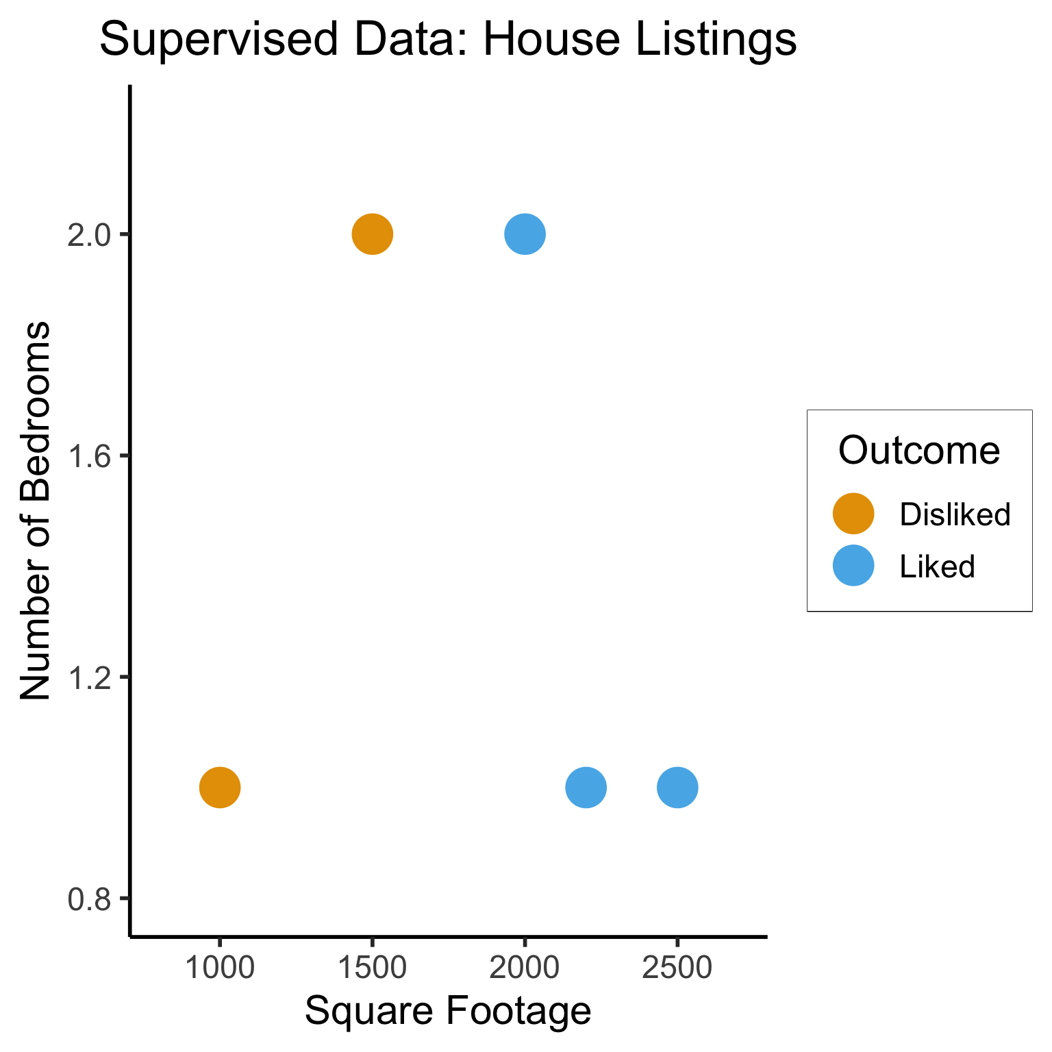
library(tidyverse)── Attaching core tidyverse packages ──────────────────────── tidyverse 2.0.0 ──
✔ dplyr 1.1.4 ✔ readr 2.1.5
✔ forcats 1.0.0 ✔ stringr 1.5.1
✔ lubridate 1.9.3 ✔ tibble 3.2.1
✔ purrr 1.0.2 ✔ tidyr 1.3.1
── Conflicts ────────────────────────────────────────── tidyverse_conflicts() ──
✖ dplyr::filter() masks stats::filter()
✖ dplyr::lag() masks stats::lag()
ℹ Use the conflicted package (<http://conflicted.r-lib.org/>) to force all conflicts to become errors# To force a legend
unsup_grouped <- unsup_data |> mutate(big=bedrooms > 1)
unsup_grouped[['big']] <- factor(unsup_grouped[['big']], labels=c("?1","?2"))
ggplot(unsup_grouped, aes(x=sqft, y=bedrooms, fill=big)) +
geom_point(size = g_pointsize * 2) +
labs(
x = "Square Footage",
y = "Number of Bedrooms",
fill = "?"
) +
dsan_theme("half") +
expand_limits(x=c(800,2700), y=c(0.8,2.2)) +
ggtitle("Unsupervised Data: House Listings") +
theme(legend.background = element_rect(fill="white", color="white"), legend.box.background = element_rect(fill="white"), legend.text = element_text(color="white"), legend.title = element_text(color="white"), legend.position = "right") +
scale_fill_discrete(labels=c("?","?")) +
#scale_color_discrete(values=c("white","white"))
scale_color_manual(name=NULL, values=c("white","white")) +
#scale_color_manual(values=c("?1"="white","?2"="white"))
guides(fill = guide_legend(override.aes = list(shape = NA)))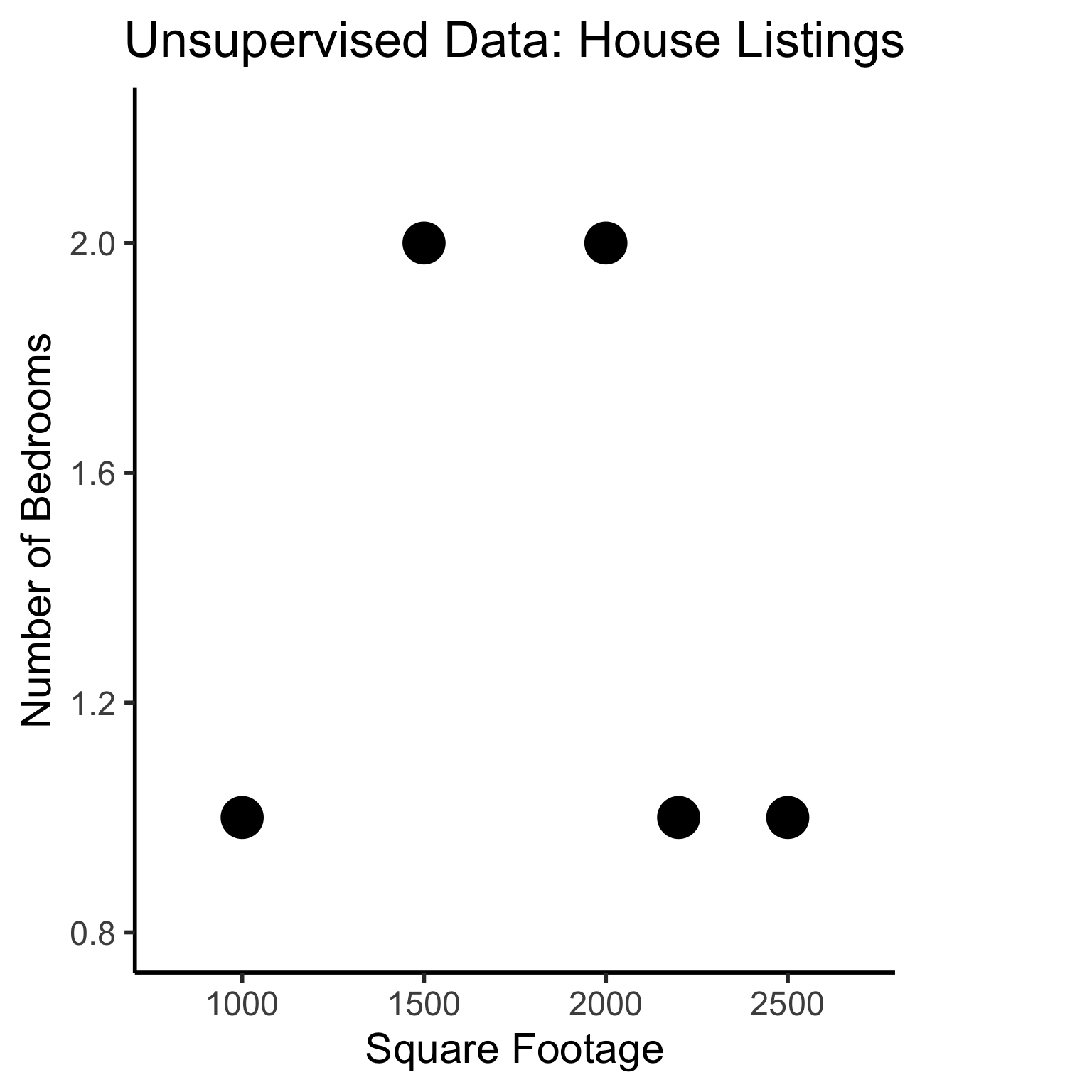
Different Goals
ggplot(sup_data, aes(x=sqft, y=bedrooms, color=rating)) +
  geom_point(size = g_pointsize * 2) +
  labs(
    title = "Supervised Data: House Listings",
    x = "Square Footage",
    y = "Number of Bedrooms",
    color = "Outcome"
  ) +
  dsan_theme("half") +
  expand_limits(x=c(800,2700), y=c(0.8,2.2)) +
  geom_vline(xintercept = 1750, linetype="dashed", color = "black", size=1) +
  annotate('rect', xmin=-Inf, xmax=1750, ymin=-Inf, ymax=Inf, alpha=.2, fill=cbPalette[1]) +
  annotate('rect', xmin=1750, xmax=Inf, ymin=-Inf, ymax=Inf, alpha=.2, fill=cbPalette[2])
Warning: Using `size` aesthetic for lines was deprecated in ggplot2 3.4.0.
ℹ Please use `linewidth` instead.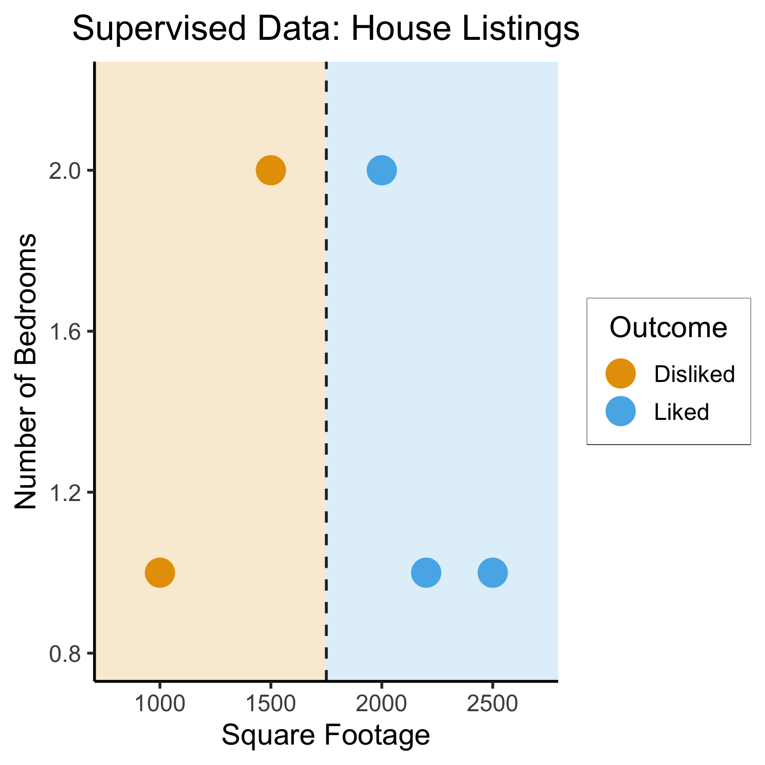
#geom_rect(aes(xmin=-Inf, xmax=Inf, ymin=0, ymax=Inf, alpha=.2, fill='red'))library(ggforce)
ggplot(unsup_grouped, aes(x=sqft, y=bedrooms)) +
#scale_color_brewer(palette = "PuOr") +
geom_mark_ellipse(expand=0.1, aes(fill=big), size = 1) +
geom_point(size=g_pointsize) +
labs(
x = "Square Footage",
y = "Number of Bedrooms",
fill = "?"
) +
dsan_theme("half") +
ggtitle("Unsupervised Data: House Listings") +
#theme(legend.position = "none") +
#theme(legend.title = text_element("?"))
expand_limits(x=c(800,2700), y=c(0.8,2.2)) +
scale_fill_manual(values=c(cbPalette[3],cbPalette[4]), labels=c("?","?"))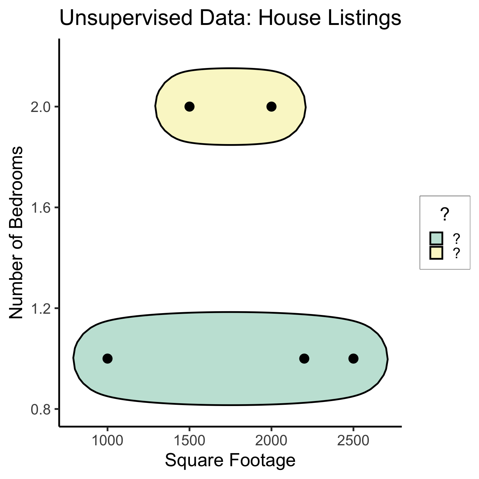
#scale_fill_manual(labels=c("?","?"))K-Nearest Neighbors (KNN)
The KNN Algorithm
- Binary Classification: Given a set of information (“features”) about an observation (\(X\)), predict a yes/no outcome (\(y \in \{0, 1\}\)) for this observation
- Example: Given a count of words in an email, classify it as spam (\(y=1\)) or not spam (\(y = 0\))
- Multiclass classification: Classify the observation into one of \(N\) categories (\(y \in \{0, 1, \ldots, N\}\))
- Example: Given a handwritten symbol, classify it as a digit (\(y = \{0, 1, \ldots, 9\}\))
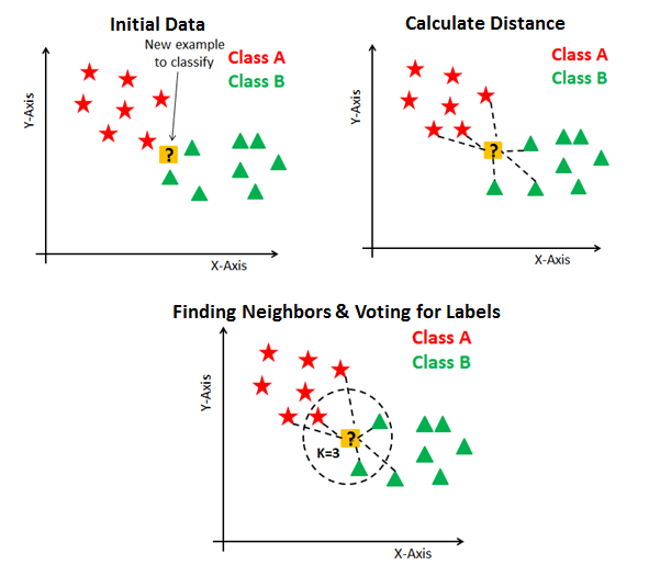
- K-Nearest Neighbors Intuition: Find the \(K\) most similar observations that we’ve seen before, and have them “majority vote” on the outcome.
MNIST Digits Example
KNN Example
- The problem: Given a student’s GPA, predict whether or not they will graduate
- K-Nearest Neighbor Approach:
- Get a dataset of previous years, students’ GPAs and whether or not they graduated
- Find the \(K = 5\) students with GPA closest to the student of interest
- If a majority of these 5 students graduated, predict that the student will graduate. Otherwise, predict that they will not.
KNN In Pictures
Naïve Bayes Classifiers
What is “Naïve” About It?
Guessing House Prices:
- If I tell you there’s a house, what is your guess for number of bathrooms it has?
- If I tell you the house is 50,000 sqft, does your guess go up?
Guessing Word Frequencies:
- If I tell you there’s a book, how often do you think the word “University” appears?
- Now if I tell you that the word “Stanford” appears 2,000 times, does your guess go up?

In Math
- Email \(E\) with \(N = 5\) words: \(E = (w_1, w_2, w_3, w_4, w_5) = (\texttt{you},\texttt{win},\texttt{a},\texttt{million},\texttt{dollars})\)
- We’re trying to classify \(S = \begin{cases}1 &\text{if spam} \\ 0 &\text{otherwise}\end{cases}~\) given \(E\)
- Normal person (marine biologist?)2:
\[ \begin{align*} &\Pr(S = 1 \mid w_5 = \texttt{dollars}, w_4 = \texttt{million}) \\ &> \Pr(S = 1 \mid w_5 = \texttt{dollars}, w_4 = \texttt{octopus}) \end{align*} \]
- Naïve Bayes classifier:
\[ \Pr(S = 1 \mid w_5) \perp \Pr(S = 1 \mid w_4) \]
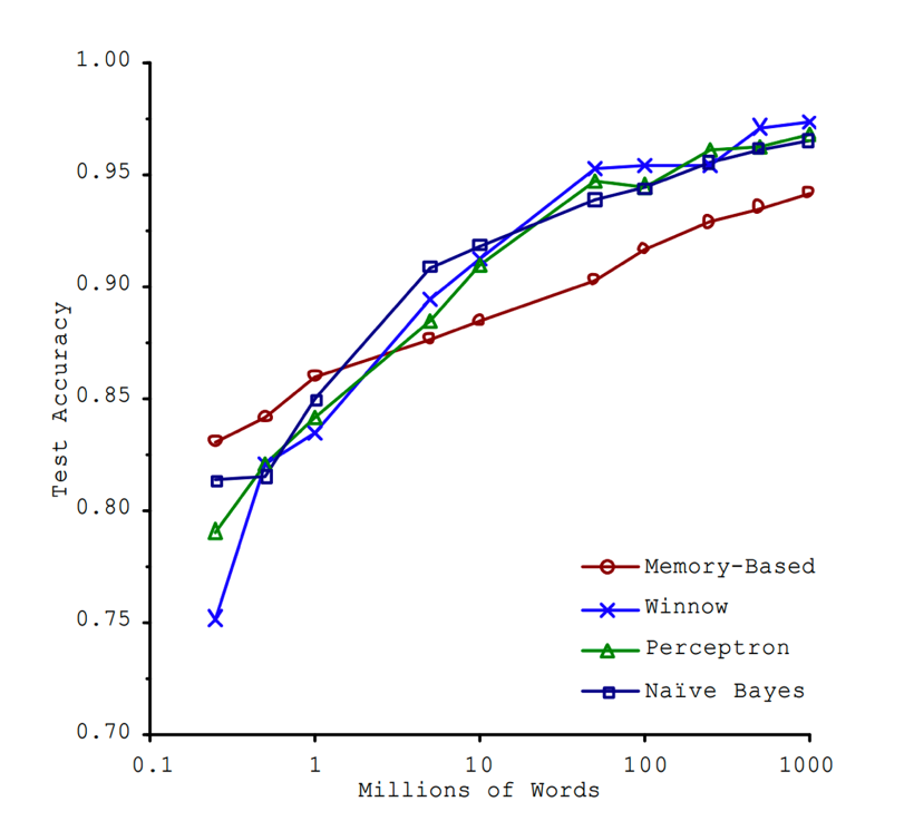
“Unreasonable Effectiveness”
- This must absolutely suck in practice, right?

K-Means Clustering
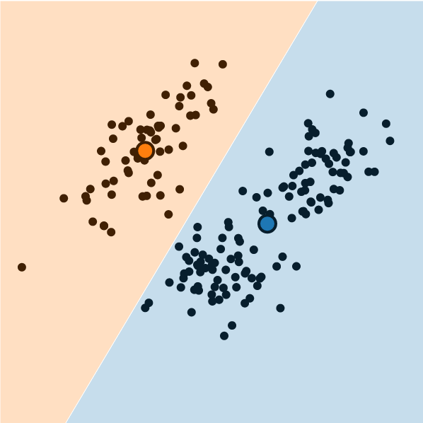
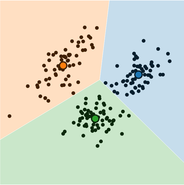
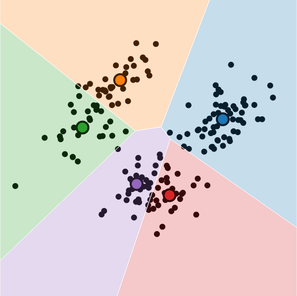
What is K-Means Clustering?
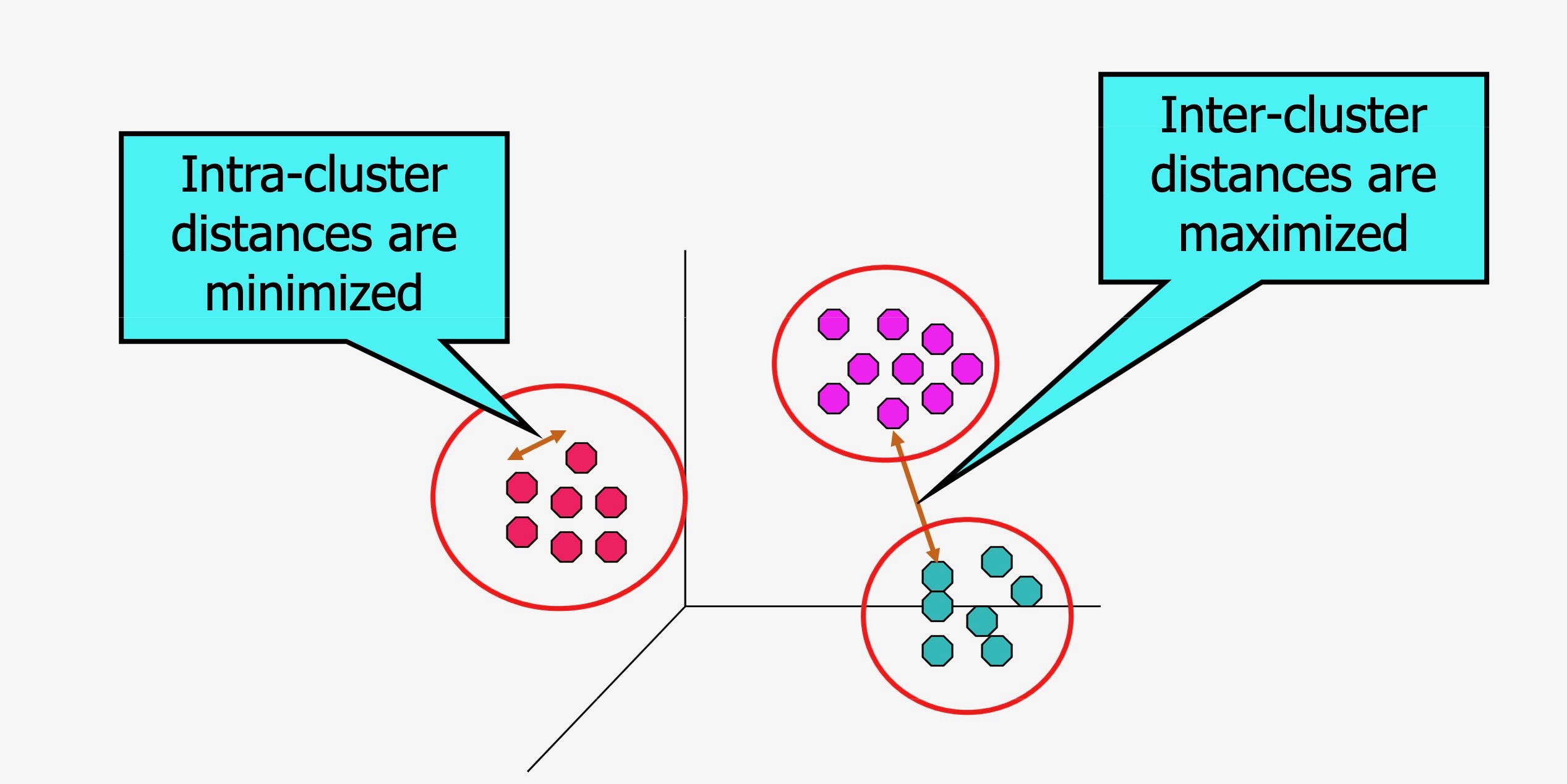
- Operationalizes our two heuristics by simultaneously:
- Maximizing within-cluster similarity
- Minimizing between-cluster similarity
K-Means Clustering Algorithm
- Data \(\mathbf{X} = (X_1 = \mathbf{x}_1, \ldots, X_N = \mathbf{x}_N)\)
- Distance metric \(d(\mathbf{v}_1, \mathbf{v}_2)\)
- Hyperparameter value for \(K\) (⁉️)
- Assign each point \(\mathbf{x}_i\) to a cluster \(C_i \in \{1, \ldots, K\}\) (so \(S_j = \{\mathbf{x}_i \mid C_i = j\}\) is the set of points assigned to cluster \(j\))
In Pictures
In Code + Pictures
import pandas as pd
import matplotlib.colors
from sklearn.cluster import KMeans
cluster_df = pd.read_csv("assets/cluster_data.csv")
X = cluster_df[['x','y']].values
kmc_model = KMeans(
  n_clusters=2,
  init='k-means++',
  verbose=0,
  random_state=5000,
  copy_x=True,
  algorithm='lloyd'
);
kmc_model.fit(X);
/Users/jpj/.virtualenvs/r-reticulate/lib/python3.11/site-packages/sklearn/cluster/_kmeans.py:1416: FutureWarning: The default value of `n_init` will change from 10 to 'auto' in 1.4. Set the value of `n_init` explicitly to suppress the warning
super()._check_params_vs_input(X, default_n_init=10)y_pred_vals = kmc_model.predict(X)
y_pred_df = pd.DataFrame({'y_pred': y_pred_vals})
y_pred_df.to_csv("assets/kmc_preds.csv", index=False)
kmc_centroid_df = pd.DataFrame(kmc_model.cluster_centers_.transpose(), columns=['x','y'])
#disp(kmc_centroid_df)
kmc_centroid_df.to_csv("assets/kmc_centroids.csv", index=False)
import matplotlib.pyplot as plt
# Step size of the mesh. Decrease to increase the quality of the VQ.
h = 0.01 # point in the mesh [x_min, x_max]x[y_min, y_max].
# Plot the decision boundary. For that, we will assign a color to each
bpad = 0.05
x_min, x_max = X[:, 0].min() - bpad, X[:, 0].max() + bpad
y_min, y_max = X[:, 1].min() - bpad, X[:, 1].max() + bpad
xx, yy = np.meshgrid(np.arange(x_min, x_max, h), np.arange(y_min, y_max, h))
# Obtain labels for each point in mesh. Use last trained model.
Z = kmc_model.predict(np.c_[xx.ravel(), yy.ravel()])
# Put the result into a color plot
#custom_cmap = matplotlib.colors.LinearSegmentedColormap.from_list("", ["red","violet","blue"])
#custom_cmap = matplotlib.colors.ListedColormap(['white', 'red'])
#custom_cmap = matplotlib.colors.ListedColormap(cb_palette).reversed()
custom_cmap = matplotlib.colors.ListedColormap([cb_palette[0], cb_palette[2], cb_palette[1]])
Z = Z.reshape(xx.shape)
plt.figure(1)
plt.clf()
plt.imshow(
Z,
interpolation="nearest",
extent=(xx.min(), xx.max(), yy.min(), yy.max()),
#cmap=plt.cm.Paired,
cmap=custom_cmap,
aspect="auto",
origin="lower",
)
# And plot the points
plt.plot(X[:, 0], X[:, 1], "o", markersize=6, color='white', markerfacecolor='black', alpha=0.75)
# Plot the centroids as a white X
centroids = kmc_model.cluster_centers_
plt.scatter(
centroids[:, 0],
centroids[:, 1],
marker="*",
s=250,
linewidths=1.5,
color='white',
facecolor='black',
zorder=10,
)
# Plot gaussian means as... smth else
plt.scatter(
[0.2,0.8],
[0.8,0.2],
marker="*",
s=250,
linewidths=1.5,
color=cb_palette[3],
facecolor='black',
zorder=9,
)
plt.title(
"K-means clustering on the Gaussian mixture data"
)
plt.legend([
'Original Data',
'K-Means Centroids',
'True Centroids (DGP)'
])
plt.show()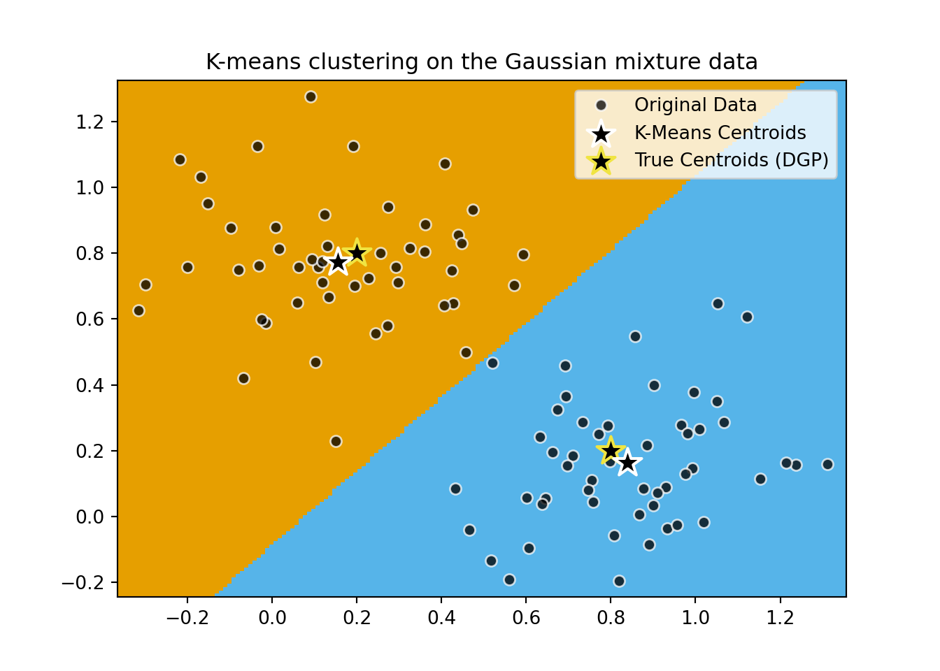
DBSCAN
import time
import warnings
from itertools import cycle, islice

import matplotlib.pyplot as plt
import numpy as np

from sklearn import cluster, datasets, mixture
from sklearn.neighbors import kneighbors_graph
from sklearn.preprocessing import StandardScaler

# ============
# Generate datasets. We choose the size big enough to see the scalability
# of the algorithms, but not too big to avoid too long running times
# ============
n_samples = 500
seed = 30
noisy_circles = datasets.make_circles(
    n_samples=n_samples, factor=0.5, noise=0.05, random_state=seed
)
noisy_moons = datasets.make_moons(n_samples=n_samples, noise=0.05, random_state=seed)
blobs = datasets.make_blobs(n_samples=n_samples, random_state=seed)
rng = np.random.RandomState(seed)
no_structure = rng.rand(n_samples, 2), None

# Anisotropicly distributed data
random_state = 170
X, y = datasets.make_blobs(n_samples=n_samples, random_state=random_state)
transformation = [[0.6, -0.6], [-0.4, 0.8]]
X_aniso = np.dot(X, transformation)
aniso = (X_aniso, y)

# blobs with varied variances
varied = datasets.make_blobs(
    n_samples=n_samples, cluster_std=[1.0, 2.5, 0.5], random_state=random_state
)

# ============
# Set up cluster parameters
# ============
plt.figure(figsize=(9 * 2 + 3, 13))
plt.subplots_adjust(
    left=0.02, right=0.98, bottom=0.001, top=0.95, wspace=0.05, hspace=0.01
)

plot_num = 1

default_base = {
    "quantile": 0.3,
    "eps": 0.3,
    "damping": 0.9,
    "preference": -200,
    "n_neighbors": 3,
    "n_clusters": 3,
    "min_samples": 7,
    "xi": 0.05,
    "min_cluster_size": 0.1,
    "allow_single_cluster": True,
    "hdbscan_min_cluster_size": 15,
    "hdbscan_min_samples": 3,
    "random_state": 42,
}

datasets = [
    (
        noisy_circles,
        {
            "damping": 0.77,
            "preference": -240,
            "quantile": 0.2,
            "n_clusters": 2,
            "min_samples": 7,
            "xi": 0.08,
        },
    ),
    (
        noisy_moons,
        {
            "damping": 0.75,
            "preference": -220,
            "n_clusters": 2,
            "min_samples": 7,
            "xi": 0.1,
        },
    ),
    # (
    #     varied,
    #     {
    #         "eps": 0.18,
    #         "n_neighbors": 2,
    #         "min_samples": 7,
    #         "xi": 0.01,
    #         "min_cluster_size": 0.2,
    #     },
    # ),
    (
        aniso,
        {
            "eps": 0.15,
            "n_neighbors": 2,
            "min_samples": 7,
            "xi": 0.1,
            "min_cluster_size": 0.2,
        },
    ),
    (blobs, {"min_samples": 7, "xi": 0.1, "min_cluster_size": 0.2}),
    (no_structure, {}),
]

for i_dataset, (dataset, algo_params) in enumerate(datasets):
    # update parameters with dataset-specific values
    params = default_base.copy()
    params.update(algo_params)

    X, y = dataset

    # normalize dataset for easier parameter selection
    X = StandardScaler().fit_transform(X)

    # estimate bandwidth for mean shift
    bandwidth = cluster.estimate_bandwidth(X, quantile=params["quantile"])

    # connectivity matrix for structured Ward
    connectivity = kneighbors_graph(
        X, n_neighbors=params["n_neighbors"], include_self=False
    )
    # make connectivity symmetric
    connectivity = 0.5 * (connectivity + connectivity.T)

    # ============
    # Create cluster objects
    # ============
    two_means = cluster.MiniBatchKMeans(
        n_clusters=params["n_clusters"],
        n_init="auto",
        random_state=params["random_state"],
    )
    ms = cluster.MeanShift(bandwidth=bandwidth, bin_seeding=True)
    # spectral = cluster.SpectralClustering(
    #     n_clusters=params["n_clusters"],
    #     eigen_solver="arpack",
    #     affinity="nearest_neighbors",
    #     random_state=params["random_state"],
    # )
    dbscan = cluster.DBSCAN(eps=params["eps"])
    average_linkage = cluster.AgglomerativeClustering(
        linkage="average",
        metric="cityblock",
        n_clusters=params["n_clusters"],
        connectivity=connectivity,
    )
    birch = cluster.Birch(n_clusters=params["n_clusters"])
    gmm = mixture.GaussianMixture(
        n_components=params["n_clusters"],
        covariance_type="full",
        random_state=params["random_state"],
    )

    clustering_algorithms = (
        ("MiniBatch\nKMeans", two_means),
        #("Affinity\nPropagation", affinity_propagation),
        ("MeanShift", ms),
        #("Spectral\nClustering", spectral),
        #("Ward", ward),
        ("Agglomerative\nClustering", average_linkage),
        ("DBSCAN", dbscan),
        #("HDBSCAN", hdbscan),
        #("OPTICS", optics),
        ("BIRCH", birch),
        ("Gaussian\nMixture", gmm),
    )

    for name, algorithm in clustering_algorithms:
        t0 = time.time()

        # catch warnings related to kneighbors_graph
        with warnings.catch_warnings():
            warnings.filterwarnings(
                "ignore",
                message="the number of connected components of the "
                + "connectivity matrix is [0-9]{1,2}"
                + " > 1. Completing it to avoid stopping the tree early.",
                category=UserWarning,
            )
            warnings.filterwarnings(
                "ignore",
                message="Graph is not fully connected, spectral embedding"
                + " may not work as expected.",
                category=UserWarning,
            )
            algorithm.fit(X)

        t1 = time.time()
        if hasattr(algorithm, "labels_"):
            y_pred = algorithm.labels_.astype(int)
        else:
            y_pred = algorithm.predict(X)

        plt.subplot(len(datasets), len(clustering_algorithms), plot_num)
        if i_dataset == 0:
            plt.title(name, size=18)

        colors = np.array(
            list(
                islice(
                    cycle(
                        [
                            "#377eb8",
                            "#ff7f00",
                            "#4daf4a",
                            "#f781bf",
                            "#a65628",
                            "#984ea3",
                            "#999999",
                            "#e41a1c",
                            "#dede00",
                        ]
                    ),
                    int(max(y_pred) + 1),
                )
            )
        )
        # add black color for outliers (if any)
        colors = np.append(colors, ["#000000"])
        plt.scatter(X[:, 0], X[:, 1], s=10, color=colors[y_pred])

        plt.xlim(-2.5, 2.5)
        plt.ylim(-2.5, 2.5)
        plt.xticks(())
        plt.yticks(())
        plt.text(
            0.99,
            0.01,
            ("%.2fs" % (t1 - t0)).lstrip("0"),
            transform=plt.gca().transAxes,
            size=15,
            horizontalalignment="right",
        )
        plot_num += 1

plt.show()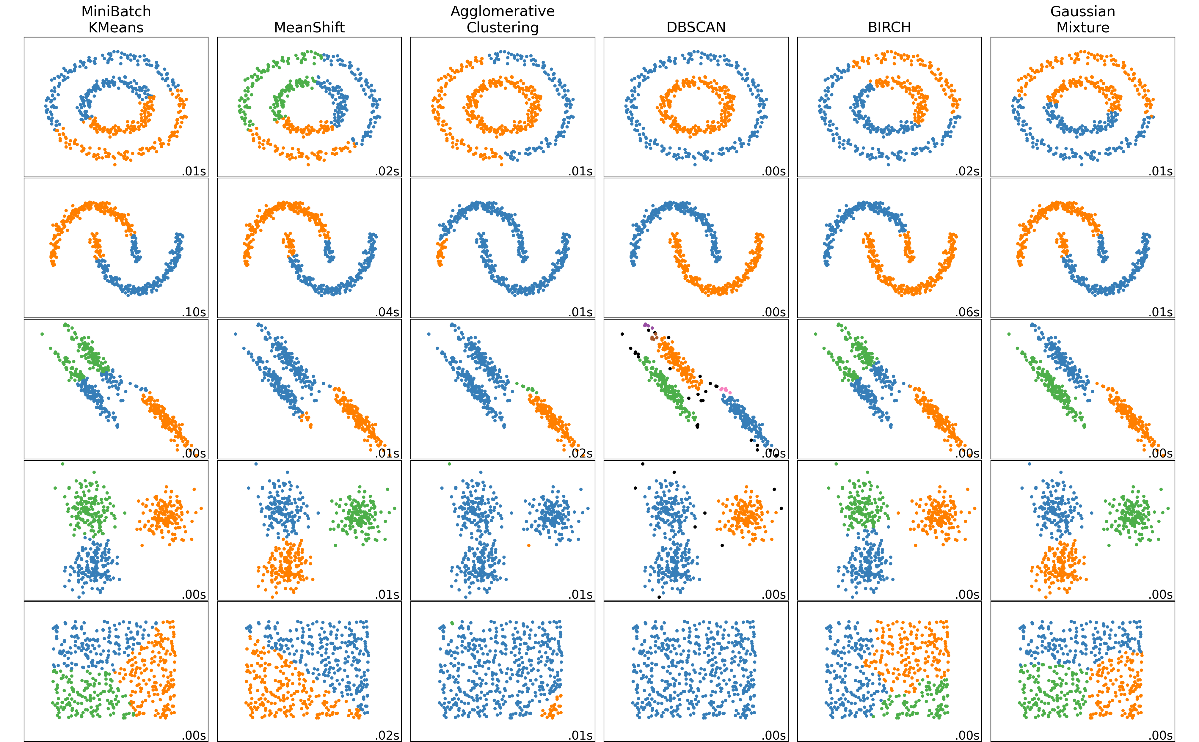
Hyperparameter Tuning: More Heuristics
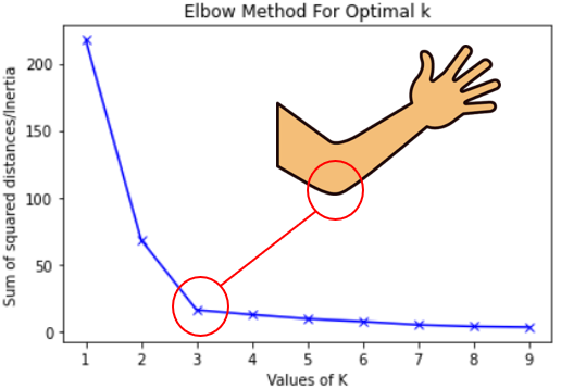
- Inertia: A measure of how “well-clustered” a dataset is
- Sum of squared distances of samples to their closest cluster center
- A good model is one with low inertia and low \(K\) (tradeoff, akin to bias-variance)
- Elbow Method: Find the \(K\) value after which decrease in inertia begins to slow →
References
Footnotes
Whether standard classification (sorting observations into bins) or regression (assigning a real number to each observation)↩︎
(But we might have the opposite result for a marine economist… rly makes u think
 )↩︎
)↩︎If you’re in my DSAN5100 class, then you already know this! If not, check out the MLE slides here for more details↩︎
