source("../_globals.r")Week 7: Supervised Learning
DSAN 5000: Data Science and Analytics
Week 06 Part 2
- Normalization
- Correlation and Covariance
- Distance Metrics
cb_palette = ["#E69F00", "#56B4E9", "#009E73", "#F0E442", "#0072B2", "#D55E00", "#CC79A7"]

from IPython.display import Markdown
def disp(df, floatfmt='g', include_index=True):
  return Markdown(
    df.to_markdown(
      floatfmt=floatfmt,
      index=include_index
    )
  )

def summary_to_df(summary_obj, corner_col = ''):
    reg_df = pd.DataFrame(summary_obj.tables[1].data)
    reg_df.columns = reg_df.iloc[0]
    reg_df = reg_df.iloc[1:].copy()
    # Save index col
    index_col = reg_df['']
    # Drop for now, so it's all numeric
    reg_df.drop(columns=[''], inplace=True)
    reg_df = reg_df.apply(pd.to_numeric)
    my_round = lambda x: round(x, 2)
    reg_df = reg_df.apply(my_round)
    numeric_cols = reg_df.columns
    # Add index col back in
    reg_df.insert(loc=0, column=corner_col, value=index_col)
    # Sigh. Have to escape | characters?
    reg_df.columns = [c.replace("|","\|") for c in reg_df.columns]
    return reg_df
\[ \DeclareMathOperator*{\argmax}{argmax} \DeclareMathOperator*{\argmin}{argmin} \newcommand{\bigexpect}[1]{\mathbb{E}\mkern-4mu \left[ #1 \right]} \newcommand{\definedas}{\overset{\text{defn}}{=}} \newcommand{\definedalign}{\overset{\phantom{\text{defn}}}{=}} \newcommand{\eqeventual}{\overset{\text{eventually}}{=}} \newcommand{\expect}[1]{\mathbb{E}[#1]} \newcommand{\expectsq}[1]{\mathbb{E}^2[#1]} \newcommand{\fw}[1]{\texttt{#1}} \newcommand{\given}{\mid} \newcommand{\green}[1]{\color{green}{#1}} \newcommand{\heads}{\outcome{heads}} \newcommand{\iqr}{\text{IQR}} \newcommand{\kl}{\text{KL}} \newcommand{\lik}{\mathcal{L}} \newcommand{\mle}{\textsf{ML}} \newcommand{\orange}[1]{\color{orange}{#1}} \newcommand{\outcome}[1]{\textsf{#1}} \newcommand{\param}[1]{{\color{purple} #1}} \newcommand{\paramDist}{\param{\boldsymbol\theta_\mathcal{D}}} \newcommand{\pgsamplespace}{\{\green{1},\green{2},\green{3},\purp{4},\purp{5},\purp{6}\}} \newcommand{\prob}[1]{P\left( #1 \right)} \newcommand{\purp}[1]{\color{purple}{#1}} \newcommand{\red}[1]{\color{red}#1} \newcommand{\spacecap}{\; \cap \;} \newcommand{\spacewedge}{\; \wedge \;} \newcommand{\tails}{\outcome{tails}} \newcommand{\Var}[1]{\text{Var}[#1]} \newcommand{\bigVar}[1]{\text{Var}\mkern-4mu \left[ #1 \right]} \]
Statistical EDA
- Iterative process: Ask questions of the data, find answers, generate more questions
- You’re probably already used to Mean and Variance: Fancier EDA/robustness methods build upon these two!
- Why do we need to visualize? Can’t we just use mean, \(R^2\)?
- …Enter Anscombe’s Quartet
import pandas as pd
import numpy as np
import matplotlib.pyplot as plt
import seaborn as sns
sns.set_theme(style="ticks")
# https://towardsdatascience.com/how-to-use-your-own-color-palettes-with-seaborn-a45bf5175146
sns.set_palette(sns.color_palette(cb_palette))

# Load the example dataset for Anscombe's quartet
anscombe_df = sns.load_dataset("anscombe")
#print(anscombe_df)

# Show the results of a linear regression within each dataset
anscombe_plot = sns.lmplot(
    data=anscombe_df, x="x", y="y", col="dataset", hue="dataset",
    col_wrap=4, palette="muted", ci=None,
    scatter_kws={"s": 50, "alpha": 1},
    height=3
);
anscombe_plot;
The Scariest Dataset of All Time

# Compute dataset means
my_round = lambda x: round(x,2)
data_means = anscombe_df.groupby('dataset').agg(
  x_mean = ('x', np.mean),
  y_mean = ('y', np.mean)
).apply(my_round)
<string>:1: FutureWarning: The provided callable <function mean at 0x1304d9940> is currently using SeriesGroupBy.mean. In a future version of pandas, the provided callable will be used directly. To keep current behavior pass the string "mean" instead.
<string>:1: FutureWarning: The provided callable <function mean at 0x1304d9940> is currently using SeriesGroupBy.mean. In a future version of pandas, the provided callable will be used directly. To keep current behavior pass the string "mean" instead.disp(data_means, floatfmt='.2f')| dataset | x_mean | y_mean |
|---|---|---|
| I | 9.00 | 7.50 |
| II | 9.00 | 7.50 |
| III | 9.00 | 7.50 |
| IV | 9.00 | 7.50 |
# Compute dataset SDs
data_sds = anscombe_df.groupby('dataset').agg(
  x_mean = ('x', np.std),
  y_mean = ('y', np.std),
).apply(my_round)
<string>:2: FutureWarning: The provided callable <function std at 0x1304d9a80> is currently using SeriesGroupBy.std. In a future version of pandas, the provided callable will be used directly. To keep current behavior pass the string "std" instead.
<string>:2: FutureWarning: The provided callable <function std at 0x1304d9a80> is currently using SeriesGroupBy.std. In a future version of pandas, the provided callable will be used directly. To keep current behavior pass the string "std" instead.disp(data_sds, floatfmt='.2f')| dataset | x_mean | y_mean |
|---|---|---|
| I | 3.32 | 2.03 |
| II | 3.32 | 2.03 |
| III | 3.32 | 2.03 |
| IV | 3.32 | 2.03 |
import tabulate
from IPython.display import HTML
corr_matrix = anscombe_df.groupby('dataset').corr().apply(my_round)
#Markdown(tabulate.tabulate(corr_matrix))
HTML(corr_matrix.to_html())| x | y | ||
|---|---|---|---|
| dataset | |||
| I | x | 1.00 | 0.82 |
| y | 0.82 | 1.00 | |
| II | x | 1.00 | 0.82 |
| y | 0.82 | 1.00 | |
| III | x | 1.00 | 0.82 |
| y | 0.82 | 1.00 | |
| IV | x | 1.00 | 0.82 |
| y | 0.82 | 1.00 |
It Doesn’t End There…

import statsmodels.formula.api as smf
summary_dfs = []
for cur_ds in ['I','II','III','IV']:
  ds1_df = anscombe_df.loc[anscombe_df['dataset'] == "I"].copy()
  # Fit regression model (using the natural log of one of the regressors)
  results = smf.ols('y ~ x', data=ds1_df).fit()
  # Get R^2
  rsq = round(results.rsquared, 2)
  # Inspect the results
  summary = results.summary()
  summary.extra_txt = None
  summary_df = summary_to_df(summary, corner_col = f'Dataset {cur_ds}<br>R^2 = {rsq}')
  summary_dfs.append(summary_df)
disp(summary_dfs[0], include_index=False)
disp(summary_dfs[1], include_index=False)
disp(summary_dfs[2], include_index=False)
disp(summary_dfs[3], include_index=False)
/Users/jpj/.virtualenvs/r-reticulate/lib/python3.11/site-packages/scipy/stats/_stats_py.py:1806: UserWarning: kurtosistest only valid for n>=20 ... continuing anyway, n=11
warnings.warn("kurtosistest only valid for n>=20 ... continuing "
/Users/jpj/.virtualenvs/r-reticulate/lib/python3.11/site-packages/scipy/stats/_stats_py.py:1806: UserWarning: kurtosistest only valid for n>=20 ... continuing anyway, n=11
warnings.warn("kurtosistest only valid for n>=20 ... continuing "
/Users/jpj/.virtualenvs/r-reticulate/lib/python3.11/site-packages/scipy/stats/_stats_py.py:1806: UserWarning: kurtosistest only valid for n>=20 ... continuing anyway, n=11
warnings.warn("kurtosistest only valid for n>=20 ... continuing "
/Users/jpj/.virtualenvs/r-reticulate/lib/python3.11/site-packages/scipy/stats/_stats_py.py:1806: UserWarning: kurtosistest only valid for n>=20 ... continuing anyway, n=11
warnings.warn("kurtosistest only valid for n>=20 ... continuing "| Dataset I R^2 = 0.67 |
coef | std err | t | P>|t| | [0.025 | 0.975] |
|---|---|---|---|---|---|---|
| Intercept | 3 | 1.12 | 2.67 | 0.03 | 0.46 | 5.54 |
| x | 0.5 | 0.12 | 4.24 | 0 | 0.23 | 0.77 |
| Dataset II R^2 = 0.67 |
coef | std err | t | P>|t| | [0.025 | 0.975] |
|---|---|---|---|---|---|---|
| Intercept | 3 | 1.12 | 2.67 | 0.03 | 0.46 | 5.54 |
| x | 0.5 | 0.12 | 4.24 | 0 | 0.23 | 0.77 |
| Dataset III R^2 = 0.67 |
coef | std err | t | P>|t| | [0.025 | 0.975] |
|---|---|---|---|---|---|---|
| Intercept | 3 | 1.12 | 2.67 | 0.03 | 0.46 | 5.54 |
| x | 0.5 | 0.12 | 4.24 | 0 | 0.23 | 0.77 |
| Dataset IV R^2 = 0.67 |
coef | std err | t | P>|t| | [0.025 | 0.975] |
|---|---|---|---|---|---|---|
| Intercept | 3 | 1.12 | 2.67 | 0.03 | 0.46 | 5.54 |
| x | 0.5 | 0.12 | 4.24 | 0 | 0.23 | 0.77 |
Normalization
Code
num_students <- 30
student_ids <- seq(from = 1, to = num_students)
# So we have the censored Normal pdf/cdf
library(crch)
gen_test_scores <- function(min_pts, max_pts) {
  score_vals_unif <- runif(num_students, min_pts, max_pts)
  unif_mean <- mean(score_vals_unif)
  unif_sd <- sd(score_vals_unif)
  # Resample, this time censored normal dist
  score_vals <- round(rcnorm(num_students, mean=unif_mean, sd=unif_sd, left=min_pts, right=max_pts), 2)
  return(score_vals)
}
# Test 1
t1_min <- 0
t1_max <- 268.3
t1_score_vals <- gen_test_scores(t1_min, t1_max)
t1_mean <- mean(t1_score_vals)
t1_sd <- sd(t1_score_vals)
get_t1_pctile <- function(s) round(100 * ecdf(t1_score_vals)(s), 1)
# Test 2
t2_min <- -1
t2_max <- 1.2
t2_score_vals <- gen_test_scores(t2_min, t2_max)
t2_mean <- mean(t2_score_vals)
t2_sd <- sd(t2_score_vals)
get_t2_pctile <- function(s) round(100 * ecdf(t2_score_vals)(s), 1)
score_df <- tibble::tibble(
  id=student_ids,
  t1_score=t1_score_vals,
  t2_score=t2_score_vals
)
score_df <- score_df |> dplyr::arrange(desc(t1_score))
“I got a 238.25 on the first test!” 🤩
“But only a 0.31 on the second” 😭
| id | t1_score | t2_score |
|---|---|---|
| 17 | 268.30 | -0.54 |
| 27 | 258.44 | -0.33 |
| 26 | 245.86 | -0.55 |
| 5 | 238.25 | 0.31 |
| 11 | 206.54 | -0.02 |
| 16 | 205.49 | -0.06 |
score_df <- score_df |>
  dplyr::mutate(
    t1_z_score = round((t1_score - t1_mean) / t1_sd, 2),
    t2_z_score = round((t2_score - t2_mean) / t2_sd, 2),
    t1_pctile = get_t1_pctile(t1_score),
    t2_pctile = get_t2_pctile(t2_score)
  ) |>
  dplyr::relocate(t1_pctile, .after = t1_score) |>
  dplyr::relocate(t2_pctile, .after = t2_score)
“I scored higher than 90% of students on the first test! 🤩
“And higher than 60% on the second!” 😎
| id | t1_score | t1_pctile | t2_score | t2_pctile | t1_z_score | t2_z_score |
|---|---|---|---|---|---|---|
| 17 | 268.30 | 100.0 | -0.54 | 30.0 | 1.87 | -0.82 |
| 27 | 258.44 | 96.7 | -0.33 | 46.7 | 1.73 | -0.52 |
| 26 | 245.86 | 93.3 | -0.55 | 26.7 | 1.54 | -0.83 |
| 5 | 238.25 | 90.0 | 0.31 | 60.0 | 1.44 | 0.39 |
| 11 | 206.54 | 86.7 | -0.02 | 56.7 | 0.98 | -0.08 |
| 16 | 205.49 | 83.3 | -0.06 | 50.0 | 0.96 | -0.14 |
Scaling
The percentile places everyone at evenly-spaced intervals from 0 to 100:
# https://community.rstudio.com/t/number-line-in-ggplot/162894/4
# Add a binary indicator to track "me" (student #8)
whoami <- 29
score_df <- score_df |>
  dplyr::mutate(is_me = as.numeric(id == whoami))
library(ggplot2)
t1_line_data <- tibble::tibble(
  x = score_df$t1_pctile,
  y = 0,
  me = score_df$is_me
)
ggplot(t1_line_data, aes(x, y, col=factor(me), shape=factor(me))) +
  geom_point(aes(size=g_pointsize)) +
  scale_x_continuous(breaks=seq(from=0, to=100, by=10)) +
  scale_color_discrete(c(0,1)) +
  dsan_theme("half") +
  theme(
    legend.position="none",
    #rect = element_blank(),
    #panel.grid = element_blank(),
    axis.title.y = element_blank(),
    axis.text.y = element_blank(),
    axis.line.y = element_blank(),
    axis.ticks.y=element_blank(),
    panel.spacing = unit(0, "mm"),
    plot.margin = margin(-35, 0, 0, 0, "pt"),
  ) +
  labs(
    x = "Test 1 Percentile"
  ) +
  coord_fixed(ratio = 100)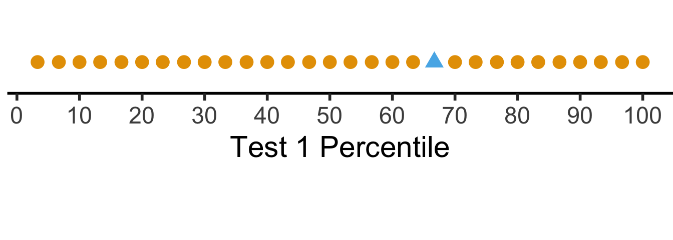

But what if we want to see their absolute performance, on a 0 to 100 scale?
library(scales)
score_df <- score_df |>
  dplyr::mutate(
    t1_rescaled = rescale(
      t1_score,
      from = c(t1_min, t1_max),
      to = c(0, 100)
    ),
    t2_rescaled = rescale(
      t2_score,
      from = c(t2_min, t2_max),
      to = c(0, 100)
    )
  )
# Place "me" last so that it gets plotted last
t1_rescaled_line_data <- tibble::tibble(
  x = score_df$t1_rescaled,
  y = 0,
  me = score_df$is_me
) |> dplyr::arrange(me)
ggplot(t1_rescaled_line_data, aes(x,y,col=factor(me), shape=factor(me))) +
  geom_point(size=g_pointsize) +
  scale_x_continuous(breaks=seq(from=0, to=100, by=10)) +
  dsan_theme("half") +
  expand_limits(x=c(0, 100)) +
  theme(
    legend.position="none",
    #rect = element_blank(),
    #panel.grid = element_blank(),
    axis.title.y = element_blank(),
    axis.text.y = element_blank(),
    axis.line.y = element_blank(),
    axis.ticks.y=element_blank(),
    #panel.spacing = unit(0, "mm"),
    #plot.margin = margin(-40, 0, 0, 0, "pt"),
  ) +
  labs(
    x = "Test 1 Score (Rescaled to 0-100)"
  ) +
  coord_fixed(ratio = 100)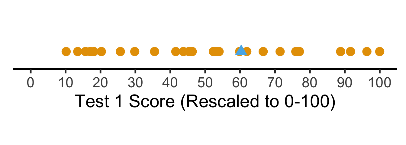

Shifting / Recentering
- Percentiles tell us how the students did in terms of relative rankings
- Rescaling lets us reinterpret the boundary points
- What about with respect to some absolute baseline? For example, how well they did relative to the mean \(\mu\)?
\[ x'_i = x_i - \mu \]
- But we’re still “stuck” in units of the test: is \(x'_i = 0.3\) (0.3 points above the mean) “good”? What about \(x'_j = -2568\) (2568 points below the mean)? How “bad” is this case?
Shifting and Scaling: The \(z\)-Score
- Enter the \(z\)-score!
\[ z_i = \frac{x_i - \mu}{\sigma} \]
- Unit of original \(x_i\) values: ?
- Unit of \(z\)-score: standard deviations from the mean!
t1_z_score_line_data <- tibble::tibble(
  x = score_df$t1_z_score,
  y = 0,
  me = score_df$is_me
) |> dplyr::arrange(me)
ggplot(t1_z_score_line_data, aes(x, y, col=factor(me), shape=factor(me))) +
  geom_point(aes(size=g_pointsize)) +
  scale_x_continuous(breaks=c(-2,-1,0,1,2)) +
  dsan_theme("half") +
  theme(
    legend.position="none",
    #rect = element_blank(),
    #panel.grid = element_blank(),
    axis.title.y = element_blank(),
    axis.text.y = element_blank(),
    axis.line.y = element_blank(),
    axis.ticks.y=element_blank(),
    plot.margin = margin(-20,0,0,0,"pt")
  ) +
  expand_limits(x=c(-2,2)) +
  labs(
    x = "Test 1 Z-Score"
  ) +
  coord_fixed(ratio = 3)
Missing Values
The Value of Studying
- You are a teacher trying to assess the causal impact of studying on homework scores
- Let \(S\) = hours of studying, \(H\) = homework score
- So far so good: we could estimate the relationship via (e.g.) regression
\[ h_i = \beta_0 + \beta_1 s_i + \varepsilon_i \]
My Dog Ate My Homework
- The issue: for some students \(h_i\) is missing, since their dog ate their homework
- Let \(D = \begin{cases}1 &\text{if dog ate homework} \\ 0 &\text{otherwise}\end{cases}\)
- This means we don’t observe \(H\) but \(H^* = \begin{cases} H &\text{if }D = 0 \\ \texttt{NA} &\text{otherwise}\end{cases}\)
- In the easy case, let’s say that dogs eat homework at random (i.e., without reference to \(S\) or \(H\)). Then we say \(H\) is “missing at random”. Our PGM now looks like:
My Dog Ate My Homework Because of Reasons

There are scarier alternatives, though! What if…
Dogs eat homework because their owner studied so much that the dog got ignored?
Dogs hate sloppy work, and eat bad homework that would have gotten a low score
Noisy homes (\(Z = 1\)) cause dogs to get agitated and eat homework more often, and students do worse
Outlier Detection
Tukey’s Rule
- Given the first quartile (25th percentile) \(Q_1\), and the third quartile (75th percentile) \(Q_2\), define the Inter-Quartile Range as
\[ \iqr = Q_3 - Q_1 \]
- Then an outlier is a point more than \(1.5 \cdot \iqr\) away from \(Q_1\) or \(Q_3\); outside of
\[ [Q_1 - 1.5 \cdot \iqr, \; Q_3 + 1.5 \cdot \iqr] \]
- This is the outlier rule used for box-and-whisker plots:
library(ggplot2)
library(tibble)
library(dplyr)
Attaching package: 'dplyr'The following objects are masked from 'package:stats':
filter, lagThe following objects are masked from 'package:base':
intersect, setdiff, setequal, union# Generate normal data
dist_df <- tibble::tibble(Score=rnorm(95), Distribution="N(0,1)")
# Add outliers
outlier_dist_sd <- 6
outlier_df <- tibble::tibble(Score=rnorm(5, 0, outlier_dist_sd), Distribution=paste0("N(0,",outlier_dist_sd,")"))
data_df <- bind_rows(dist_df, outlier_df)
# Compute iqr and outlier range
q1 <- quantile(data_df$Score, 0.25)
q3 <- quantile(data_df$Score, 0.75)
iqr <- q3 - q1
iqr_cutoff_lower <- q1 - 1.5 * iqr
iqr_cutoff_higher <- q3 + 1.5 * iqr
is_outlier <- function(x) (x < iqr_cutoff_lower) || (x > iqr_cutoff_higher)
data_df['Outlier'] <- sapply(data_df$Score, is_outlier)
#data_df
ggplot(data_df, aes(x=Score, y=factor(0))) +
geom_boxplot(outlier.color = NULL, linewidth = g_linewidth, outlier.size = g_pointsize / 1.5) +
geom_jitter(data=data_df, aes(col = Distribution, shape=Outlier), size = g_pointsize / 1.5, height=0.15, alpha = 0.8, stroke = 1.5) +
geom_vline(xintercept = iqr_cutoff_lower, linetype = "dashed") +
geom_vline(xintercept = iqr_cutoff_higher, linetype = "dashed") +
#coord_flip() +
dsan_theme("half") +
theme(
axis.title.y = element_blank(),
axis.ticks.y = element_blank(),
axis.text.y = element_blank()
) +
scale_x_continuous(breaks=seq(from=-3, to=3, by=1)) +
scale_shape_manual(values=c(16, 4))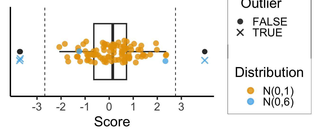
3-Sigma Rule
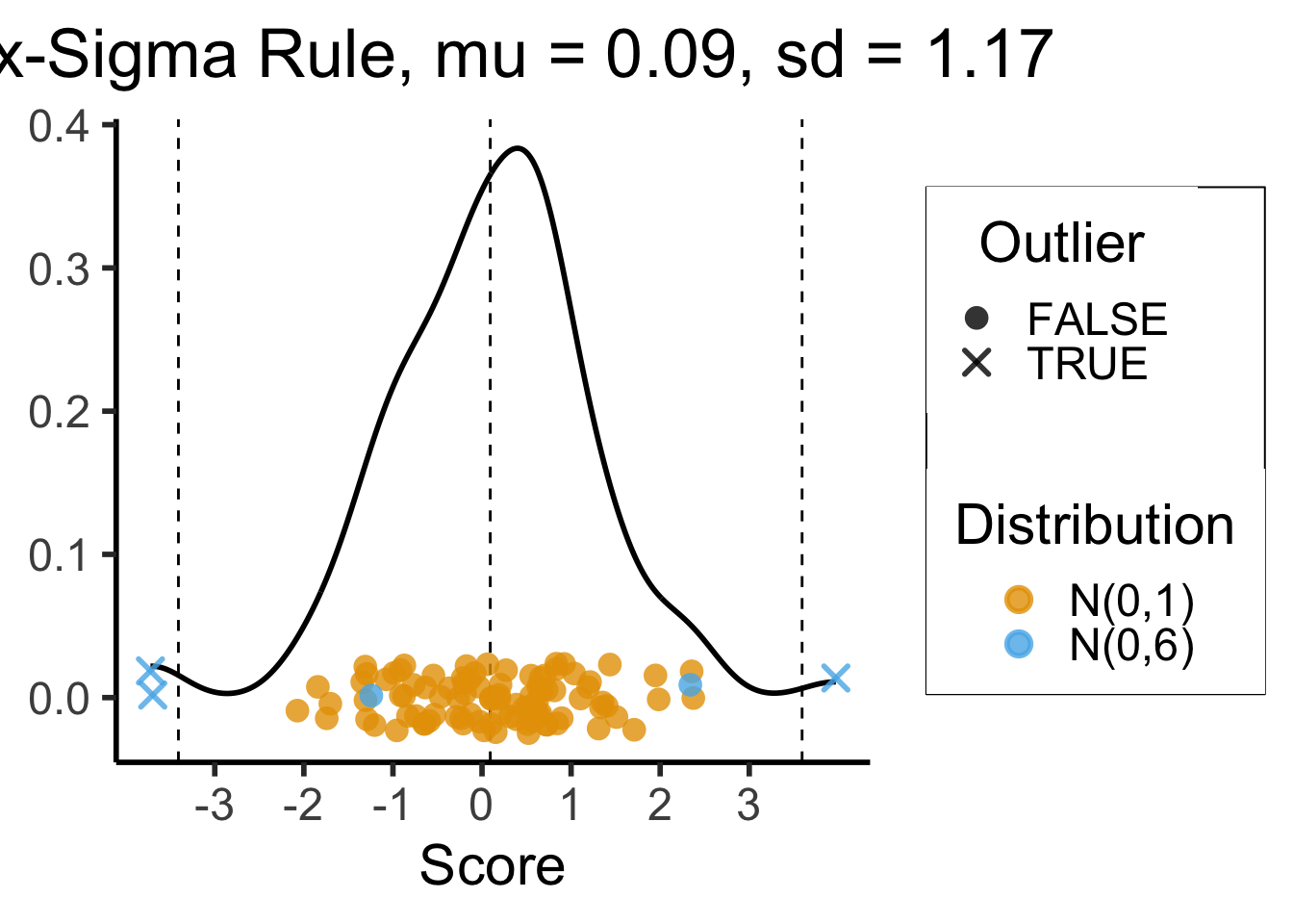
- Recall the 68-95-99.7 Rule
- The 3-Sigma Rule says simply: throw away anything more than 3 standard deviations away from the mean (beyond range that should contain 99.7% of data)
mean_score <- mean(data_df$Score)
sd_score <- sd(data_df$Score)
lower_cutoff <- mean_score - 3 * sd_score
upper_cutoff <- mean_score + 3 * sd_score
# For printing / displaying
mean_score_str <- sprintf(mean_score, fmt='%.2f')
sd_score_str <- sprintf(sd_score, fmt='%.2f')
ggplot(data_df, aes(x=Score)) +
  geom_density(linewidth = g_linewidth) +
  #geom_boxplot(outlier.color = NULL, linewidth = g_linewidth, outlier.size = g_pointsize / 1.5) +
  #geom_jitter(data=data_df, aes(y = factor(0), col = dist), size = g_pointsize / 1.5, height=0.25) +
  #coord_flip() +
  dsan_theme("half") +
  theme(
    axis.title.y = element_blank(),
    #axis.ticks.y = element_blank(),
    #axis.text.y = element_blank()
  ) +
  #geom_boxplot() +
  geom_vline(xintercept = mean_score, linetype = "dashed") +
  geom_vline(xintercept = lower_cutoff, linetype = "dashed") +
  geom_vline(xintercept = upper_cutoff, linetype = "dashed") +
  geom_jitter(data=data_df, aes(x = Score, y = 0, col = Distribution, shape = Outlier),
    size = g_pointsize / 1.5, height=0.025, alpha=0.8, stroke=1.5) +
  scale_x_continuous(breaks=seq(from=-3, to=3, by=1)) +
  scale_shape_manual(values=c(16, 4)) +
  labs(
    title = paste0("Six-Sigma Rule, mu = ",mean_score_str,", sd = ",sd_score_str),
    y = "Density"
  )
Missing Data + Outliers: Most Important Takeaway!
- Always have a working hypothesis about the Data-Generating Process!
- Literally the solution to… 75% of all data-related headaches
- What variables explain why this data point is missing?
- What variables explain why this data point is an outlier?
Driving the Point Home
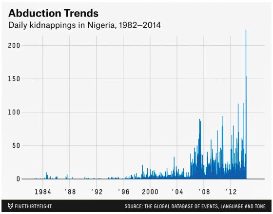
Presumed DGP:
Actual DGP:
Normalization
- Recall from last week’s slides:
- IQR Rule (Tukey), suitable for general data
- Three-Sigma Rule, suitable for Normally-distributed data
- In either case: when we remove outliers using one of these methods, in the context of machine learning we call this feature clipping
One More: Log-Scaling
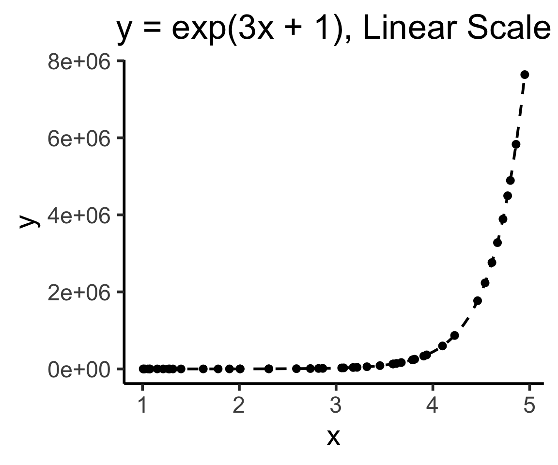
In math (I wish I had learned it like this), the \(\log()\) function is a magic function that “reduces” complicated operations to less-complicated operations:
Exponentiation \(\rightarrow\) Multiplication:
\[ \log(a^b) = b\cdot \log(a) \]
Multiplication \(\rightarrow\) Addition:
\[ \log(a\cdot b) = \log(a) + \log(b) \]
Why Does This Help Us?
- Tl;dr Humans have superpowers for identifying linear relationships: \(y = mx + b\)
- \(\implies\) if we can use \(\log()\), we also get superpowers for identifying exponential relationships for free, since
\[ y = e^{mx + b} \iff \log(y) = mx + b \]
- If we see \(mx + b\) in a log-scale plot, we can immediately infer the functional relationship!
In Pictures
library(tidyverse)── Attaching core tidyverse packages ──────────────────────── tidyverse 2.0.0 ──
✔ forcats 1.0.0 ✔ readr 2.1.5
✔ lubridate 1.9.3 ✔ stringr 1.5.1
✔ purrr 1.0.2 ✔ tidyr 1.3.1
── Conflicts ────────────────────────────────────────── tidyverse_conflicts() ──
✖ readr::col_factor() masks scales::col_factor()
✖ purrr::discard() masks scales::discard()
✖ dplyr::filter() masks stats::filter()
✖ dplyr::lag() masks stats::lag()
ℹ Use the conflicted package (<http://conflicted.r-lib.org/>) to force all conflicts to become errorsN <- 50
x_min <- 1
x_max <- 5
x_vals <- runif(N, x_min, x_max)
noise_vals <- rnorm(N, 0, exp(5))
my_exp <- function(x) exp(3*x + 1)
y_exp <- my_exp(x_vals) + noise_vals
exp_df <- tibble::tibble(x=x_vals, y=y_exp)
ggplot(exp_df) +
stat_function(data=data.frame(x=c(x_min,x_max)), fun = my_exp, linewidth = g_linewidth, linetype="dashed") +
geom_point(aes(x=x, y=y), size = g_pointsize / 2) +
dsan_theme("half") +
labs(
title="y = exp(3x + 1), Linear Scale"
)
# Log2 scaling of the y axis (with visually-equal spacing)
library(scales)
ggplot(exp_df) +
  stat_function(data=data.frame(x=c(x_min,x_max)), fun = my_exp, linewidth = g_linewidth, linetype="dashed") +
  geom_point(aes(x=x, y=y), size = g_pointsize / 2) +
  dsan_theme("half") +
  scale_y_continuous(trans = log_trans(),
    breaks = log_breaks()) +
  labs(
    title="y = exp(3x + 1), Log Scale"
  )
Warning in transformation$transform(x): NaNs producedWarning in scale_y_continuous(trans = log_trans(), breaks = log_breaks()):
log-2.718282 transformation introduced infinite values.Warning: Removed 4 rows containing missing values or values outside the scale range
(`geom_point()`).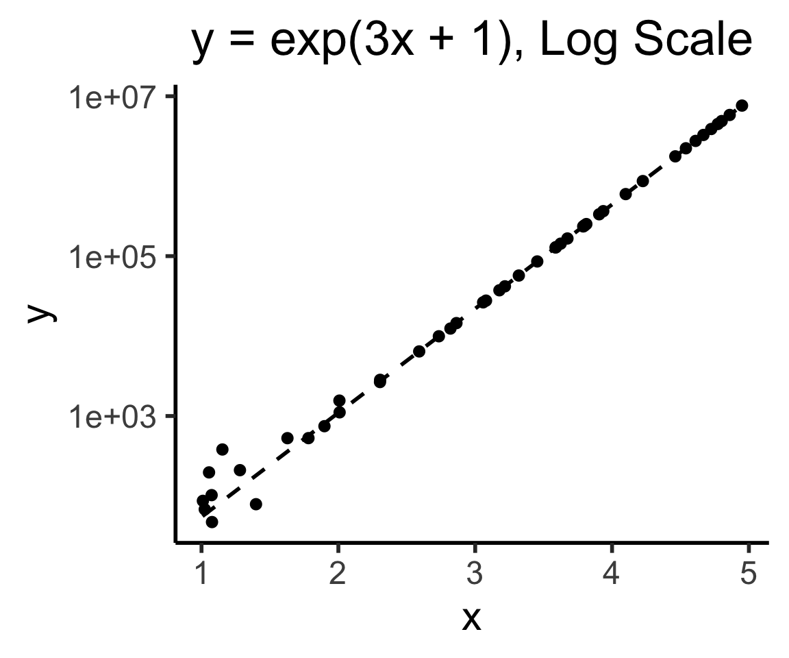
\[ y = e^{mx + b} \iff \log(y) = mx + b \]
Covariance: Intuition 1.0
- If we are at the mean \((\mu_x,\mu_y)\), what is likelihood points to the right are also above?
- Similarly,what is the likelihood that points to the left are also below?
library(tidyverse)
library(latex2exp)
gen_y_noisy <- function(x_val, eps) {
  lower <- max(-1, x_val - eps)
  upper <- min(1, x_val + eps)
  y_noisy <- runif(1, lower, upper)
  return(y_noisy)
}
N <- 100
x_vals <- runif(N, -1, 1)
x_mean <- mean(x_vals)
y_collinear <- x_vals
y_coll_mean <- mean(y_collinear, drop.na = TRUE)
df_collinear <- tibble::tibble(x=x_vals, y=y_collinear, rel="collinear")
# Force the points to be inside [-1,1]
y_noisy <- x_vals
for (i in 1:length(y_noisy)) {
  cur_x_val <- x_vals[i]
  y_noisy[i] <- gen_y_noisy(cur_x_val, 0.75)
}
y_noisy_mean <- mean(y_noisy, na.rm = TRUE)
#print(y_noisy_mean)
df_noisy <- tibble::tibble(x = x_vals, y = y_noisy, rel="noise")
# Label vals above and below mean
label_df <- tribble(
  ~x, ~y, ~label,
  0.5, 0.5, "+",
  -0.5, -0.5, "+",
  0.5, -0.5, "\u2212",
  -0.5, 0.5, "\u2212"
)
gen_cov_plot <- function(df) {
  x_mean = mean(df$x)
  y_mean = mean(df$y)
  ggplot(df, aes(x=x, y=y)) +
    geom_point() +
    geom_vline(xintercept = x_mean) +
    geom_hline(yintercept = y_mean) +
    #facet_grid(. ~ rel) +
    geom_label(
      data=label_df,
      aes(x=x, y=y, label=label, color=label),
      alpha=0.75,
      size = g_pointsize * 1.5
    ) +
    scale_color_manual(values=c("darkgreen","red")) +
    dsan_theme() +
    remove_legend() +
    theme(
      #axis.text.x = element_blank(),
      axis.title.x = element_blank(),
      #axis.ticks.x = element_blank(),
      #axis.text.y = element_blank(),
      #axis.ticks.y = element_blank(),
      axis.title.y = element_blank()
    ) +
    xlim(c(-1,1)) + ylim(c(-1,1)) +
    coord_fixed(ratio=1) +
    scale_x_continuous(breaks=c(-1, x_mean, 1), labels=c("-1",TeX(r"($\mu_x$)"),"1")) +
    scale_y_continuous(breaks=c(-1, y_mean, 1), labels=c("-1",TeX(r"($\mu_y$)"),"1"))
}
gen_cov_table <- function(df, print_matches = FALSE) {
  x_mean <- mean(df$x, na.rm = TRUE)
  y_mean <- mean(df$y, na.rm = TRUE)
  df <- df |> mutate(
    x_contrib = ifelse(x > x_mean, "+", "-"),
    y_contrib = ifelse(y > y_mean, "+", "-"),
    match = x_contrib == y_contrib
  )
  contrib_crosstab <- table(df$y_contrib, df$x_contrib)
  colnames(contrib_crosstab) <- c("x-", "x+")
  rownames(contrib_crosstab) <- c("y-", "y+")
  if (!print_matches) {
    print(contrib_crosstab)
  } else {
    # Num matches
    num_matches <- sum(df$match)
    num_mismatch <- nrow(df) - num_matches
    writeLines(paste0(num_matches, " matches, ",num_mismatch," mismatches"))
    writeLines("\nCovariance:")
    writeLines(paste0(cov(df$x, df$y)))
  }
}
gen_cov_plot(df_collinear)
Scale for x is already present.
Adding another scale for x, which will replace the existing scale.
Scale for y is already present.
Adding another scale for y, which will replace the existing scale.
     x- x+
  y- 50  0
  y+  0 50
100 matches, 0 mismatches
Covariance:
0.249739926690812gen_cov_plot(df_noisy)Scale for x is already present.
Adding another scale for x, which will replace the existing scale.
Scale for y is already present.
Adding another scale for y, which will replace the existing scale.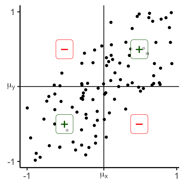
     x- x+
  y- 38 11
  y+ 12 39
77 matches, 23 mismatches
Covariance:
0.176773211271979y_noisy_neg <- x_vals
for (i in 1:length(y_noisy_neg)) {
cur_x_val <- x_vals[i]
y_noisy_neg[i] <- -gen_y_noisy(cur_x_val, 0.75)
}
y_noisy_neg_mean <- mean(y_noisy_neg, na.rm = TRUE)
#print(y_noisy_mean)
df_noisy_neg <- tibble::tibble(x = x_vals, y = y_noisy_neg, rel="noise")
gen_cov_plot(df_noisy_neg)Scale for x is already present.
Adding another scale for x, which will replace the existing scale.
Scale for y is already present.
Adding another scale for y, which will replace the existing scale.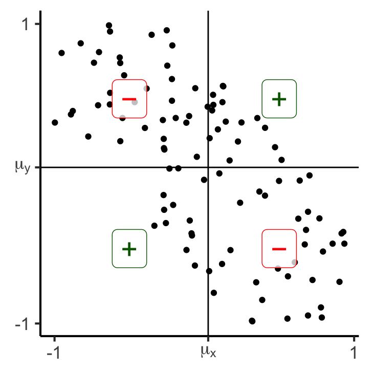
     x- x+
  y- 13 34
  y+ 37 16
29 matches, 71 mismatches
Covariance:
-0.182286216712012Covariance: Intuition 2.0
- Now, rather than just is this point above-right? (binary), let’s compute how above-right it is!:
gen_rect_plot <- function(df, col_order=c("red","darkgreen")) {
  x_mean = mean(df$x)
  y_mean = mean(df$y)
  df <- df |> mutate(
      x_contrib = ifelse(x > x_mean, "+", "-"),
      y_contrib = ifelse(y > y_mean, "+", "-"),
      match = x_contrib == y_contrib
  )
  ggplot(df, aes(x=x, y=y)) +
    geom_point() +
    geom_vline(xintercept = x_mean) +
    geom_hline(yintercept = y_mean) +
    #facet_grid(. ~ rel) +
    geom_rect(aes(xmin=x_mean, xmax=x, ymin=y_mean, ymax=y, fill=match), color='black', linewidth=0.1, alpha=0.075) +
    scale_color_manual(values=c("darkgreen","red")) +
    scale_fill_manual(values=col_order) +
    geom_label(
      data=label_df,
      aes(x=x, y=y, label=label, color=label),
      alpha=0.75,
      size = g_pointsize * 1.5
    ) +
    dsan_theme() +
    remove_legend() +
    theme(
      #axis.text.x = element_blank(),
      axis.title.x = element_blank(),
      #axis.ticks.x = element_blank(),
      #axis.text.y = element_blank(),
      #axis.ticks.y = element_blank(),
      axis.title.y = element_blank()
    ) +
    xlim(c(-1,1)) + ylim(c(-1,1)) +
    coord_fixed(ratio=1) +
    scale_x_continuous(breaks=c(-1, x_mean, 1), labels=c("-1",TeX(r"($\mu_x$)"),"1")) +
    scale_y_continuous(breaks=c(-1, y_mean, 1), labels=c("-1",TeX(r"($\mu_y$)"),"1"))
}
gen_rect_plot(df_collinear, col_order=c("darkgreen","red"))
Scale for x is already present.
Adding another scale for x, which will replace the existing scale.
Scale for y is already present.
Adding another scale for y, which will replace the existing scale.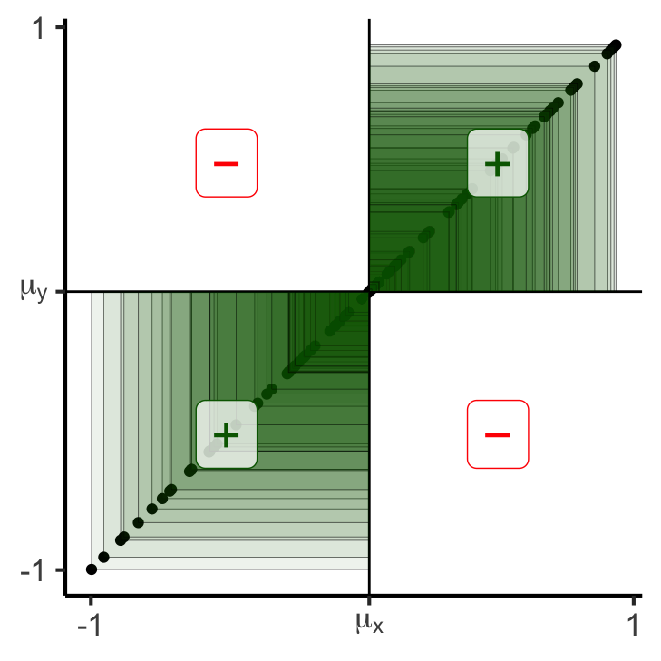
     x- x+
  y- 50  0
  y+  0 50
100 matches, 0 mismatches
Covariance:
0.249739926690812gen_rect_plot(df_noisy)Scale for x is already present.
Adding another scale for x, which will replace the existing scale.
Scale for y is already present.
Adding another scale for y, which will replace the existing scale.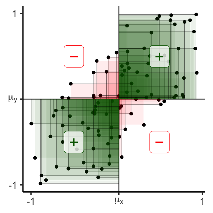
     x- x+
  y- 38 11
  y+ 12 39
77 matches, 23 mismatches
Covariance:
0.176773211271979gen_rect_plot(df_noisy_neg)Scale for x is already present.
Adding another scale for x, which will replace the existing scale.
Scale for y is already present.
Adding another scale for y, which will replace the existing scale.
     x- x+
  y- 13 34
  y+ 37 16
29 matches, 71 mismatches
Covariance:
-0.182286216712012Covariance: Intuition 3.0
- This means that if we break out of \([-1,1]\), covariance will grow even larger:
# Label vals above and below mean
N <- 100
x_min_expanded <- -5
x_max_expanded <- 15
gen_y_noisy_expanded <- function(x_val, x_min, x_max, eps) {
  lower <- max(x_min, x_val - eps)
  upper <- min(x_max, x_val + eps)
  y_noisy <- runif(1, lower, upper)
  return(y_noisy)
}
x_vals_expanded <- runif(N, x_min_expanded, x_max_expanded)
x_mean_expanded <- mean(x_vals_expanded)
y_collinear_expanded <- x_vals_expanded
y_mean_collinear_expanded <- mean(y_collinear_expanded)
df_collinear_expanded <- tibble::tibble(x=x_vals_expanded, y=y_collinear_expanded, rel="collinear")
gen_rect_plot_expanded <- function(df, col_order=c("red","darkgreen")) {
  x_mean <- mean(df$x)
  x_mean_str <- sprintf("%.2f", x_mean)
  x_mean_tex <- paste0("($\\mu_x = ",x_mean_str,"$)")
  y_mean = mean(df$y)
  y_mean_str <- sprintf("%.2f", y_mean)
  y_mean_tex <- paste0("($\\mu_y = ",y_mean_str,"$)")
  label_df_expanded <- tribble(
    ~x, ~y, ~label,
    # Upper right
    (x_mean + x_max_expanded) / 2, (y_mean + x_max_expanded) / 2, "+",
    (x_min_expanded + x_mean) / 2, (x_min_expanded + y_mean) / 2, "+",
    (x_mean + x_max_expanded) / 2, (x_min_expanded + y_mean) / 2, "\u2212",
    (x_min_expanded + x_mean) / 2, (y_mean + x_max_expanded) / 2, "\u2212"
  )
  df <- df |> mutate(
      x_contrib = ifelse(x > x_mean, "+", "-"),
      y_contrib = ifelse(y > y_mean, "+", "-"),
      match = x_contrib == y_contrib
  )
  ggplot(df, aes(x=x, y=y)) +
    geom_point() +
    geom_vline(xintercept = x_mean) +
    geom_hline(yintercept = y_mean) +
    #facet_grid(. ~ rel) +
    geom_rect(aes(xmin=x_mean, xmax=x, ymin=y_mean, ymax=y, fill=match), color='black', linewidth=0.1, alpha=0.075) +
    scale_color_manual(values=c("darkgreen","red")) +
    scale_fill_manual(values=col_order) +
    geom_label(
      data=label_df_expanded,
      aes(x=x, y=y, label=label, color=label),
      alpha=0.75,
      size = g_pointsize * 1.5
    ) +
    dsan_theme() +
    remove_legend() +
    theme(
      #axis.text.x = element_blank(),
      axis.title.x = element_blank(),
      #axis.ticks.x = element_blank(),
      #axis.text.y = element_blank(),
      #axis.ticks.y = element_blank(),
      axis.title.y = element_blank()
    ) +
    coord_fixed(ratio=1) +
    xlim(c(x_min_expanded,x_max_expanded)) +
    ylim(c(x_min_expanded,x_max_expanded)) +
    scale_x_continuous(breaks=c(x_min_expanded, x_mean, x_max_expanded), labels=c("-5",TeX(x_mean_tex),"15")) +
    scale_y_continuous(breaks=c(x_min_expanded, y_mean, x_max_expanded), labels=c("-5",TeX(y_mean_tex),"15"))
}
gen_rect_plot_expanded(df_collinear_expanded, col_order=c("darkgreen","red"))
Scale for x is already present.
Adding another scale for x, which will replace the existing scale.
Scale for y is already present.
Adding another scale for y, which will replace the existing scale.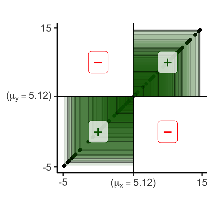
     x- x+
  y- 50  0
  y+  0 50
100 matches, 0 mismatches
Covariance:
34.2082173443672# Force the points to be inside [-1,1]
y_noisy_expanded <- x_vals_expanded
for (i in 1:length(y_noisy_expanded)) {
cur_x_val_expanded <- x_vals_expanded[i]
y_noisy_expanded[i] <- gen_y_noisy_expanded(cur_x_val_expanded, x_min_expanded, x_max_expanded, 5)
}
y_noisy_expanded_mean <- mean(y_noisy_expanded, na.rm = TRUE)
#print(y_noisy_mean)
df_noisy_expanded <- tibble::tibble(x = x_vals_expanded, y = y_noisy_expanded, rel="noise")
gen_rect_plot_expanded(df_noisy_expanded)Scale for x is already present.
Adding another scale for x, which will replace the existing scale.
Scale for y is already present.
Adding another scale for y, which will replace the existing scale.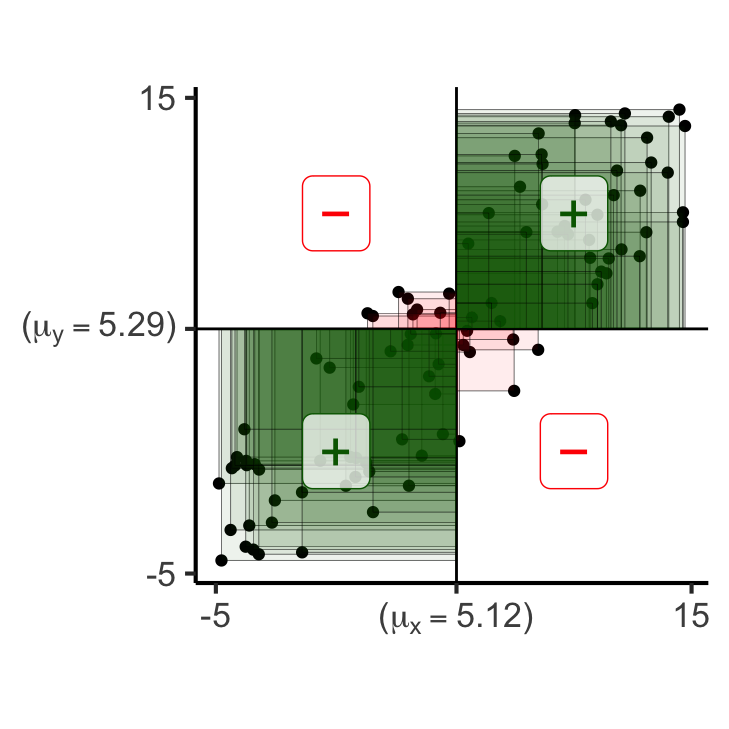
     x- x+
  y- 42  7
  y+  8 43
85 matches, 15 mismatches
Covariance:
28.2619112324438gen_y_noisy_neg <- function(x_val, x_min, x_max, eps) {
lower <- max(x_min, x_val - eps)
upper <- min(x_max, x_val + eps)
y_noisy <- runif(1, lower, upper)
return(y_noisy)
}
y_noisy_neg_expanded <- x_vals_expanded
for (i in 1:length(y_noisy_neg_expanded)) {
cur_x_val_expanded <- x_vals_expanded[i]
#y_noisy_neg_expanded[i] <- x_mean_expanded - (gen_y_noisy_expanded(cur_x_val_expanded, x_min_expanded, x_max_expanded, 5) - x_mean_expanded)
y_noisy_neg_expanded[i] <- 10 - gen_y_noisy_expanded(cur_x_val_expanded, x_min_expanded, x_max_expanded, 5)
#y_noisy_neg_expanded[i] <- x_mean_expanded - (y_noisy_neg_expanded[i] - x_mean_expanded)
}
y_noisy_neg_expanded_mean <- mean(y_noisy_neg_expanded, na.rm = TRUE)
#print(y_noisy_mean)
df_noisy_neg_expanded <- tibble::tibble(x = x_vals_expanded, y = y_noisy_neg_expanded, rel="noise")
gen_rect_plot_expanded(df_noisy_neg_expanded)Scale for x is already present.
Adding another scale for x, which will replace the existing scale.
Scale for y is already present.
Adding another scale for y, which will replace the existing scale.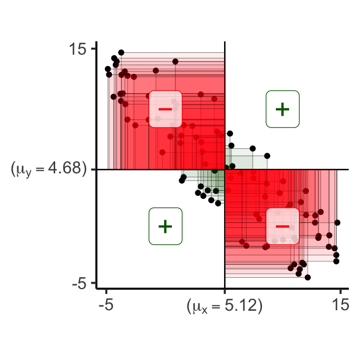
     x- x+
  y- 10 44
  y+ 40  6
16 matches, 84 mismatches
Covariance:
-27.8964403686282Distance Metrics
- One More Important Metric! Cosine Distance
\[ \begin{align*} &A = (5,0), B = (3,4) \\ &\implies \cos(A,B) = \frac{3}{5} \end{align*} \]
Plus new names for ones you already know!
“Levenshtein Distance”: Edit distance
“Chebyshev Distance”: \(L^{\infty}\)-norm, meaning, maximum absolute distance. In \(\mathbb{R}^2\):
\[ \begin{align*} &D((x_1,y_1),(x_2,y_2)) \\ &= \max\{ |x_2 - x_1|, |y_2 - y_1| \} \end{align*} \]
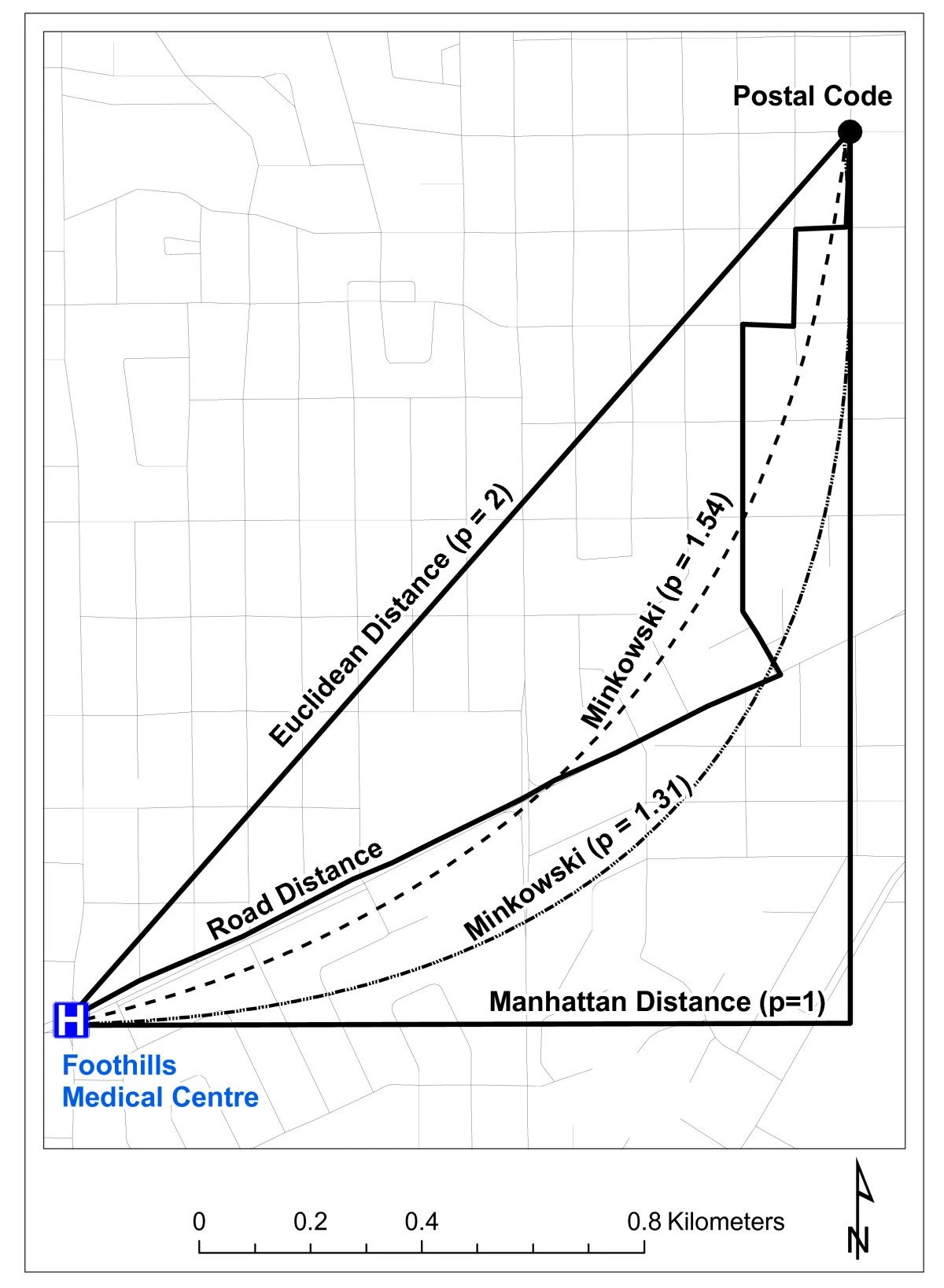
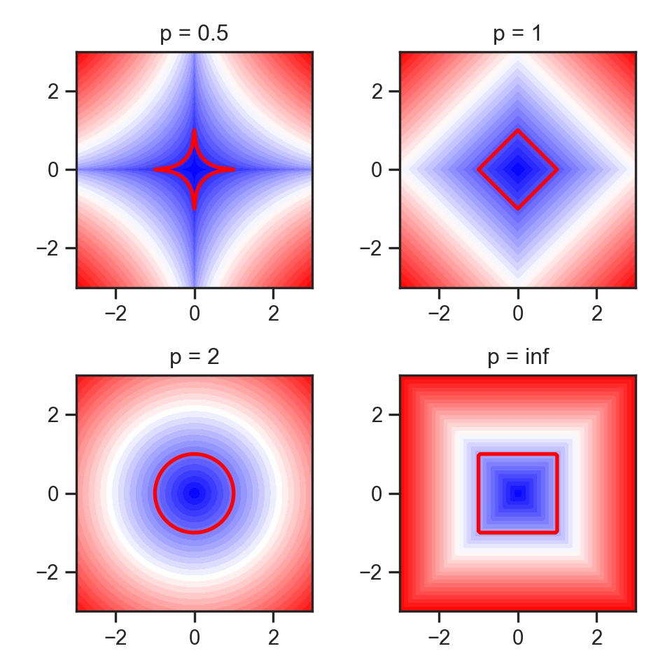
- “Minkowski Distance”: \(L^p\)-norm (Generalizes Euclidean, Manhattan, Min, and Max)
Entropy \(\rightarrow\) Distance
- Entropy (of one distribution): How uncertain are we about what we’re going to pull out of the bag?
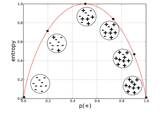
- Think about:
- What exactly makes a boring {song,movie,book} boring?
- What makes an overwhelming/stressful {song,movie,book} overwhelming/stressful?
“Distance” Metrics on Distributions
- KL-Divergence (Non-symmetric!): \(\kl(P \parallel Q) \neq \kl(Q \parallel P)\)
- Not distance but relative entropy: how surprised were we to see \(P\) when we expected \(Q\)? How much information is lost when we approximate \(P\) with \(Q\)?
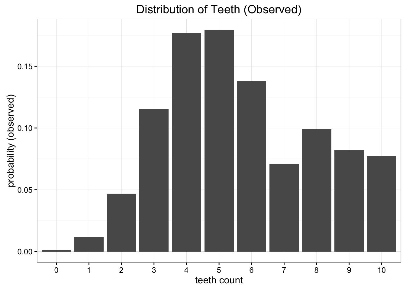
(Example from Count Bayesie Blog)
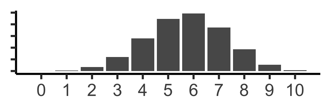
\(\mathcal{A} = \mathcal{U}\{0,10\}\)? \(\kl(\mathcal{O} \parallel \mathcal{A})=0.338\)
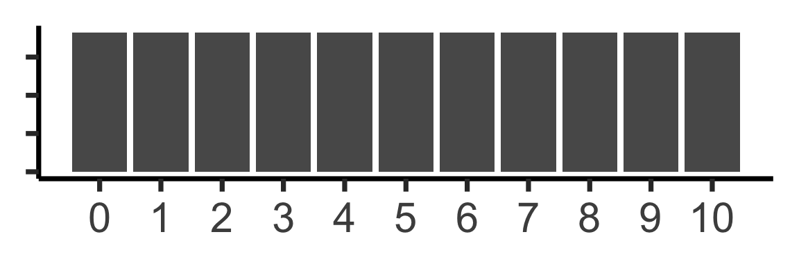
\(\text{Binom}(10,0.57)\)? \(\kl(\mathcal{O} \parallel \mathcal{B})=0.477\)
Machine Learning
Supervised vs. Unsupervised Learning
Supervised Learning: You want the computer to learn the existing pattern of how you are classifying2 observations
- Discovering the relationship between properties of data and outcomes
- Example (Binary Classification): I look at homes on Zillow, saving those I like to folder A and don’t like to folder B
- Example (Regression): I assign a rating of 0-100 to each home
- In both cases: I ask the computer to learn my schema (how I classify)
Unsupervised Learning: You want the computer to find patterns in a dataset, without any prior classification info
- Typically: grouping or clustering observations based on shared properties
- Example (Clustering): I save all the used car listings I can find, and ask the computer to “find a pattern” in this data, by clustering similar cars together
Dataset Structures
Supervised Learning: Dataset has both explanatory variables (“features”) and response variables (“labels”)
sup_data <- tibble::tribble(
  ~home_id, ~sqft, ~bedrooms, ~rating,
  0, 1000, 1, "Disliked",
  1, 2000, 2, "Liked",
  2, 2500, 1, "Liked",
  3, 1500, 2, "Disliked",
  4, 2200, 1, "Liked"
)
sup_data| home_id | sqft | bedrooms | rating |
|---|---|---|---|
| 0 | 1000 | 1 | Disliked |
| 1 | 2000 | 2 | Liked |
| 2 | 2500 | 1 | Liked |
| 3 | 1500 | 2 | Disliked |
| 4 | 2200 | 1 | Liked |
Unsupervised Learning: Dataset has only explanatory variables (“features”)
unsup_data <- tibble::tribble(
  ~home_id, ~sqft, ~bedrooms,
  0, 1000, 1,
  1, 2000, 2,
  2, 2500, 1,
  3, 1500, 2,
  4, 2200, 1
)
unsup_data| home_id | sqft | bedrooms |
|---|---|---|
| 0 | 1000 | 1 |
| 1 | 2000 | 2 |
| 2 | 2500 | 1 |
| 3 | 1500 | 2 |
| 4 | 2200 | 1 |
Dataset Structures: Visualized
ggplot(sup_data, aes(x=sqft, y=bedrooms, color=rating)) +
  geom_point(size = g_pointsize * 2) +
  labs(
    title = "Supervised Data: House Listings",
    x = "Square Footage",
    y = "Number of Bedrooms",
    color = "Outcome"
  ) +
  expand_limits(x=c(800,2700), y=c(0.8,2.2)) +
  dsan_theme("half")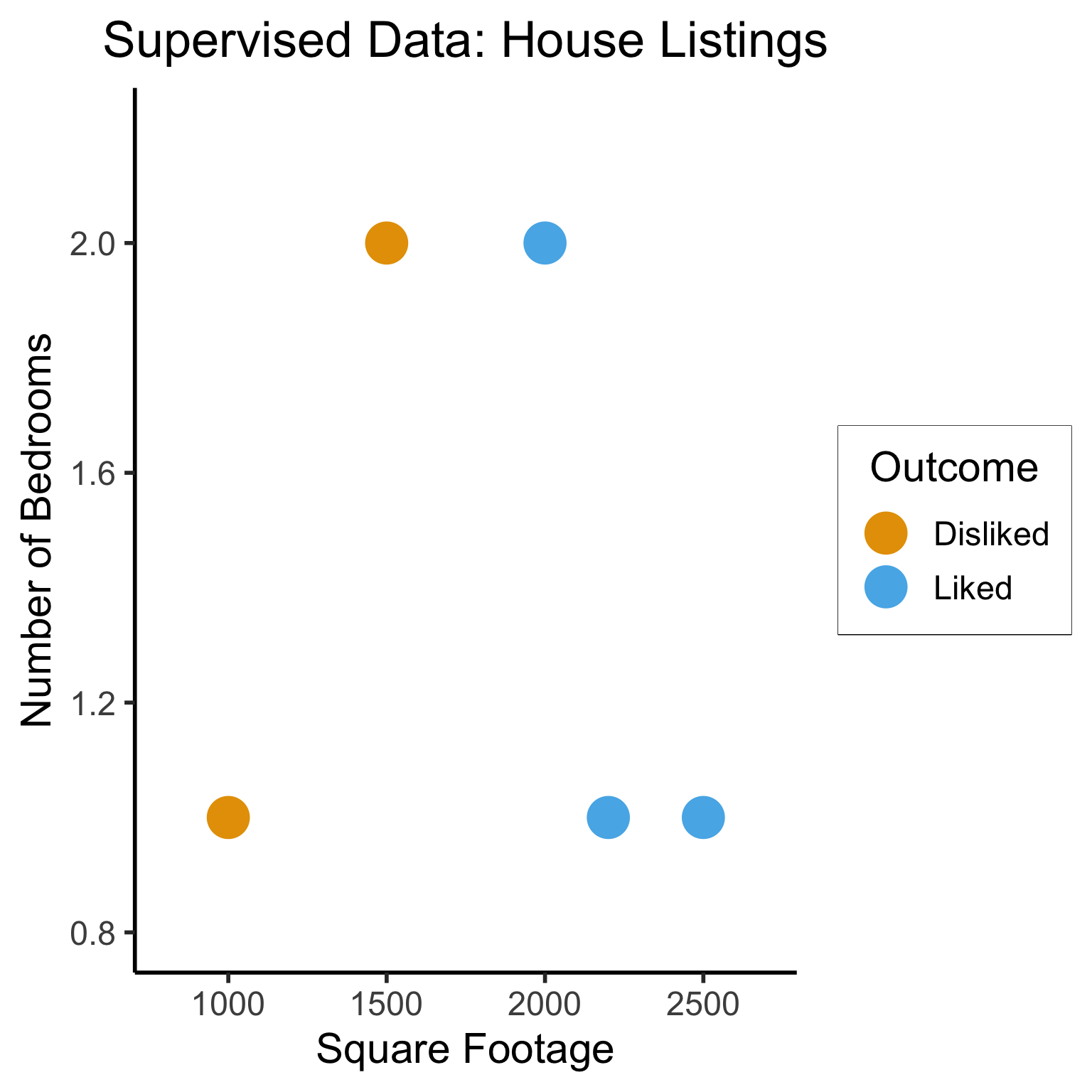
# To force a legend
unsup_grouped <- unsup_data %>% mutate(big=bedrooms > 1)
unsup_grouped[['big']] <- factor(unsup_grouped[['big']], labels=c("?1","?2"))
ggplot(unsup_grouped, aes(x=sqft, y=bedrooms, fill=big)) +
  geom_point(size = g_pointsize * 2) +
  labs(
    x = "Square Footage",
    y = "Number of Bedrooms",
    fill = "?"
  ) +
  dsan_theme("half") +
  expand_limits(x=c(800,2700), y=c(0.8,2.2)) +
  ggtitle("Unsupervised Data: House Listings") +
  theme(legend.background = element_rect(fill="white", color="white"), legend.box.background = element_rect(fill="white"), legend.text = element_text(color="white"), legend.title = element_text(color="white"), legend.position = "right") +
  scale_fill_discrete(labels=c("?","?")) +
  #scale_color_discrete(values=c("white","white"))
  scale_color_manual(name=NULL, values=c("white","white")) +
  #scale_color_manual(values=c("?1"="white","?2"="white"))
  guides(fill = guide_legend(override.aes = list(shape = NA)))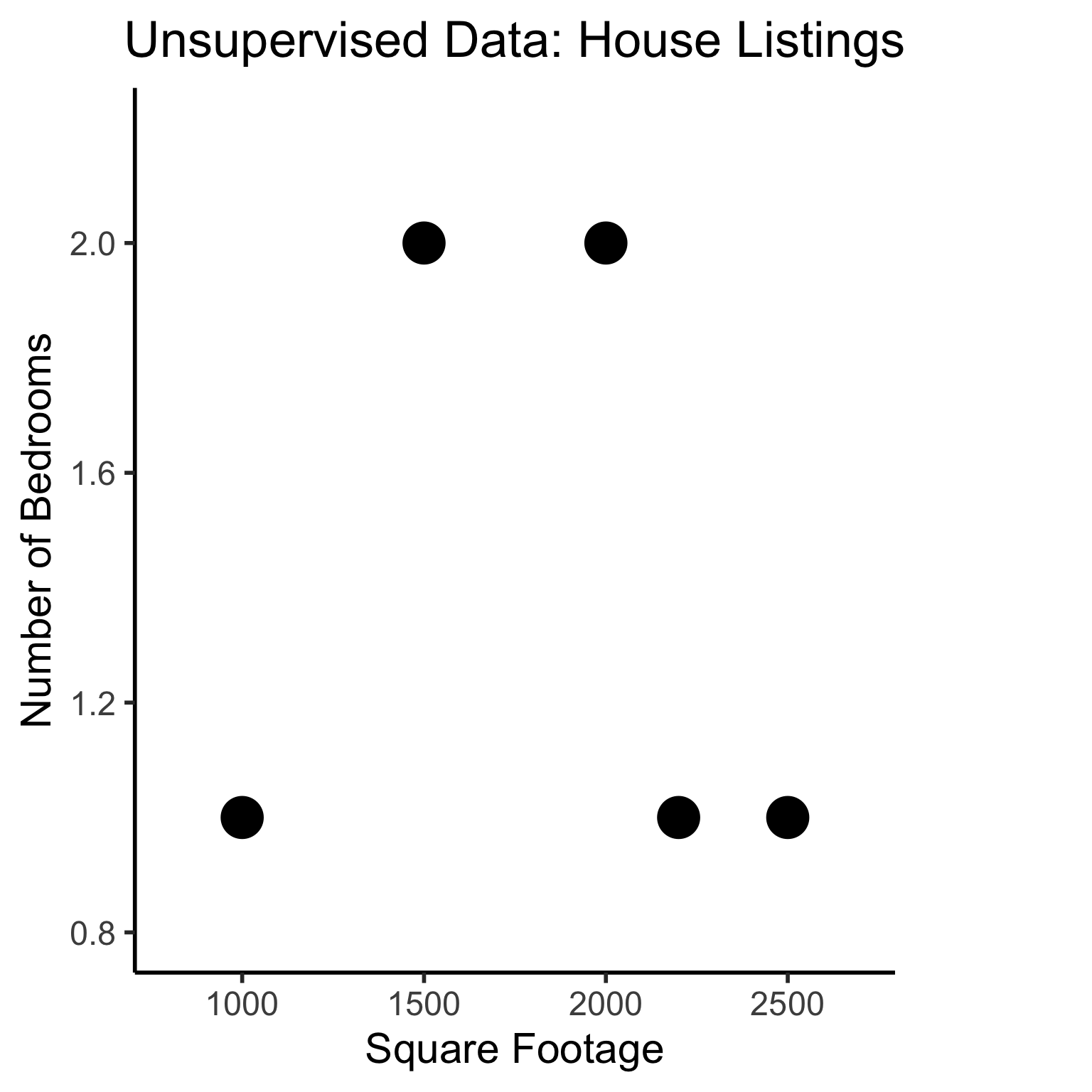
Different Goals
ggplot(sup_data, aes(x=sqft, y=bedrooms, color=rating)) +
  geom_point(size = g_pointsize * 2) +
  labs(
    title = "Supervised Data: House Listings",
    x = "Square Footage",
    y = "Number of Bedrooms",
    color = "Outcome"
  ) +
  dsan_theme("half") +
  expand_limits(x=c(800,2700), y=c(0.8,2.2)) +
  geom_vline(xintercept = 1750, linetype="dashed", color = "black", size=1) +
  annotate('rect', xmin=-Inf, xmax=1750, ymin=-Inf, ymax=Inf, alpha=.2, fill=cbPalette[1]) +
  annotate('rect', xmin=1750, xmax=Inf, ymin=-Inf, ymax=Inf, alpha=.2, fill=cbPalette[2])
Warning: Using `size` aesthetic for lines was deprecated in ggplot2 3.4.0.
ℹ Please use `linewidth` instead.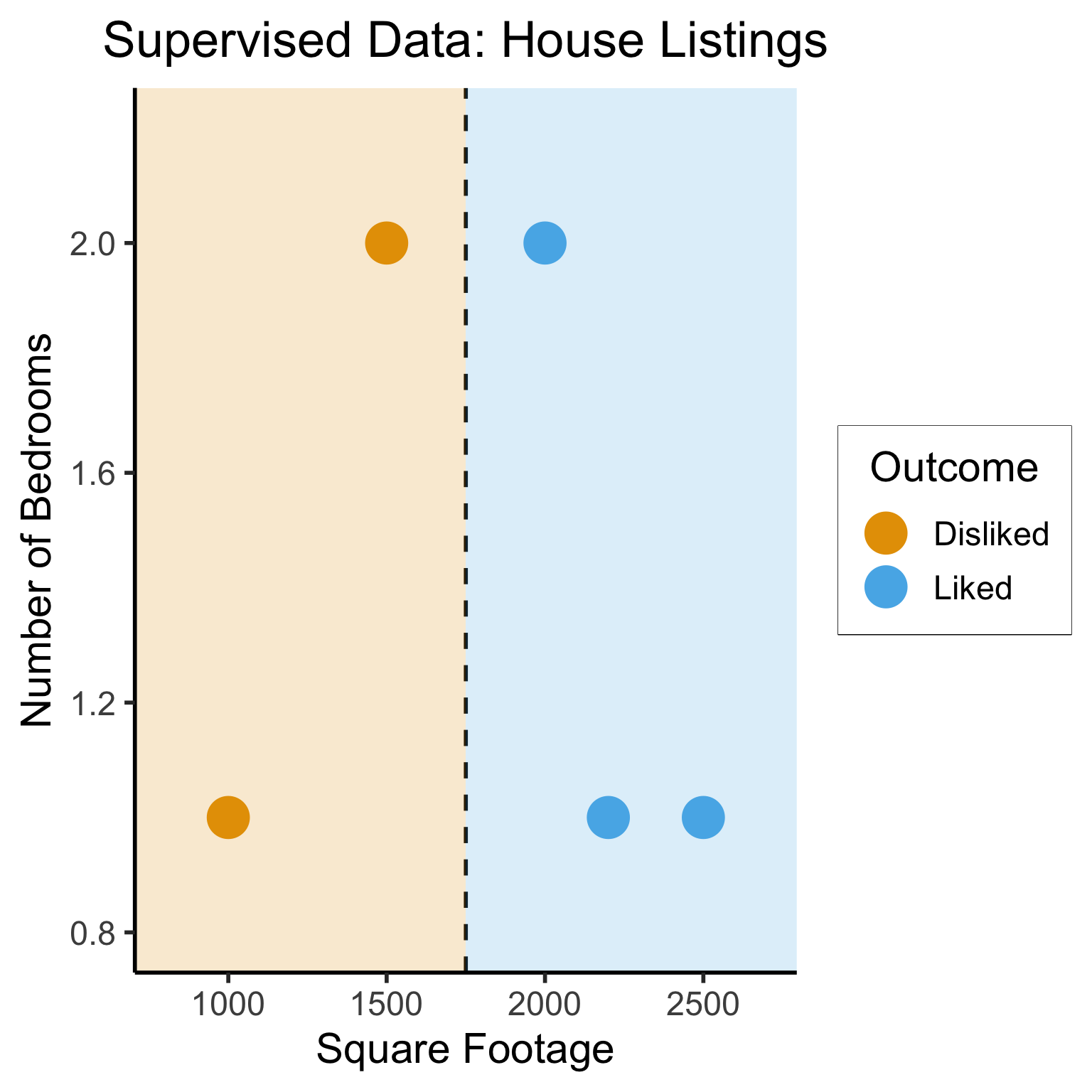
#geom_rect(aes(xmin=-Inf, xmax=Inf, ymin=0, ymax=Inf, alpha=.2, fill='red'))library(ggforce)
ggplot(unsup_grouped, aes(x=sqft, y=bedrooms)) +
#scale_color_brewer(palette = "PuOr") +
geom_mark_ellipse(expand=0.1, aes(fill=big), size = 1) +
geom_point(size=g_pointsize) +
labs(
x = "Square Footage",
y = "Number of Bedrooms",
fill = "?"
) +
dsan_theme("half") +
ggtitle("Unsupervised Data: House Listings") +
#theme(legend.position = "none") +
#theme(legend.title = text_element("?"))
expand_limits(x=c(800,2700), y=c(0.8,2.2)) +
scale_fill_manual(values=c(cbPalette[3],cbPalette[4]), labels=c("?","?"))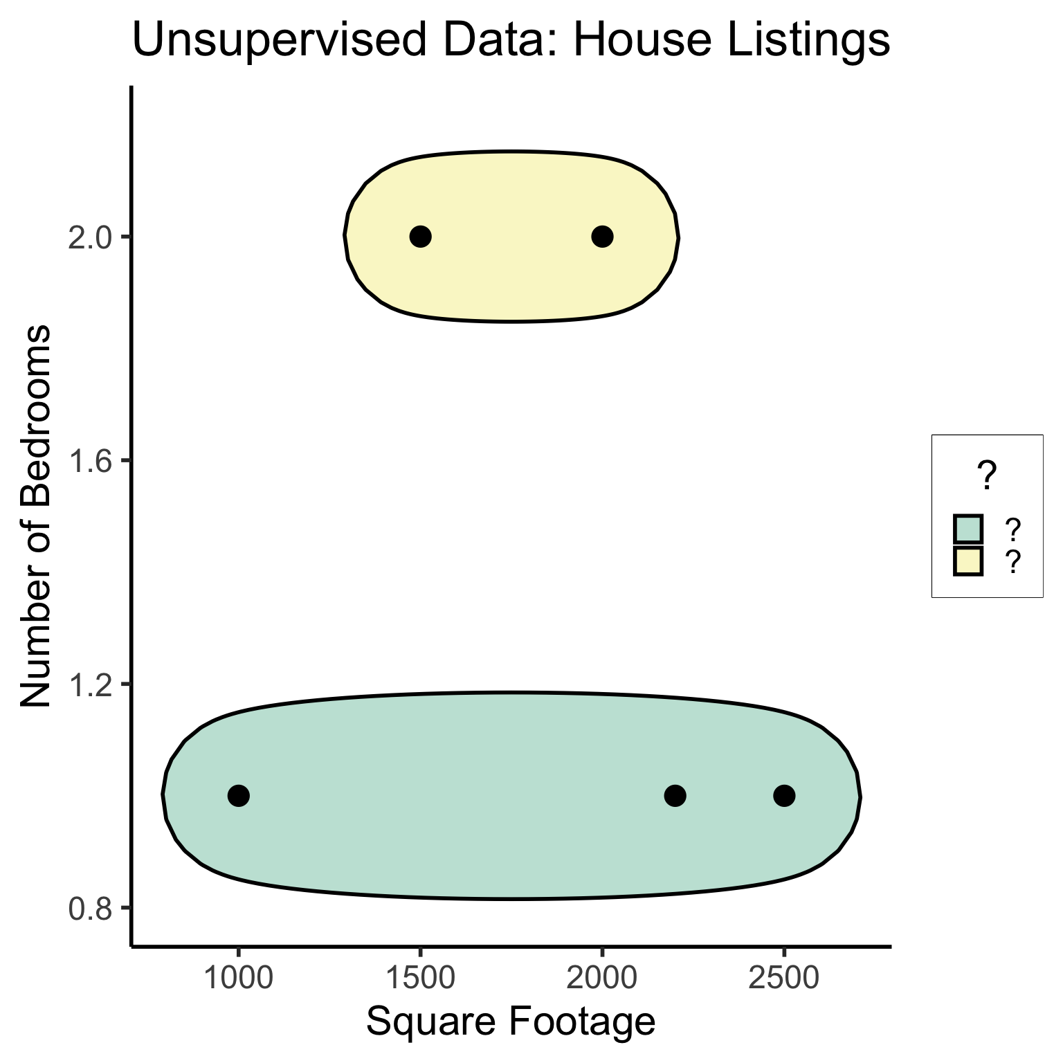
#scale_fill_manual(labels=c("?","?"))K-Nearest Neighbors (KNN)
The KNN Algorithm
- Binary Classification: Given a set of information (“features”) about an observation (\(X\)), predict a yes/no outcome (\(y \in \{0, 1\}\)) for this observation
- Example: Given a count of words in an email, classify it as spam (\(y=1\)) or not spam (\(y = 0\))
- Multiclass classification: Classify the observation into one of \(N\) categories (\(y \in \{0, 1, \ldots, N\}\))
- Example: Given a handwritten symbol, classify it as a digit (\(y = \{0, 1, \ldots, 9\}\))
- K-Nearest Neighbors Intuition: Find the \(K\) most similar observations that we’ve seen before, and have them “majority vote” on the outcome.
MNIST Digits Example
KNN Example
- The problem: Given a student’s GPA, predict whether or not they will graduate
- K-Nearest Neighbor Approach:
- Get a dataset of previous years, students’ GPAs and whether or not they graduated
- Find the \(K = 5\) students with GPA closest to the student of interest
- If a majority of these 5 students graduated, predict that the student will graduate. Otherwise, predict that they will not.
KNN In Pictures

Naïve Bayes Classifiers
What is “Naïve” About It?
Guessing House Prices:
- If I tell you there’s a house, what is your guess for number of bathrooms it has?
- If I tell you the house is 50,000 sqft, does your guess go up?
Guessing Word Frequencies:
- If I tell you there’s a book, how often do you think the word “University” appears?
- Now if I tell you that the word “Stanford” appears 2,000 times, does your guess go up?

In Math
- Assume some email \(E\) with \(N = 5\) words, \(E = (w_1, w_2, w_3, w_4, w_5)\). Say \(E = (\texttt{you},\texttt{win},\texttt{a},\texttt{million},\texttt{dollars})\).
- We’re trying to classify \(S = \begin{cases}1 &\text{if spam} \\ 0 &\text{otherwise}\end{cases}\) given \(E\)
- Normal person (marine biologist?)3:
\[ \begin{align*} &\Pr(S = 1 \mid w_5 = \texttt{dollars}, w_4 = \texttt{million}) \\ &> \Pr(S = 1 \mid w_5 = \texttt{dollars}, w_4 = \texttt{octopus}) \end{align*} \]
- Naïve Bayes classifier:
\[ \Pr(S = 1 \mid w_5) \perp \Pr(S = 1 \mid w_4) \]
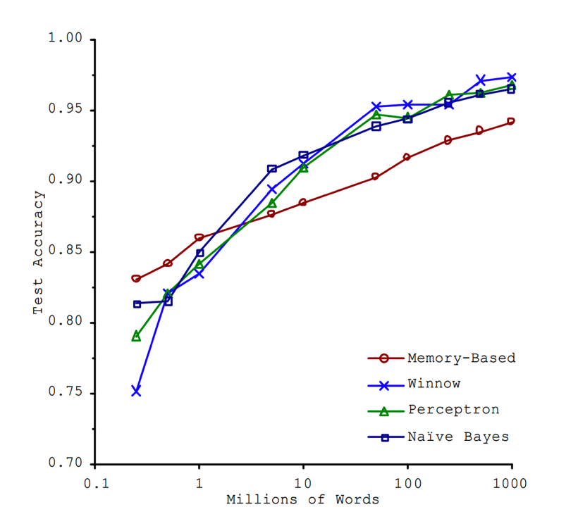
“Unreasonable Effectiveness”
- This must absolutely suck in practice, right?

Lab: Feature Selection in Scikit-Learn
Feature Selection in Scikit-Learn
Lab Demo Task Overview
What are the keys to success in the NBA?
Lab Assignment Overview
References
Footnotes
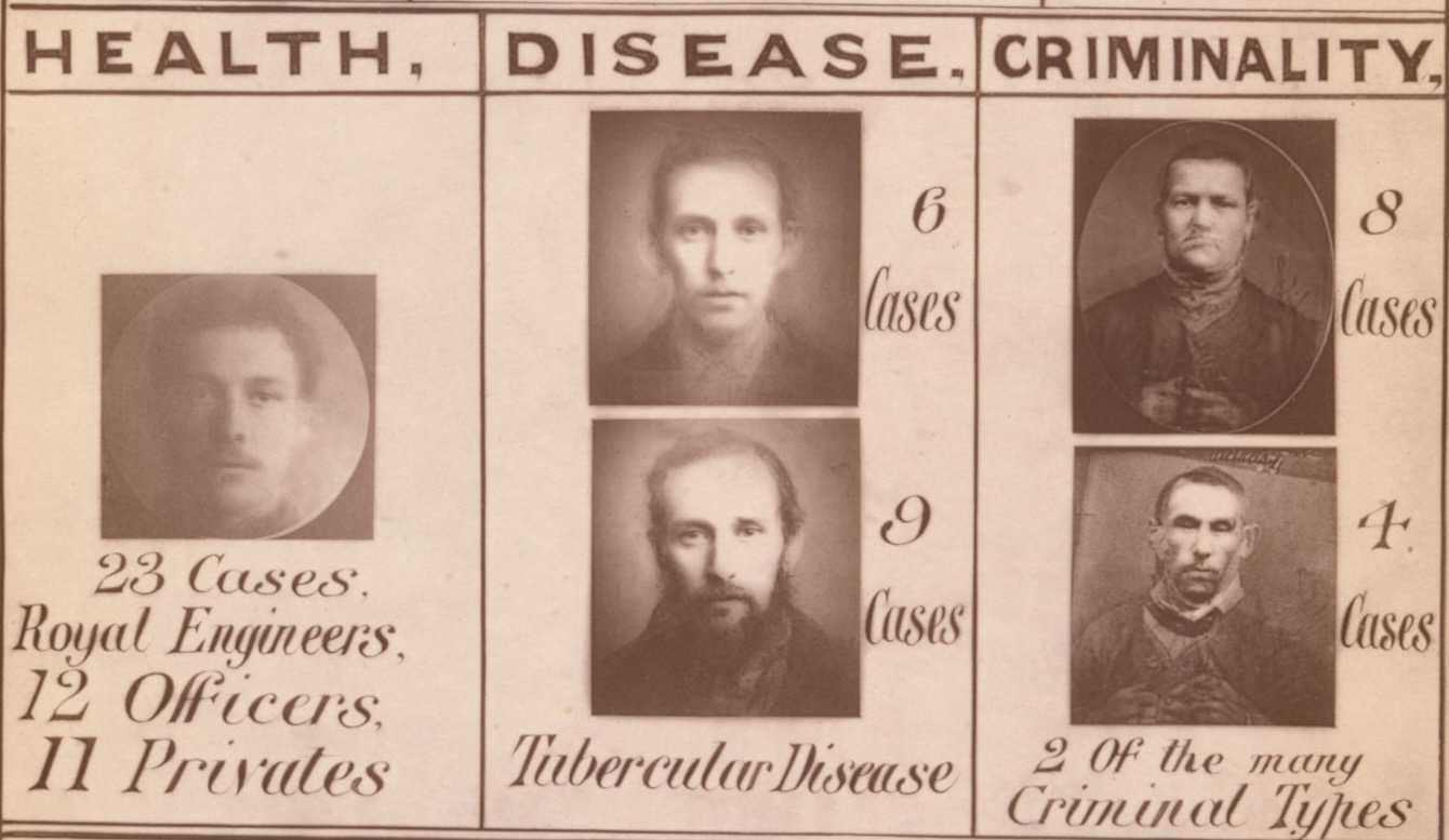
Good thing this guy isn’t the father of modern statistics or anything like that 😮💨
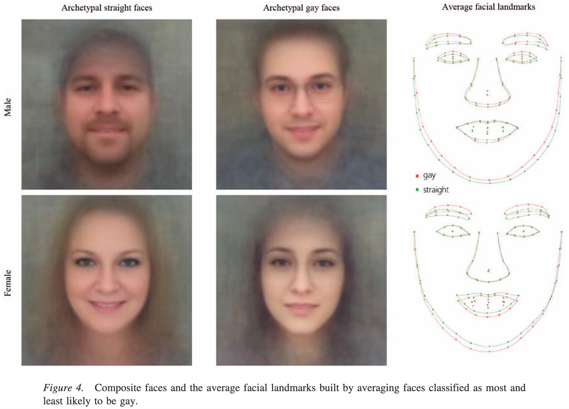
(For more historical scariness take my DSAN 5450: Data Ethics and Policy course next semester! 😉)↩︎Whether standard classification (sorting observations into bins) or regression (assigning a real number to each observation)↩︎
(But we might have the opposite result for a marine economist… rly makes u think
 )↩︎
)↩︎
