Why Poisson Processes are ‘The’ Null Model for Testing Spatial Hypotheses
Extra Writeups
Author
Affiliation
Jeff Jacobs
jj1088@georgetown.edu
Published
October 16, 2025
Overview
I fumbled this concept towards the end of the Week 8 lecture, since I was rushing to try and get to intensity functions and pair correlation functions. As we know, this kind of guilt will weigh on Jeff’s mind until he creates a writeup where he can slow down and walk through it with the proper attention to detail… so here we are!
The reason we worry so much about the “proper” null model to use when we want to test spatial hypotheses (and the reason for creating a full-on Writeup about it), is that certain intuitions we may have developed in our standard (non-spatial) statistics courses fail to generalize easily to our current two-dimensional spatial setting! So, let’s:
Start by looking at what may be in our heads from these earlier classes when we hear the term “null model” (Part 1), then
Describe the trouble we run into if we try to haphazardly take the one-dimensional statistical notion of independent and identically distributed (i.i.d.) random variables and just “lift” it into two dimensions (Part 2),
Start more slowly, building up from the simplest possible point process to see where exactly this naïve approach goes wrong (Part 3, and finally
Conclude with the less-rushed version of what I said in class: that the Poisson Point Process model “saves us” by avoiding these troubles (Part 4)
Part 1: The Null Model from Introductory Statistics
In standard “one-dimensional” statistics, when we start building up our conceptual/methodological toolbox towards the goal of developing a set of statistical hypothesis tests, we usually start with the notion of a collection \(X_1, X_2, \ldots, X_n\) of \(N\) independent and identically distributed (i.i.d.) Random Variables.
The reason this odd term “independent and identically distributed” is so important is because is exactly this i.i.d. property that underlies the two key theorems of statistical sampling theory: the Law of Large Numbers (LLN) and the Central Limit Theorem (CLT).
Say we have a goal of figuring out the average height of Georgetown students, in centimeters. We don’t have any way to instantaneously “divine” this information from out of nowhere, however, so instead we decide to start sampling students from campus. We let \(X_1\) be the Random Variable corresponding to the height of the first person we sample, \(X_2\) be the Random Variable corresponding to the height of the second person we sample, and so on, up to \(X_n\), the Random Variable corresponding to the height of the final person we sample.
We make the assumption that the Random Variables in this series \(\{X_1, X_2, \ldots, X_n\}\) are independent, since we believe that learning the height of any one person doesn’t give us any information about the height of other people.
We make the assumption that the Random Variables in this series \(\{X_1, X_2, \ldots, X_n\}\) are identically distributed because we believe there is some underlying distribution (perhaps a Normal distribution) describing the population of Georgetown students, and that each of our samples is a single draw from this (assumed) underlying population distribution.
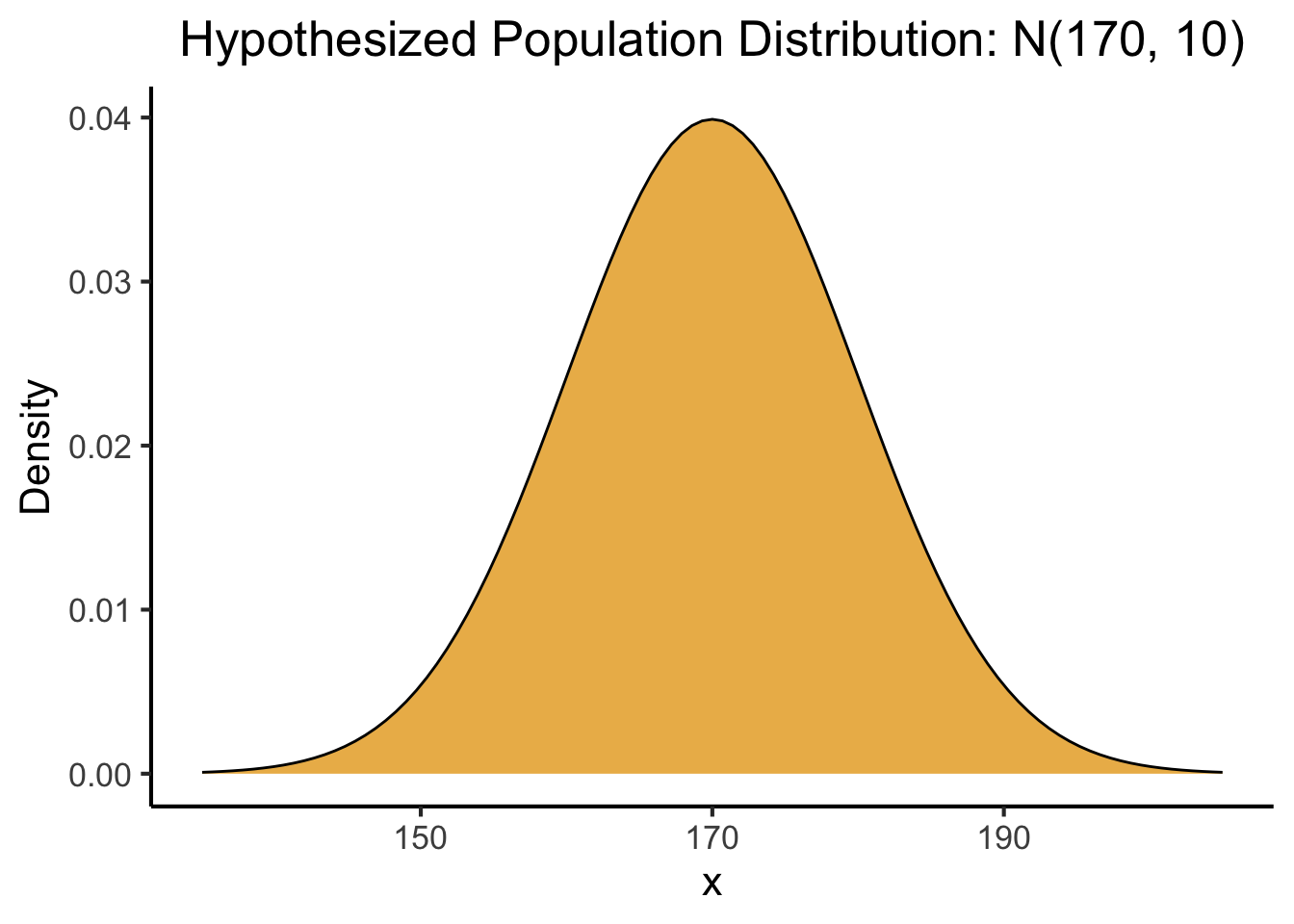
The second assumption (that \(\{X_1, X_2, \ldots, X_n\}\) are identically distributed) is super important for the wording of the LLN and CLT. To see exactly why these theorems are useful, we’ll add one more piece of information to this assumption, namely, that the underlying population distribution we’ve assumed has some well-defined mean\(\mu\)1. We actually don’t need to assume anything more than this, but for the sake of making a picture let’s also assume a well-defined standard deviation \(\sigma\).
These assumptions now allow us to visualize the population distribution of height, the distribution of the heights of all possible Georgetown students in the past, present, and future:
We won’t have any way of knowing the actual values\(\mu\) and \(\sigma\) in practice (if we did, we wouldn’t need to use this whoe sampling thing in the first place), but to make our visualization a little more concrete, let’s assume that this abstract population mean height is \(\mu = 170\text{cm}\) and population mean SD is \(\sigma = 10\text{cm}\). Then the above visualization becomes:
Code
(pop_plot <- base_pop_plot +labs(title="Hypothesized Population Distribution: N(170, 10)" ))
If our goal is to estimate this now-assumed underling \(\mu\) value, we can frame the LLN and CLT for our sample of size \(N\), \(\{X_1, X_2, \ldots, X_n\}\) as follows. Consider the mean of these i.i.d. RVs, \[
\overline{X}_{N} = \frac{1}{N}(X_1 + X_2 + \cdots + X_n).
\]
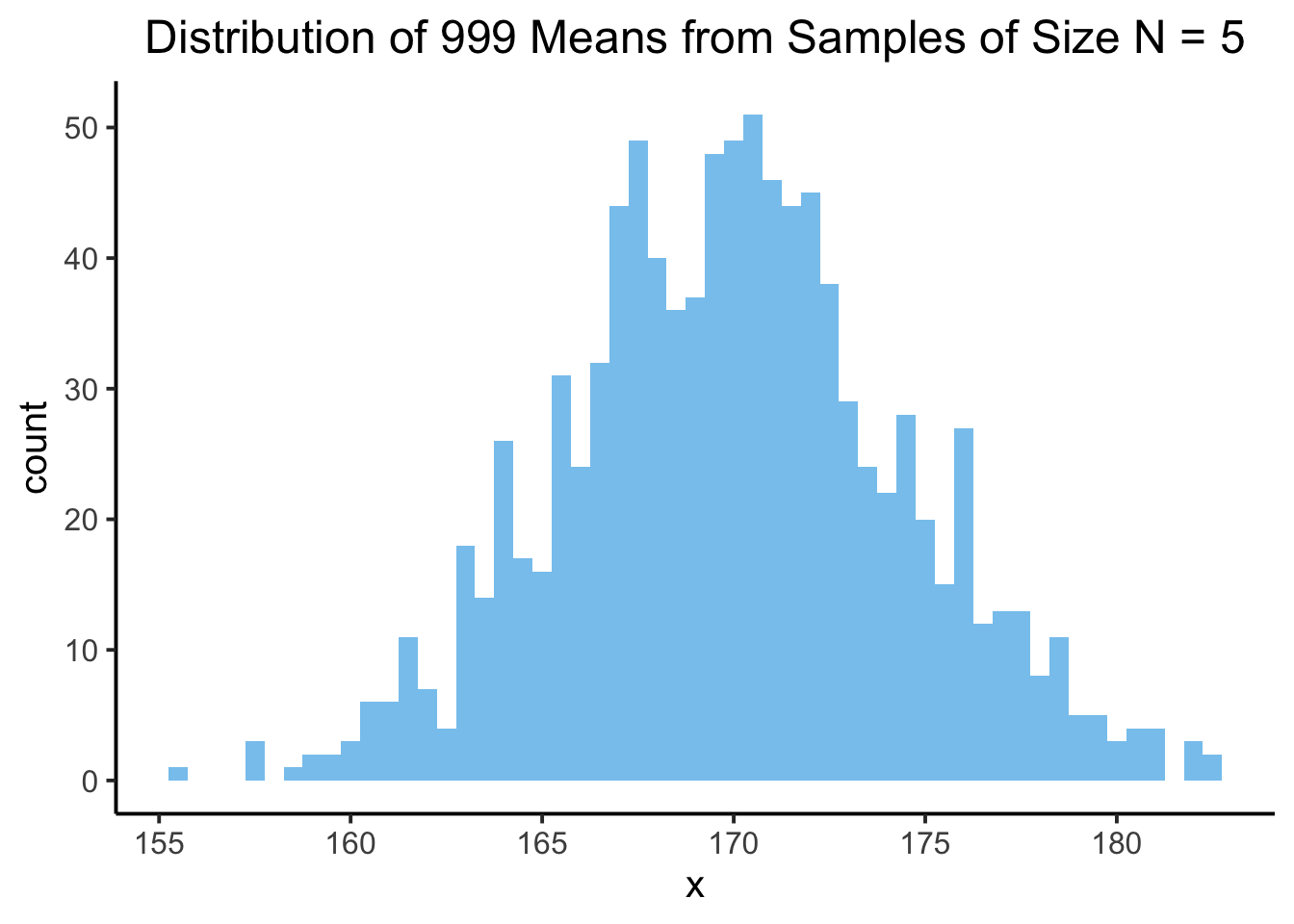
Notice how this RV \(\overline{X}_N\) is itself a Random Variable, with some distribution! We can actually use R again to visualize this separate distribution, of the number we get when we compute the mean of \(N\) samples:
Sample #1: 162.51, 151.24, 166.77, 163.45, 161.84
Mean = 161.16
Sample #2: 175.28, 165.1, 182.1, 168.89, 179.84
Mean = 174.24
Sample #3: 159.99, 164.23, 159.36, 163.04, 167.38
Mean = 162.8
And if we repeat this 999 times, we’ll get 999 different sample means: that is, 999 different realized values of \(\overline{X}_N\) (here we display only the first 100 of these realized values, for brevity):
If we plot the distribution of these values, we get a different distribution from the above. This time, it’s a sampling distribution! It’s a distribution of the averages we get when we sample from the population distribution:
Code
sample_mean_df <-tibble(x=sample_means)sample_plot <- sample_mean_df |>ggplot(aes(x=x)) +geom_histogram(binwidth=0.5,fill=cb_palette[2],alpha=0.75 ) +theme_classic(base_size=15) +labs(title="Distribution of 999 Means from Samples of Size N = 5") +theme(plot.title =element_text(hjust=0.5))sample_plot
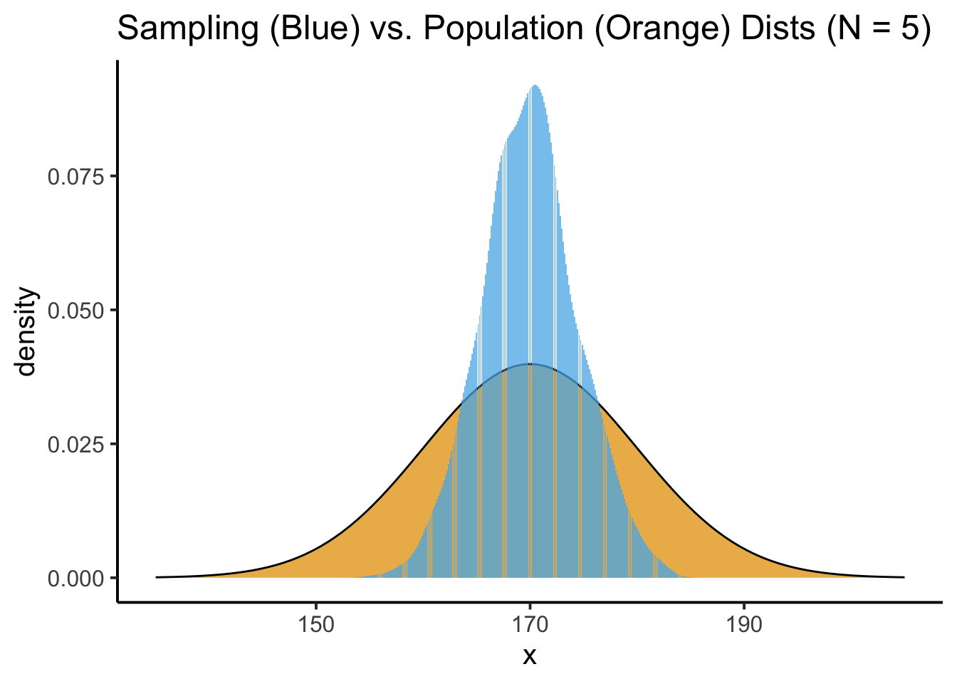
By overlaying this sampling distribution on top of the population distribution (though remember, again, that in the real world we’re never going to be able to discover this “true” population distribution), we can start to see what’s going on:
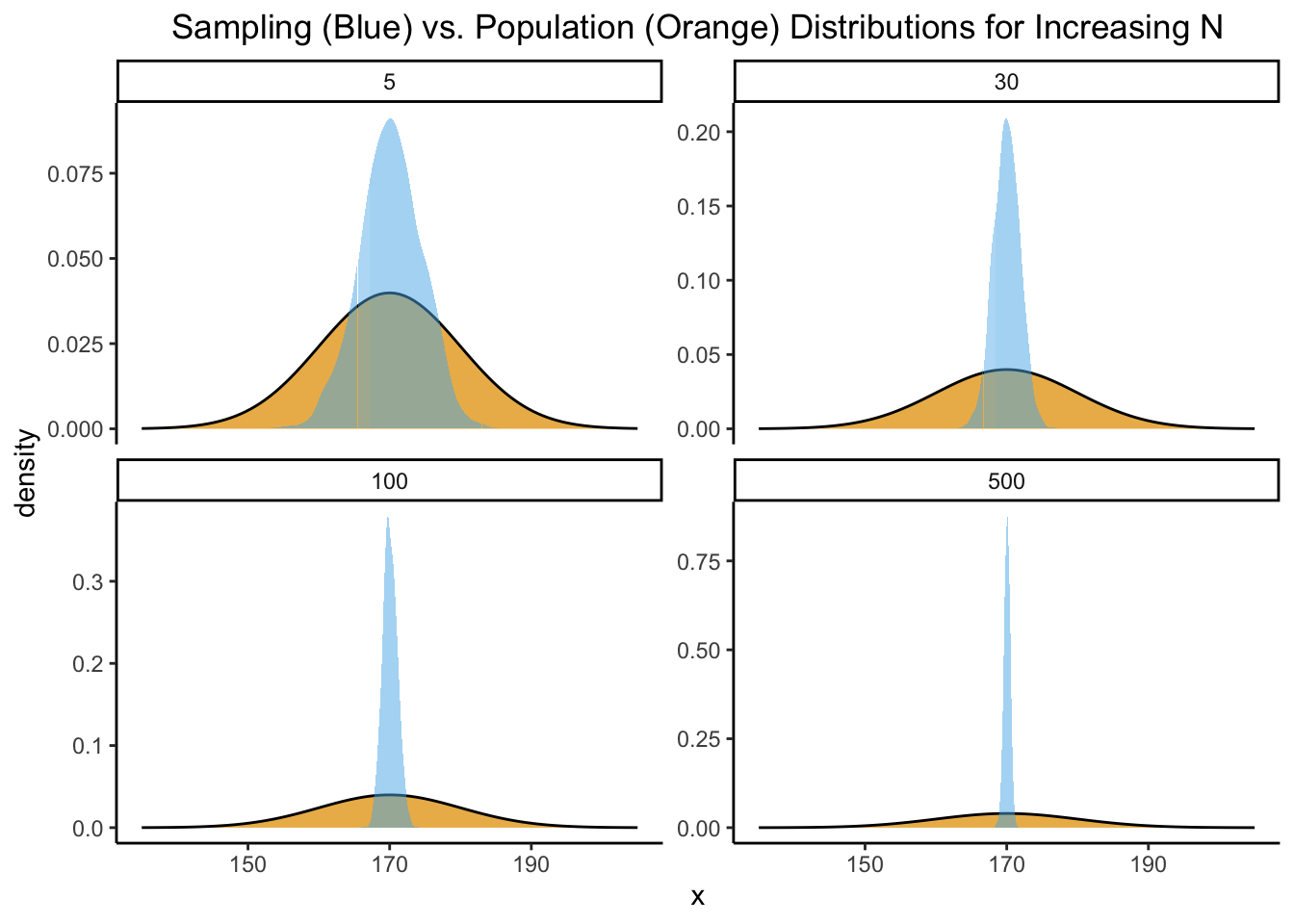
The values we’re getting for the sample mean, in blue here, vary around the true mean that we’re trying to estimate. And, intuitively, if we have the resources to take bigger samples (e.g., more time to ask more than \(N = 5\) people), this should give us even more accurate estimates of the population mean, which is what we indeed find in our simulation:
The two key theorems of sampling theory therefore describe (along with formal mathematical proofs) what we can see intuitively from the four plots above: that is, what happens to this RV as \(N\) gets bigger and bigger (goes towards \(\infty\)):
The Law of Large Numbers tells us that the middle of the blue sampling distribution will converge to the population mean\(\mu\).
It says in essence that we can pick any really small value \(\varepsilon\), and then, regardless of what particular small value we pick, the probability that \(\overline{X}\) is more than \(\varepsilon\) away from the (assumed) “true” mean value \(\mu\) goes to 0 as we take more and more samples: \(\Pr\left(|\overline{X} - \mu| > \varepsilon\right) \rightarrow 0\) as \(N \rightarrow \infty\).
The Central Limit Theorem gives us more specifics about the shape of the blue sampling distribution, and about how quickly the convergence guaranteed by the LLN will proceed.
It says that the blue sampling distribution will specifically be a Normal distribution, whose mean will be \(\mu\) and whose standard deviation will be \(\sigma / \sqrt{N}\). In symbols: \(\overline{X}_{N} \sim \mathcal{N}\left(\mu, \frac{\sigma}{\sqrt{N}}\right)\). The presence of \(N\) in the standard deviation is why we see the blue sampling distribution getting thinner and thinner above: as we raise \(N\), \(\sigma\) stays the same but \(\sqrt{N}\) gets bigger and bigger, which makes the overall standard deviation term get smaller and smaller!
Having built up to these two key theorems, we can now perform statistical hypothesis testing! Because, we can:
Take any specific sample we happen to have, \(\{X_1 = x_1, X_2 = x_2, \ldots, X_n = x_n\}\), and
Compare it to the expected shape of the sampling distribution under some hypothesis!
Continuing our above example, if we think that the “true” mean height of Georgetown students is \(\mu = 170\text{cm}\), we can take a sample of \(N\) Georgetown students and compare the mean height value of this particular sample with the distribution of mean height values that a population distribution with \(\mu = 170\text{cm}\) would generate.
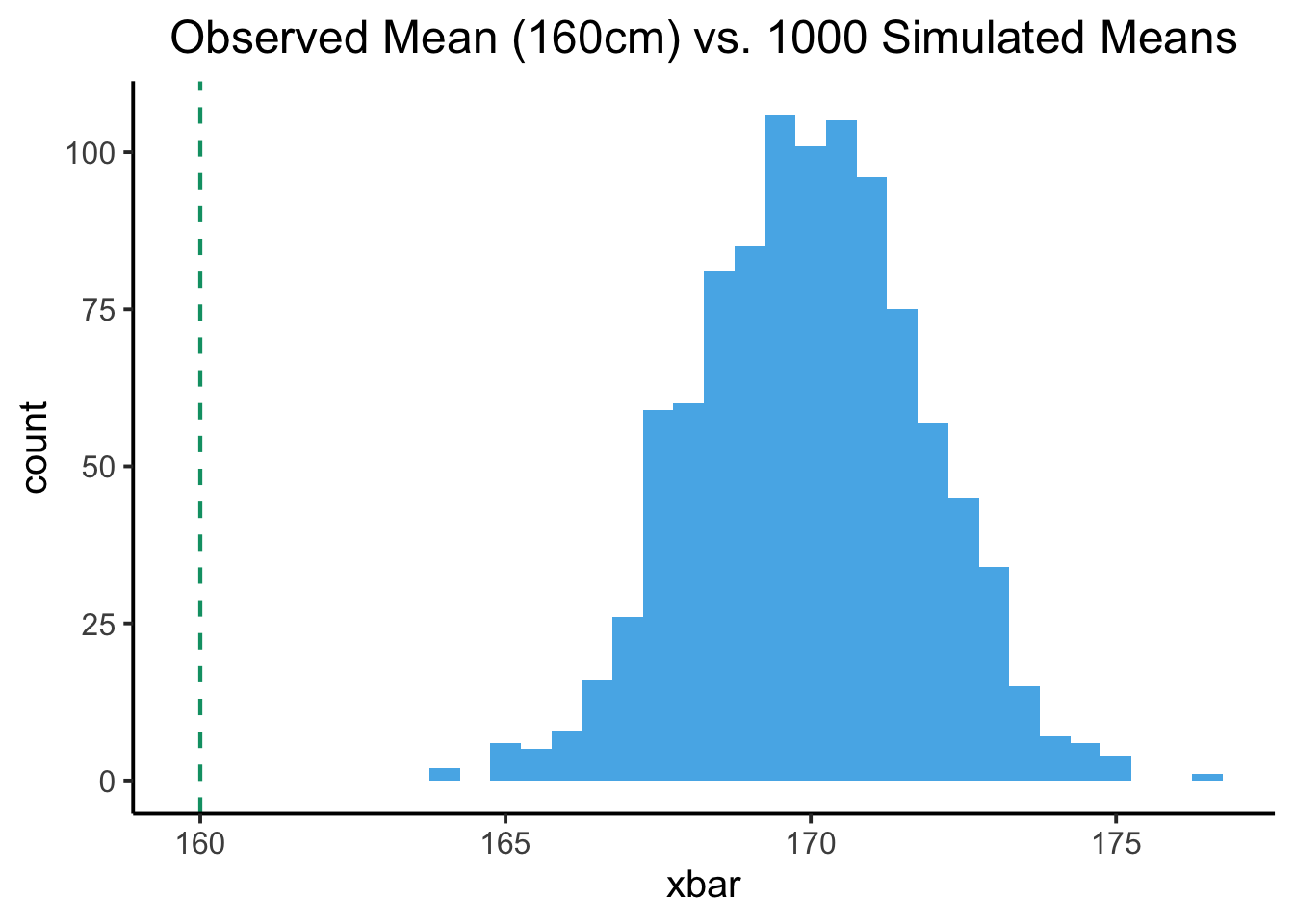
For example, if we take a sample of \(N = 30\) Georgetown students, and find that the mean height of these 30 students is 160cm, we can “test” how likely it is that this particular mean height value would arise relative to our working hypothesis that the “true” population mean is \(\mu = 170\text{cm}\)… just take the blue distribution from the \(N = 30\) plot above, and check where 160cm falls relative to this distribution! Here’s what this looks like:
The vertical (dashed) green line in this plot is the mean we actually obtained from our sample of 30 students. The blue histogram represents all of the means we got when we simulated taking a sample of size \(N = 30\) from the hypothesized population distribution \(\mathcal{N}(170, 10)\)… and what it tells us is that the mean we actually observed is not very likely to arise from our hypothesized population… Meaning, in turn, that we decrease our confidence in our hypothesis, relative to whatever our confidence was before we collected this sample!
Part 2: “Naïvely” Generalizing to the Spatial-Statistical Setting
The next idea is that, if we want to statistically test hypotheses about observed spatial distributions, we’d like an equivalent to the above normal distribution for the two-dimensional spatial settings (Random Fields) we analyze in this course!
In the same way that we just tested our observed mean of \(160\text{cm}\) against the range of means we would expect to see under some hypothesis, we’d like to test observed point patterns against some range of expected point patterns under some hypothesis. In this case, rather than a hypothesis about the mean\(\mu\), let’s start with a hypothesis about the first spatial statistic we learned in Week 7, namely, Moran’s \(I\)! Let’s say we think there is a propensity for points to cluster together very tightly, so that although the specific cluster patterns may vary slightly from year to year, we think that the underlying population autocorrelation \(I\) is close to \(1.0\).
The reason for “overthinking” the Poisson process at this point is, we’re going to need to think about how we might falsify this hypothesis2.
Like we did above for the simpler “one-dimensional” hypothesis about the population mean height, we’ll subject our hypothesis \(\mathcal{H} = [I \approx 1]\) to falsification testing by developing a “null model”: a model of what a world where our hypothesis is wrong would look like.
With this “null model” in hand, we can then simulate what not-high spatial autocorrelation would look like within the same spatial domain. In fact, since the null model is a generative model, we can use it to generate as many worlds-where-my-hypothesis-is-false as we’d like! Above we arbitrarily chose to stop after we had generated 999 such worlds, and we’ll do the same for most examples in this course.
Once we have these 999 simulated null-world patterns, we can compute a Moran’s \(I\) value for each, producing \(\{I_1, I_2, \ldots, I_{999}\}\), which we call the “null distribution” of our “test statistic” \(I\). We then compare\(I_{\text{obs}}\) with these 999 simulated \(I\) values:
If we find that the observed autocorrelation value \(I_{\text{obs}}\), calculated with respect to the point pattern we actually saw, is sufficiently different from the range of \(I\) values \(\{I_1, I_2, \ldots, I_{999}\)} that we calculated from the simulated patterns, we should3increase our confidence in the idea that the underlying spatial pattern is indeed one with high autocorrelation (relative to our confidence before carrying out this test)
If we find that the observed autocorrelation value \(I_{\text{obs}}\), calculated with respect to the point pattern we actually saw, is not very different from the range of \(I\) values \(\{I_1, I_2, \ldots, I_{999}\)} that we calculated from the simulated patterns, we should decrease our confidence in the idea that the underlying spatial pattern is indeed one with high autocorrelation (relative to our confidence before carrying out this test)
So, if we observed (say) \(N_{\text{obs}} = 60\) points in some region, and we’re hypothesizing that the underlying micro-level process generating these points is one with the property of high autocorrelation… our instinct may very reasonably be: “Cool! Let’s go generate 999 point patterns, each with \(N = 60\) points spread randomly across the same region!”
There is, unfortunately, a big red flag inherent in this approach that we need to train our brains to notice. The issue with this approach, that makes it inappropriate as a null model for most spatial data analyses, is extremely subtle but extremely important as we move forward with our spatial data analysis unit! It boils down to where exactly we think the “randomness” is happening in the “random spatial process”.
To move from the above intuitive-but-deficient approach to the notion of Complete Spatial Randomness (CSR) that is the “standard” null model for spatial data, let’s follow Sections 5.2 and 5.3 (pages 128 to 137) of Baddeley, Rubak, and Turner (2015) by moving slowly, starting from the simplest possible point process.
Part 3: What Kind(s) of Spatial Randomness Do We Want to Model?
Model 😐: Uniform Point Process
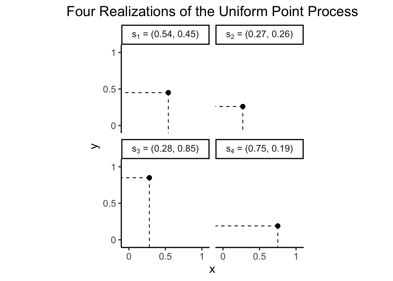
To start, consider the simplest possible point process we can imagine: just taking some 2D shape like a (unit) square and placing a single point randomly within it. If we place our unit square in the first quadrant of the Cartesian plane, then to generate a random point \(\mathbf{s}_0\) within this square we literally just need to generate a random \(x\) coordinate \(X \sim \mathcal{U}[0,1]\) and a random \(y\) coordinate \(Y \sim \mathcal{U}[0,1]\), as in the following plot:
Code
library(latex2exp)set.seed(6862)x_coords <-runif(n =4, min =0, max =1) |>round(2)y_coords <-runif(n =4, min =0, max =1) |>round(2)rand_point_df <- tibble::tibble(index=1:4,x=x_coords,y=y_coords)rand_point_df <- rand_point_df |>mutate(point_tex_str =paste0('$s_', index,'$' ),point_prob_tex_str =paste0('$\\Pr(s=s_', index,') = 0$' ),label_tex_str =paste0( point_tex_str,' = (', x,", ", y,")" ))rand_point_df$point_tex <-as.list(TeX(rand_point_df$point_tex_str))rand_point_df$point_prob_tex <-as.list(TeX(rand_point_df$point_prob_tex_str))rand_point_df |>select(index, x, y, point_tex_str)
Now, if we take this and try to generalize it into a probabilistic model, we should at minimum be able to ask a question like, what’s the probability of getting this particular point (or any other point in the unit square, but, we have a specific example above we can work with for concreteness). From previous probability and statistics courses you might know that the answer is… zero! When working in continuous spaces like the unit square, we actually can’t compute probabilities for individual, infinitesimally-small points.
So, given this limitation, when we are working with probabilities in continuous spaces we employ a simple but powerful “trick” that ends up unlocking the whole world of continuous probability distributions: we shift away from thinking about probabilities of points and instead think about probabilities of areas: unlike the question
“What is the probability that a randomly-generated point \(\mathbf{s}\) in \(D\) appears at the exact coordinates\((x,y) \in D\)?”,
which always has the answer 0, we instead ask
“What is the probability that a randomly-generated point \(\mathbf{s}\) in \(D\) appears within some area\(A \subseteq D\)?”,
which has a well-formed, meaningful answer! An answer that we can therefore use, for example, to identify subregions of \(D\) with higher and lower densities of points (the thing we’ve been hoping to do all along, since these subregions represent areas with clusters of points!)
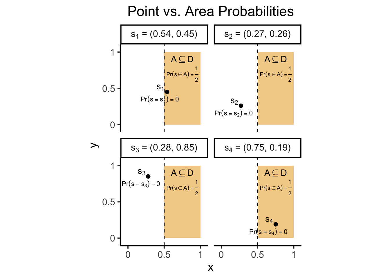
For example, the following plot illustrates how we can meaningfully ask the question
“What is the probability that a randomly-generated point in \(D\) appears in the right half of \(D\)?”,
to obtain the answer \(\frac{1}{2}\), as the proportion of the area covered by \(A\) to the total area of our working domain \(D\) (in this case, the total area of the unit square, which is 1).
This notion, that we can only meaningfully ask about the probability of a point falling within some area, is key to why the next model (which is in fact the “intuitive” model from earlier) fails as a workable null model for spatial data science.
Model 🤔: Binomial Point Process
Now, if we want to develop a process which can generate more than one point, a natural approach might be to just run the above process \(N\) times. That is, we might fix a number of points \(N\) in advance, and then generate coordinates for each of the \(N\) points uniformly within \(D\)… Does that sound familiar? That is exactly the “intuitive” null model we came up with above, as a way of testing the “randomness” (as opposed to “clustered-ness” or “regular-ness”) of some observed collection of points!
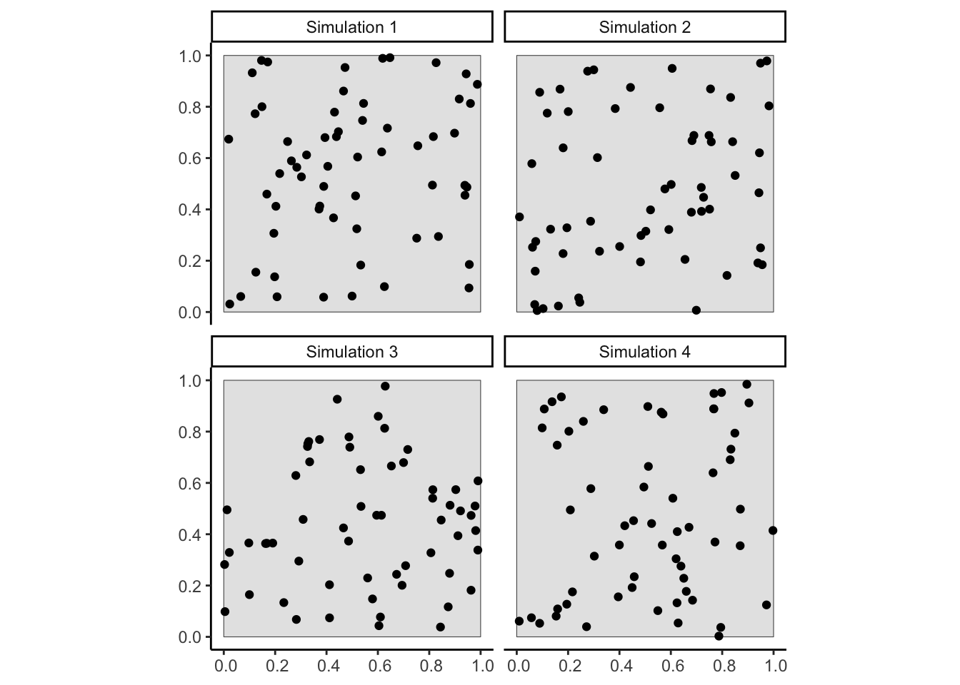
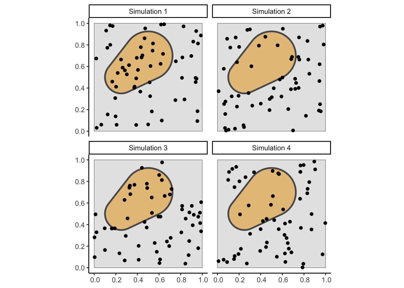
The following figure generates four point patterns using this process, with \(N\) set to be \(60\):
Code
library(tidyverse) |>suppressPackageStartupMessages()library(sf) |>suppressPackageStartupMessages()library(spatstat) |>suppressPackageStartupMessages()window_to_sf <-function(ppp_obj) { window_sf <- sf::st_as_sf(ppp_obj) |>filter(label =="window")return(window_sf)}points_to_sf <-function(ppp_obj) { points_sf <- sf::st_as_sf(ppp_obj) |>filter(label =="point")return(points_sf)}sim_points_to_sf <-function(ppp_obj, sim_index, label_num_points=FALSE) {# Extract points from ppp object points_sim_sf <-points_to_sf(ppp_obj)# Add *sim_index* as an additional column. If# label_num_points is TRUE, also add the number# of generated points to the sim column labels sim_label <-ifelse( label_num_points,paste0(sim_index, ": N = ", nrow(points_sim_sf)), sim_index ) points_sim_sf <- points_sim_sf |>mutate(sim_label = sim_label,sim_N =nrow(points_sim_sf) )return(points_sim_sf)}sim_list_points_to_sf <-function(ppp_list_obj, label_num_points=FALSE) {# This produces a *list* of sf objects points_sf_list <-imap( ppp_list_obj, \(x, idx) sim_points_to_sf(x, idx, label_num_points) )# And this concatenates the list elements (by row)# together to produce a single combined sf object all_points_sf <-bind_rows(points_sf_list)return(all_points_sf)}set.seed(6805)binom_ppp_sims <- spatstat.random::rpoint(60, nsim=4)win_sf <-window_to_sf(binom_ppp_sims[[1]])points_sf <-sim_list_points_to_sf(binom_ppp_sims)ggplot() +geom_sf(data=win_sf ) +geom_sf(data=points_sf,size=1.5 ) +theme_classic() +facet_wrap(vars(sim_label),nrow=2, ncol=2 )
Figure 1: Four individual realizations of the Binomial Point Process described in this section
Why is it called the Binomial Point Process? Recall our above intuition, that we can only obtain meaningful probabilities if we ask about the likelihood of points falling within areas. This means that any probabilistic point model where points are generated within a continuous space \(D\) must provide answers to the question “Given some area \(A \subseteq D\), What is the probability that a point appears in \(A\)?” So, if we ask this question after running our Uniform Point Process from earlier a bunch of times (producing point patterns like those plotted in Figure 1) fixing some region \(A\), we end up with the Binomial PDF:
\[
\Pr(\mathbf{s} \in A) = \binom{N}{k}p^{k}(1-p)^{N-k}
\]
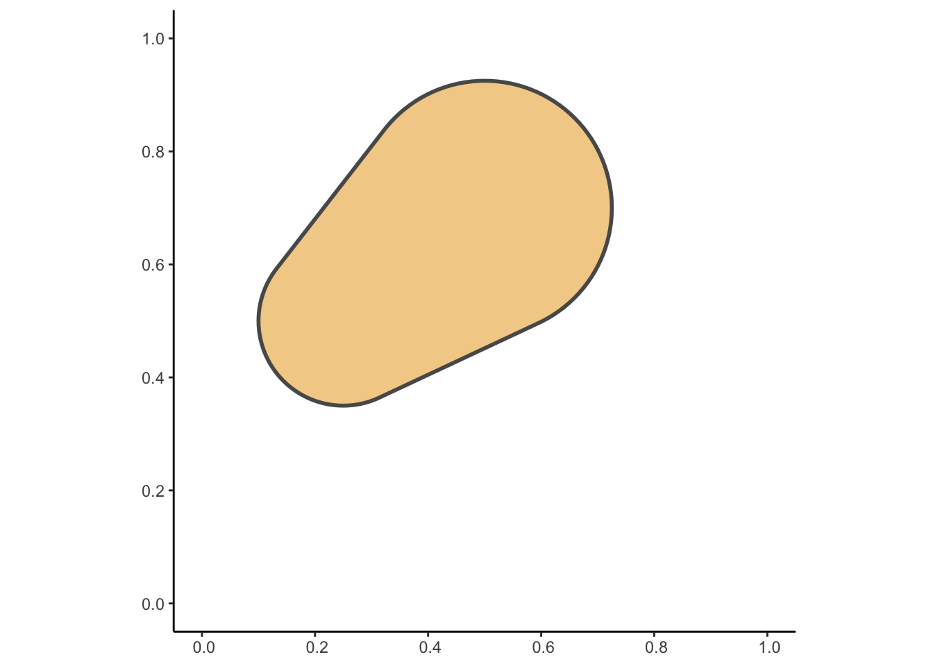
For visual intuition of why we arrive at this formula, we can re-run the process four times as we did above, but this time consider asking the question of how many points we expect to see within a specific shaded (orange) region\(A\), constructed and visualized on its own in the following figure:
Code
library(sf) |>suppressPackageStartupMessages()# One circle with large radius at (0.5, 0.7), plus# a circle with smaller radius at (0.25, 0.5)cent_df <- tibble::tribble(~x, ~y, ~r,0.5, 0.7, 0.225,0.25, 0.5, 0.15,)# Convert from df to sfcent_sf <- sf::st_as_sf( cent_df,coords=c('x','y'))# Use st_buffer to "transform" from points to circles# with desired radiibuf_sf <- sf::st_buffer( cent_sf,dist=cent_sf$r)# Compute the *union* of the two circlesunion_sf <- sf::st_union(buf_sf)# Transform into a single combined shape via st_convex_hullhull_sf <- sf::st_convex_hull(union_sf)# Print out the area of this final shapeprint(sf::st_area(hull_sf))
[1] 0.2381532
Code
# And plot it in the Cartesian planeggplot() +geom_sf(data=hull_sf,fill=cb_palette[1],linewidth=1,alpha=0.5 ) +xlim(0, 1) +ylim(0, 1) +theme_classic()
And then overlaid with the points from our Binomial patterns generated earlier:
Figure 2: The same four realizations of the Binary Point Process in Figure 1, but where the goal is now to model the probability (for each \(k\) between 0 and 60) that exactly \(k\) out of the \(N\) generated points lie within the shaded subregion \(A\). The mathematical formula for this probability turns out to be precisely the probability mass function (pmf) of the Binomial distribution, \(\Pr(K = k) = \binom{N}{k}p^k(1-p)^{N-k}\).
Intuitively, since the area of \(A\) is about \(0.238\), while the area of \(D\) is \(1\), the probability that a randomly (uniformly) generated point within \(D\) will fall within \(A\) is \(p = \frac{|A|}{|D|} = \frac{0.238}{1} = 0.238\), which thus serves as our value for \(p\) in this binomial pmf. This linkage with the Binomial distribution also means that we expect \(\mathbb{E}[K] = Np = N \cdot \frac{|A|}{|D|}\) points to lie within \(A\). Since \(N = 60\) here, we expect \(60 \cdot \frac{0.238}{1} \approx 14.28\) points within this particular shaded region.
This is almost what we want, in order to have a null model for 2D spatial data that mirrors the null model for “1D” data we saw above in Part 1.
However, there is one thing wrong with this Binomial Point Process model, which we didn’t encounter with the Normal distribution above: namely, that for the points-appearing-in-areas-probabilities to be completely random, we need the property that
For any two disjoint regions \(R_1 \subseteq D\) and \(R_2 \subseteq D\), the probability \(\Pr(K_R = k)\) that we’re aiming to model – in words, the probability that \(k\) points appear in region \(R\) – should be independent!
If we rephrase this to focus on what “independence” means for Random Variables: learning that there are \(k_1\) points in a region \(R_1\) (that is, learning that the random variable \(K_1\) has been realized as the integer \(k_1\)) should not give us any information about how many points are in \(R_2\).
But, unfortunately for us, we only need to pick one subregion \(R\) of \(D\) to immediately see why the Binomial Point Process violates this independence property:
If we learn that there are \(k_1\) points in a subregion \(R_1\), we actually immediately learn something about another subregion: \(D \setminus R_1\), the remaining portion of \(D\) that is not within \(R_1\)!
Using our grey square \(D\) and orange blob region \(A\) from above, for example, if we learn (for a given realization) that 50 of the 60 total points are contained within the orange-shaded region, then we’ve actually immediately learned with certainty that there are exactly 10 points in the region outside of\(A\)!
What we’d really like, for a model of random and independent appearances of events (as spatial points within a larger domain \(D\)), is a model with the property that learning the number of points in one portion of the domain does not provide any information about the number of points in other portions. Is this even possible? Are we perhaps doomed by some fact of geometry, so that any point process we can think of will have this dependence property? The answer, thankfully, is no! We can come up with a point process which, though it looks similar to the Binomial Point Process at first glance, in fact does satisfy the independence property we are looking for. And that magical point process is the Poisson Point Process 🥳
WarningQuick But Important Disclaimer: The ‘Right’ Null Model for What?
Here, now that we see the main issue with the Binomial Point Process, and before we move on to its resolution via the Poisson distribution, it’s important to note one “corner case”:
If the phenomenon you’re trying to model actually does involve exactly \(N\) points moving around in an enclosed space – meaning, you have a case where no matter how many time the process is run, you always end up with \(N\) points (e.g., a 1-meter-by-1-meter box where rats are trapped and each realization is a measurement of the rats’ positions after \(t\) seconds) – then the Binomial Point Process is the proper null model!
However, excepting this very specific case, the Poisson Point Process is almost always the null model you want to use, for reasons described in the next section! (e.g., if the 1-by-1 rat-box example is modified so that rats can leave or enter the box between one realization and the next, then you’re back to a case where the PPP is likely the null model you want to use)
Part 4: Saved by the Poisson Distribution!
The gist, the core property that illustrates why the Poisson Point Process magically “fixes” the issues with the Binomial Point Process mentioned above, is simply the following:
The probability of finding \(k\) points within a chosen region \(R\) will now be modeled as a random process that depends only on the area of \(R\) relative to the larger domain \(D\).
This approach, at first, probably sounds horrifically complex – at a high level it feels like we’d have to figure out some fancy fractal-based way to “scale” the Binomial distribution probabilities for randomly-chosen regions \(R\) up and down based on the ratio of \(|R|\) to \(|D|\).
In fact, however, this French guy already wrestled with precisely this issue in the early 1800s, and worked out the scary math “under the hood” so that today we get to just use the resulting distribution that’s named after him, the Poisson Distribution!
Model 🤩: Poisson Point Process
The intuition for the Poisson distribution (before we apply it to come up with a point process) is just that, as you may have learned in an earlier stats class, it is a probabilistic model of the number of “successes” in an extremely large number of independent trials, each of which has an extremely low success probability.
In other words (as you may have learned in a slightly-more-intense statistics class), the Poisson distribution can be thought of as the limiting distribution that you get if you start with the Binomial distribution but take the limit as the number of trials\(N \rightarrow \infty\) while simultaneously the probability of success\(p \rightarrow 0\).
Why does this help us model subregions of \(D\) independently from one another? The following diagram, from page 134 of Baddeley, Rubak, and Turner (2015), visualizes how an “independent set of trials with rare success probability” might appear in a spatial setting: if we treat each infinitesimally-small grid cell here as a “trial”, with a \(1\) in the grid cell in the very rare case that an event occurs within that cell, and a \(0\) otherwise, the Poisson distribution then “emerges” as the probabilistic model of the number of points \(k\) appearing in \(R\) if we know that events happen across the domain \(D\) at a rate of \(\lambda\) points per unit area. In particular, since we’re modeling the random appearance of points in a subregion \(R \subseteq D\) as being proportional to the area of \(R\), we’ve arrived at the Poisson Point Process with the rate parameter \(\lambda\) set to be the portion of \(D\)’s total area that is taken up by \(R\): \(\lambda = \frac{|R|}{|D|}\)!
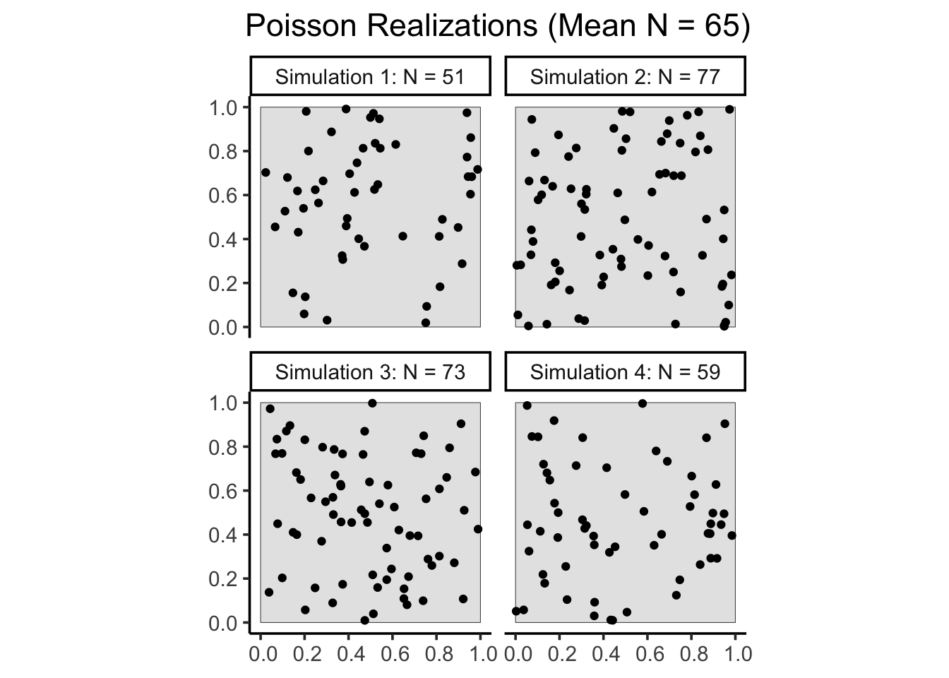
So, equipped with this new ability that the Poisson distribution gives us – the ability to model the rate of event occurrence within a region \(R\) as being proportional to the area of \(R\) – we can now use the rpoispp() function from spatstat to implement the (in most cases) “appropriate” null model for a spatial process, wherein events (points) occur in a given area in a manner that is independent of the occurrence of events in other areas. Four realizations of this final Poisson Point Process model are given below, though you will generate many more throughout your adventures in spatial hypothesis testing!
Code
library(spatstat) |>suppressPackageStartupMessages()set.seed(6805)pois_ppp_list <- spatstat.random::rpoispp(lambda=60, nsim=4)pois_win_sf <-window_to_sf(pois_ppp_list[[1]])pois_points_sf <-sim_list_points_to_sf( pois_ppp_list,label_num_points=TRUE)# Compute the mean number of points across the four# realizationsmean_N <- pois_points_sf |> sf::st_drop_geometry() |>group_by(sim_label) |>summarize(first_N =first(sim_N)) |>summarize(mean_N =mean(first_N))ggplot() +geom_sf(data=pois_win_sf ) +geom_sf(data=pois_points_sf ) +theme_classic(base_size=14) +facet_wrap(vars(sim_label),nrow=2, ncol=2 ) +labs(title=paste0("Poisson Realizations (Mean N = ", mean_N,")" ) ) +theme(plot.title =element_text(hjust=0.5))
In slightly more detail, in the context we’ve set up, this assumption of a “well-defined” mean \(\mu\) is saying that \(\mathbb{E}[X_i] = \mu\), i.e., that the most likely value, the specific numeric value we most “expect” to see when \(X_i\) is realized, is the value \(\mu\).↩︎
This is not specific to spatial statistics, or even statistics in general – it’s the foundation of the so-called “Popperian” scientific method, which Jeff needs to not rant about here 😜↩︎
The word “should” might feel weird here, as a normative/prescriptive term suddenly appearing in the middle of a descriptive statistical procedure – in Bayesian statistics, though, we actually have a good reason for using “should”: any other rule we might use for evaluating hypotheses is provably “sub-optimal”, at least in the narrow sense that we’ll make worse predictions in the future. This is true, sadly, even for the “standard” hypothesis test setup you may have learned, where you “reject” or “fail to reject” the null hypothesis: we can do better in terms of future predictions by converting “reject” into “decrease my belief by an amount determined by Bayes’ Rule” and “fail to reject” into “increase my belief by an amount determined by Bayes’ Rule”! You can find proofs and applications and etc. in Jaynes (2002)↩︎