Code
source("../dsan-globals/_globals.r")DSAN 5650: Causal Inference for Computational Social Science
Summer 2026, Georgetown University
Today’s Planned Schedule:
| Start | End | Topic | |
|---|---|---|---|
| Lecture | 6:30pm | 7:00pm | Final Project Templates → |
| 7:00pm | 7:30pm | Propensity Score Weighting → | |
| 7:30pm | 8:00pm | Regression Discontinuity → | |
| Break! | 8:00pm | 8:10pm | |
| 8:30pm | 9:00pm | Violations of Causal Inference Axioms in NLP and Network Analysis → |
source("../dsan-globals/_globals.r")\[ \DeclareMathOperator*{\argmax}{argmax} \DeclareMathOperator*{\argmin}{argmin} \newcommand{\bigexp}[1]{\exp\mkern-4mu\left[ #1 \right]} \newcommand{\bigexpect}[1]{\mathbb{E}\mkern-4mu \left[ #1 \right]} \newcommand{\definedas}{\overset{\small\text{def}}{=}} \newcommand{\definedalign}{\overset{\phantom{\text{defn}}}{=}} \newcommand{\eqeventual}{\overset{\text{eventually}}{=}} \newcommand{\Err}{\text{Err}} \newcommand{\expect}[1]{\mathbb{E}[#1]} \newcommand{\expectsq}[1]{\mathbb{E}^2[#1]} \newcommand{\fw}[1]{\texttt{#1}} \newcommand{\given}{\mid} \newcommand{\green}[1]{\color{green}{#1}} \newcommand{\heads}{\outcome{heads}} \newcommand{\iid}{\overset{\text{\small{iid}}}{\sim}} \newcommand{\lik}{\mathcal{L}} \newcommand{\loglik}{\ell} \DeclareMathOperator*{\maximize}{maximize} \DeclareMathOperator*{\minimize}{minimize} \newcommand{\mle}{\textsf{ML}} \newcommand{\nimplies}{\;\not\!\!\!\!\implies} \newcommand{\orange}[1]{\color{orange}{#1}} \newcommand{\outcome}[1]{\textsf{#1}} \newcommand{\param}[1]{{\color{purple} #1}} \newcommand{\pgsamplespace}{\{\green{1},\green{2},\green{3},\purp{4},\purp{5},\purp{6}\}} \newcommand{\pedge}[2]{\require{enclose}\enclose{circle}{~{#1}~} \rightarrow \; \enclose{circle}{\kern.01em {#2}~\kern.01em}} \newcommand{\pnode}[1]{\require{enclose}\enclose{circle}{\kern.1em {#1} \kern.1em}} \newcommand{\ponode}[1]{\require{enclose}\enclose{box}[background=lightgray]{{#1}}} \newcommand{\pnodesp}[1]{\require{enclose}\enclose{circle}{~{#1}~}} \newcommand{\purp}[1]{\color{purple}{#1}} \newcommand{\sign}{\text{Sign}} \newcommand{\spacecap}{\; \cap \;} \newcommand{\spacewedge}{\; \wedge \;} \newcommand{\tails}{\outcome{tails}} \newcommand{\Var}[1]{\text{Var}[#1]} \newcommand{\bigVar}[1]{\text{Var}\mkern-4mu \left[ #1 \right]} \]

HERO or VILLAIN)library(tidyverse) |> suppressPackageStartupMessages()
rug_df <- read_csv("assets/rugged_data.csv", show_col_types=FALSE)
# Compute Box-Cox params
bc_params <- car::powerTransform(
object = cbind(
rug_df$rgdppc_2000,
rug_df$rugged
)
)
rug_df <- rug_df |> mutate(
continent = ifelse(cont_africa == 1, "African", "Non-African"),
gdpc_transformed = rgdppc_2000_m ^ bc_params$lambda[1],
rugged_transformed = rugged ^ bc_params$lambda[2],
)
rug_df |> ggplot(aes(
x = rugged_transformed,
y = gdpc_transformed
)) +
geom_text(aes(label=isocode), size=3) +
geom_smooth(method="lm", fullrange=TRUE) +
facet_wrap(~ continent) +
theme_classic() +
theme(
panel.background = ggplot2::element_rect(fill='transparent'),
plot.background = ggplot2::element_rect(fill='transparent', color=NA),
plot.title = element_text(hjust=0.5),
) +
labs(
title="Differential Effects of Ruggedness by Continent",
x="Terrain Ruggedness",
y="Log GDP Per Capita, 2000",
)

library(tidyverse)
library(Rlab)
Rlab 4.5.1 attached.
Attaching package: 'Rlab'The following object is masked from 'package:dplyr':
countThe following object is masked from 'package:tibble':
viewThe following objects are masked from 'package:stats':
dexp, dgamma, dweibull, pexp, pgamma, pweibull, qexp, qgamma,
qweibull, rexp, rgamma, rweibullThe following object is masked from 'package:datasets':
precipset.seed(5650)
n <- 250
motiv_vals <- runif(n, 0, 1)
enroll_vals <- ifelse(
motiv_vals < 0.25,
0,
# We know motiv > 0.25
ifelse(
motiv_vals > 0.75,
1,
# We know 0.25 < motiv < 0.75
rbern(n, prob=(motiv_vals - 0.125)*1.5)
)
)Warning in rbinom(n, size = 1, prob = prob): NAs producedncigs_vals <- rbinom(n, size=30, prob=0.6-0.2*enroll_vals)
smoke_df <- tibble(
motiv=motiv_vals,
enroll=enroll_vals,
ncigs=ncigs_vals
)
(smoke_mean_df <- smoke_df |> group_by(enroll) |> summarize(mean_ncigs=mean(ncigs)))| enroll | mean_ncigs |
|---|---|
| 0 | 17.88060 |
| 1 | 12.26724 |
naive_smoke_lm <- lm(ncigs ~ enroll, data=smoke_df)
summary(naive_smoke_lm) |> broom::tidy() |>
select(term, estimate)| term | estimate |
|---|---|
| (Intercept) | 17.880597 |
| enroll | -5.613356 |

smoke_df |> ggplot(aes(x=enroll, y=ncigs)) +
  geom_boxplot(
    aes(group=enroll),
    width=0.5
  ) +
  geom_smooth(
    method='lm',
    formula='y ~ x',
    se=TRUE
  ) +
  geom_point(
    data=smoke_mean_df,
    aes(x=enroll, y=mean_ncigs),
    size=3
  ) +
  theme_dsan(base_size=24) +
  transparent_bg() +
  labs(
    title="Naïve Estimate of Program Effectiveness",
    x="Enrolled?",
    y="Cigarettes Per Day",
  ) +
  scale_x_continuous(breaks=c(0, 1))
eprop_model <- glm(enroll ~ motiv, family='binomial', data=smoke_df)
eprop_preds <- predict(eprop_model, type="response")
smoke_df <- smoke_df |> mutate(pred=eprop_preds)
# Use the preds to compute IPW
smoke_df <- smoke_df |> rowwise() |> mutate(
  ipw=ifelse(enroll, 1/pred, 1/(1-pred))
) |> arrange(pred)
#smoke_df
smoke_df |> mutate(enroll=factor(enroll)) |>
  ggplot(aes(x=motiv, y=ncigs, color=enroll)) +
  geom_point() +
  theme_dsan(base_size=24) +
  labs(title="Before Weighting") +
  transparent_bg()
smoke_df |> mutate(enroll=factor(enroll)) |>
  ggplot(aes(
    x=motiv, y=ncigs, color=enroll, size=ipw,
    alpha=log(ipw-1)
  )) +
  geom_point() +
  guides(alpha="none") +
  theme_dsan(base_size=24) +
  labs(title="After Weighting") +
  transparent_bg()
smoke_df |>
  ggplot(aes(x=motiv)) +
  # Predictions
  geom_point(
    aes(y=enroll, color=factor(enroll))
  ) +
  # Values
  geom_point(
    aes(y=pred, color=factor(enroll))
  ) +
  labs(color="enroll") +
  theme_dsan(base_size=24) +
  transparent_bg() +
  labs(title="Propensity to Enroll")
ipw_min <- min(smoke_df$ipw)
ipw_max <- max(smoke_df$ipw)
smoke_df <- smoke_df |> mutate(
  ipw_scaled = (ipw - ipw_min) / (ipw_max - ipw_min)
)
smoke_df |>
  ggplot(aes(x=motiv)) +
  # Predictions
  geom_point(
    aes(y=enroll, color=factor(enroll))
  ) +
  # Values
  geom_point(
    aes(y=ipw_scaled, color=factor(enroll))
  ) +
  theme_dsan(base_size=24) +
  transparent_bg() +
  labs(
    title="Inverse Probability-of-Treatment Weights (IPTW)",
    color="enroll"
  )
↓

→
↑

lm_with_weights <- lm(ncigs ~ enroll,
  data=smoke_df, weights=smoke_df$ipw
)
summary(lm_with_weights) |> broom::tidy() |>
select(term, estimate, std.error)| term | estimate | std.error |
|---|---|---|
| (Intercept) | 18.10133 | 0.2466712 |
| enroll | -5.66453 | 0.3571696 |
library(WeightIt)
W <- weightit(
  enroll ~ motiv, data = smoke_df, ps="pred"
)
smoke_weighted_lm <- lm_weightit(
  ncigs ~ enroll, data = smoke_df, weightit = W
)
summary(smoke_weighted_lm, ci = FALSE)
Call:
lm_weightit(formula = ncigs ~ enroll, data = smoke_df, weightit = W)

Coefficients:
            Estimate Std. Error z value Pr(>|z|)
(Intercept)  18.1013     0.2479   73.02   <1e-06 ***
enroll       -5.6645     0.5463  -10.37   <1e-06 ***
Standard error: HC0 robustW_default <- weightit(
enroll ~ motiv, data = smoke_df
)
smoke_default_lm <- lm_weightit(
ncigs ~ enroll, data = smoke_df,
weightit = W_default
)
summary(smoke_default_lm, ci = FALSE)
Call:
lm_weightit(formula = ncigs ~ enroll, data = smoke_df, weightit = W_default)

Coefficients:
            Estimate Std. Error z value Pr(>|z|)
(Intercept)  18.1013     0.2441   74.16   <1e-06 ***
enroll       -5.6645     0.5444  -10.41   <1e-06 ***
Standard error: HC0 robust (adjusted for estimation of weights)When one’s margin of victory switches from a negative number to a positive number, we would expect a large, discontinuous, positive jump in the personal wealth of electoral candidates, if serving in office actually financially benefits them. (Imai 2018)
library(tidyverse) |> suppressPackageStartupMessages()
# load the data and subset them into two parties
MPs <- read_csv("assets/mps.csv")
Rows: 427 Columns: 10
── Column specification ────────────────────────────────────────────────────────
Delimiter: ","
chr (4): surname, firstname, party, region
dbl (6): ln.gross, ln.net, yob, yod, margin.pre, margin
ℹ Use `spec()` to retrieve the full column specification for this data.
ℹ Specify the column types or set `show_col_types = FALSE` to quiet this message.MPs |> head()| surname | firstname | party | ln.gross | ln.net | yob | yod | margin.pre | region | margin |
|---|---|---|---|---|---|---|---|---|---|
| Llewellyn | David | tory | 12.13591 | 12.135906 | 1916 | 1992 | NA | Wales | 0.0569040 |
| Morris | Claud | labour | 12.44809 | 12.448091 | 1920 | 2000 | NA | South West England | -0.0497383 |
| Walker | George | tory | 12.42845 | 10.349009 | 1914 | 1999 | -0.0571682 | North East England | -0.0415887 |
| Walker | Harold | labour | 11.91845 | 12.395034 | 1927 | 2003 | -0.0725089 | Yorkshire and Humberside | 0.0232952 |
| Waring | John | tory | 13.52022 | 13.520219 | 1923 | 1989 | -0.2696896 | Greater London | -0.2300058 |
| Brown | Ronald | labour | 12.46051 | 9.631837 | 1921 | 2002 | 0.3409587 | Greater London | 0.3679703 |
library(modelr)
library(tidyr)
library(broom)
Attaching package: 'broom'The following object is masked from 'package:modelr':
bootstrap## load the data
## Subset the data
labour_winners <- filter(MPs, party == "labour", margin > 0)
labour_losers <- filter(MPs, party == "labour", margin < 0)
tory_winners <- filter(MPs, party == "tory", margin > 0)
tory_losers <- filter(MPs, party == "tory", margin < 0)
### the regressions
labour_fit_win <- lm(ln.net ~ margin, data = labour_winners)
labour_fit_lose <- lm(ln.net ~ margin, data = labour_losers)
tory_fit_win <- lm(ln.net ~ margin, data = tory_winners)
tory_fit_lose <- lm(ln.net ~ margin, data = tory_losers)
y1_labour_win <- labour_winners %>%
data_grid(margin) %>%
add_predictions(labour_fit_win)
y2_labour_lose <- labour_losers %>%
data_grid(margin) %>%
add_predictions(labour_fit_lose)
y1_tory_win <- tory_winners %>%
data_grid(margin) %>%
add_predictions(tory_fit_win)
y2_tory_lose <- tory_losers %>%
data_grid(margin) %>%
add_predictions(tory_fit_lose)
## setting the ggplot theme
theme_set(theme_classic(base_size = 22))
## Labour
ggplot() +
geom_point(data = labour_winners,
mapping = aes(x = margin, y = ln.net), shape = 1, alpha=0.6) +
geom_point(data = labour_losers,
mapping = aes(x = margin, y = ln.net), shape = 1, alpha=0.6) +
geom_line(data = y1_labour_win,
mapping = aes(x = margin, y = pred),
color = "blue", size = 1, linewidth=2) +
geom_line(data = y2_labour_lose,
mapping = aes(x = margin, y = pred),
color = "blue", size = 1, linewidth=2) +
geom_vline(xintercept = 0,
linetype = "dashed") +
labs(x = "Margin of victory",
y = "log net wealth at death",
title = "Labour") +
xlim(-0.5, 0.5) +
ylim(6, 18) +
transparent_bg()Warning: Using `size` aesthetic for lines was deprecated in ggplot2 3.4.0.
ℹ Please use `linewidth` instead.
## Tory
ggplot() +
  geom_point(data = tory_winners,
             mapping = aes(x = margin, y = ln.net), shape = 1, alpha=0.6) +
  geom_point(data = tory_losers,
             mapping = aes(x = margin, y = ln.net), shape = 1, alpha=0.6) +
  geom_line(data = y1_tory_win,
            mapping = aes(x = margin, y = pred),
            color = "blue", size = 1, linewidth=2) +
  geom_line(data = y2_tory_lose,
            mapping = aes(x = margin, y = pred),
            color = "blue", size = 1, linewidth=1) +
  geom_vline(xintercept = 0,
             linetype = "dashed") +
  labs(x = "Margin of victory",
       y = "log net wealth at death",
       title = "Tory") +
  xlim(-0.5, 0.5) +
  ylim(6, 18) +
  transparent_bg()
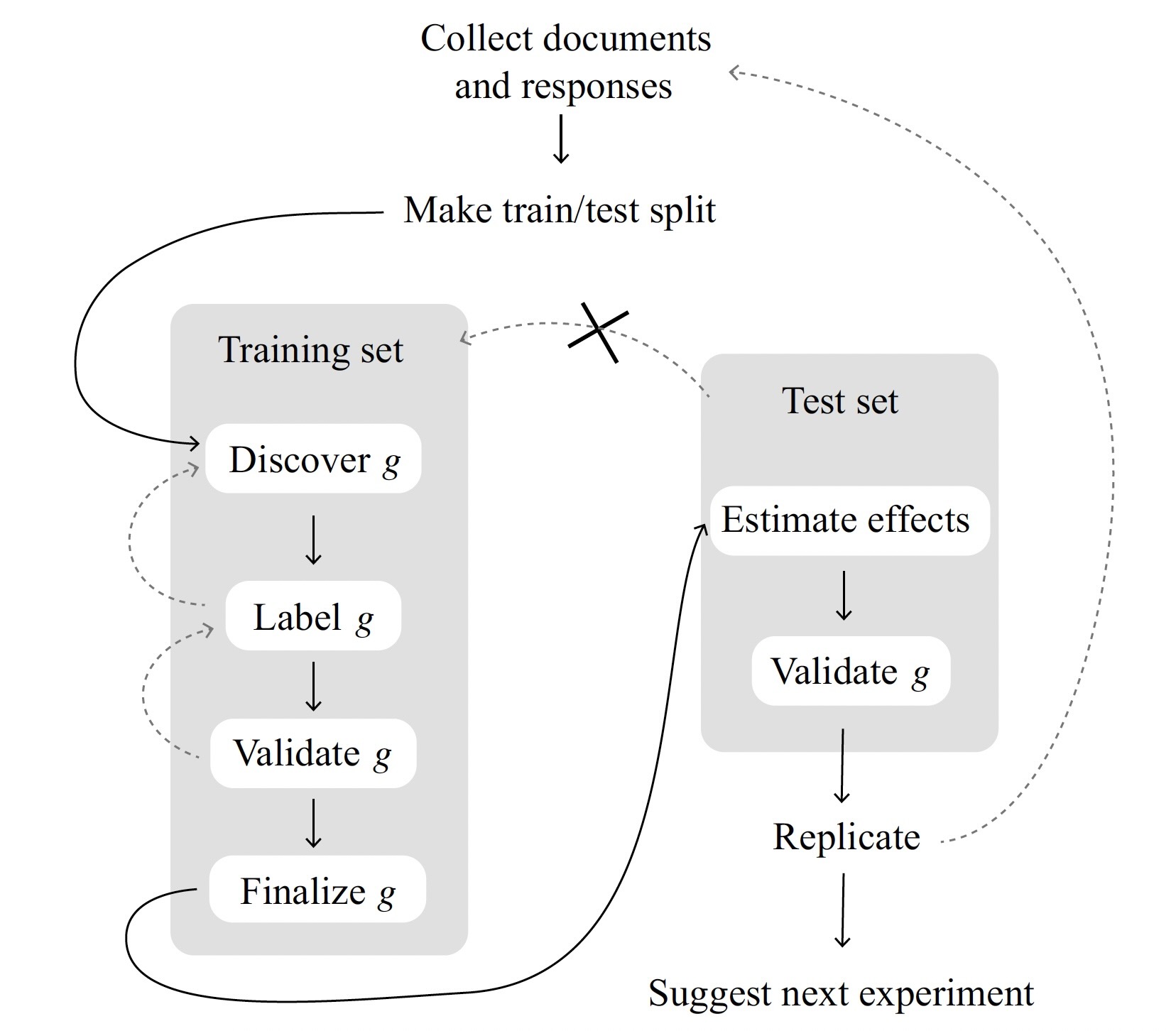
(The necessity for sample splitting!)
| \(Y_i \mid \textsf{do}(D_i \leftarrow 1)\) | \(Y_i \mid \textsf{do}(D_i \leftarrow 0)\) | |
|---|---|---|
| Person 1 | Candidate’s Morals | Taxes |
| Person 2 | Candidate’s Morals | Taxes |
| Person 3 | Polarization | Immigration |
| Person 4 | Polarization | Immigration |
| \(Y_i \mid \textsf{do}(D_i \leftarrow 1)\) | \(Y_i \mid \textsf{do}(D_i \leftarrow 0)\) | |
|---|---|---|
| Person 1 | Candidate’s Morals | Taxes |
| Person 2 | Candidate’s Morals | Taxes |
| Person 3 | Polarization | Immigration |
| Person 4 | Polarization | Immigration |
| Actual Assignment | Outcome \(Y_i\) | |
|---|---|---|
| Person 1 | \(D_1 = 1\) | Morals |
| Person 2 | \(D_2 = 1\) | Morals |
| Person 3 | \(D_3 = 0\) | Immigration |
| Person 4 | \(D_4 = 0\) | Immigration |
| Actual Assignment | Outcome \(Y_i\) | |
|---|---|---|
| Person 1 | \(D_1 = 1\) | Morals |
| Person 2 | \(D_2 = 0\) | Taxes |
| Person 3 | \(D_3 = 1\) | Polarization |
| Person 4 | \(D_4 = 0\) | Immigration |