First, let’s visualize the objective function one more time, then we’ll see what the gradient vector (specifically, the gradient vector) tells us about how we should move/update our guess after each step.
In this case, we’re given the following loss function \(L(w)\): (but, see sidebar on loss functions below!)
\[
L(w) = (w - 10)^2 + 5
\]
Where Does the Loss Function Come From?
The focus of this assignment is to help you see how numerical methods like gradient descent can use a loss function \(L\), along with its first and second derivates (whether exact or approximate), to optimize parameters of a model by finding the minimum of \(L\) with respect to these parameters.
In Section 01, for example, we looked at the contrived but (imo) useful-for-intuition model of regression without an intercept:
\[
Y = \beta_1 X + \varepsilon
\]
And then we saw how, once we choose some particular value \(b\) for \(\beta_1\), we can compute how well this model with this parameter setting fits a dataset \((\mathbf{x}, \mathbf{y}) = ((x_1,y_1), (x_2,y_2), \ldots, (x_n,y_n))\) by computing the residual sum of squares (RSS)—the differences between the predictions\(\widehat{y}_i = b x_i\) generated by the model (again, using that choice \(\beta_1 = b\)) and the actual observed values \(y_i\):
This is why using a quadratic function as our starting example of a loss function is useful here—while in practice the loss function is a potentially-complex function of the data \((\mathbf{x}, \mathbf{y})\) and the model parameters, here we simplify the above RSS computation down to its essence of a quadratic function like \(L(w) = (w - 10)^2 + 5\), so that we can explore how a function like this can be optimized via numerical methods.
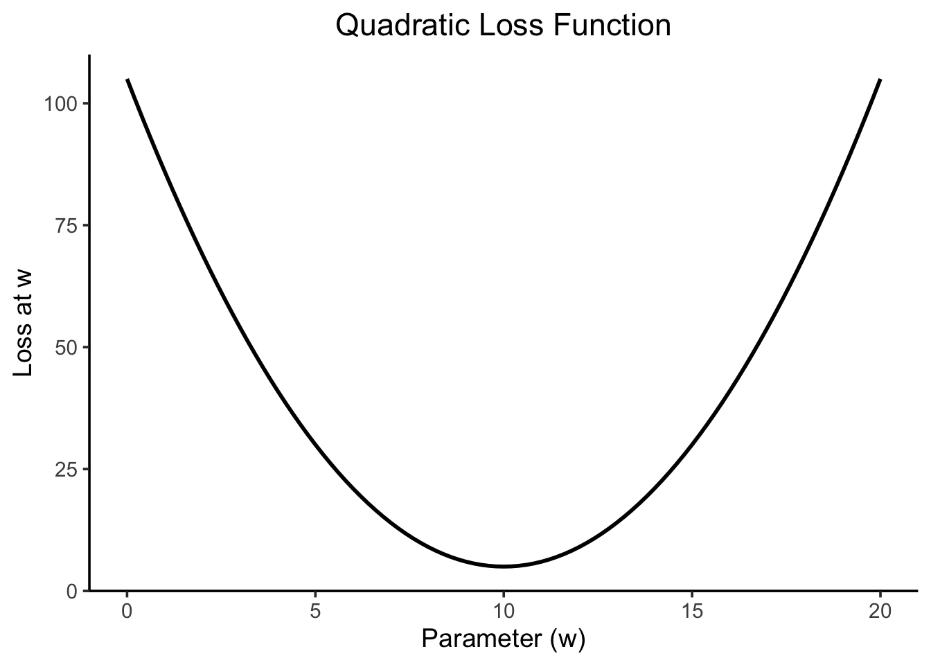
The given loss function \(L(w)\) on its own looks as follows:
Code
library(tidyverse) |>suppressPackageStartupMessages()loss_fn <-function(w) {# Make predictions using w, then sum the# squared residuals, how good/bad is a line# with slope wreturn((w -10)^2+5)}ggplot() +stat_function(data=tibble(x=c(0, 10)), fun=loss_fn, linewidth=1) +xlim(0, 20) +theme_classic(base_size=14) |>center_title() +labs(title ="Quadratic Loss Function",x ="Parameter (w)",y ="Loss at w" )
How the Derivative Helps Us
In this case, our loss function actually has an easily-computed closed-form derivative (though, as mentioned in the info box above, this is usually not the case as we move to more complex models like neural networks). We can use the chain rule \(\frac{\partial}{\partial x}f(g(w)) = f'(g(w))g'(w)\) to make our lives easier, letting \(f(x) = x^2 + 5\) and \(g(x) = x - 10\) and recalling that \(\frac{\partial}{\partial x}x^2 = 2x\):
The reason this matters / the reason it helps us is as follows. Recall how, in calculus class, we were able to use the derivative as a tool for finding minima and maxima of functions since the minima and maxima of these functions are precisely the values at which the function’s derivative is zero!
But what happens if we’re not exactly at a minimum, in this case? Calculus classes usually gloss over this question, since the answer would usually be “Why do we care about points besides these optimal points? We can just compute the minimum and then we’re done! No need to worry about non-optimal points”
However, when we work with more complicated models like neural networks, we don’t necessarily have an exact closed-form solution allowing us to take a derivative, set to zero, and solve. We therefore need to utilize numerical optimization approaches, which use the derivative as information telling us which direction we should move in and (approximately) how much we should move if we want to move from a non-optimal point towards the optimal point.
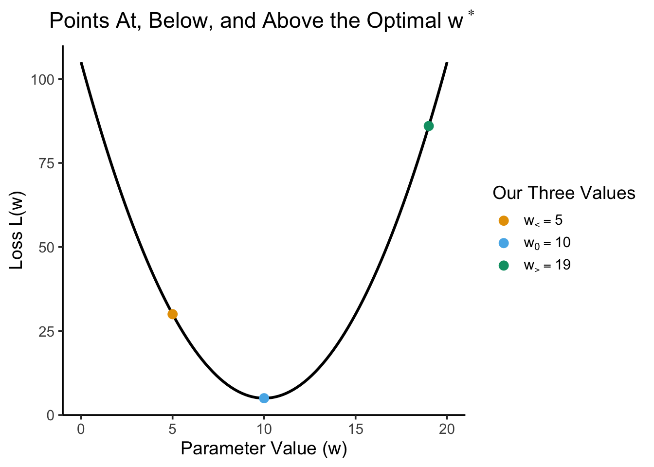
And let’s evaluate both the loss function itself (loss) as well as the derivative of the loss function (deriv) at each point, looking closely at what these values tell us:
Code
data_df
w
label
loss
deriv
second_deriv
5
wlt
30
-10
2
10
w0
5
0
2
19
wgt
86
18
2
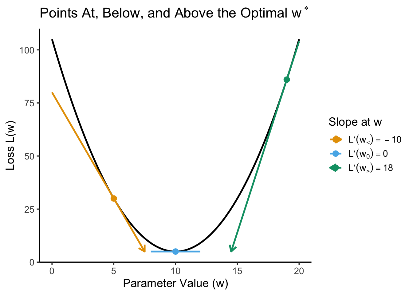
Here we can notice that, when we are at a value below the optimal value like \(w_<\), the derivative has a negative sign, whereas at a value above the optimal value like \(w_>\) the derivative has a positive sign. This relates to one of the natural interpretations of the derivative, one that your calculus class hopefully talked about, as the slope of the line tangent to the curve at that point. Adding to the previous plot of just the points, we can see this “slope interpretation” in action: while the loss value tells us how high or low we are on the \(y\)-axis here, the deriv value tells us how steep the loss function is at this point. If we adopt the convention of drawing the tangent lines (for nonzero slopes) as vectors, we get a picture that looks like:
The derivatives “point” in the direction you should go to get to the maximum value, at which it has value zero
And this shows us exactly why computing the derivative at a point away from the optimal value still helps us when it comes to numerical optimization, in two ways:
First, the derivative at these points (literally) points us in the direction we should go in if we want to move towards the optimal value.
Then (though I’ll stop after this and let you see the effect of this point by going through the assignment’s different parts, since it relates to the second derivative rather than the first), notice also how the monotonicity properties of the quadratic function \(f(x) = x^2\) also tells us “how wrong” we are, in a sense:
\(w_> = 19\) is further away from the optimal point than \(w_< = 5\), therefore
The magnitude of the derivative at \(w_>\) (18) is greater than the magnitude of the derivative at \(w_<\) (10).
Like I mentioned, I’m stopping here since the later portions of the assignment dive into the information that the second derivative at a point can provide for our numerical optimizer, but to test your understanding you can imagine writing a third section here titled “How The (Second) Derivative Helps Us”.
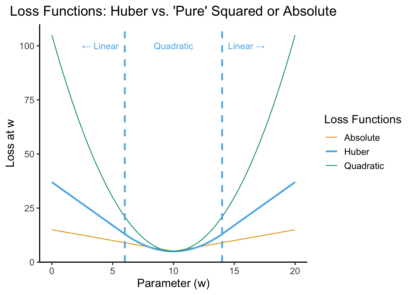
For example, the Huber Loss is often used as an alternative to both “pure” quadratic loss and “pure” absolute loss functions because it penalizes outliers less harshly than \(f(x) = x^2\) but more harshly than \(f(x) = |x|\). The following plot illustrates a “Huberized” version of Lab 1’s loss function, where values within \(\delta = 4\) units of the optimal value \(w^* = 10\) are penalized quadratically, but values more than 4 units away from the optimal value are penalized linearly. Think through what is happening to the second derivative as we move from left to right here (relative to quadratic loss with \(L''(w) = 2\) and absolute loss with \(L''(w) = 1\)):