Week 2: How Do Maps Work?
PPOL 6805 / DSAN 6750: GIS for Spatial Data Science
Fall 2025
Wednesday, September 3, 2025
R and/or Python and/or JS
- My Geometry vs. Algebra Rant… Euclid’s Elements, Book VI, Proposition 28.
- The problem: Divide a given straight line so that the rectangle contained by its segments may be equal to a given area, not exceeding the square of half the line.
Geometers solved w/geometry (300 BC)…
…Algebraists solved w/algebra (2000 BC)…
\[ \begin{align*} &ax^2 + bx + c = 0 \\ \Rightarrow \; & x_+ = \frac{-b + \sqrt{b^2 - 4ac}}{2a} \end{align*} \]
…From 1637 onwards, whichever is easier! 🤯🤯🤯 (Isomorphism)


He’s Literally Extremely Correct!
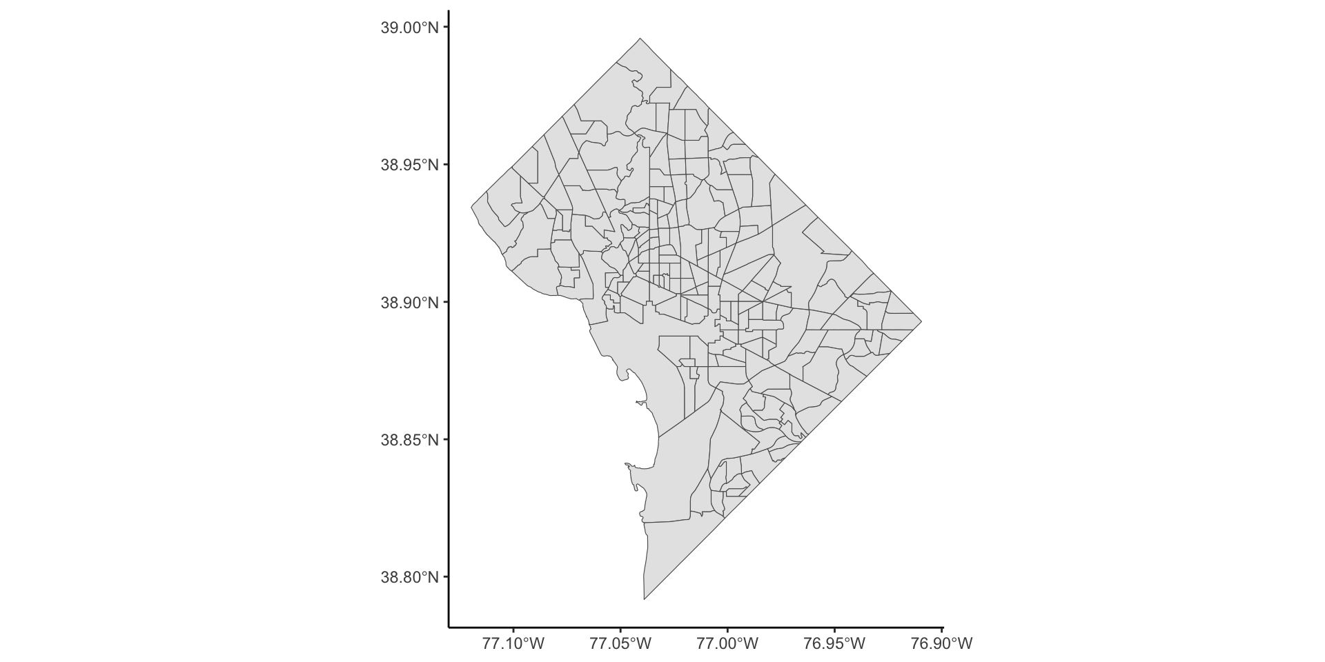
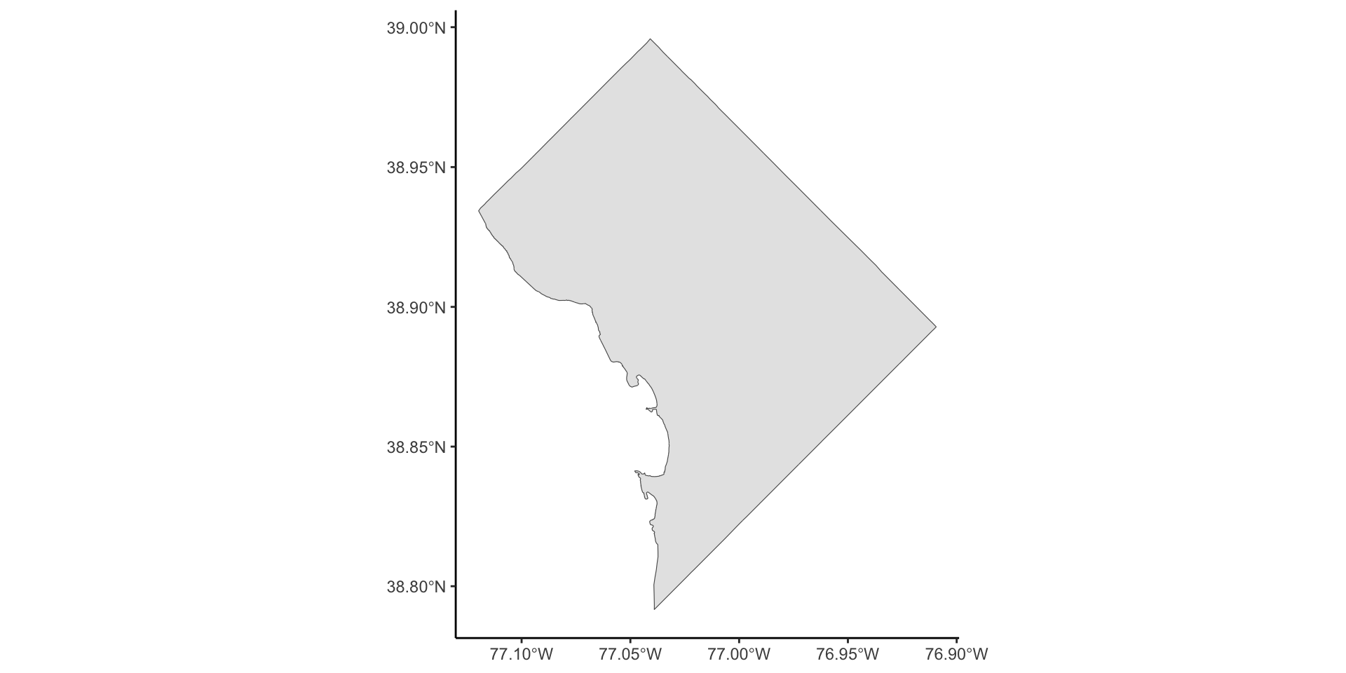
And… Actually Displaying the Map!
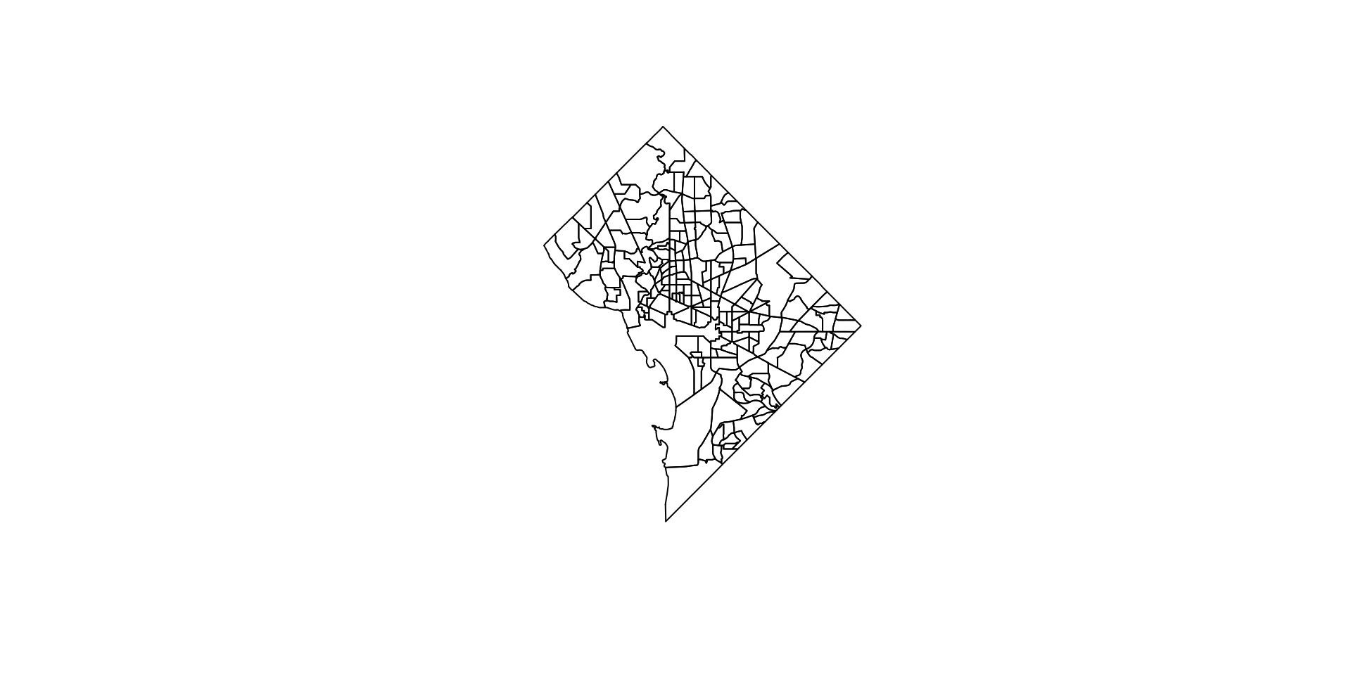
And with ggplot!
Step 1: Union of All Tracts
Step 2: Rasterize (terra)
Code
[1] 29 23 1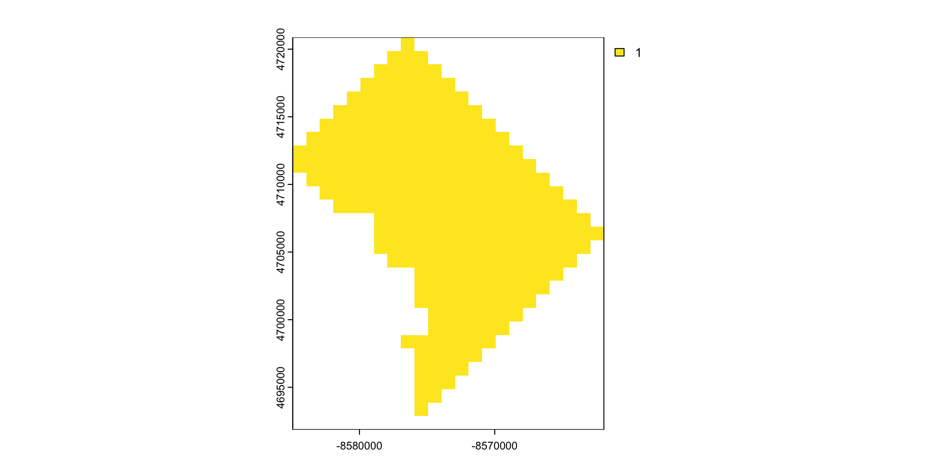
Rasters From Scratch
Welcome to Gridtown!

- Raster indices vs. values: The above plot displays indices for each cell: since a raster is a regular grid, can achieve memory-efficient representation with a single index (rather than, e.g., \((x, y)\) coords). But what we really care about are…
Raster Layer Values
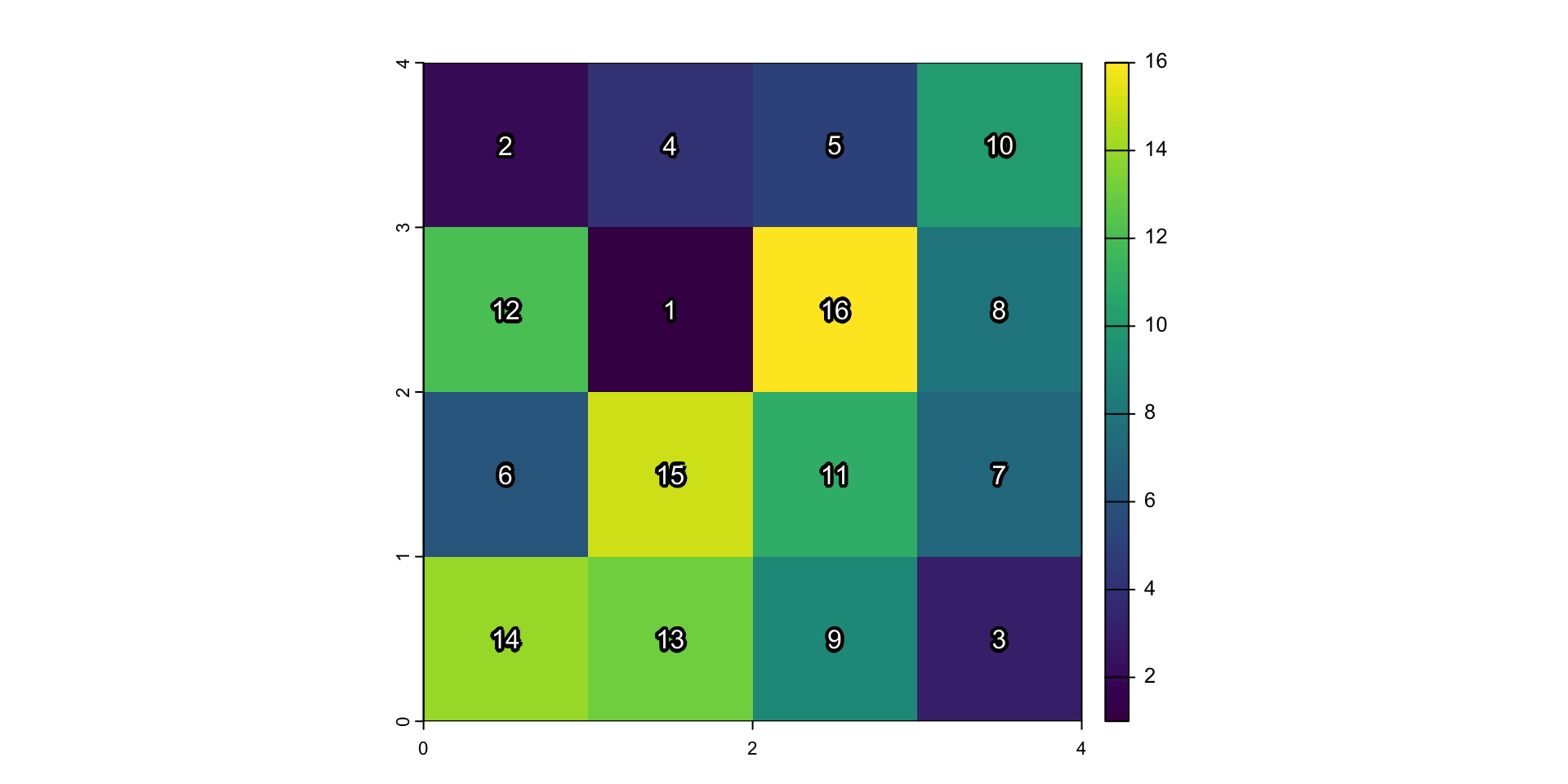
Figure 4: Gridtown Values