Lecture 2: Visual Encodings, Integrity, Color Theory

DSAN 5200-03: Advanced Data Visualization

Class Sessions
Authors
Affiliations

Abhijit Dasgupta

Jeff Jacobs

Anderson Monken

Marck Vaisman

Published

Tuesday, January 16, 2024

Open slides in new window →

Planned Schedule

Start End Topic
12:30pm 1:00pm Encodings →
1:00pm 1:30pm Visualization Integrity →
1:30pm 2:00pm Color Theory →
2:00pm 2:10pm Break!
2:10pm 3:00pm Lab →

Encodings

Key Point: Data Viz \(\neq\) Data Analysis

  • Readers haven’t gone through the process of developing and answering questions that you went through in developing the viz
  • Your audience wants to know the story, result, and/or conclusions
  • They (usually) don’t want the messy details you trudged through when analyzing the data; that’s your job!

Different Approaches for Different Audiences!

Visualization for Analysis:
  • “Internal” audience: You and your team (shared context)
  • Efficient understanding and iteration to develop insights
  • Rough drafts: Can make changes/“polish” later
Visualization for Presentation:
  • “External” audience: Content is likely new to them; audience has no context
  • Different info is useful to them vs. useful to your teammates
  • Takes significantly more time to get to publication ready

From Chaos Theory: The Glorious Unpredictability of Young Thug, Jayson Greene, Pitchfork, 28 September 2015

What Does “Designing For An Audience” Look Like?

Explaining Encodings

  • What scale are you using? What does that color represent? Is this normal?

  • Better to err on the side of too much explanation than too little

  • Too much? People can gloss over details (if designed well 😉)

  • Too little? People unfamiliar with the visual encodings will get stuck

Figure 1: The Statistical Atlas of the United States, produced in the late 1800s by the Census Bureau, explained all of the encodings. For example, look at this bump chart from the 1880 atlas. It ranks cities by population.

Explaining Things You Forgot You Need To Explain

  • When you work with a dataset for a while, it’s easy to forget that others aren’t as familiar […] When you know all the intimate details, it’s hard to step back and remember what it was like when you first opened up a file or database—just a bunch of numbers (Yau 2013, 209)

Explaining Things You Forgot You Need To Explain

  • (If you know this video, don’t say anything!!)

Provide Context

  • When readers can decode the shapes, colors and geometries on your chart, you are more than half way there to producing an awesome chart.

  • However, readers also need to understand the context of the data.

But How Much Context Do I Need To Provide?

Readability

  • Charts should read like text! It should be obvious what the chart is about, how to interpret it

Aesthetics

  • Default settings in viz tools are generic and designed specifically to work with as many datasets and visualization types as possible
  • This \(\neq\) best for your use cases!
  • You can (and should) develop aesthetics to make your charts less ugly
  • (Note: In this context, aesthetics means a visual style. Do not confuse this with the aes() call in ggplot2.)

Aesthetics: Broad Umbrella Term

  • Something like… the gestalt sum of visual design choices

From Georgetown’s official color guide (but remember: color is only one of many factors that makes up an “aesthetic”)

Aesthetics: Broad Umbrella Term

From Nicholas Felton’s 2014 Annual Report

Guidelines, Not Rules!

  • They’re more continuous than absolute. Your charts may need more or less explanations, more or less context, etc.
  • Depends on your audience and the purpose behind your chart:
    • If your audience is a small group who has the same background as you, then you might not need to provide as much context for the data you show.
    • If your audience is already excited about a dataset, then you probably don’t need to make it too flashy.
    • If you make charts for a research paper, there are probably publisher guidelines that you need to follow, which limits what you can do (sometimes a good thing).
  • Think of the above adjustments as continuous knobs that you can turn up or down. The more charts you make, the better you’ll get at deciding how much to turn.

Cognitive-Perceptual Foundations

Pre-Attentive Processing

  • The ability of the visual system to effortlessly identify certain basic visual properties.

Tamara Munzner

  • Computer scientist, info viz expert, and professor at University of British Columbia

Nested Model Analysis Framework (Munzner)

Four levels, three questions:

  • Domain: Characterize the problems and data of a particular domain
    • Who are the target users?

Nested Model Analysis Framework (Munzner)

Four levels, three questions:

  • Domain: Characterize the problems and data of a particular domain
    • Who are the target users?
  • Abstraction: Translate from the domain specifics to the visualization vocabulary
    • What is shown? → data abstraction
    • Why is the user looking at it? → task abstraction
  • Idiom: How is it shown?
    • Visual encoding idiom → how to draw
    • Interaction idiom → how to manipulate
  • Algorithm: Efficient computation

The What: Abstracting the Data

Abstracting the Data

  • Why abstract the data?
    • Different attribute types different representations
    • Different dataset types different idioms available
  • What do you need to abstract?
    • Dataset type: (e.g. table, network, temporal, etc.)
    • Attribute types: (e.g. categorical, ordinal, quantitative)
    • Ordering direction: (e.g. sequential, diverging, cyclical)
    • Data availability: (e.g. dynamic, static)

Types of Datasets

  • (Also temporal!)

Tables

From Tidy data for efficiency, reproducibility, and collaboration, Julie Lowndes and Allison Horst, 12 October 2020

Types of Attributes

  • Categorical: No order
    • Example: names, countries, types
    • Must be represented with visual channels that don’t convey order
  • Ordered
    • Ordinal: Has implicit order, but you can’t do arithmetic
      • Can be numerical (but should be treated as categorical)
      • Example: t-shirt sizes, grade in school, rankings
    • Quantitative: Ordered, and you can do arithmetic
      • Can be divergent or sequential
      • Example: age, temperature, earnings

Ordering

  • Sequential: Infinite range with clear minimum
    • You can perform arithmetic
    • Example: age, number of goals, price
    • Must be represented with visual channels that don’t convey order
  • Diverging: Middle point + two opposite directions
    • Middle point not always zero
    • Example: temperature, earnings, political affiliation index
  • Cyclic: Cycle in the values
    • Starting point may not be obvious
    • Can be repsented w/cyclical channels
    • Ex: days of the week, hours in the day

The Why?

(More on this next week!)

The How?

Marks and Channels

  • Marks are geometric primitives:

  • Channels (encodings) control the appearance of marks

Channel (Encoding) Types

Marks and Channels: Examples

Points

  • Zero-dimensional
  • Convey position only
  • Additionally, can be size and shape coded

Lines

  • One-dimensional
  • Convey position and length
  • Can only be width coded

Areas

  • Two dimensional
  • Fully constrained

Graphical Presentations of Relational Information

Figure 2: Figures 14 and 15 in Mackinlay (1986)
  • Although encoding is often undertaken without much intention or deeper consideration, it has significant impact on the ability of the visualization to communicate knowledge accurately and efficiently.

Another Guide (Illinsky)

Examples of Visual and Integrity Issues

Position: Example 1

Position allows you to compare values based on where they are placed with reference to a coordinate system.

  • Considerations:
    • Be aware of the scales you are using (linear vs logarithmic)
    • The scale changes the interpretation of distance
    • It can also change the perceived patterns
Code
library(tidyverse)
── Attaching core tidyverse packages ──────────────────────── tidyverse 2.0.0 ──
✔ dplyr     1.1.2     ✔ readr     2.1.4
✔ forcats   1.0.0     ✔ stringr   1.5.1
✔ ggplot2   3.4.3     ✔ tibble    3.2.1
✔ lubridate 1.9.2     ✔ tidyr     1.3.0
✔ purrr     1.0.2     
── Conflicts ────────────────────────────────────────── tidyverse_conflicts() ──
✖ dplyr::filter() masks stats::filter()
✖ dplyr::lag()    masks stats::lag()
ℹ Use the conflicted package (<http://conflicted.r-lib.org/>) to force all conflicts to become errors
Code
set.seed(140)
d <-  data.frame(x = rgamma(15,1)) %>% mutate(y = 3 + 2*x + 5*I(x^2) + rnorm(15,3,3))
plt <- ggplot(d, aes(x, y))+
    geom_point(size=6) + 
    theme_bw() + 
    theme(axis.title=element_blank(), axis.text = element_blank(), 
          axis.ticks=element_blank())
plt + annotate('text', x=0.5, y=60,label = "Linear scales", hjust=0, size=8 )

Code
plt + scale_y_log10() + scale_x_log10() +
    annotate('text', x = 0.1, y = 50, label = "Logarithmic scales", hjust=0, size=8)

Position: Example 2

Position allows you to compare values based on where they are placed with reference to a coordinate system.

Considerations

  • Avoid overplotting since many points can occupy the same space and obscure one another

Solutions

  • Use transparency so that overlapping points make darker areas
  • jitter (add noise so points no longer are on top of each other)
  • Use binning to show aggregate data per pixel
Warning: The dot-dot notation (`..density..`) was deprecated in ggplot2 3.4.0.
ℹ Please use `after_stat(density)` instead.

Length

  • Length is most commonly used in the context of bar charts. The longer a bar is, the greater the value.
  • Don’t truncate bar charts, use length in its entirety!

Angle

  • Angles range from 0 to 360 degrees in a circle.
  • Considerations:
    • Angles are most associated with pie charts. Pie chart is made up of parts that make up a whole.
    • Don’t use too many categories (bar chart is better)
    • The sum of all percentages should equal 100%!

Pls Don’t

Slope

  • Slope is similar to angle. Line charts are the most common use of slope to encode data.
  • Considerations:
    • Slope magnitude: steeper = greater change, flatter = lesser change
    • Aspect ratio
    • Visual change should match the context of the change
  • Cleveland, McGIll & McGill (1988) suggested that the average slope in a line chart should be 45°, in order to make neutral comparisons between lines (still a good rule of thumb)

Area

  • Like length, area can be used to represent data with size, but with two dimensions instead of one.
  • Considerations:
    • While the encoding might not be as precise from a visual perception perspective, area can provide a more intuitive, less abstract view for some types of data
    • Make sure you scale by area, not edge (remember, area gets squared per unit increase): This means you should encode the length of a side as \(\sqrt{x}\)

Volume

  • Volume can used in the same way as area (one more dimension)
  • Considerations:
    • Make sure you scale by volume, not edge (remember, volume gets cubed per unit increase)
    • This means you would encode the side of a “box” as \(x^{1/3} = \sqrt[3]{x}\)
  • For 3-D encodings, you need to take volume as proportional to the data

Color 🌈

Color + Society = Meaning

  • Color is not “sortable” in the traditional sense
  • However, color can convey implicit meaning!

Common color pitfalls

  • Encoding too much information or irrelevant information
  • Using nonmonotonic colors for data values
  • Failure to design for color vision deficiency
  • Not creating associations with color
  • Not using contrasting colors to contrast information
  • Not making the important information stand out
  • Using too many colors

Color

  • Color as a visual encoding can be split into two categories: hue and saturation.
  • Hue: what most people refer to as color (red, green, blue, etc.)
  • Saturation: amount of hue in a color.
  • Qualitative: every color represents a distinct attribute (category)
  • Sequential: color represents a range (saturation) from low to high (or vice-versa)
  • Diverging: multiple hues represent a point of inflection of the data

Sequential Scale: Example 1

Sequential Scale: Example 2

Divergent Scale: Example

Common Palettes

  • Most of these palettes are available to both ggplot2 and matplotlib. For R, you may have to load packages like RColorBrewer or viridis.

Colorblindness

1 in 8 People!

Digital Screens vs. Physical Printing

Color as Context

Looking Forward: The Grammar of Graphics (GG)

  • Cleveland (1985) lists the “basic elements of graph construction” as: scales, captions, plotting symbols, reference lines, keys, labels, panels, and tick marks.
  • Wilkinson (2006) built on Bertin (1967), formally defining components of a graphic:
Statement Description
DATA A set of data operations that create variables from datasets
TRANS Variable transformation (e.g. rank)
SCALE Scale transformations (e.g. log)
COORD Coordinate system (e.g. polar)
ELEMENT Graphs (e.g. points) and their aesthetic attributes (e.g. color)
GUIDE Axes, legends, etc.
  • Hadley Wickham implemented Wilkinson’s grammar in R via ggplot2 (more info)

Lab Time!

Making Your Own Theme 😎

References

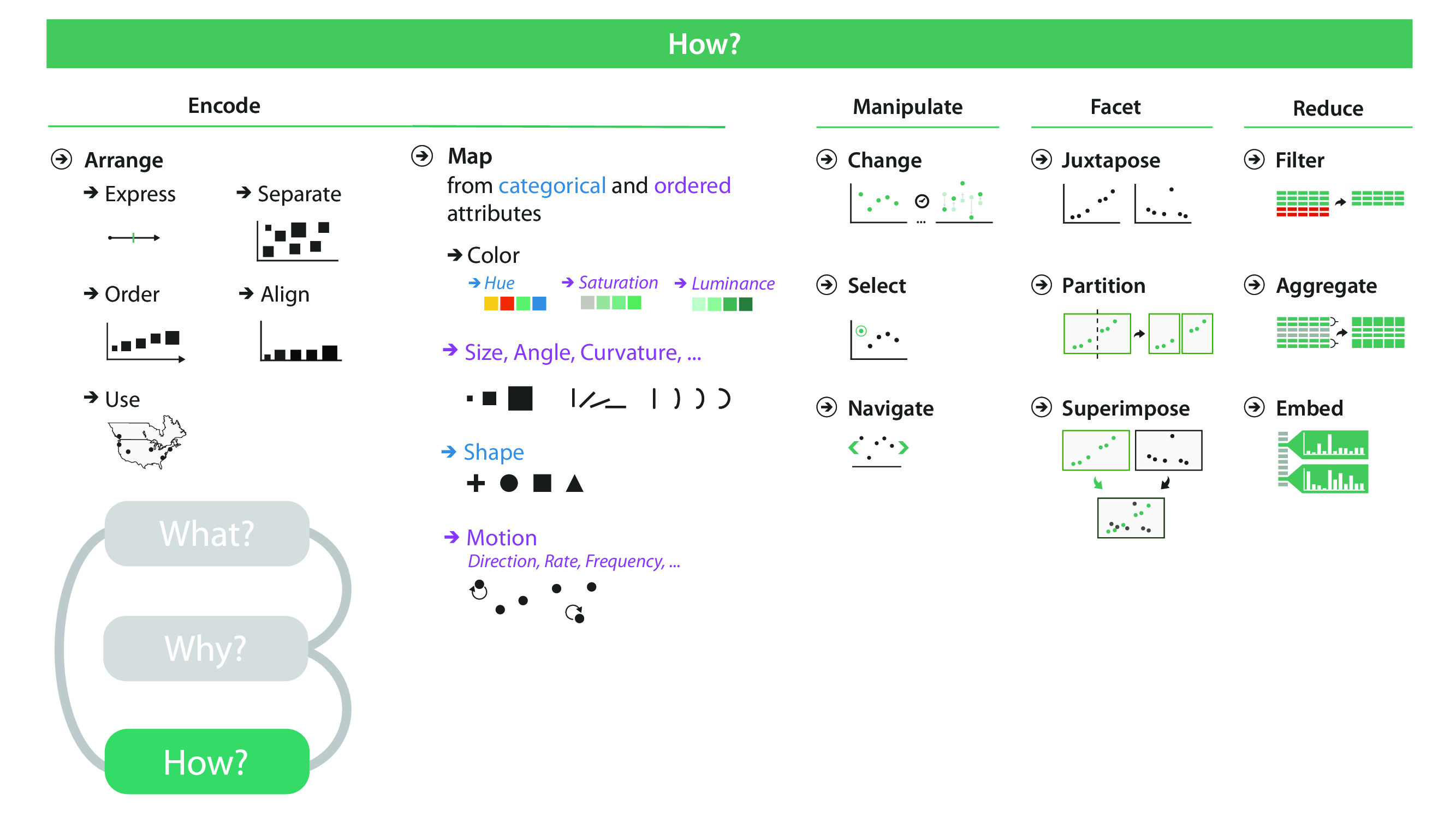
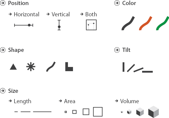
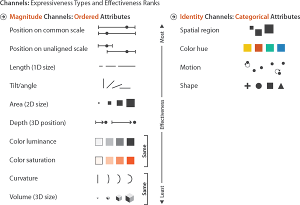
Bertin, Jacques. 1967. Semiology of Graphics: Diagrams, Networks, Maps. ESRI Press.
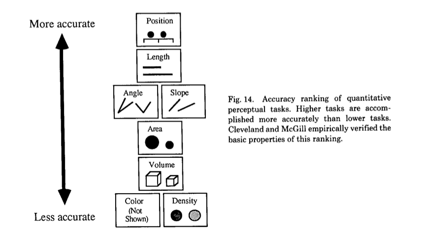
Cleveland, William S. 1985. The Elements of Graphing Data. CRC Press.
Gadamer, Hans-Georg. 1960. Truth and Method. New York: Crossroad.
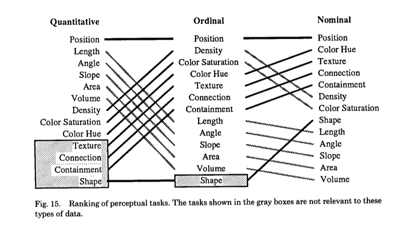
Mackinlay, Jock. 1986. “Automating the Design of Graphical Presentations of Relational Information.” ACM Transactions on Graphics 5 (2): 110–41. https://doi.org/10.1145/22949.22950.
Wilkinson, Leland. 2006. The Grammar of Graphics. Springer Science & Business Media.
Yau, Nathan. 2013. Data Points: Visualization That Means Something. John Wiley & Sons.