Week 9: Evaluating Spatial Hypotheses I: Point Data
PPOL 6805 / DSAN 6750: GIS for Spatial Data Science
Fall 2025
Wednesday, October 22, 2025
So… What Do We Do With Moran’s \(I\)?
| Doctor | Midterm Practice | Midterm | |
 |
Your temperature is 40° C | Moran’s \(I\) of Protestant Churches is 0.58 | Moran’s \(I\) of toxic waste dump sites is 0.67 |
 |
One cause could be malaria, 40% likelihood | One cause could be urbanization, 40% likelihood | One cause could be population density of stigmatized ethnic group, 60% likelihood |
 |
One cause could be lupus, 75% likelihood | One cause could be distance from Luther, 75% likelihood | One cause could be distance from UNOCI HQ, 75% likelihood |
 |
I judge lupus is the more likely cause, we should do lupus treatments | I judge distance from Luther as more likely, we should study Luther more | I judge distance from UNOCI is the most likely cause; handle in UN rather than ICC |
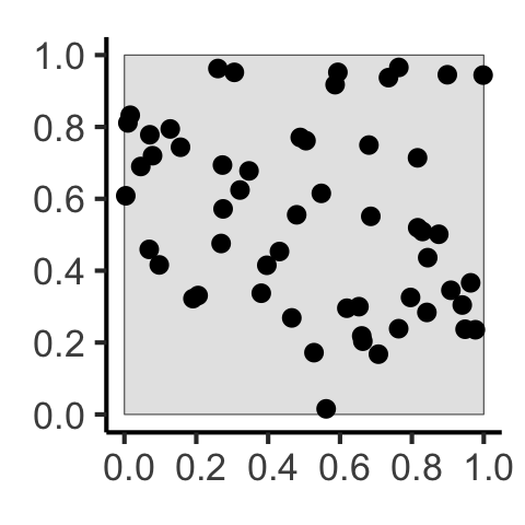
[] Why Do Events Appear Where They Do?
Code
library(tidyverse)
library(spatstat)
set.seed(6806)
N <- 60
lambda <- 60
r_core <- 0.05
obs_window <- square(1)
# Regularity via Inhibition
# Regularity via Inhibition
reg_sims <- rMaternI(lambda, r=r_core, win=obs_window)
# CSR data
csr_sims <- rpoispp(N, win=obs_window)
### Clustered data
clust_mu <- 10
clust_sims <- rMatClust(kappa=lambda / clust_mu, scale=2*r_core, mu=10, win=obs_window)
# Each cluster consist of 10 points in a disc of radius 0.2
nclust <- function(x0, y0, radius, n) {
#print(n)
return(runifdisc(10, radius, centre=c(x0, y0)))
}
cond_clust_sims <- rNeymanScott(kappa=5, expand=0.0, rclust=nclust, radius=2*r_core, n=10)
cond_clust_sf <- cond_clust_sims |> sf::st_as_sf()
pines_plot <- cond_clust_sf |>
ggplot() +
geom_sf() +
theme_classic(base_size=12)
ggsave("images/pines.png", pines_plot)
# density() calls density.ppp() if the argument is a ppp object
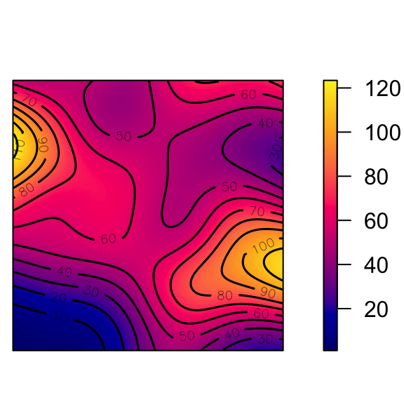
den <- density(cond_clust_sims, sigma = 0.1)
#summary(den)
png("images/intensity_plot.png")
plot(den, main = "Intensity λ(s)")
contour(den, add = TRUE) # contour plot
dev.off()
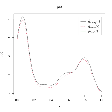
# And Gest / Kest / Lest
# saveRDS(cond_clust_sims, "cond_clust_sims.rds")
pcf_result <- spatstat.explore::pcf.ppp(
cond_clust_sims,
divisor="d",
stoyan=0.25,
bw=0.05,
r=seq(from=0.0, to=1.0, by=0.001)
)
png("images/spatstat_pcf.png")
plot(pcf_result, xlim=c(0, 1), main="pcf")
dev.off()
# kest_result <- Kest(cond_clust_sims, rmax=0.5, correction="best")
# lest_result <- center_l_function(cond_clust_sims, rmax=0.5)
# png("images/lest.png")
# plot(lest_result, main="K(h)")
# dev.off()| First-Order | Second-Order | |
|---|---|---|
| Events considered individually \(\Rightarrow\) Intensity function \(\lambda(\mathbf{s})\) | Events considered pairwise \(\Rightarrow\) Pairwise Correlation Function \(\textrm{pcf}(\vec{h})\) | |
 |
 |
 |
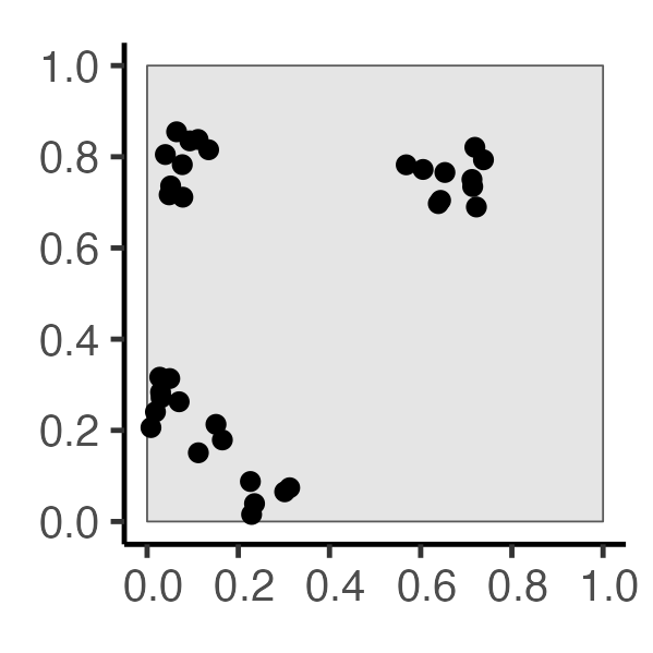
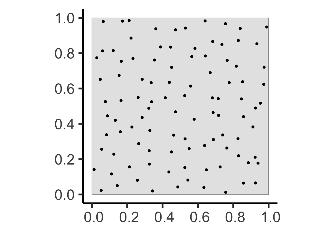
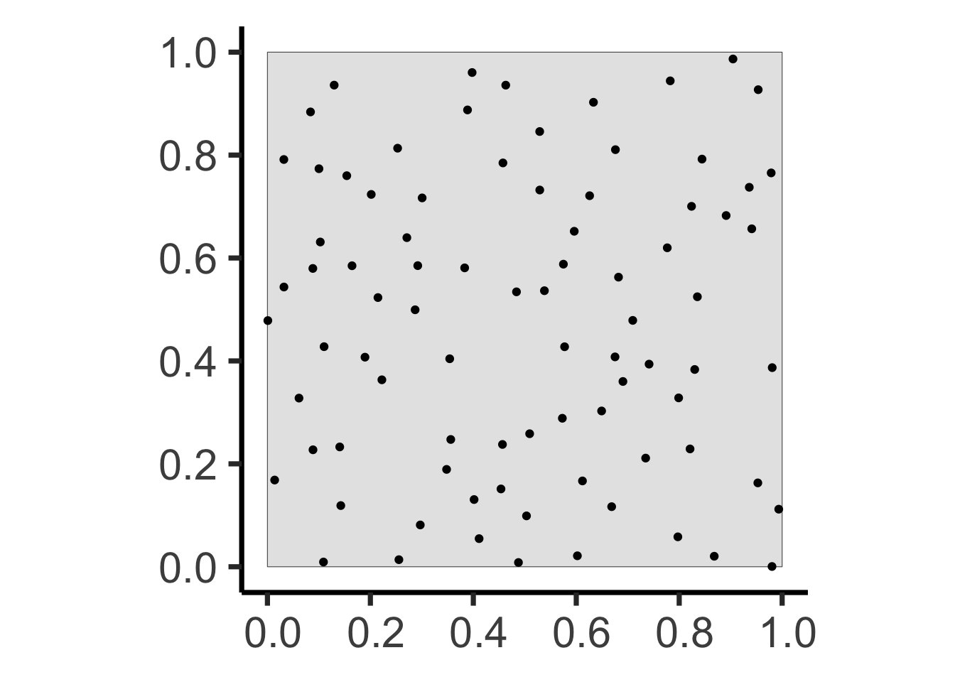
The Tree-Grid Mystery
You’ve been hired as an archaeologist – congratulations! Your job: determine whether arrangement of trees formed:
- Naturally, via a process of resource competition, or
- Artificially, via an ancient civilization planting in a grid…
Two Possible Histories…
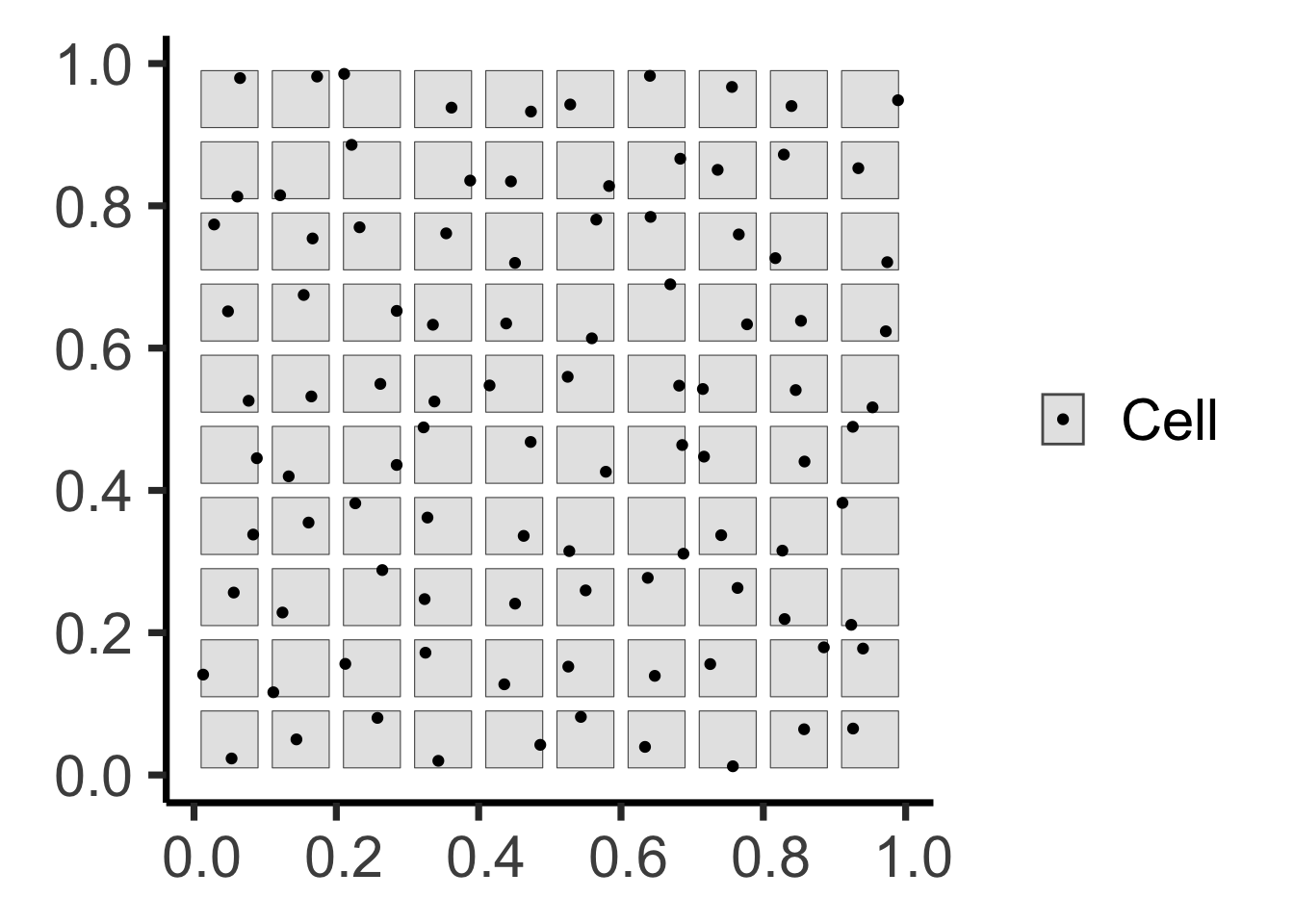
Code (Step 2: Point Generation)
grid_points <- sf::st_sample(grid_buffer_sf, size=rep(1,100))
grid_buffer_sf |> ggplot(aes(shape='Cell')) +
  geom_sf() +
  geom_sf(data=grid_points) +
  scale_shape_manual("Shape", values=c('Cell'=19)) +
  theme_classic(base_size=ha_base) +
  theme(
    legend.title = element_blank(),
    # legend.text = element_text(size=18)
  )

Code (Step 2: Competition)
age <- runif(npoints(pois_ppp))
pair_dists <- pairdist(pois_ppp)
close <- (pair_dists < r)
later <- outer(age, age, ">")
killed <- apply(close & later, 1, any)
killed_ppp <- pois_ppp[killed]
alive_ppp <- pois_ppp[!killed]
pois_window_sf <- pois_ppp |> sf::st_as_sf() |> filter(label=="window")
pois_killed_sf <- killed_ppp |> sf::st_as_sf() |> filter(label=="point")
pois_alive_sf <- alive_ppp |> sf::st_as_sf() |> filter(label=="point")
alive_buff_sf <- pois_alive_sf |> sf::st_buffer(r) |> sf::st_union() |> sf::st_intersection(pois_window_sf)
ggplot() +
  geom_sf(data=pois_window_sf) +
  geom_sf(data=alive_buff_sf, aes(color='Inhibition', shape='Inhibition'), linetype='dashed') +
  geom_sf(data=pois_killed_sf, aes(color='Dead', shape='Dead'), size=2, stroke=2) +
  geom_sf(data=pois_alive_sf, aes(color='Alive', shape='Alive'), size=1, stroke=1) +
  scale_shape_manual(name=NULL, values=c("Alive"=19, "Dead"=4, 'Inhibition'=21), labels=c("Alive", "Dead", "Inhibition")) +
  scale_color_manual(name=NULL, values=c("Alive"="black", "Dead"=cb_palette[1], "Inhibition"="black"), labels=c("Alive", "Dead", "Inhibition")) +
  guides(shape=guide_legend(override.aes=list(fill = "white"))) +
  theme_classic(base_size = hn_base) +
  theme(plot.margin = unit(c(0,0,0,0), "cm"))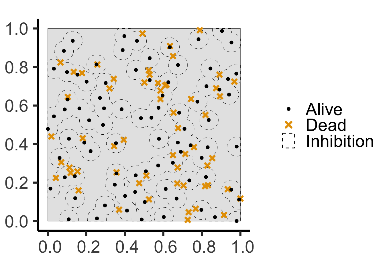
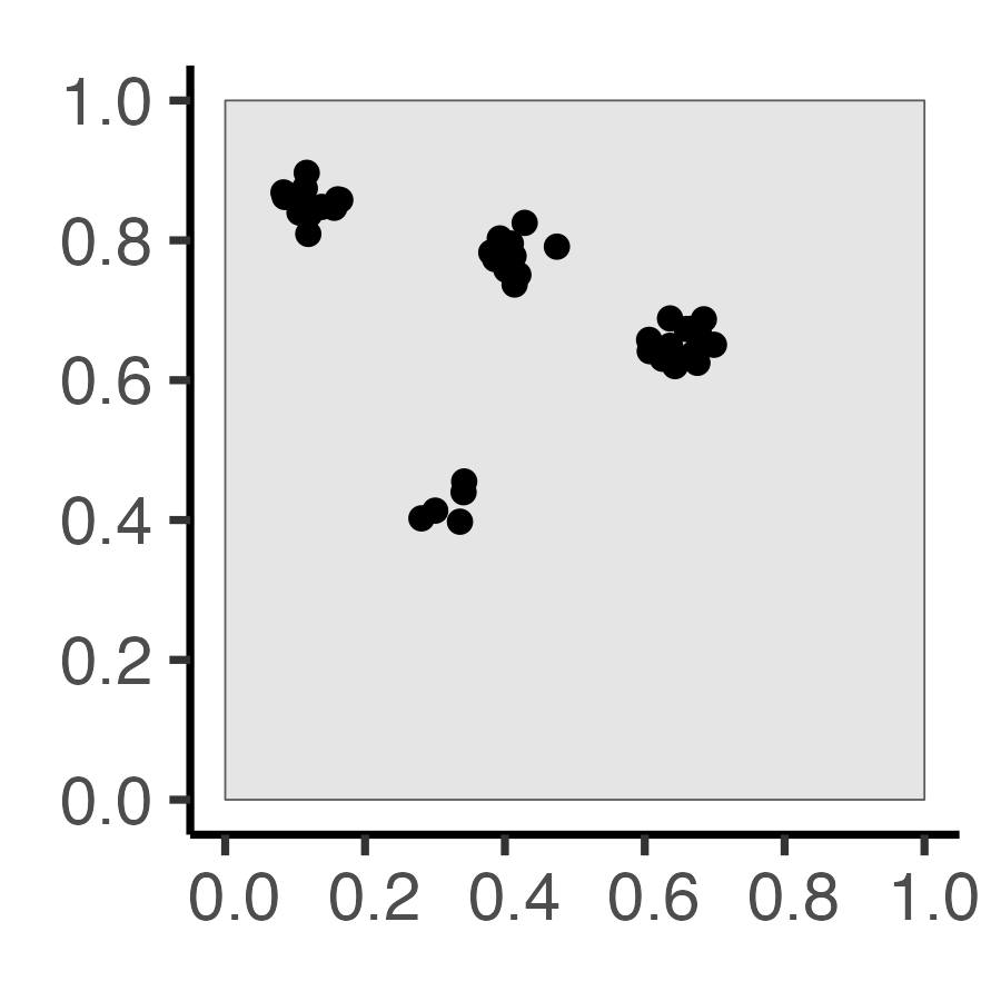
Why Do Events Appear Where They Do?
Code
library(tidyverse)
library(spatstat)
set.seed(6809)
N <- 60
r_core <- 0.05
obs_window <- square(1)
### Clustered data
clust_ppp <- rMatClust(
  kappa=6,
  scale=r_core,
  mu=10
)
clust_sf <- clust_ppp |> sf::st_as_sf()
clust_plot <- clust_sf |>
  ggplot() +
  geom_sf(size=2) +
  theme_classic(base_size=18)
ggsave("images/clust_ppp.png", clust_plot, width=3, height=3)
# Intensity fn
clust_intensity <- density(clust_ppp, sigma = 0.1)
png("images/clust_intensity.png")
par(mar=c(0,0,0,2), las=2, oma=c(0,0,0,0), cex=2)
plot(clust_intensity, main=NULL)
contour(clust_intensity, add = TRUE)
dev.off()
### PCF
clust_pcf <- spatstat.explore::pcf(
  clust_ppp, divisor="d",
  r=seq(from=0.00, to=0.50, by=0.01)
)
clust_pcf_plot <- clust_pcf |> ggplot(aes(x=r, y=iso)) +
  geom_hline(yintercept=1, linetype='dashed', linewidth=1) +
  geom_area(color='black', fill=cb_palette[1], alpha=0.75) +
  scale_x_continuous(breaks=seq(from=0.0, to=1.0, by=0.1)) +
  labs(x="Distance", y="Density") +
  theme_classic(base_size=14)
ggsave("images/clust_pcf.png", clust_pcf_plot, width=3, height=3)| Original Data | First-Order | Second-Order |
|---|---|---|
| \(N = 60\) Events | Events modeled individually \(\Rightarrow\) Intensity Function \(\lambda(\mathbf{s})\) |
Events modeled pairwise \(\Rightarrow\) Pairwise-Corr Function \(\textrm{pcf}(\vec{h})\) |
 |
 |
 |
What Do These Functions “Detect”?
Code (Fixed Points)
sq_base <- 16
sq_psize <- 2.5
obs_window <- square(1)
r0 <- 0.2
sq_df <- tibble::tribble(
~x, ~y,
0.5-r0,0.5-r0,
0.5+r0,0.5+r0,
0.5-r0,0.5+r0,
0.5+r0,0.5-r0
)
sq_sf <- sf::st_as_sf(
sq_df,
coords = c("x","y")
)
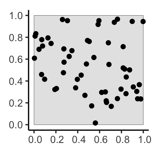
sq_ppp <- as.ppp(sq_sf, W=obs_window)
sq_ppp |> sf::st_as_sf() |> ggplot() +
geom_sf(size=sq_psize) +
theme_classic(base_size=sq_base)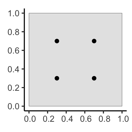
Code
### PCF
pcf_result <- spatstat.explore::pcf(
  sq_ppp,
  divisor="d",
  r=seq(from=0.00, to=0.8, by=0.01)
)
pcf_result |> ggplot(aes(x=r, y=iso)) +
  geom_hline(yintercept=1, linetype='dashed', linewidth=1.5) +
  geom_area(color='black', fill=cb_palette[1], alpha=0.75) +
  scale_x_continuous(breaks=seq(from=0.0, to=1.0, by=0.1)) +
  theme_classic(base_size=sq_base)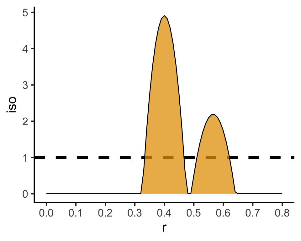
Code
csr_pcf_result <- spatstat.explore::pcf(
  csr_ppp,
  divisor="d",
  r=seq(from=0.00, to=0.8, by=0.01)
)
csr_pcf_result |> ggplot(aes(x=r, y=iso)) +
  geom_hline(yintercept=1, linetype='dashed', linewidth=1.5) +
  geom_area(color='black', fill=cb_palette[1], alpha=0.75) +
  scale_x_continuous(breaks=seq(from=0.0, to=1.0, by=0.1)) +
  theme_classic(base_size=sq_base)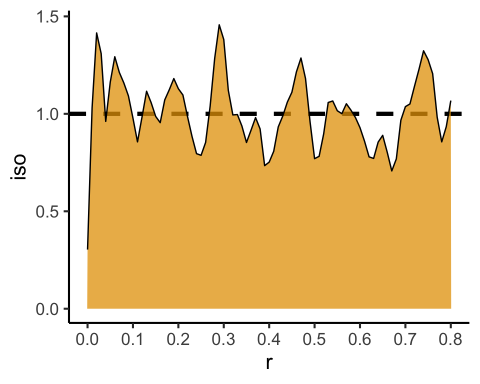
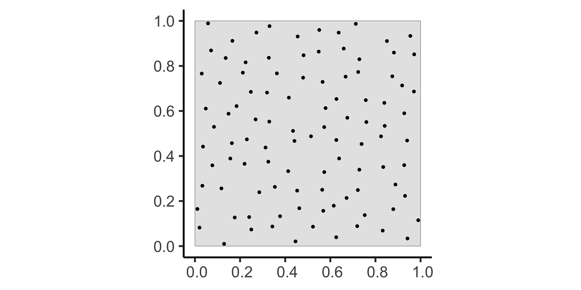
Poisson Point Processes (CSR)
- \(N \sim \text{Pois}(\lambda)\)
- For \(i \in \{1, \ldots, N\}\):
- Generate \(X_i, Y_i \sim \mathcal{U}(\texttt{win})\)
Code
sim_base <- 22
sim_psize <- 2
sim_xticks <- seq(from=0.0, to=1.0, by=0.2)
sim_yticks <- seq(from=0.0, to=1.0, by=0.2)
gen_pois_df <- function(num_sims=1) {
  pois_sims <- spatstat.random::rpoispp(
    lambda = 60, nsim=num_sims
  )
  return(tibble::as_tibble(pois_sims))
}
#pois_dfs <- gen_pois_df()
#pois_dfs |> head()
pois_sims <- spatstat.random::rpoispp(
  lambda = 60, nsim=3
)
to_sim_df <- function(cur_sim, sim_name) {
  cur_df <- tibble::as_tibble(cur_sim) |> mutate(sim=sim_name)
  return(cur_df)
}
combined_df <- imap(.x=pois_sims, .f=to_sim_df) |> bind_rows()
combined_df |> ggplot(aes(x=x, y=y)) +
  geom_point(size=sim_psize) +
  facet_wrap(vars(sim)) +
  coord_equal() +
  theme_classic(base_size=sim_base) +
  theme(panel.spacing.x = unit(2, "lines")) +
  scale_x_continuous(breaks=sim_xticks) +
  scale_y_continuous(breaks=sim_yticks)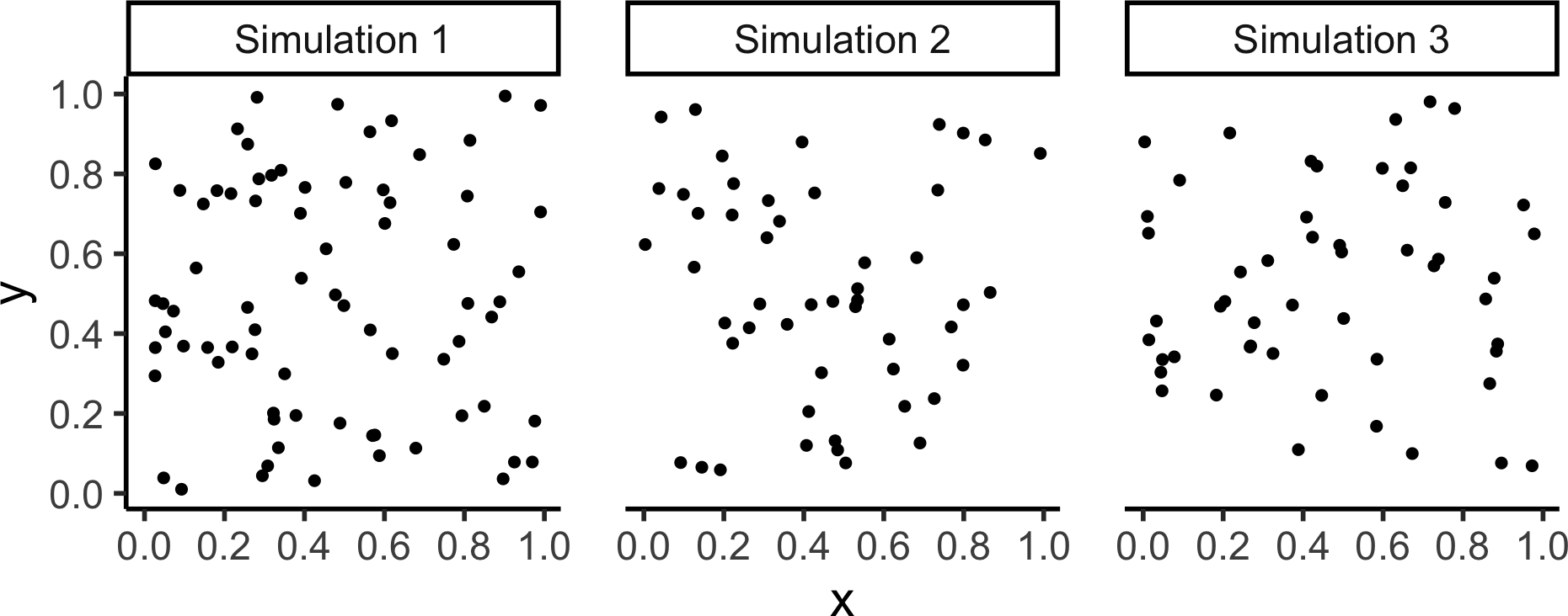
Simple Sequential Inhibition (SSI)
- \(\mathbf{S} = \varnothing\)
- While not
done:- Generate \(\mathbf{E} = (X, Y) \sim \mathcal{U}(\texttt{win})\)
- Check if \(\mathbf{E}\) within
runits of any existing point in \(\mathbf{S}\)- If it is, throw \(\mathbf{E}\) away. Otherwise, add \(\mathbf{E}\) to \(\mathbf{S}\)
-
done=TRUEif \(\mathbf{S}\) hasnpoints OR has been the same forgiveupsteps
Code
capture.output(ssi_sims <- spatstat.random::rSSI(
  r = 0.05, n=60, nsim=3
), file=nullfile())
combined_df <- imap(.x=ssi_sims, .f=to_sim_df) |> bind_rows()
combined_df |> ggplot(aes(x=x, y=y)) +
  geom_point(size=sim_psize) +
  facet_wrap(vars(sim)) +
  coord_equal() +
  theme_classic(base_size=24) +
  theme(panel.spacing.x = unit(3, "lines")) +
  scale_x_continuous(breaks=sim_xticks) +
  scale_y_continuous(breaks=sim_yticks)
Matérn Cluster Process
- Generate \(K(\kappa)\) parent points via Poisson Point Process with intensity \(\lambda = \kappa\)
- For each parent point \(\mathbf{s}_i \in \left\{\mathbf{s}_1, \ldots, \mathbf{s}_{K(\kappa)}\right\}\):
- Generate \(N(\mu)\) offspring points via Poisson Point Process with intensity \(\lambda = \mu\), distributed uniformly within a circle of radius
scalecentered at \(\mathbf{s}_i\)
- Generate \(N(\mu)\) offspring points via Poisson Point Process with intensity \(\lambda = \mu\), distributed uniformly within a circle of radius
- Offspring points form the outcome (parent points are thrown away)
Code
matclust_sims <- rMatClust(
  kappa = 6,
  scale = 0.075,
  mu = 10,
  nsim = 3
)
matclust_df <- imap(.x=matclust_sims, .f=to_sim_df) |> bind_rows()
matclust_plot <- matclust_df |> ggplot(aes(x=x, y=y)) +
  geom_point(size=sim_psize) +
  facet_wrap(vars(sim), nrow=1) +
  coord_equal() +
  theme_classic(base_size=sim_base) +
  theme(panel.spacing.x = unit(2, "lines")) +
  scale_x_continuous(breaks=sim_xticks) +
  scale_y_continuous(breaks=sim_yticks)
matclust_plot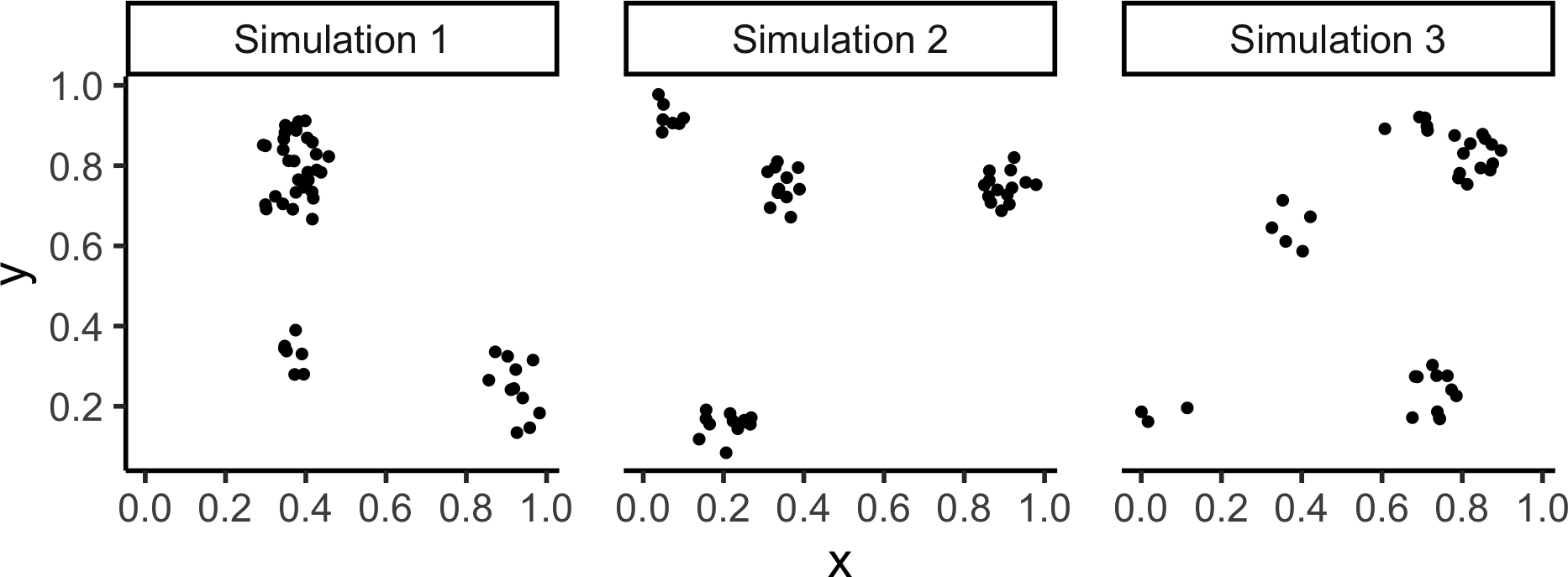
Matérn Inhibition Process (I and II)
rMaternI() [Docs] |
rMaternII() [Docs] |
|---|---|
|
|
|
|
Code
mI_sims <- rMaternI(
  kappa = 60, r = 0.075, nsim=2
)
mII_sims <- rMaternII(
  kappa = 60, r = 0.075, nsim=2
)
mI_combined_df <- imap(.x=mI_sims, .f=to_sim_df) |> bind_rows() |> mutate(sim=paste0("MI ",sim))
mII_combined_df <- imap(.x=mII_sims, .f=to_sim_df) |> bind_rows() |> mutate(sim=paste0("MII ",sim))
m_combined_df <- bind_rows(mI_combined_df, mII_combined_df)
m_plot <- m_combined_df |> ggplot(aes(x=x, y=y)) +
  geom_point(size=sim_psize) +
  facet_wrap(vars(sim), nrow=1) +
  coord_equal() +
  theme_classic(base_size=sim_base) +
  theme(panel.spacing.x = unit(2, "lines")) +
  scale_x_continuous(breaks=sim_xticks) +
  scale_y_continuous(breaks=sim_yticks)
m_plot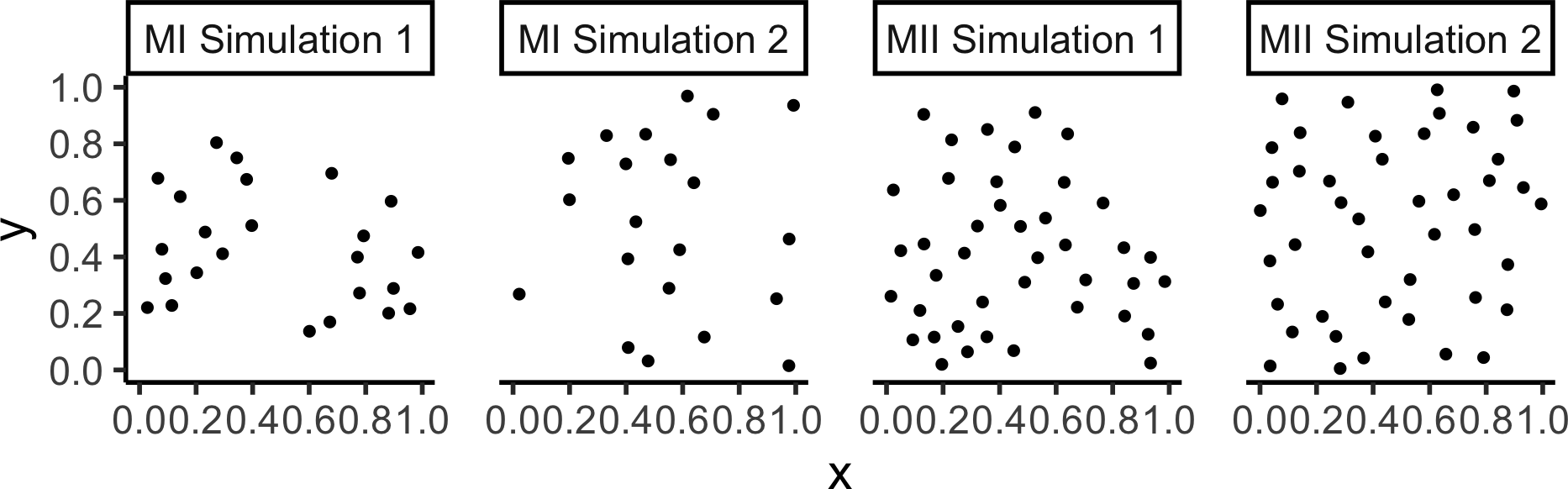
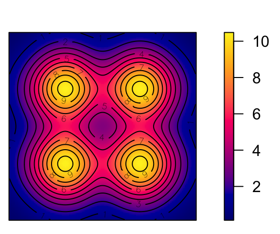
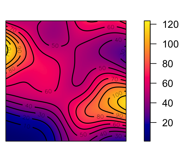
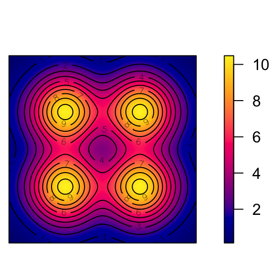
Cox Processes: Random Intensity → Random Events
Code
cox_pcol <- "black"
cox_bg <- "grey90"
cox_pch <- 21
# inhomogeneous LGCP with Gaussian covariance function
m <- as.im(function(x, y){
  5 - 1.5 * (x - 0.5)^2 + 2 * (y - 0.5)^2
}, W=owin())
lgcp_sims <- rLGCP("gauss", m, var=0.15, scale =0.5, nsim=3)
# lgcp_combined_df <- imap(.x=ssi_sims, .f=to_sim_df) |> bind_rows()
plot_lgcp <- function(lgcp_sim) {
  plot(attr(lgcp_sim, "Lambda"), main=NULL)
  points(lgcp_sim, col=cox_pcol, bg=cox_bg, pch=cox_pch)
}
par(mfrow=c(1,3), mar=c(0,0,0,2), oma=c(0,0,0,0), las=2)
nulls <- lapply(X=lgcp_sims, FUN=plot_lgcp)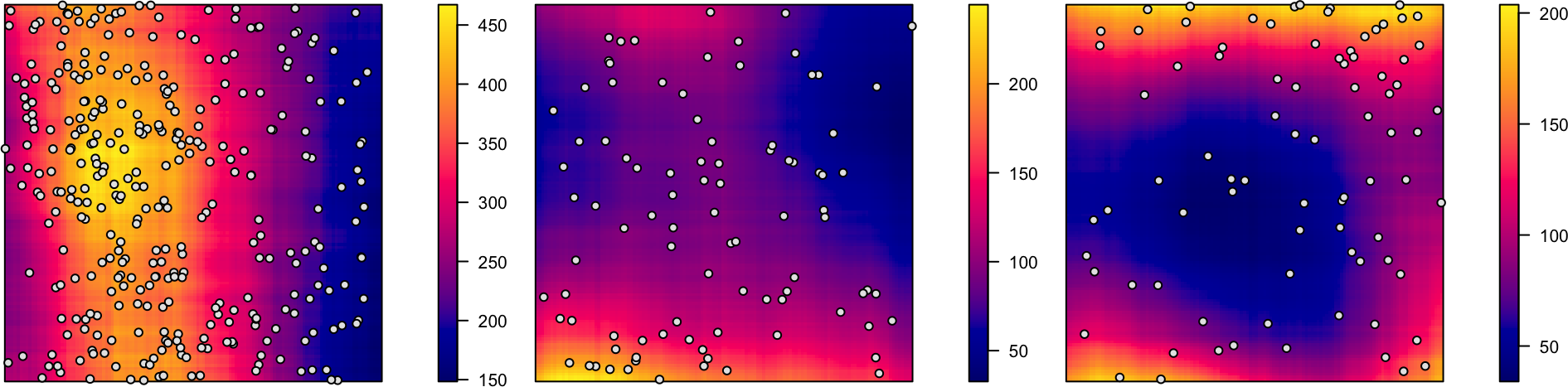
ppp \(\leftrightarrow\) sf Conversion
ppp to sf Conversion:
| label | geom |
|---|---|
| window | POLYGON ((0 0, 1 0, 1 1, 0 … |
| point | POINT (0.5177981 0.553718) |
| point | POINT (0.6221358 0.3933781) |
| point | POINT (0.8446784 0.8187611) |
Code
library(mdthemes) |> suppressPackageStartupMessages()
pois_sf |> ggplot() +
geom_sf(data=pois_sf |> filter(label=="window"), aes(fill='grey')) +
geom_sf(data=pois_sf |> filter(label != "window"), aes(color='black')) +
md_theme_classic(base_size=26) +
scale_fill_manual(name=NULL, values=c("gray90"), labels=c("<span style='font-family: mono'>label == 'window'</span>")) +
scale_color_manual(name=NULL, values=c("black"), labels=c("<span style='font-family: mono'>label == 'point'</span>")) +
labs(title = "<span style='font-family: mono'>ppp</span> → <span style='font-family: mono'>sf</span> Result")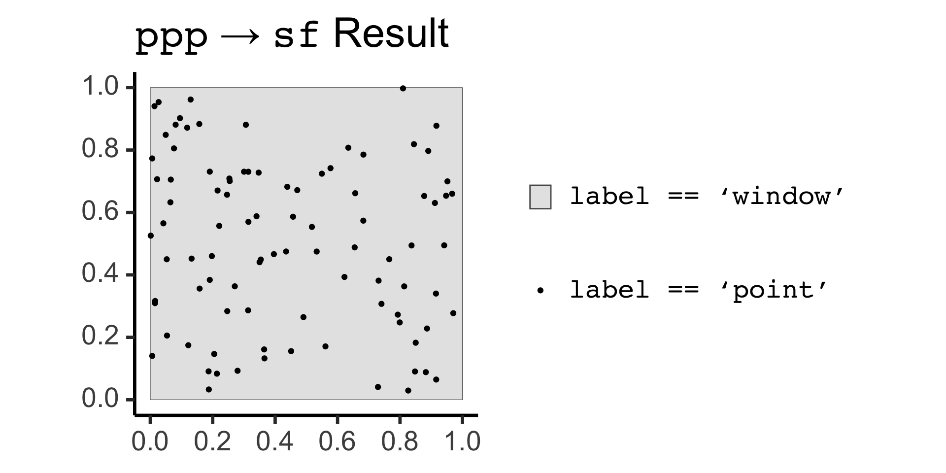
sf to ppp Conversion:
Code
Planar point pattern: 100 points
window: polygonal boundary
enclosing rectangle: [0, 1] x [0, 1] units
Code
tree_ppp_sf <- tree_ppp |> sf::st_as_sf()
tree_ppp_sf |> ggplot() +
geom_sf(aes(fill='gray90')) +
geom_sf(data=tree_ppp_sf |> filter(label != "window"), aes(color='black')) +
md_theme_classic(base_size=26) +
scale_fill_manual(name=NULL, values=c("gray90"), labels=c("<span style='font-family: mono'>tree_ppp$window</span>")) +
scale_color_manual(name=NULL, values=c("black"), labels=c("<span style='font-family: mono'>tree_ppp${x,y}</span>")) +
labs(
title = "<span style='font-family: mono'>sf</span> → <span style='font-family: mono'>ppp</span> Result",
x="<span style='font-family: mono'>tree_ppp$x</span>",
y="<span style='font-family: mono'>tree_ppp$y</span>"
) +
guides(fill = guide_legend(order = 1),
color = guide_legend(order = 2))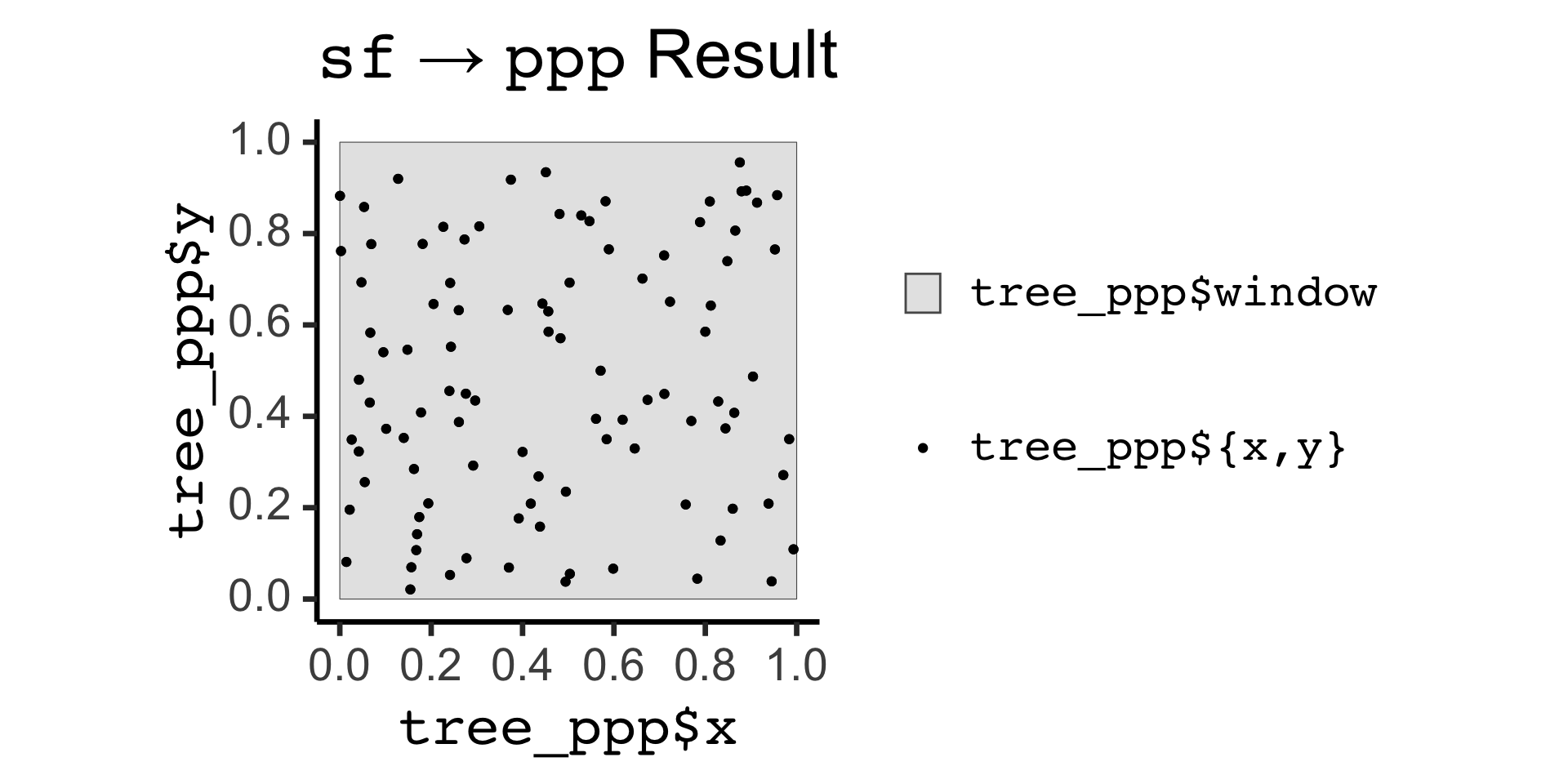
Why Do Events Appear Where They Do?
Code
set.seed(6809)
N <- 60
r_core <- 0.05
obs_window <- square(1)
### Clustered data
clust_ppp <- rMatClust(
  kappa=6,
  scale=r_core,
  mu=10
)
clust_sf <- clust_ppp |> sf::st_as_sf()
clust_plot <- clust_sf |>
  ggplot() +
  geom_sf(size=2) +
  theme_classic(base_size=18)
ggsave("images/clust_ppp.png", clust_plot, width=3, height=3)
# Intensity fn
clust_intensity <- density(clust_ppp, sigma = 0.1)
png("images/clust_intensity.png")
par(mar=c(0,0,0,2), las=2, oma=c(0,0,0,0), cex=2)
plot(clust_intensity, main=NULL)
contour(clust_intensity, add = TRUE)
dev.off()
### PCF
clust_pcf <- spatstat.explore::pcf(
  clust_ppp, divisor="d",
  r=seq(from=0.00, to=0.50, by=0.01)
)
clust_pcf_plot <- clust_pcf |> ggplot(aes(x=r, y=iso)) +
  geom_hline(yintercept=1, linetype='dashed', linewidth=1) +
  geom_area(color='black', fill=cb_palette[1], alpha=0.75) +
  scale_x_continuous(breaks=seq(from=0.0, to=1.0, by=0.1)) +
  labs(x="Distance", y="Density") +
  theme_classic(base_size=14)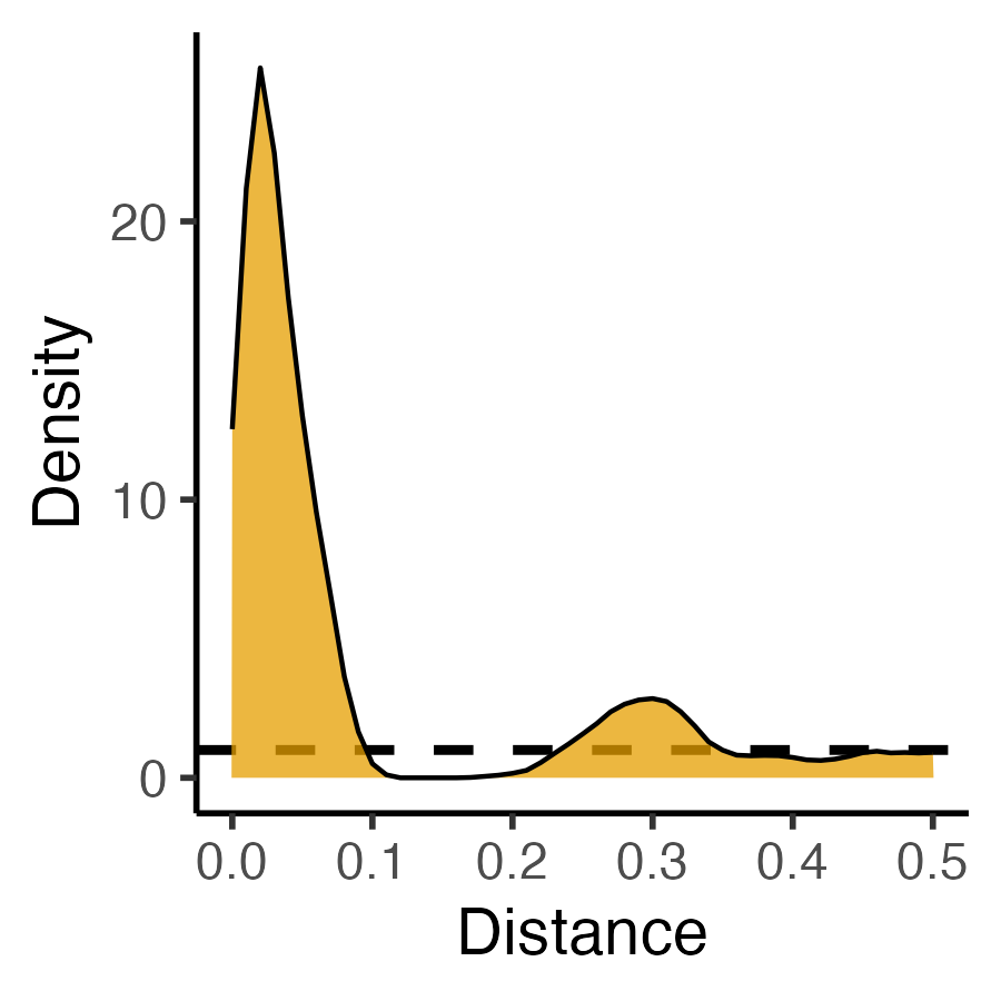
ggsave("images/clust_pcf.png", clust_pcf_plot, width=3, height=3)| Original Data | First-Order | Second-Order |
|---|---|---|
| \(N = 60\) Events | Events modeled individually \(\implies\) Intensity function \(\lambda(\mathbf{s})\) |
Events modeled pairwise \(\implies\) \(K\)-function \(K(\vec{h})\) |
|
|
|
What Do These Functions “Detect”?
Code
sq_base <- 16
sq_psize <- 2.5
obs_window <- square(1)
r0 <- 0.2
sq_df <- tibble::tribble(
  ~x, ~y,
  0.5-r0,0.5-r0,
  0.5+r0,0.5+r0,
  0.5-r0,0.5+r0,
  0.5+r0,0.5-r0
)
sq_sf <- sf::st_as_sf(
  sq_df,
  coords = c("x","y")
)
sq_ppp <- as.ppp(sq_sf, W=obs_window)
sq_ppp |> sf::st_as_sf() |> ggplot() +
  geom_sf(size=sq_psize) +
  theme_classic(base_size=sq_base)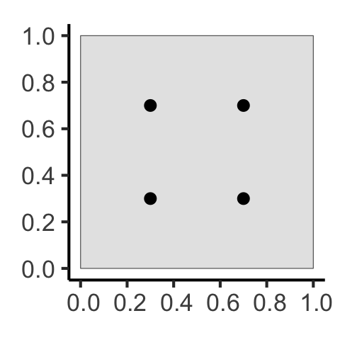
Code
### PCF
pcf_result <- spatstat.explore::pcf(
  sq_ppp,
  divisor="d",
  r=seq(from=0.00, to=0.8, by=0.01)
)
pcf_result |> ggplot(aes(x=r, y=iso)) +
  geom_hline(yintercept=1, linetype='dashed', linewidth=1.5) +
  geom_area(color='black', fill=cb_palette[1], alpha=0.75) +
  scale_x_continuous(breaks=seq(from=0.0, to=1.0, by=0.1)) +
  theme_classic(base_size=sq_base)
Code
csr_pcf_result <- spatstat.explore::pcf(
  csr_ppp,
  divisor="d",
  r=seq(from=0.00, to=0.8, by=0.01)
)
csr_pcf_result |> ggplot(aes(x=r, y=iso)) +
  geom_hline(yintercept=1, linetype='dashed', linewidth=1.5) +
  geom_area(color='black', fill=cb_palette[1], alpha=0.75) +
  scale_x_continuous(breaks=seq(from=0.0, to=1.0, by=0.1)) +
  theme_classic(base_size=sq_base)