Primary communication tools
DSAN 5200-03: Advanced Data Visualization
Tuesday, January 30, 2024
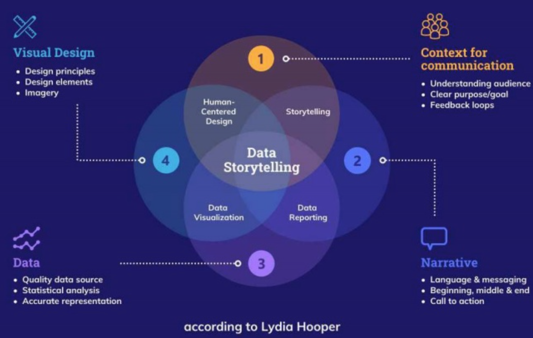
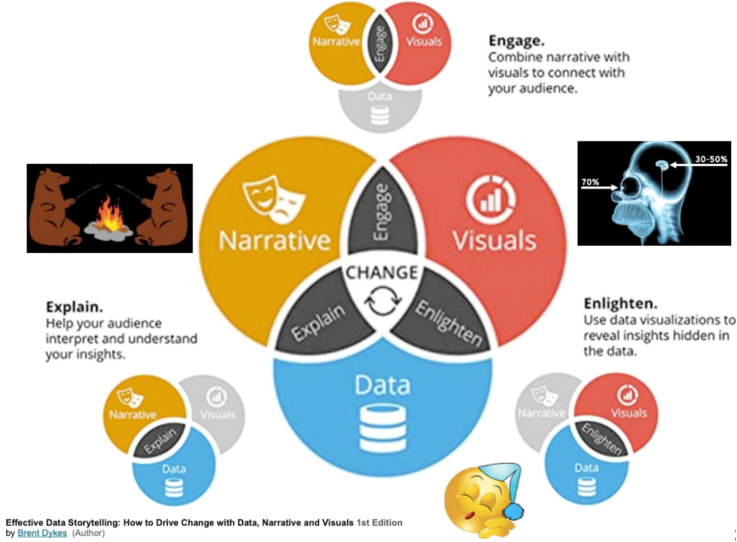
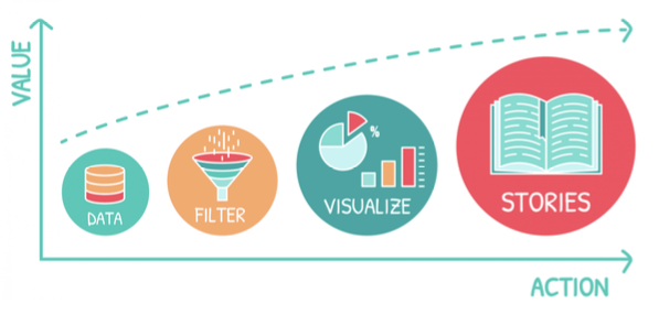
Often, your jobs as a data scientist is to be an effective communicator
There is more to communication than numbers on a paper
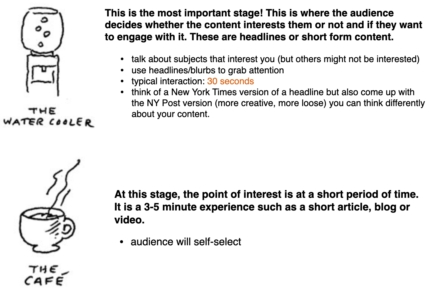
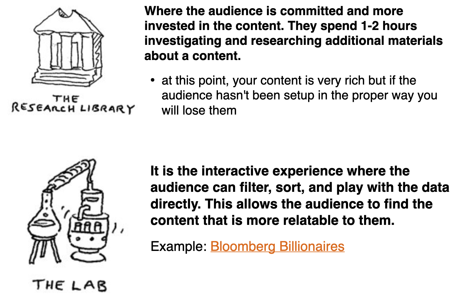
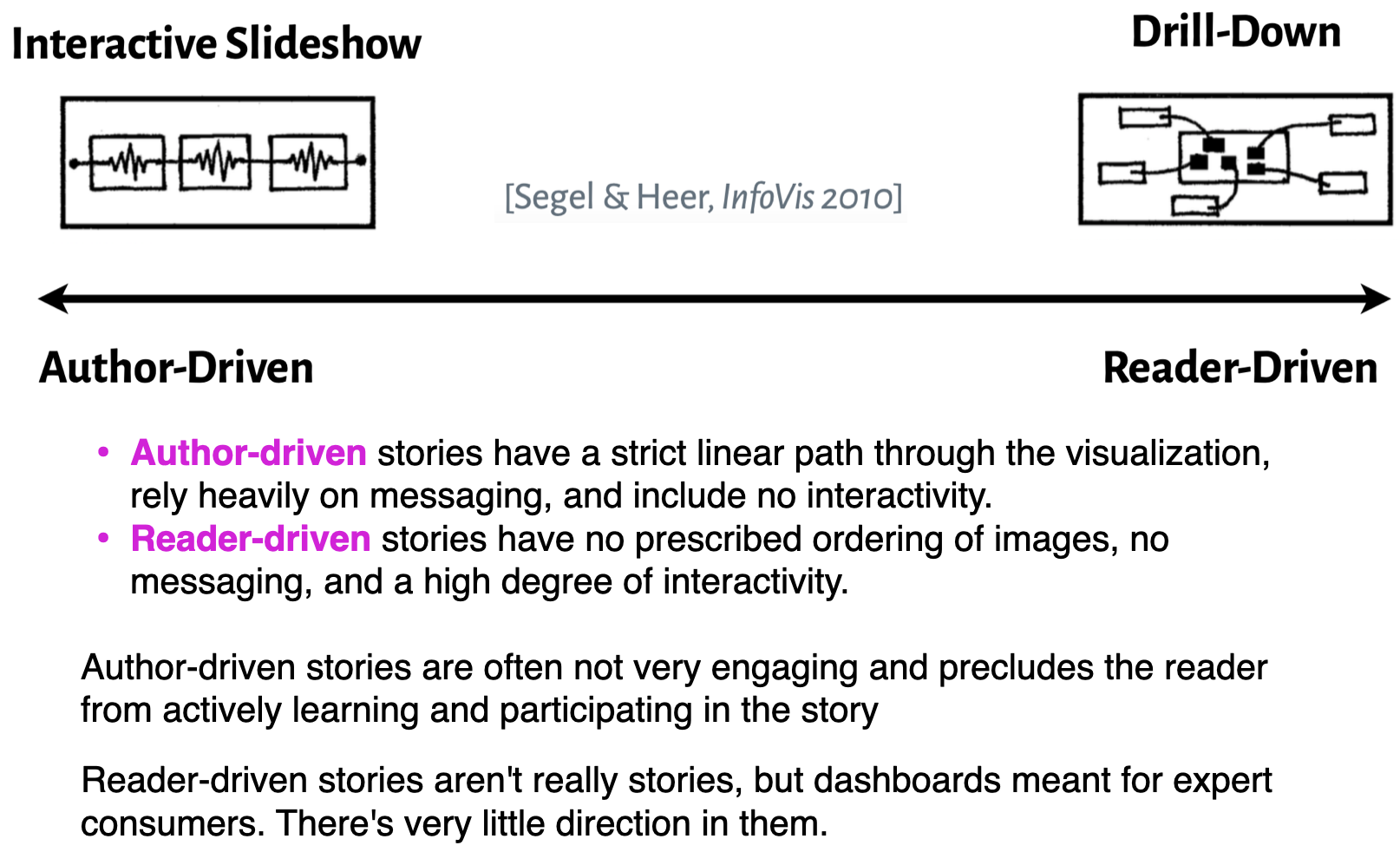
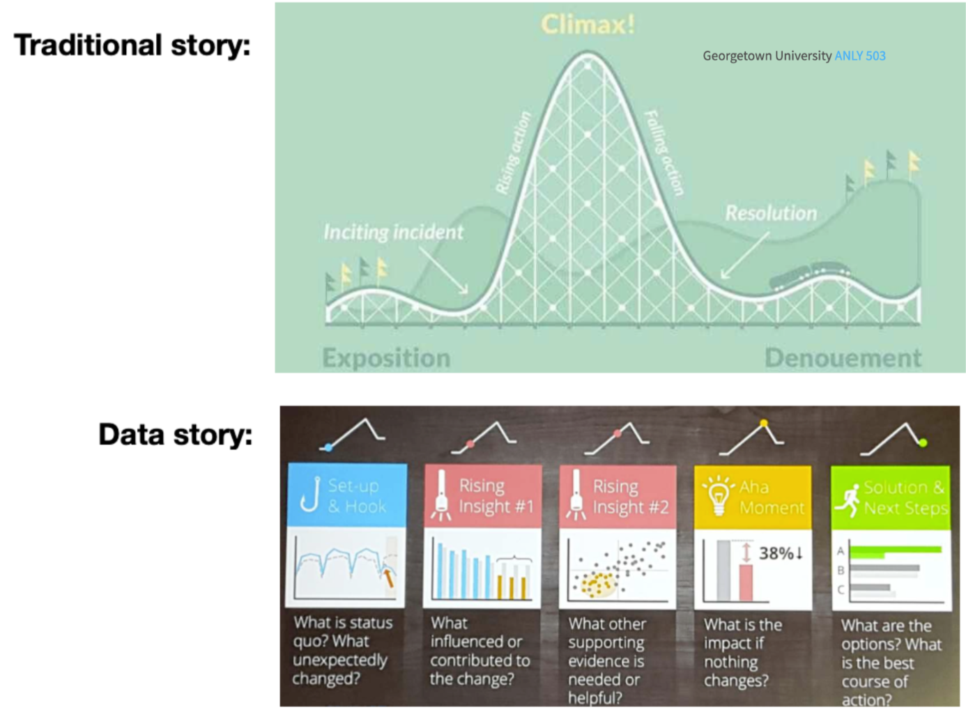
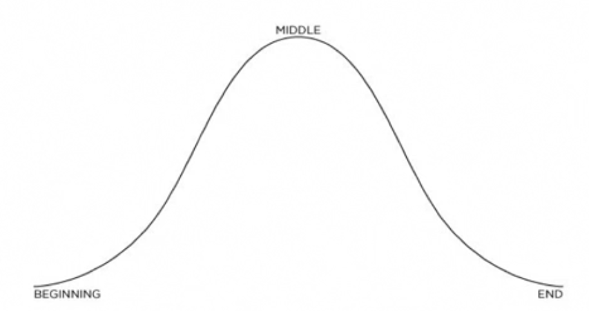
Data stories appear to be most effective when they have constrained interaction at various checkpoints within a narrative, allowing the user to explore the data without veering too far from the intended narrative.
It is not merely:
a technical matter of creating an image
designing the right chart
Rather it is:
Story components
To tell a story you have to define a story
A story is how what happens affects someone who is trying to achieve what turns out to be a difficult goal, and how they change as a result
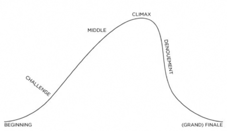
Whether driven by time or logic, stories are typically is linear
Beginning, middle and end
The old adage on how to present anything:
https://medium.com/nightingale/the-past-present-and-future-of-scrollytelling-10dd37dc1003
https://opensourcelibs.com/lib/rolldown
https://elementor.com/blog/guide-to-scrollytelling/
https://www.visualstorytell.com/blog/what-is-visual-storytelling
https://mathisonian.github.io/idyll/scaffolding-interactives/
https://idl.cs.washington.edu/
https://distill.pub/2020/communicating-with-interactive-articles/
Let’s take a 10 minute break before moving onto the lab.
DSAN 5200-03 Week 4: Storytelling and Visual Narratives