Week 11: Hypothesis Testing
DSAN 5100: Probabilistic Modeling and Statistical Computing
Section 01
Tuesday, November 11, 2025
Example 1: Bird Wingspans
- Trying to figure out the population distribution of bird wingspans.
- We hypothesize \(\mu_0 = 120\text{cm}\)
- Somehow we know the population variance \(\sigma = 20\text{cm}\), and we know that bird wingspans form a normal distribution, but we don’t know the true \(\mu\):
Code
library(tidyverse)
hyp_mu <- 120
sigma <- 20
bird_dnorm <- function(x) dnorm(x, mean=hyp_mu, sd=sigma)
sigma_df <- tribble(
    ~x,
    hyp_mu - 3 * sigma,
    hyp_mu - 2 * sigma,
    hyp_mu - 1 * sigma,
    hyp_mu + 1 * sigma,
    hyp_mu + 2 * sigma,
    hyp_mu + 3 * sigma
)
sigma_df <- sigma_df |> mutate(
    y = 0,
    xend = x,
    yend = bird_dnorm(x)
)
plot_rad <- 4 * sigma
plot_bounds <- c(hyp_mu - plot_rad, hyp_mu + plot_rad)
bird_plot <- ggplot(data=data.frame(x=plot_bounds), aes(x=x)) +
  stat_function(fun=bird_dnorm, linewidth=g_linewidth) +
  geom_vline(aes(xintercept=hyp_mu), linewidth=g_linewidth) +
  geom_segment(data=sigma_df, aes(x=x, y=y, xend=xend, yend=yend), linewidth=g_linewidth, linetype="dashed") +
  dsan_theme("half") +
  labs(
    title = "Our Hypothesized Bird Distribution",
    x = "Wingspan Values (m)",
    y = "Probability Density"
  )
bird_plot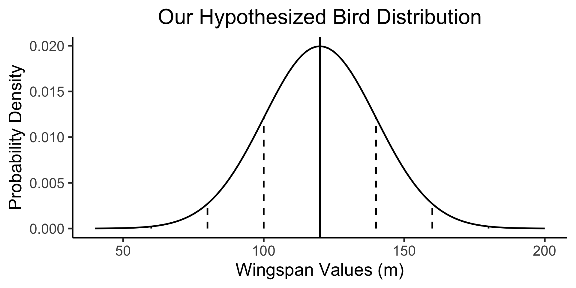
What Would Sample Means Look Like If Hypothesis Was True?
- What we know, from asymptotic sample theory, is that \(Z = \frac{\overline{X} - \mu}{\sigma / \sqrt{N}}\) is approximately standard normal, for sufficiently large values of \(N\)!
- So, let’s (1) plot this distribution, for a bunch of potential sample means, and then (2) see where our actual observed sample mean lies on this distribution!
- Sanity check: let’s actually simulate taking sample means from 1000 size-16 samples:
Code
simulate_sample_mean <- function(N, mu, sigma) {
    samples <- rnorm(N, mu, sigma)
    sample_mean <- mean(samples)
    return(sample_mean)
}
N <- 16
obs_sample_mean <- 129
num_reps <- 10000
sample_means <- as_tibble(replicate(num_reps, simulate_sample_mean(N, hyp_mu, sigma)))
asymp_dnorm <- function(x) dnorm((x - hyp_mu)/(sigma / sqrt(N)), 0, 1)
ggplot() +
  geom_histogram(
    data=sample_means,
    aes(x=value, y=5*after_stat(density)),
    binwidth=1) +
  stat_function(
    data=data.frame(x=c(100,140)),
    aes(x=x, color='asymp'),
    fun=asymp_dnorm,
    linewidth = g_linewidth
  ) +
  geom_segment(
    aes(x = obs_sample_mean, xend=obs_sample_mean, y=-Inf, yend=Inf, color='obs'),
    linewidth = g_linewidth
  ) +
  dsan_theme("half") +
  labs(
    x = "Simulated Sample Mean",
    y = "(Empirical) Density",
    title = paste0(num_reps," Simulated Sample Means, N = 16")
  ) +
  scale_color_manual(values=c('asymp'='black', 'obs'=cbPalette[1]), labels=c('asymp'='Asymptotic\nDistribution', 'obs'='Observed\nSample Mean')) +
  remove_legend_title()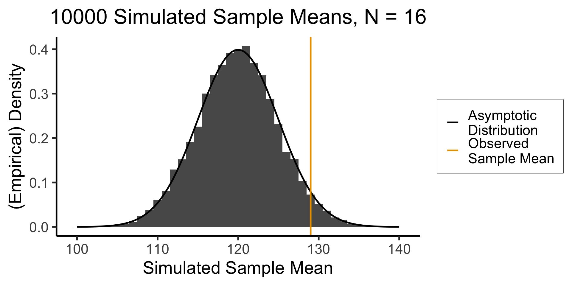
Right-Tailed Test
- Null hypothesis (in all cases) is \(H_0: \mu = \mu_0\); Right-tailed test is of alternative hypothesis \(H_A: \mu > \mu_0\)
- We reject the null if the observed sample mean \(\overline{X} = 131\) is too unlikely in the world where the null is true: \(Z(\overline{X}) \approx 1.8\)
- What cutoff should we use for “too unlikely”? (See last week’s slides…) here we’ll use \(\alpha = 0.05\): \(\int_{1.645}^{\infty}\varphi(x)dx = 0.05\), so \(1.645\) is our “critical” (cutoff) value
Code
label_df_signif_int <- tribble(
    ~x, ~y, ~label,
    0.55, 0.04, "95% Signif.\nCutoff"
)
signif_cutoff <- 1.645
funcShaded <- function(x, lower_bound, upper_bound){
    y <- dnorm(x)
    y[x < lower_bound | x > upper_bound] <- NA
    return(y)
}
funcShadedIntercept <- function(x) funcShaded(x, int_tstat, Inf)
funcShadedSignif <- function(x) funcShaded(x, signif_cutoff, Inf)
compute_z_val <- function(x) {
    return ((x - hyp_mu) / (sigma / sqrt(N)))
}
obs_zval <- compute_z_val(obs_sample_mean)
obs_zval_str <- sprintf("%.2f", obs_zval)
sample_dnorm <- function(x) dnorm(compute_z_val(x))
ggplot(data=data.frame(x=c(-3,3)), aes(x=x)) +
  stat_function(fun=dnorm, linewidth=g_linewidth) +
  #geom_segment(data=sigma_df, aes(x=x, y=y, xend=xend, yend=yend), linewidth=g_linewidth, linetype="dashed") +
  stat_function(fun = funcShadedSignif, geom = "area", fill = "grey", alpha = 0.333) +
  geom_vline(aes(xintercept = signif_cutoff), linewidth=g_linewidth, linetype="dashed") +
  geom_text(label_df_signif_int, mapping = aes(x = x, y = y, label = label), size = 8) +
  geom_vline(aes(xintercept = obs_zval, color='sample_mean'), linewidth=g_linewidth) +
  dsan_theme("half") +
  labs(
    title = "z-Test Distribution",
    x = "z Scores",
    y = "Probability Density"
  ) +
  scale_color_manual(values=c('sample_mean'=cbPalette[1]), labels=c('sample_mean'='Z(Observed Sample Mean)')) +
  remove_legend_title()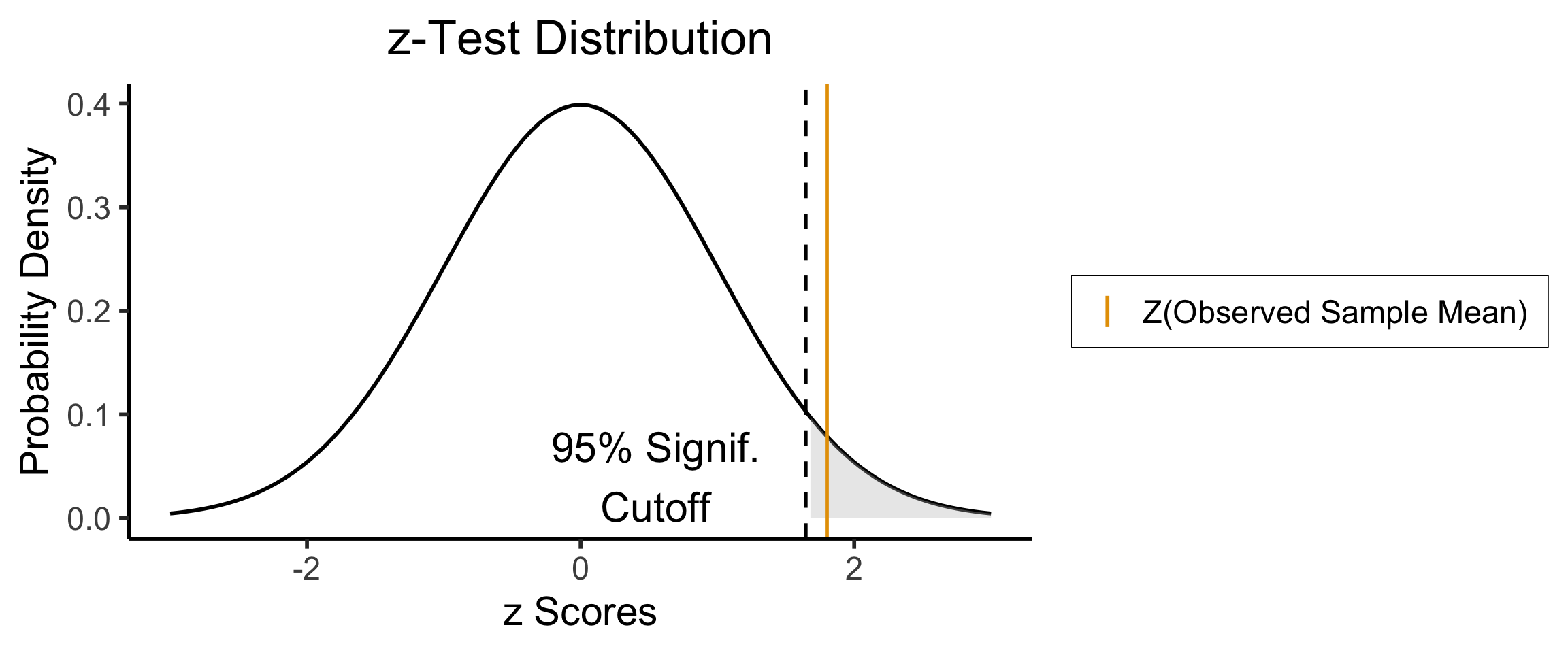
- Since \(Z(\overline{X}) > 1.645\), we reject the null hypothesis that this sample mean was generated by a distribution with mean \(\mu_0\)!
Two-Tailed Test
- Null hypothesis (in all cases) is \(H_0: \mu = \mu_0\); Two-tailed test is of alternative hypothesis \(H_A: \mu \neq \mu_0\) (the actual logical negation of the null hypothesis…)
- Reject the null if observed sample mean \(\overline{X} = 131\) is too unlikely in null world
- What cutoff should we use for “too unlikely”? Here we’ll use \(\alpha = 0.05\), but for a two tailed test we find \(\int_{-\infty}^{-1.96}\varphi(x)dx + \int_{1.96}^{\infty}\varphi(x)dx = 0.05\), so \(1.96\) is our “critical” (cutoff) value
Code
signif_cutoff <- 1.96
neg_signif_cutoff <- -signif_cutoff
label_df_signif_int <- tribble(
    ~x, ~y, ~label,
    -2.45, 0.18, paste0("Left\nCutoff\n(",neg_signif_cutoff,")"),
    2.45, 0.18, paste0("Right\nCutoff\n(",signif_cutoff,")")
)
funcShaded <- function(x, lower_bound, upper_bound){
    y <- dnorm(x)
    y[x < lower_bound | x > upper_bound] <- NA
    return(y)
}
funcShadedIntercept <- function(x) funcShaded(x, int_tstat, Inf)
funcShadedNegSignif <- function(x) funcShaded(x, -Inf, neg_signif_cutoff)
funcShadedSignif <- function(x) funcShaded(x, signif_cutoff, Inf)
compute_z_val <- function(x) {
    return ((x - hyp_mu) / (sigma / sqrt(N)))
}
obs_zval <- compute_z_val(obs_sample_mean)
sample_dnorm <- function(x) dnorm(compute_z_val(x))
ggplot(data=data.frame(x=c(-3,3)), aes(x=x)) +
  stat_function(fun=dnorm, linewidth=g_linewidth) +
  #geom_segment(data=sigma_df, aes(x=x, y=y, xend=xend, yend=yend), linewidth=g_linewidth, linetype="dashed") +
  stat_function(fun = funcShadedSignif, geom = "area", fill = "grey", alpha = 0.333) +
  stat_function(fun = funcShadedNegSignif, geom = "area", fill = "grey", alpha = 0.333) +
  geom_vline(aes(xintercept = neg_signif_cutoff), linewidth=g_linewidth, linetype="dashed") +
  geom_vline(aes(xintercept = signif_cutoff), linewidth=g_linewidth, linetype="dashed") +
  geom_text(label_df_signif_int, mapping = aes(x = x, y = y, label = label), size = 8) +
  geom_vline(aes(xintercept = obs_zval, color='sample_mean'), linewidth=g_linewidth) +
  dsan_theme("half") +
  labs(
    title = "z-Test Distribution",
    x = "z Scores",
    y = "Probability Density"
  ) +
  scale_color_manual(values=c('sample_mean'=cbPalette[1]), labels=c('sample_mean'='Z(Observed Sample Mean)')) +
  remove_legend_title()
- Since \(|Z(\overline{X})| < 1.96\), we fail to reject the null hypothesis that this sample mean was generated by a distribution with mean \(\mu_0\)!
What Is Regression?
- If science is understanding relationships between variables, regression is the most basic but fundamental tool we have to start measuring these relationships
- Often exactly what humans do when we see data!
psychology
trending_flat
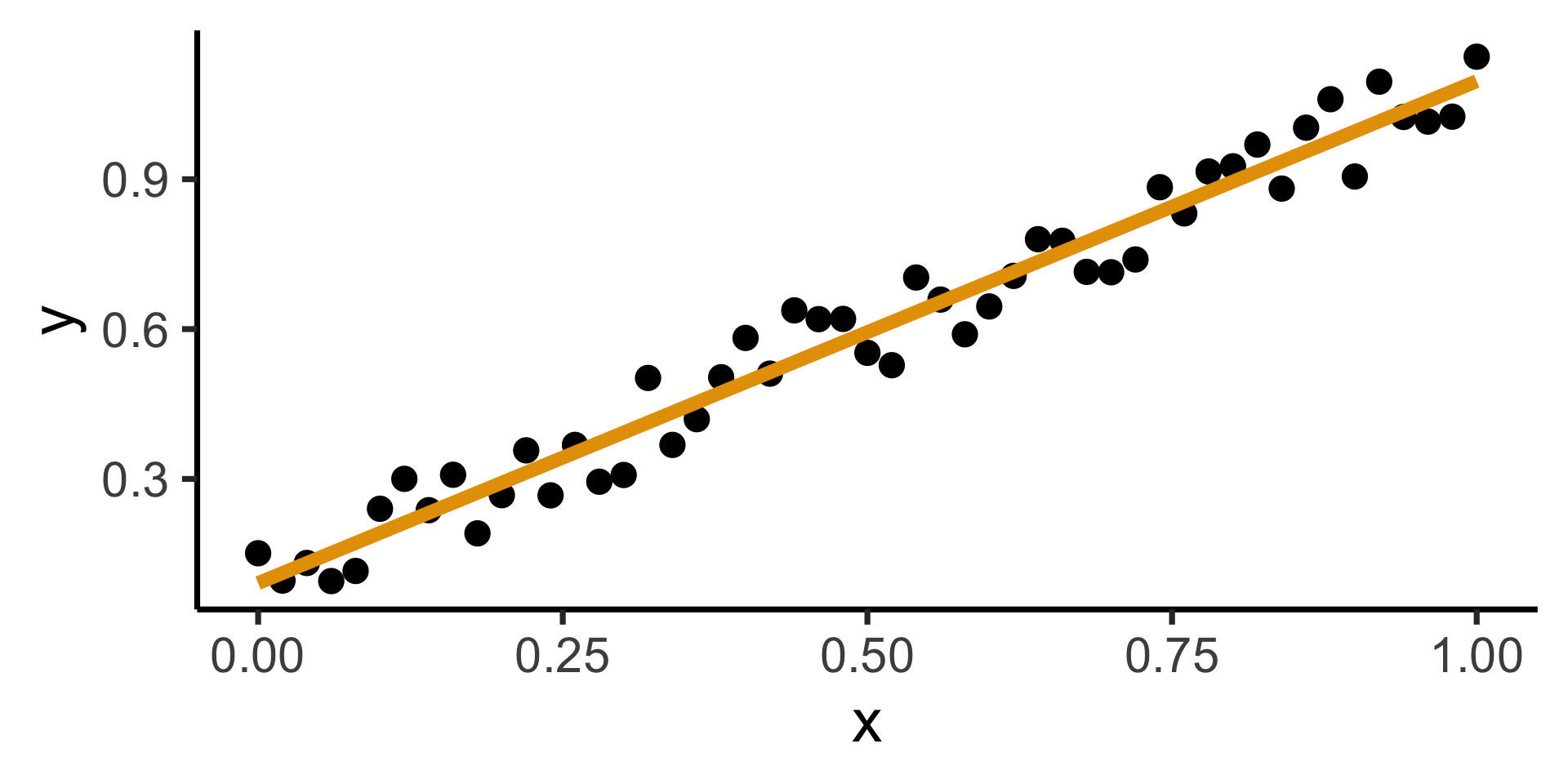
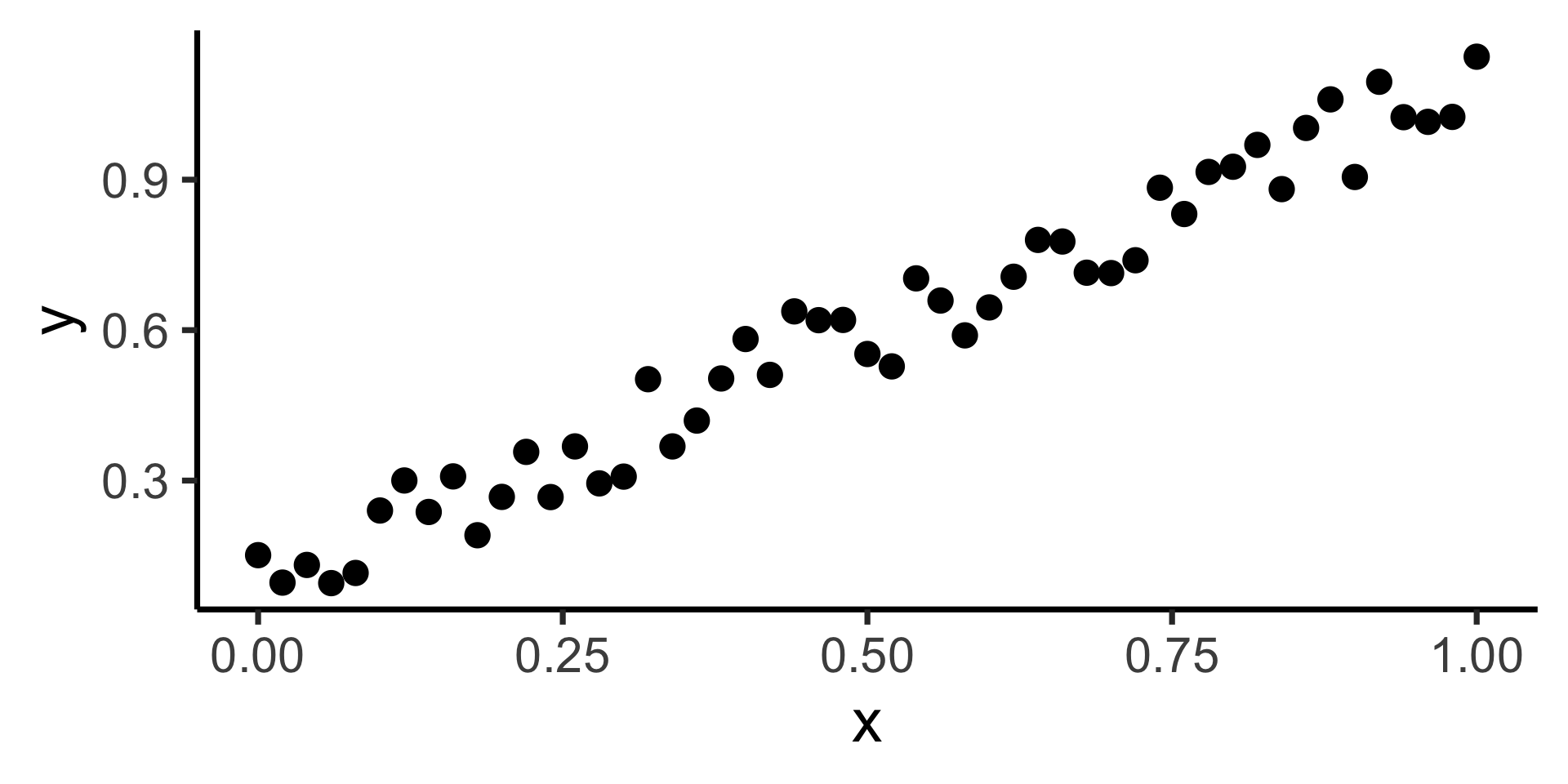
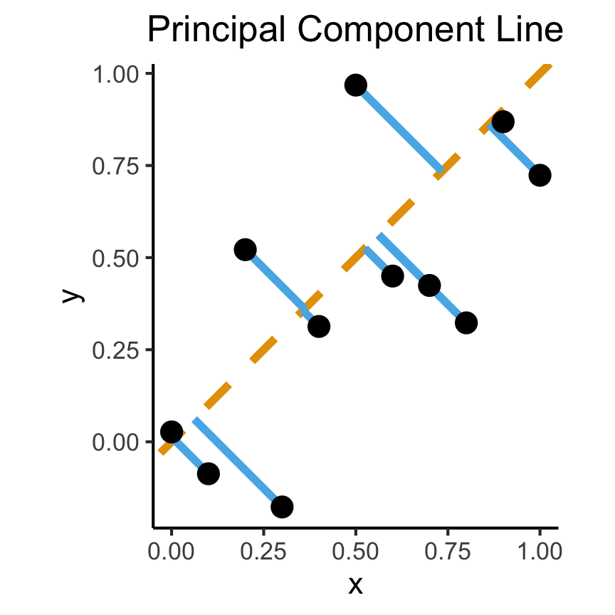
How Do We Define “Best”?
- Intuitively, two different ways to measure how well a line fits the data:
Code
set.seed(5100)
N <- 11
x <- seq(from = 0, to = 1, by = 1 / (N - 1))
y <- x + rnorm(N, 0, 0.25)
mean_y <- mean(y)
spread <- y - mean_y
df <- tibble(x = x, y = y, spread = spread)
ggplot(df, aes(x=x, y=y)) +
  geom_abline(slope=1, intercept=0, linetype="dashed", color=cbPalette[1], linewidth=g_linewidth*2) +
  geom_segment(xend=(x+y)/2, yend=(x+y)/2, linewidth=g_linewidth*2, color=cbPalette[2]) +
  geom_point(size=g_pointsize) +
  coord_equal() +
  dsan_theme("full") +
  labs(
    title = "Principal Component Line"
  )
Code
ggplot(df, aes(x=x, y=y)) +
  geom_point(size=g_pointsize) +
  geom_abline(slope=1, intercept=0, linetype="dashed", color=cbPalette[1], linewidth=g_linewidth*2) +
  geom_segment(xend=x, yend=x, linewidth=g_linewidth*2, color=cbPalette[2]) +
  dsan_theme("full") +
  labs(
    title = "Regression Line"
  ) +
  coord_equal()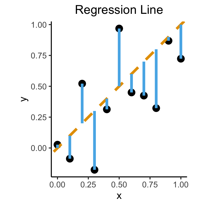
Principal Component Analysis
Principal Component Line allows projecting data onto its dimension of highest variance
More simply: PCA can discover meaningful axes in data (unsupervised learning / exploratory data analysis settings)
Code
library(readr)
library(ggplot2)
gdp_df <- read_csv("assets/gdp_pca.csv")

dist_to_line <- function(x0, y0, a, c) {
    numer <- abs(a * x0 - y0 + c)
    denom <- sqrt(a * a + 1)
    return(numer / denom)
}
# Finding PCA line for industrial vs. exports
x <- gdp_df$industrial
y <- gdp_df$exports
lossFn <- function(lineParams, x0, y0) {
    a <- lineParams[1]
    c <- lineParams[2]
    return(sum(dist_to_line(x0, y0, a, c)))
}
o <- optim(c(0, 0), lossFn, x0 = x, y0 = y)
ggplot(gdp_df, aes(x = industrial, y = exports)) +
    geom_point(size=g_pointsize/2) +
    geom_abline(aes(slope = o$par[1], intercept = o$par[2], color="pca"), linewidth=g_linewidth, show.legend = TRUE) +
    geom_smooth(aes(color="lm"), method = "lm", se = FALSE, linewidth=g_linewidth, key_glyph = "blank") +
    scale_color_manual(element_blank(), values=c("pca"=cbPalette[2],"lm"=cbPalette[1]), labels=c("Regression","PCA")) +
    dsan_theme("half") +
    remove_legend_title() +
    labs(
      title = "PCA Line vs. Regression Line",
        x = "Industrial Production (% of GDP)",
        y = "Exports (% of GDP)"
    )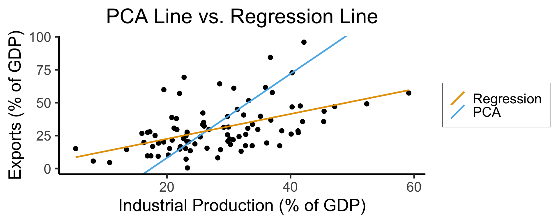
- See here for an amazing blog post using PCA to explore UN voting patterns!
Create Your Own Dimension!
Code
ggplot(gdp_df, aes(pc1, .fittedPC2)) +
    geom_point(size = g_pointsize/2) +
    geom_hline(aes(yintercept=0, color='PCA Line'), linetype='solid', size=g_linesize) +
    geom_rug(sides = "b", linewidth=g_linewidth/1.2, length = unit(0.1, "npc"), color=cbPalette[3]) +
    expand_limits(y=-1.6) +
    scale_color_manual(element_blank(), values=c("PCA Line"=cbPalette[2])) +
    dsan_theme("full") +
    remove_legend_title() +
    labs(
      title = "Exports vs. Industrial Production in Principal Component Space",
      x = "First Principal Component (Dimension of Greatest Variance)",
      y = "Second Principal Component"
    )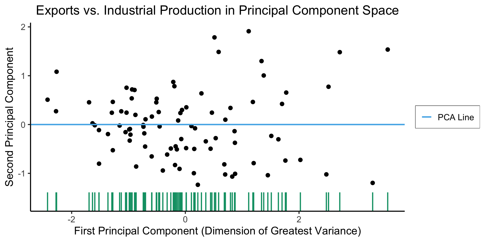
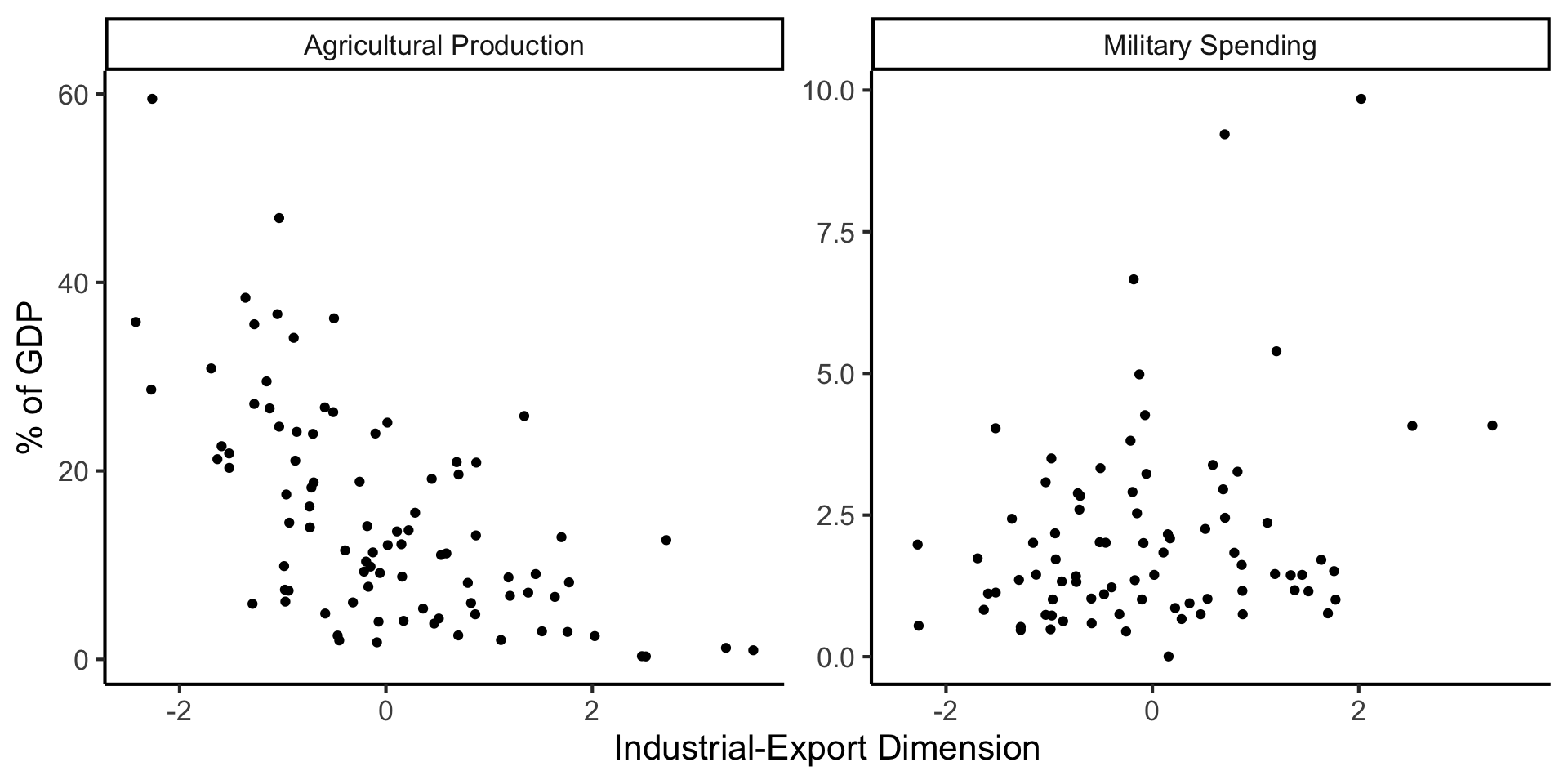
And Use It for EDA
Code
library(dplyr)
library(tidyr)
plot_df <- gdp_df %>% select(c(country_code, pc1, agriculture, military))
long_df <- plot_df %>% pivot_longer(!c(country_code, pc1), names_to = "var", values_to = "val")
long_df <- long_df |> mutate(
  var = case_match(
    var,
    "agriculture" ~ "Agricultural Production",
    "military" ~ "Military Spending"
  )
)
ggplot(long_df, aes(x = pc1, y = val, facet = var)) +
    geom_point() +
    facet_wrap(vars(var), scales = "free") +
    dsan_theme("full") +
    labs(
        x = "Industrial-Export Dimension",
        y = "% of GDP"
    )
Zooming In: Significance
| Estimate | Std. Error | t value | Pr(>|t|) | ||
|---|---|---|---|---|---|
| (Intercept) | 0.61969 | 0.59526 | 1.041 | 0.3010 | |
| industrial | 0.05253 | 0.02019 | 2.602 | 0.0111 | * |
| \(\widehat{\beta}\) | Uncertainty | Test statistic | How extreme is test stat? | Statistical significance |
Code
library(ggplot2)
int_tstat <- 1.041
int_tstat_str <- sprintf("%.02f", int_tstat)
label_df_int <- tribble(
    ~x, ~y, ~label,
    0.25, 0.05, paste0("P(t > ",int_tstat_str,")\n= 0.3")
)
label_df_signif_int <- tribble(
    ~x, ~y, ~label,
    2.7, 0.075, "95% Signif.\nCutoff"
)
funcShaded <- function(x, lower_bound, upper_bound){
    y <- dnorm(x)
    y[x < lower_bound | x > upper_bound] <- NA
    return(y)
}
funcShadedIntercept <- function(x) funcShaded(x, int_tstat, Inf)
funcShadedSignif <- function(x) funcShaded(x, 1.96, Inf)
ggplot(data=data.frame(x=c(-3,3)), aes(x=x)) +
  stat_function(fun=dnorm, linewidth=g_linewidth) +
  geom_vline(aes(xintercept=int_tstat), linewidth=g_linewidth) +
  geom_vline(aes(xintercept = 1.96), linewidth=g_linewidth, linetype="dashed") +
  stat_function(fun = funcShadedIntercept, geom = "area", fill = cbPalette[1], alpha = 0.5) +
  stat_function(fun = funcShadedSignif, geom = "area", fill = "grey", alpha = 0.333) +
  geom_text(label_df_int, mapping = aes(x = x, y = y, label = label), size = 10) +
  geom_text(label_df_signif_int, mapping = aes(x = x, y = y, label = label), size = 8) +
  # Add single additional tick
  scale_x_continuous(breaks=c(-2, 0, int_tstat, 2), labels=c("-2","0",int_tstat_str,"2")) +
  dsan_theme("quarter") +
  labs(
    title = "t Value for Intercept",
    x = "t",
    y = "Density"
  ) +
  theme(axis.text.x = element_text(colour = c("black", "black", cbPalette[1], "black")))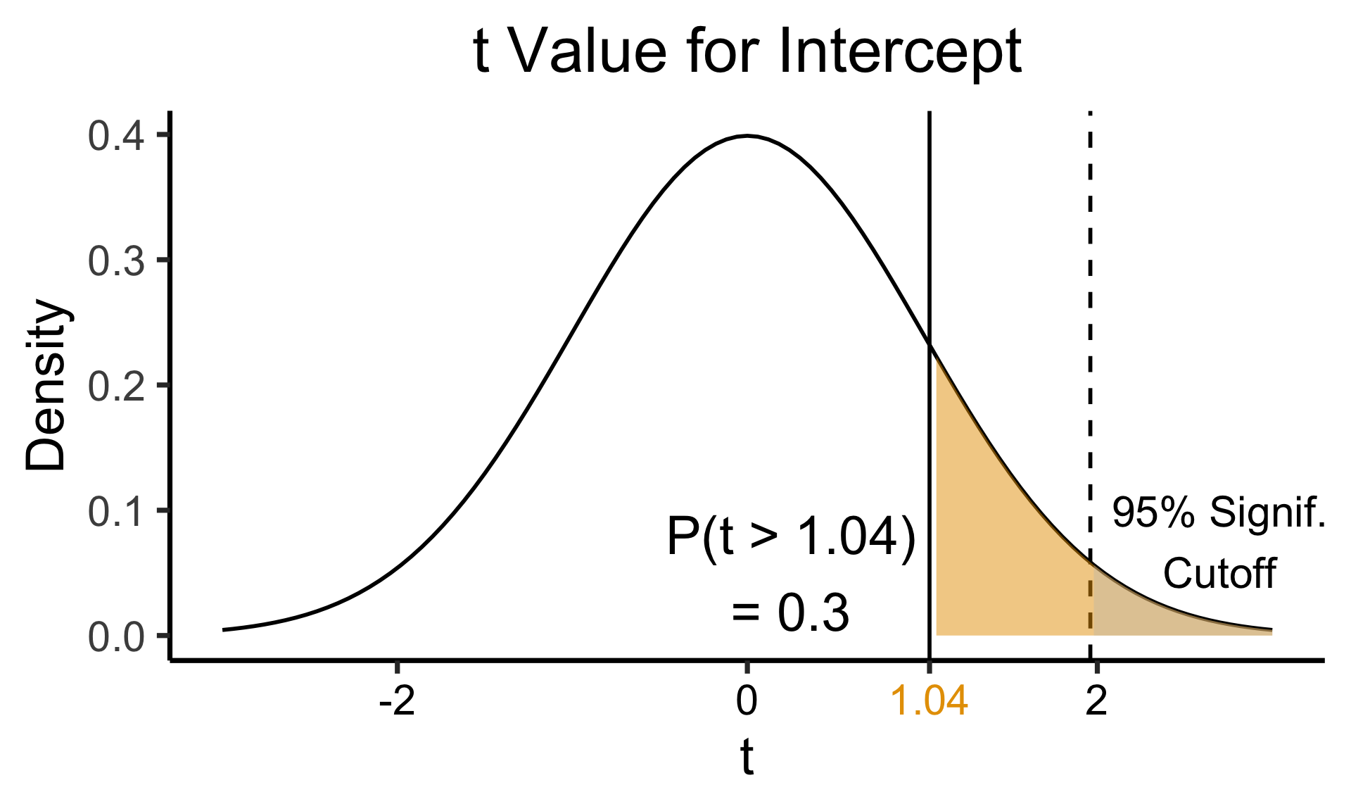
Code
library(ggplot2)
coef_tstat <- 2.602
coef_tstat_str <- sprintf("%.02f", coef_tstat)
label_df_coef <- tribble(
    ~x, ~y, ~label,
    3.65, 0.06, paste0("P(t > ",coef_tstat_str,")\n= 0.01")
)
label_df_signif_coef <- tribble(
  ~x, ~y, ~label,
  1.05, 0.03, "95% Signif.\nCutoff"
)
funcShadedCoef <- function(x) funcShaded(x, coef_tstat, Inf)
ggplot(data=data.frame(x=c(-4,4)), aes(x=x)) +
  stat_function(fun=dnorm, linewidth=g_linewidth) +
  geom_vline(aes(xintercept=coef_tstat), linetype="solid", linewidth=g_linewidth) +
  geom_vline(aes(xintercept=1.96), linetype="dashed", linewidth=g_linewidth) +
  stat_function(fun = funcShadedCoef, geom = "area", fill = cbPalette[2], alpha = 0.5) +
  stat_function(fun = funcShadedSignif, geom = "area", fill = "grey", alpha = 0.333) +
  # Label shaded area
  geom_text(label_df_coef, mapping = aes(x = x, y = y, label = label), size = 10) +
  # Label significance cutoff
  geom_text(label_df_signif_coef, mapping = aes(x = x, y = y, label = label), size = 8) +
  coord_cartesian(clip = "off") +
  # Add single additional tick
  scale_x_continuous(breaks=c(-4, -2, 0, 2, coef_tstat, 4), labels=c("-4", "-2","0", "2", coef_tstat_str,"4")) +
  dsan_theme("quarter") +
  labs(
    title = "t Value for Coefficient",
    x = "t",
    y = "Density"
  ) +
  theme(axis.text.x = element_text(colour = c("black", "black", "black", "black", cbPalette[2], "black")))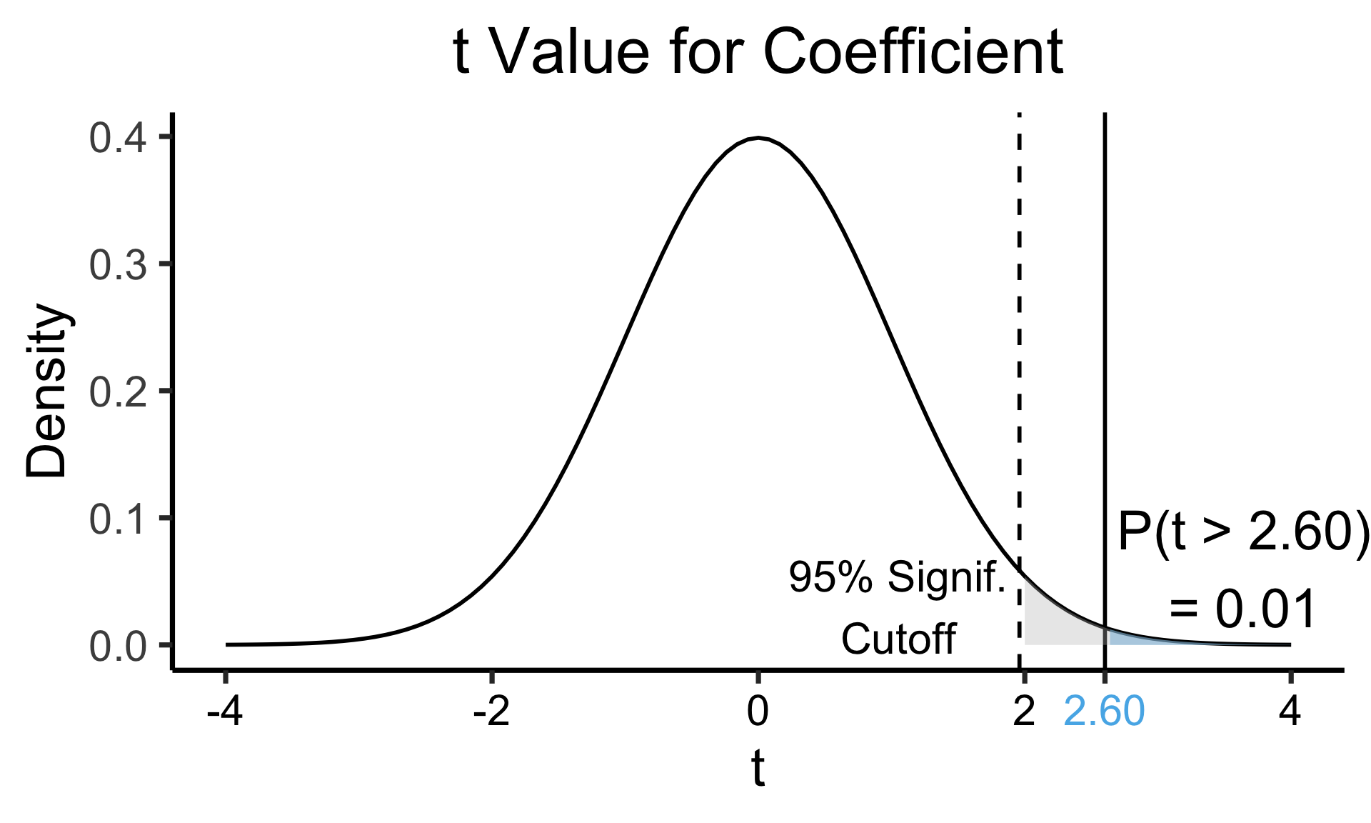
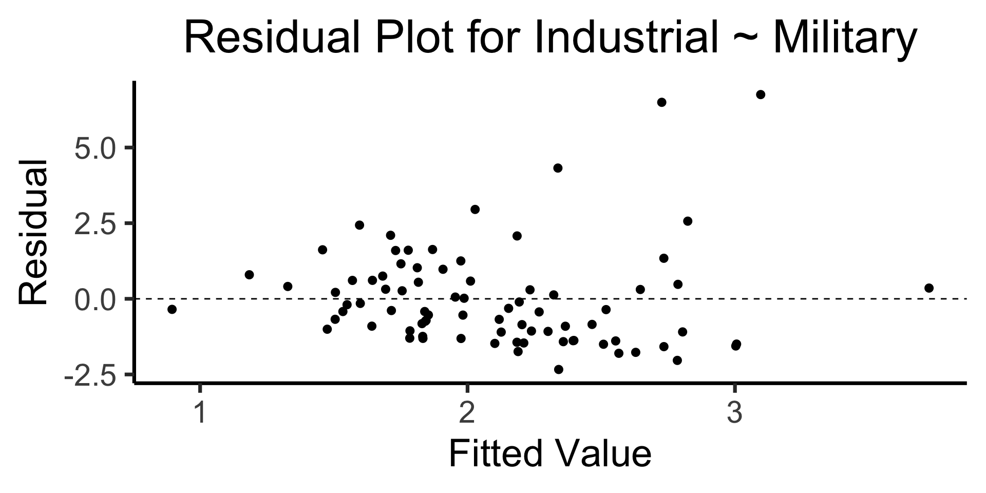
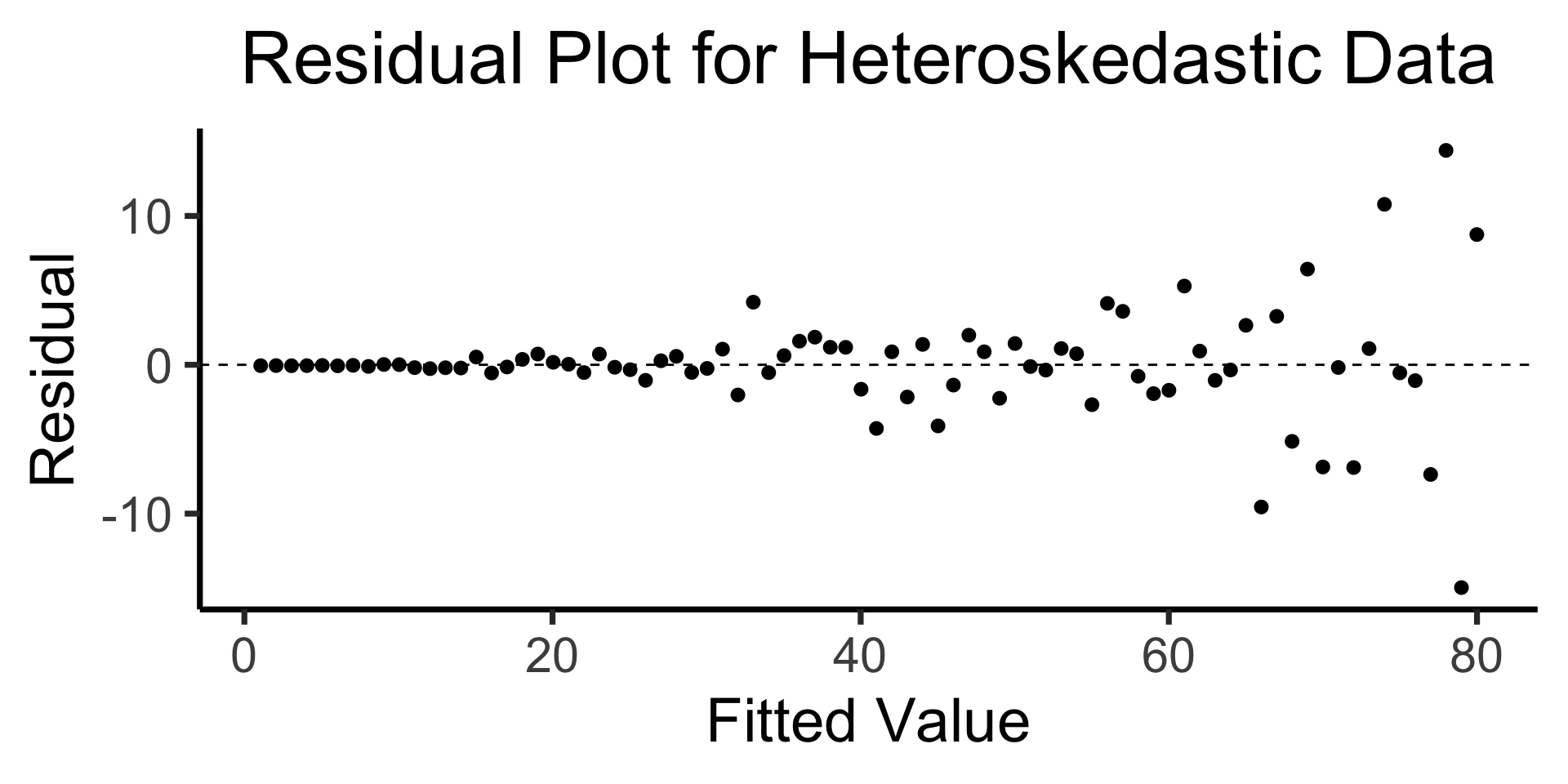
The Residual Plot
- A key assumption required for OLS: “homoskedasticity”
- Given our model \[ y_i = \beta_0 + \beta_1x_i + \varepsilon_i \] the errors \(\varepsilon_i\) should not vary systematically with \(i\)
- Formally: \(\forall i \left[ \Var{\varepsilon_i} = \sigma^2 \right]\)
Code
library(broom)
gdp_resid_df <- augment(lin_model)
ggplot(gdp_resid_df, aes(x = .fitted, y = .resid)) +
    geom_point(size = g_pointsize/2) +
    geom_hline(yintercept=0, linetype="dashed") +
    dsan_theme("quarter") +
    labs(
      title = "Residual Plot for Industrial ~ Military",
      x = "Fitted Value",
      y = "Residual"
    )
Code
x <- 1:80
errors <- rnorm(length(x), 0, x^2/1000)
y <- x + errors
het_model <- lm(y ~ x)
df_het <- augment(het_model)
ggplot(df_het, aes(x = .fitted, y = .resid)) +
    geom_point(size = g_pointsize / 2) +
    geom_hline(yintercept = 0, linetype = "dashed") +
    dsan_theme("quarter") +
    labs(
        title = "Residual Plot for Heteroskedastic Data",
        x = "Fitted Value",
        y = "Residual"
    )
Observations vs. Base Rates
Steve is very shy and withdrawn, invariably helpful but with very little interest in people or in the world of reality. A meek and tidy soul, he has a need for order and structure, and a passion for detail.
\(\Pr(\text{Steve is a librarian} \mid \text{description})?\)

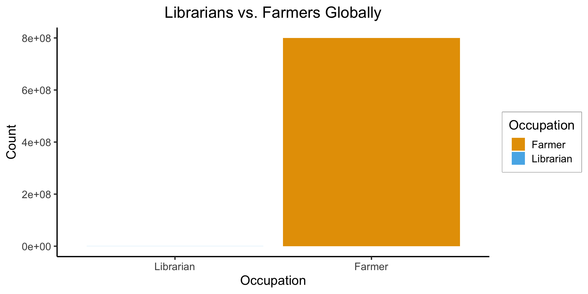
Base Rates
- Globally: ~350,000 librarians vs. ~800 million farmers
Code
library(tidyverse)
num_librarians <- 350000
num_farmers <- 800000000
occu_df <- tribble(
    ~Occupation, ~Count,
    "Farmer", num_farmers,
    "Librarian", num_librarians,
)

ggplot(occu_df, aes(x=factor(Occupation, levels=c("Librarian","Farmer")), y=Count, fill=Occupation)) +
  geom_bar(stat='identity') +
  dsan_theme() +
  labs(
    x = "Occupation",
    y = "Count",
    title = "Librarians vs. Farmers Globally"
  )
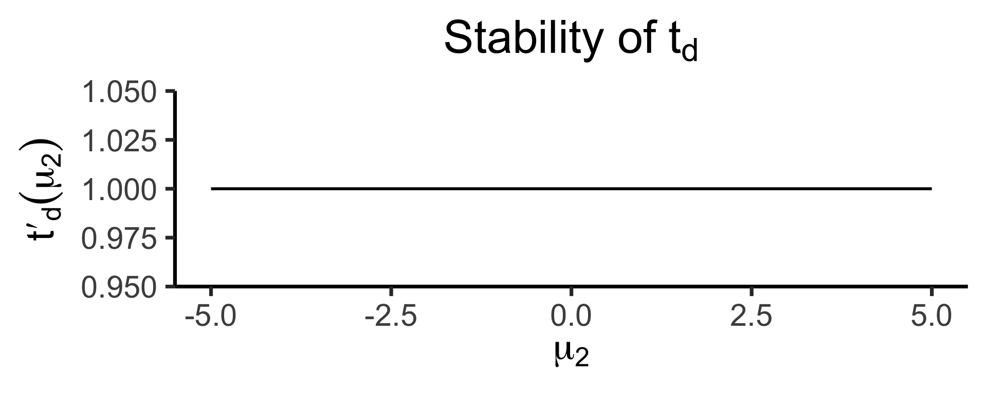
The Difference, In Math
Code
library(tidyverse)
library(latex2exp)
my_const <- function(x) 1
my_ratio <- function(x) 1/x
#data_df <- data_df |> mutate(
# z = my_diff(x, y)
#)
#print(data_df)
x_label <- TeX("$\\mu_2$")
td_title <- TeX("Stability of $t_d$")
td_label <- TeX("$t'_d(\\mu_2)$")
base_plot <- ggplot(data=data.frame(x=c(-5,5)), aes(x=x)) +
dsan_theme("quarter") +
labs(
x = x_label
)
diff_plot <- base_plot + stat_function(
fun = my_const,
linewidth = g_linewidth
) + labs(
title = td_title,
y = td_label
)
diff_plot
tr_title <- TeX("Stability of $t_r$")
tr_label <- TeX("$t'_r(\\mu_2)$")
ratio_plot <- base_plot + stat_function(
fun = my_ratio,
linewidth = g_linewidth
) + labs(
title = tr_title,
y = tr_label
)
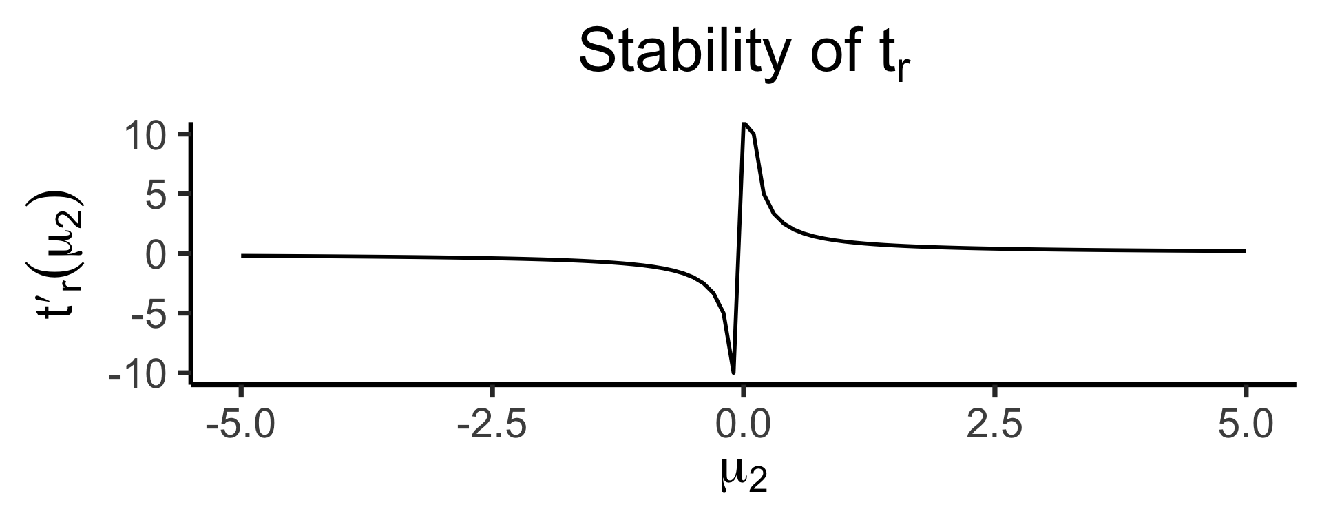
ratio_plotOur test statistic is some function \(t(\mu_1, \mu_2)\).
Let \(t_d(\mu_1, \mu_2) = \mu_1 - \mu_2\)
Let \(t_r(\mu_1, \mu_2) = \frac{\mu_1}{\mu_2}\)
How sensitive are these two ways of defining \(t\) to changes in the individual terms?
\[ t'_d(\mu_2) = \frac{\partial t^-(\mu_1, \mu_2)}{\partial \mu_1} = 1, \]
whereas
\[ t'_r(\mu_2) = \frac{\partial t^\div(\mu_1, \mu_2)}{\partial \mu_1} = \frac{1}{\mu_2} \]
\(z\)-Test \(\rightarrow\) \(t\)-Test
Code
library(tidyverse)
my_normal <- function(x) dnorm(x)
my_st <- function(x) dt(x, 2)
ggplot(data=data.frame(x=c(-3,3)), aes(x=x)) +
  stat_function(
    aes(color='norm'),
    fun=my_normal,
    linewidth = g_linewidth
  ) +
  stat_function(
    aes(color='st'),
    fun=my_st,
    linewidth = g_linewidth
  ) +
  dsan_theme("half") +
  scale_color_manual(
    "Distribution",
    values=c('norm'=cbPalette[1],'st'=cbPalette[2]),
    labels=c('norm'="Standard Normal",'st'="Student's t (df=2)")
  ) +
  remove_legend_title() +
  labs(
    title = "Standard Normal vs. Student's t Distribution"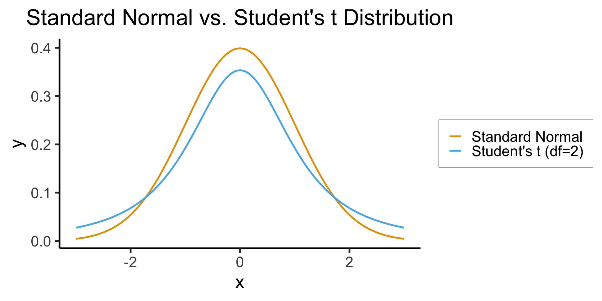
)- When we know \(\sigma^2\) but we estimate \(\mu\) from a sample, we represent our uncertainty via test statistic \(z \sim \mathcal{N}(\widehat{\mu}, \sigma^2)\)
- When we estimate both \(\mu\) and \(\sigma^2\) from a sample, we use a test statistic \(t\) with a wider “Student’s \(t\)” Distribution in place of the Normal Distribution: \(t \sim \mathcal{T}(\widehat{\mu}, \widehat{\sigma}^2, N)\)
- As \(N \rightarrow \infty\), \(\mathcal{T}_N(\widehat{\mu},\widehat{\sigma}^2,N) \rightarrow \mathcal{N}(\widehat{\mu},\widehat{\sigma}^2)\)
In R
- Let’s create a tibble containing samples from two populations
Code
library(tidyverse)
library(infer)
nl_height_mean <- 182.535
nl_height_sd <- 8
yemen_height_mean <- 159.887
yemen_height_sd <- 8
N <- 100
nl_sample <- rnorm(N, mean=nl_height_mean, sd = nl_height_sd)
nl_df <- tibble(height=nl_sample, Country="Netherlands")
yemen_sample <- rnorm(N, mean=yemen_height_mean, sd = yemen_height_sd)
yemen_df <- tibble(height=yemen_sample, Country="Yemen")
data_df <- bind_rows(nl_df, yemen_df)
ggplot(data_df, aes(x=height, fill=Country)) +
  geom_density(alpha=0.5) +
  dsan_theme() +
  #xlim(150,200) +
  labs(
    title = "Mean Heights: Yemen (N=100) vs. Netherlands (N=100)",
    x = "Height (cm)",
    y = "Sample Probability Density"
  ) +
  scale_fill_manual("Country", values=c('Netherlands'=cbPalette[1], 'Yemen'=cbPalette[2]))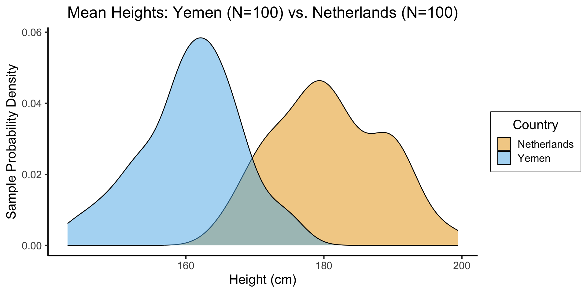
- \(H_0: \mu_{\text{NL}} - \mu_{\text{Yem}} = 0\), \(H_A: \mu_{\text{NL}} - \mu_{\text{Yem}} > 0\), \(t = \overline{h}_{\text{NL}} - \overline{h}_{\text{Yem}}\)
The Chi-Squared Test of Independence