Jeff’s Big Bucket of Datasets for Visualization
There are lots of datasets out there, to the point that it can be scary trawling through e.g. the (at time of writing) 1,780 datasets listed in the Data is Plural archive. This point of this post, therefore, is to provide a “curated” collection of datasets specifically chosen for how well they lend themselves to various methods of visualization. For the section of DSAN 5200: Advanced Data Visualization that I’m teaching this semester (Section 03), I’ll be drawing on these datasets for demonstrations of how we can produce visual representations from raw numeric or text data.
Life Expectancy By Country
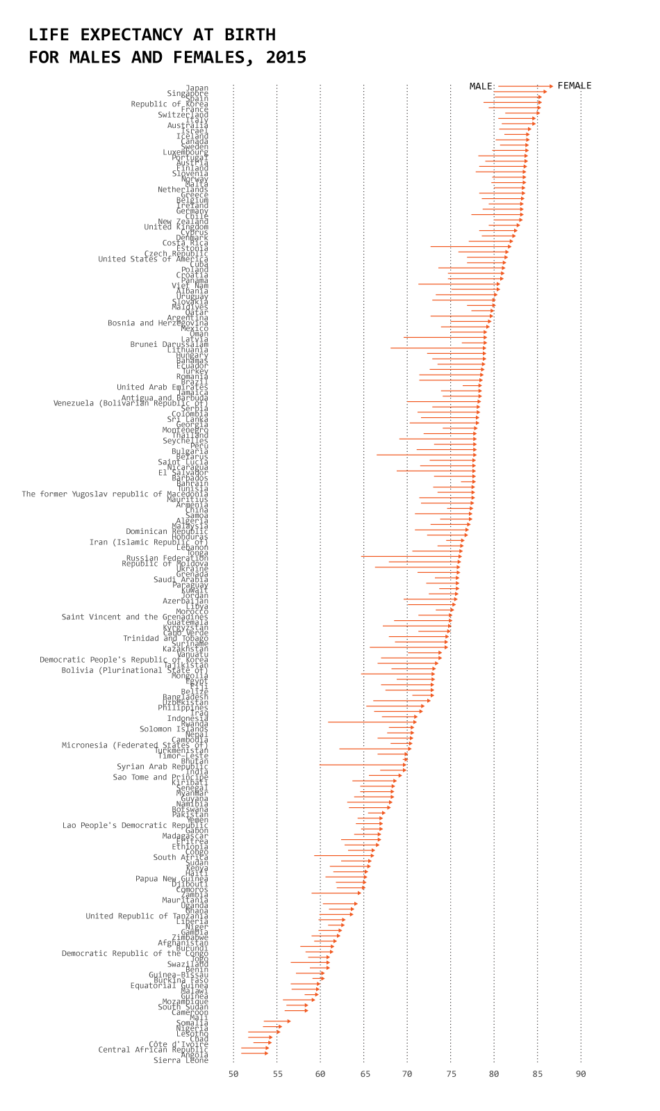
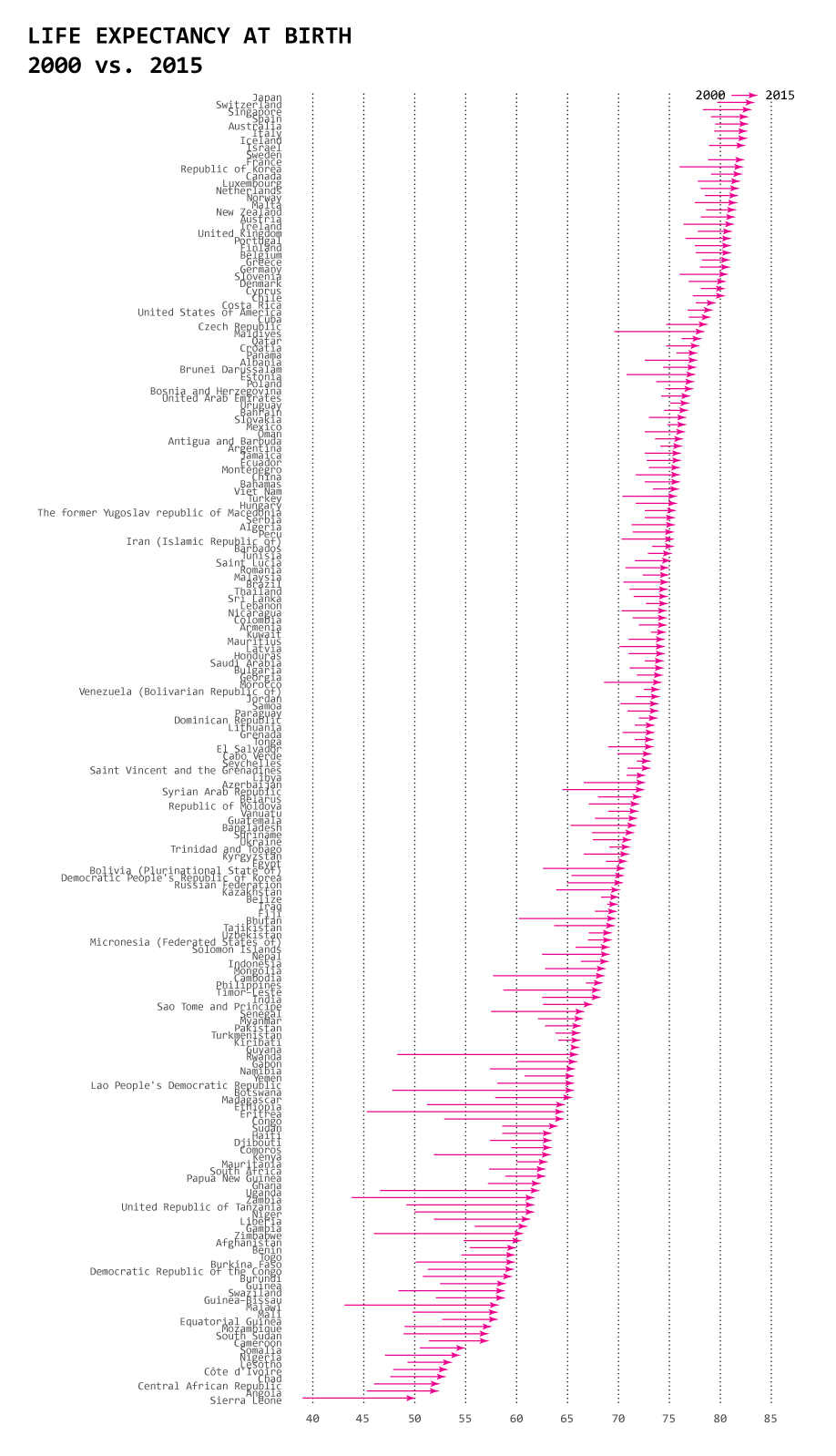
The data, from the World Health Organization’s Global Health Observatory.
- Type: Panel (Country x Year)
This is the dataset behind Nathan Yau’s blog post One Dataset, Visualized 25 Ways. This post provides a great example of how data doesn’t “speak for itself”, and how visualization choices—what aspects to highlight and what aspects to exclude—can have a big impact on how underlying patterns in the data are extracted, communicated, and understood by an audience.
Perception of Probability Words
- Type: Cross-sectional (one row per respondent)
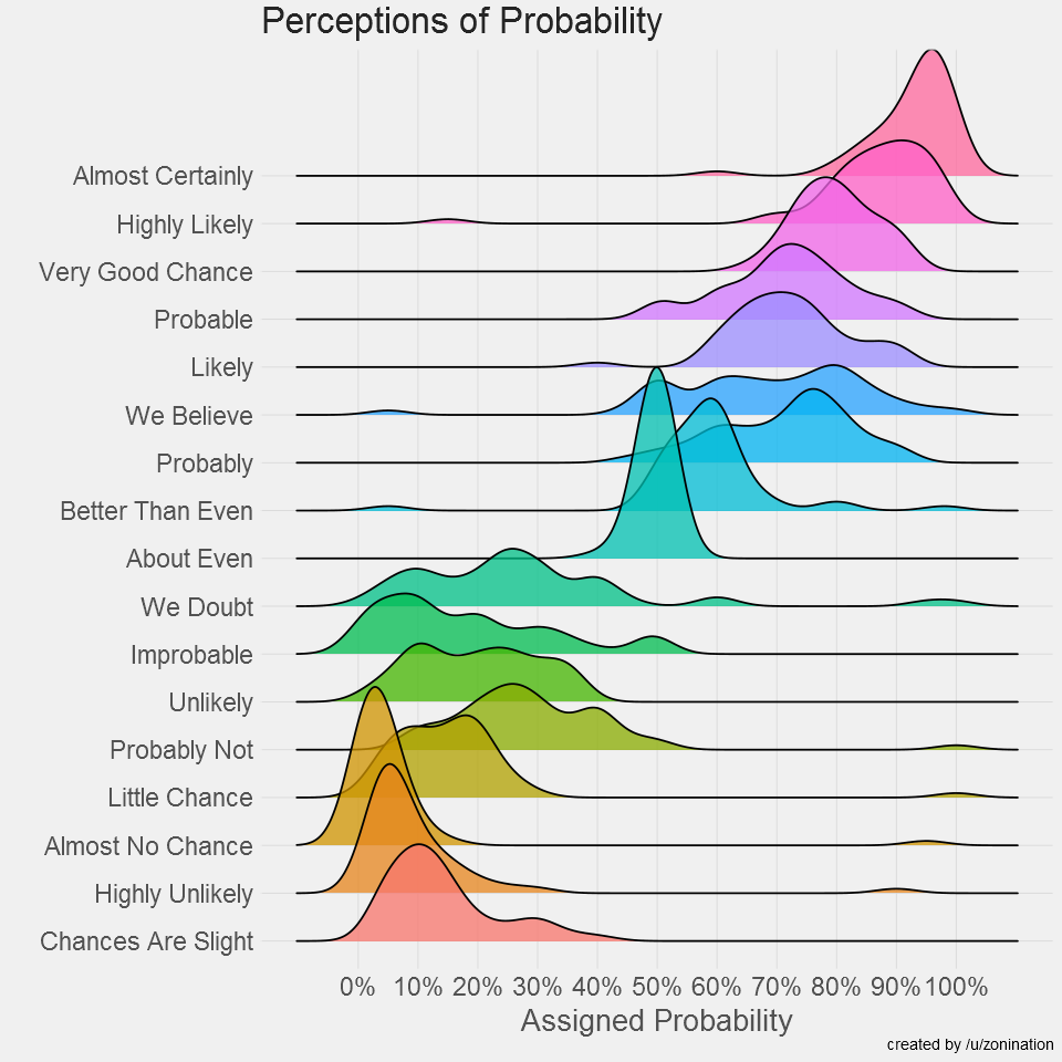
- Survey of 123 redditors, based on a set of charts from an earlier (since-declassified) CIA publication on “Words of Estimative Probability”, data here
- Visualization of a precursor to this dataset on D3 Graph Gallery
- Visualization of this data, along with additional contextual details, from Illinois Computer Science professor Wade Fagen-Ulmschneider
- Analysis from Visual Capitalist
This is one of my favorite datasets for visualization, and just for pondering in general, because it brings out the tension between the “fuzziness” of human decision-making and the numeric precision which is required for the algorithmic decision-making carried out by computers. Thinking through the visualizations of the above data on this page “in reverse” can help us understand how humans perceive the outputs of probabilistic machine learning algorithms: there is a sense in which an “average” human (generalizing speculatively from this small-\(N\) survey!) will interpret an algorithm’s output of 0.95 as an “almost certain” result, while a result between 0.15 and 0.30 will be interpreted by ~50% of humans as a “probably not” result.
Banknote Faces
- Type: Cross-sectional (one row per person)
- Data available via the GitHub repo for the article
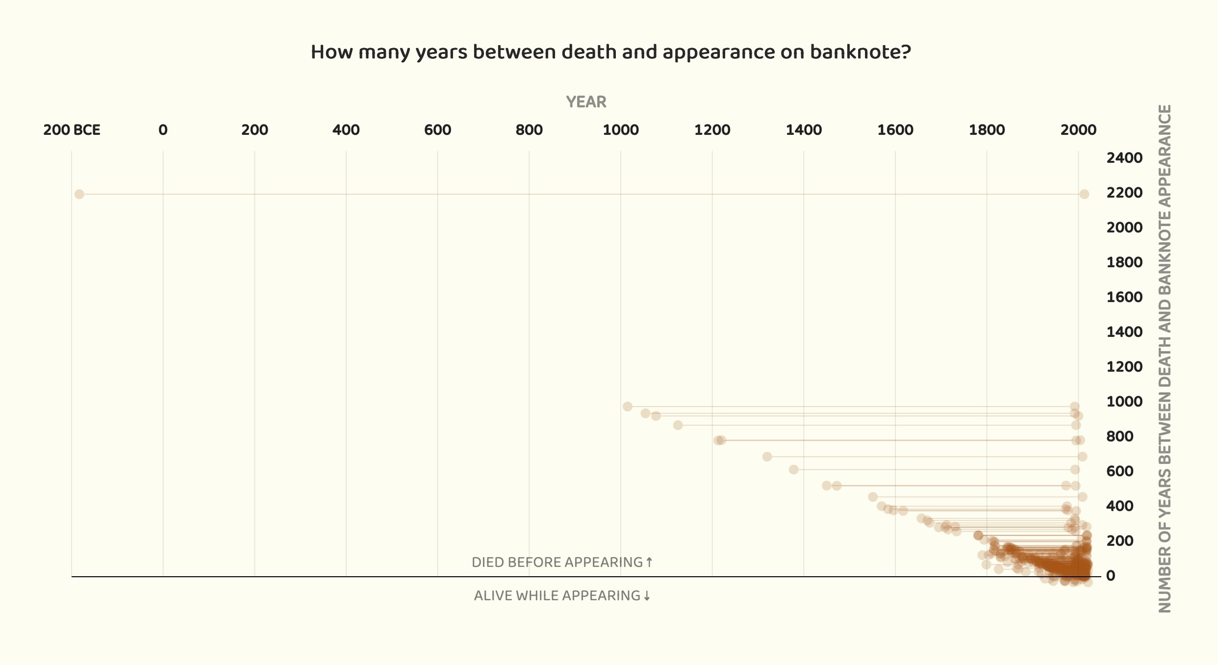
pudding.cool is one of my favorite websites of all time, and has dozens and dozens of fascinating datasets and analyses, but this one I think is really straightforward yet lends itself to lots of different visualizations, like the one presented above plotting the gaps in time between when a person died and when their face was placed on a country’s banknotes. One of my favorite aspects about this plot is how it leads the viewer (and by the viewer I specifically mean me! But, I would guess that others may be intrigued by this aspect as well?) to want to know what the “corner cases” represent: who is the one person who died ~2000 years before they were placed on a bill? Or, who are the 10 people who were still alive when their face was placed on a banknote? I guess you’ll have to go in and explore the data (or read the pudding.cool article) to find out! (Or click the text below to reveal the answers, if you want to cheat 😜)
(Click for the gist if you don’t want to read the article!)
- The outlier in terms of dying ~2000 years before being placed on a bill is Hannibal, who died around 182 BC and was placed on the 5 Tunisian Dinar bill in 2013.
- The ten outliers who lived to see their own faces on a banknote are (in chronological order of banknote issue):
- Mustafa Kemal Atatürk, placed on Turkish Lira note in 1927 and died in 1938
- Sukarno, placed on Indonesian Rupiah note in 1945 and died in 1970
- Michael Manley of Jamaica, placed on Jamaican Dollar note in 1970 and died in 1997
- Hastings Banda of Malawi, placed on Malawian Kwacha note in 1971 and died in 1997
- Sheikh Mujibur Rahman, placed on Bangladeshi Taka note in 1972 and died in 1975
- Michael Somare, placed on Papua New Guinean Kina note in 1989, died in 2021
- Edmund Hillary, placed on New Zealand Dollar note in 1992, died in 2008
- Rose Chibambo, placed on Malawian Kwacha note in 2012, died in 2016
- Nelson Mandela, placed on South African Rand note in 2012, died in 2013
- Queen Elizabth II of England, placed on British Pound note in 1963, died in 2022
The Global Flavor Map
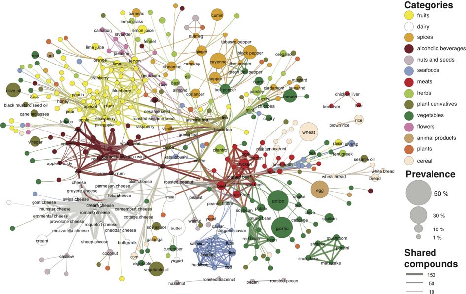
- Type: Network data (Nodes are ingredients, edges between two nodes represent shared molecular properties)
- The data: available at the bottom of the page for the paper, as “Supplementary Dataset 1”
It’s difficult to choose a good dataset to demonstrate visualization of network data, honestly, since sometimes “good” means that it is simple enough to capture using just a few nodes and a few edges, while other times “good” means that it is rich/complex enough to warrant generating a bunch of different visualizations showing different facets of the data. I think this dataset falls more into the latter case, but I like it in terms of generating the visualization reproduced above, since it shows how you could generate simple “summary” visualizations of the dataset, but (as done in the paper from which the figure is taken) you can also do a deep dive into the dataset—down into the molecular level, for example—to find other interesting patterns that too “fine grained” to be present in the above (high-level/coarse-grained) visualization.